All photos and diagrams in this post are my own. New subscribers please note that articles are free to read for 4 weeks before they go to the paid-subscribers archive.
This chapter of the series1 presents a very different style of Kufi, far from the austerity of brick-based script, but with the same core idea of weaving potent words and phrases into the structure of an edifice.
And what an edifice. I’ve been around and seen some mindblowing human-built sites, but the Alhambra of Granada sent me into an altered state. A lifetime would not suffice to study every aspect of its architecture, landscaping, ornamentation and how they all work together. Fortunately I can limit myself to my field and zoom in on the writing on the wall.
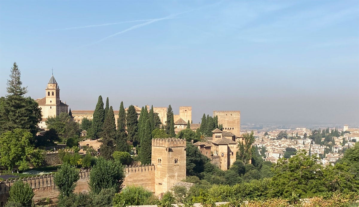
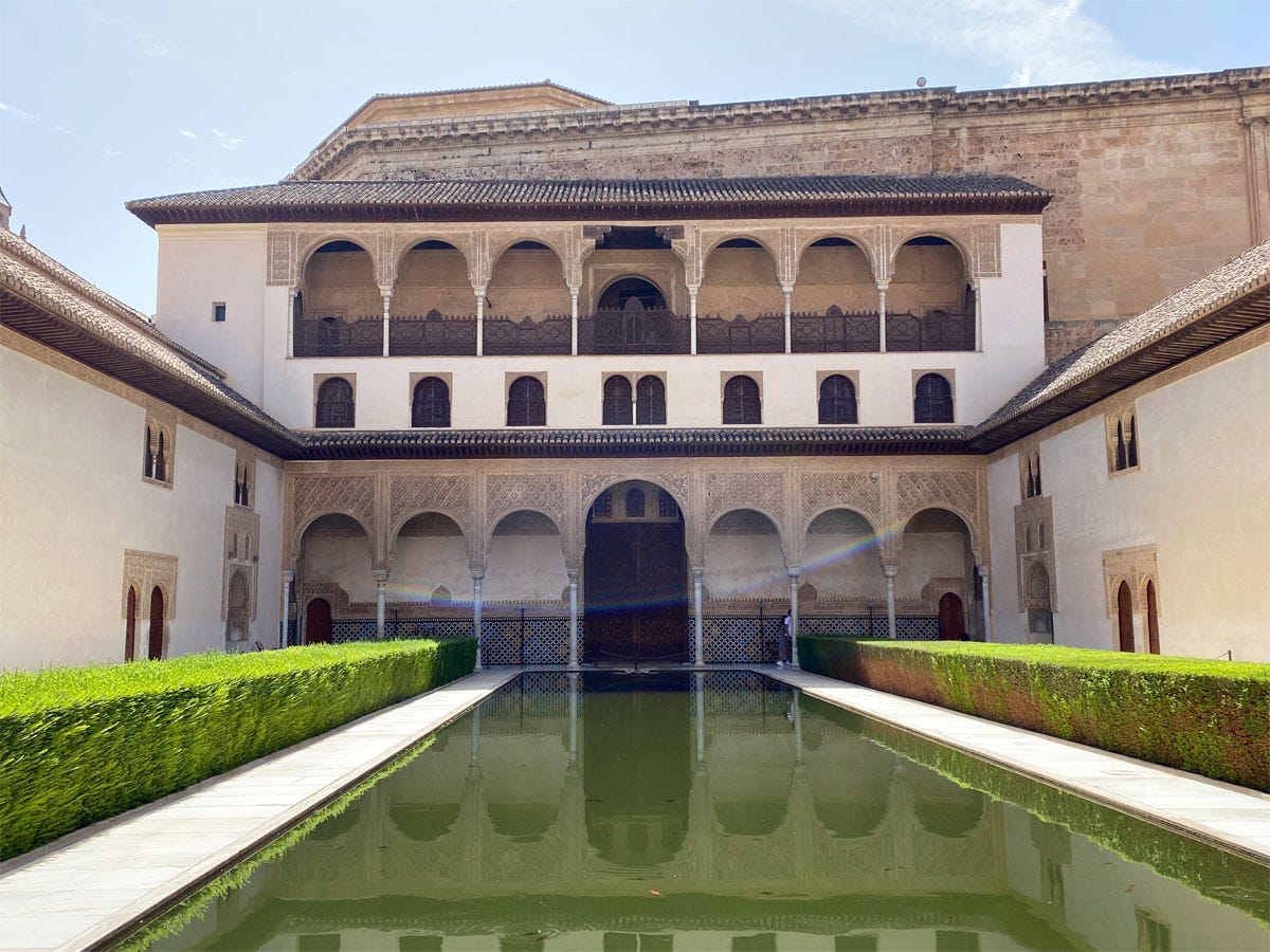
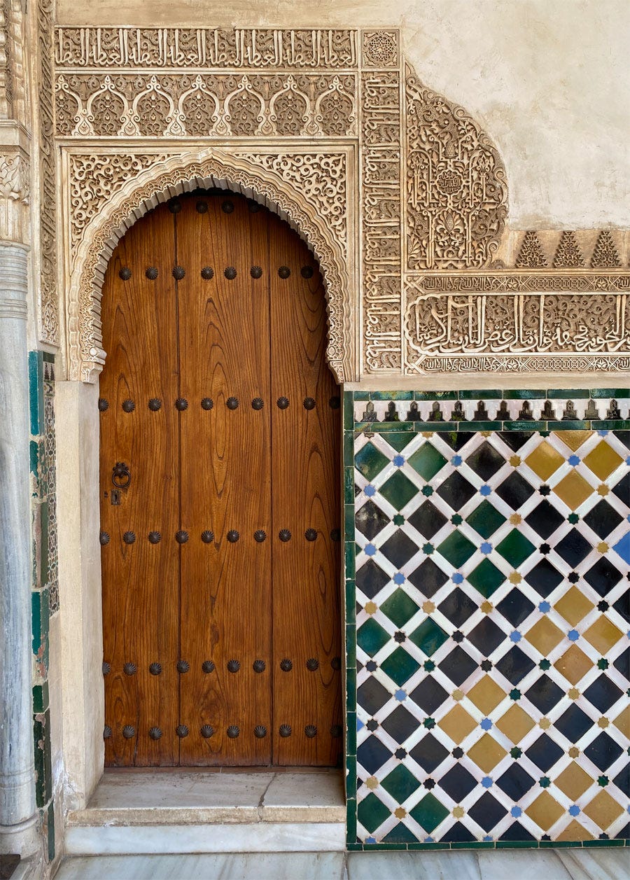
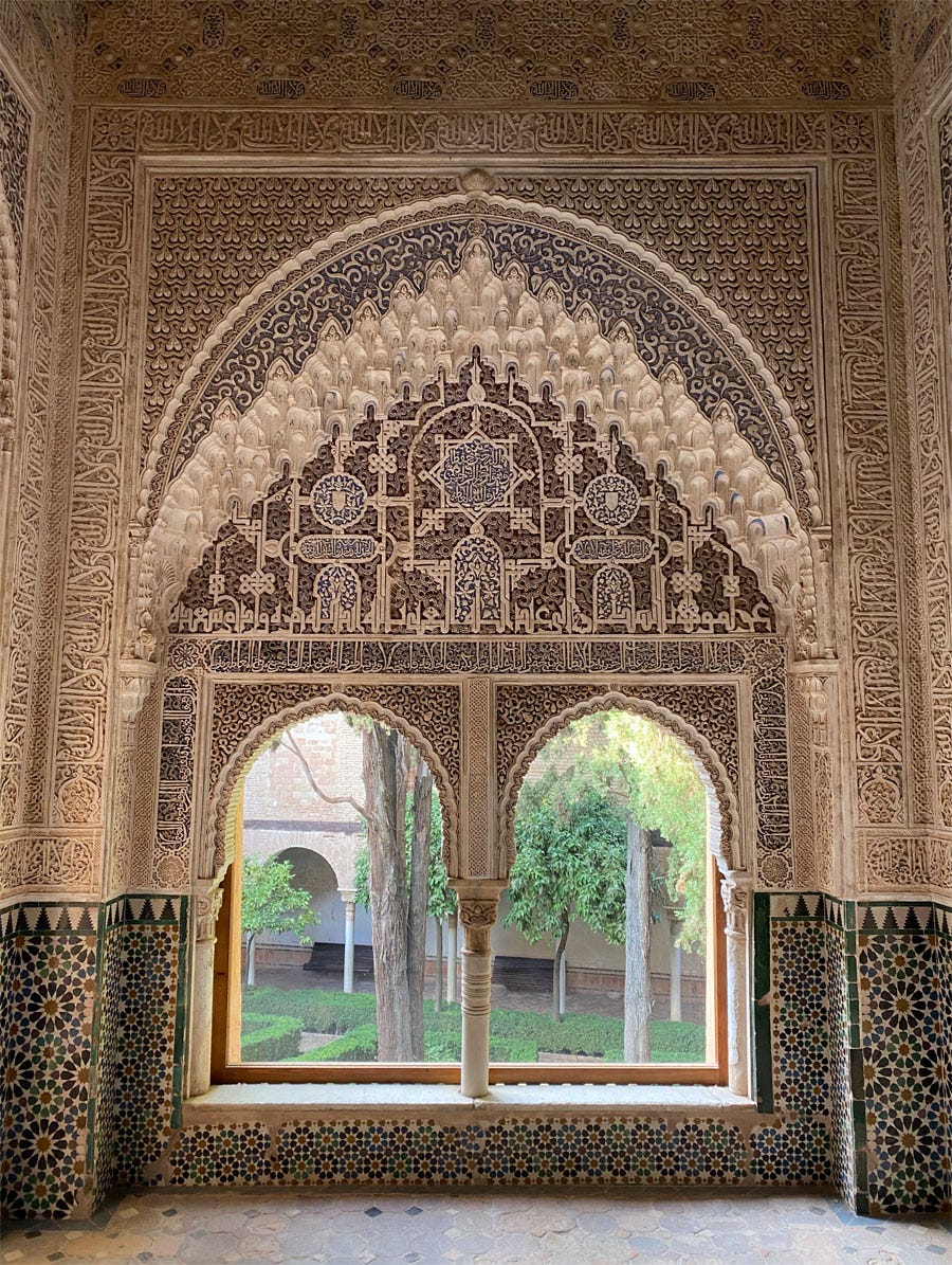
A brief intro to begin with: The citadel of Alhambra2 is the best preserved monument of the Nasrid Kingdom of Granada, and was mostly built between 1238 and the 14th century3. It’s a self-contained palatial complex that stands on a hill overlooking the Andalusian town, and a small-scale city of its own with gardens and orchards, fountains and baths. Alhambra is particularly well-known for the extraordinarily intricate and lovely decoration of its walls, an interplay of stucco carvings and colourful ceramic tiles. “Rapture” doesn’t feel like too strong a word to describe the effect of such a dense fabric of beauty, brought to life by the play of sunlight and the sound of trickling water.
And worked through the plant-inspired patterns, there are words, everywhere words – on the walls, on capitals, on muqarnas or around niches, and all sorts of spaces – a fine Easter egg hunt for anyone so inclined! Unlike the clearly Qur’anic snippets we saw in Khorasan mosques, in this secular space these words are for the most part simply well-wishes on whomever is present, though this doesn’t exclude pious thoughts.
Two scripts cohabit on these walls: the constructed type broadly referred to as Kufi, and a more cursive style I believe may be referred to as Fāsi4. My focus is on the Kufi, always the more interesting, which demonstrates here once again its ability to be shaped and adapted to the decorative programme.
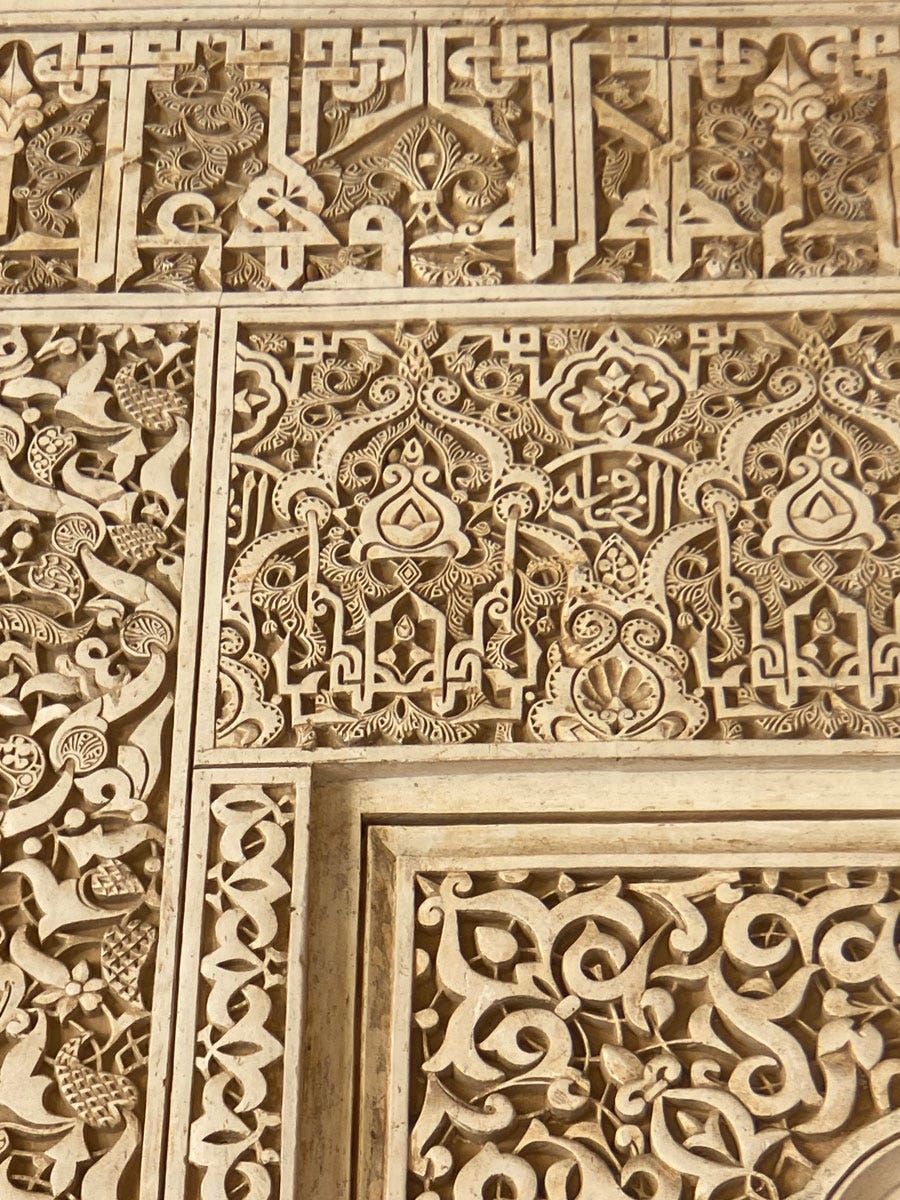
Throughout the complex, we find the same principle applied (simple, but not necessarily easy): To stylise the word or mirror it into a symmetrical design unit5. Tall letters, or if the word contains none, "tooth" letters (made up of a short stroke) are elongated to become decorative bands that can be plaited or knotted and create larger geometrical shapes for the plant motifs to fill. Sometimes these bands form a small cartouche that contains related text in cursive.
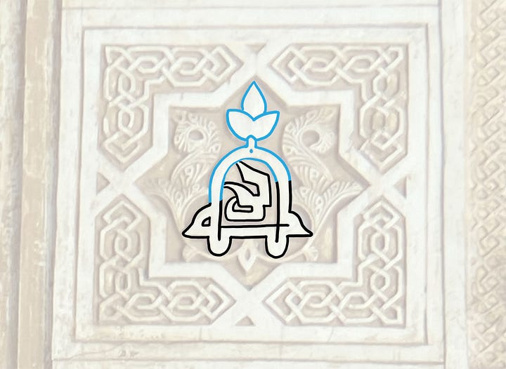
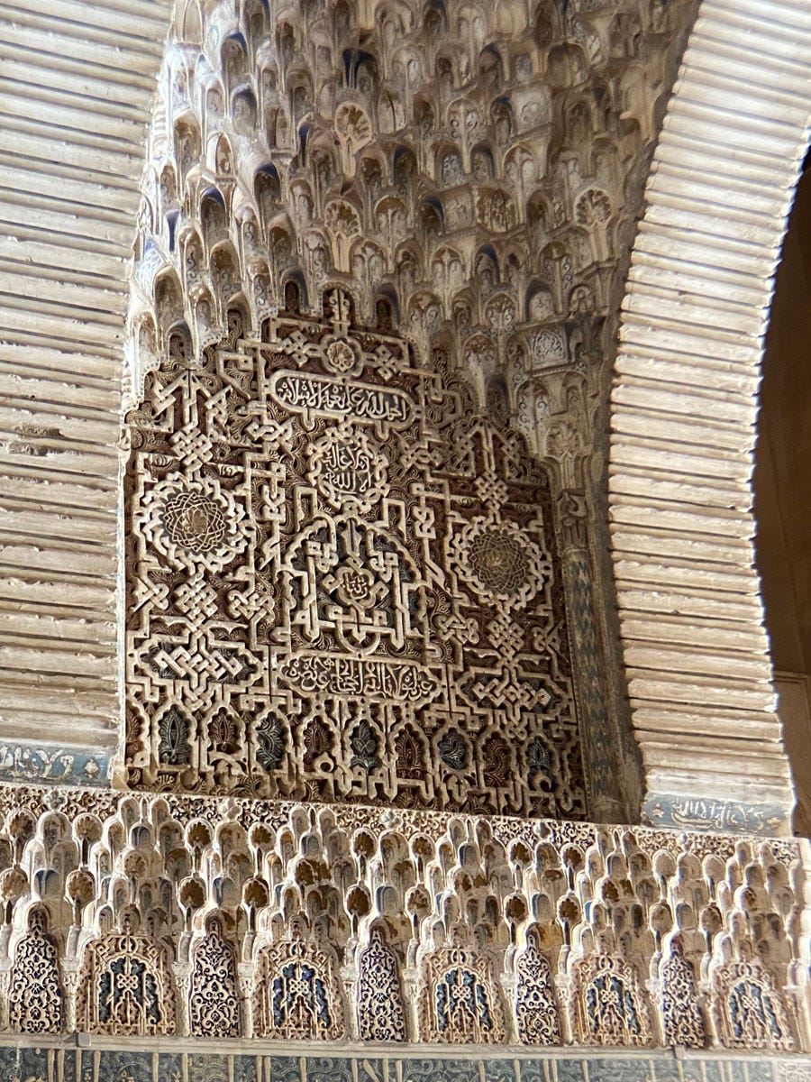
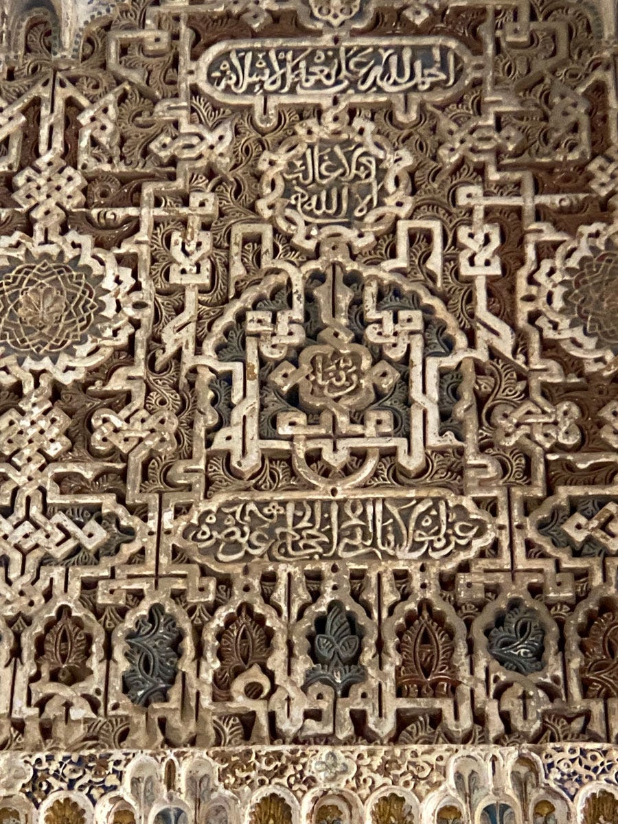
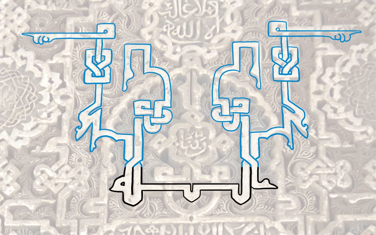
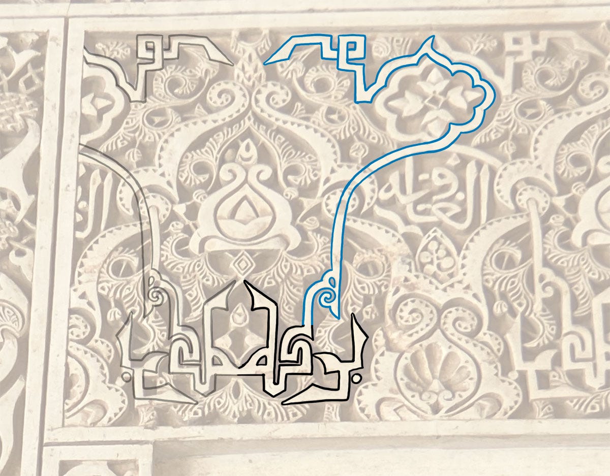
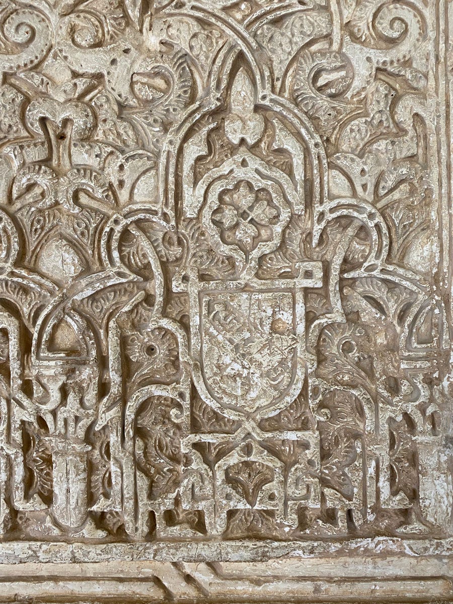
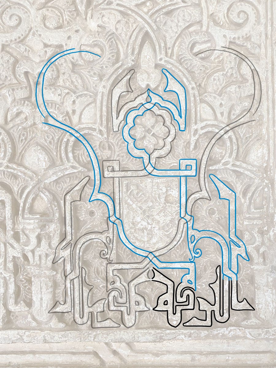
The remarkable unit at the centre of the panel below, for instance, is simply one word: Allah الله.
I’ve picked it out below, and the portion in black is the essential part of the word – everything else is flourishes.
There’s more material than would fit into a single post, so today is focused on the Alhambra’s favourite word: baraka6, which has the all-encompassing meaning “blessings, beneficence”, which we can expect to see in a shape approximating this: بركه (with or without the dot).
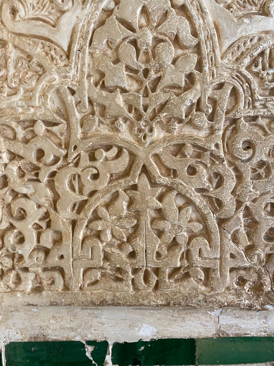
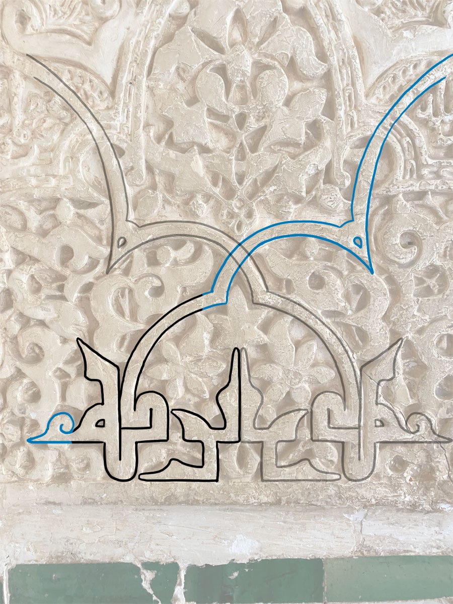
Shape-wise this is a hefty word, so the symmetry is usually created by mirroring it, either back-to-back or front-to-front. In the former option, the shafts of the two kāfs can be used to good effect by forming an arch, as below.
The greyed-out word is the back-to-front mirror image:
I also note in general that these designers got around the usual horizontal extension of letters like kāf by simply folding up that extra length! A neat solution to counter the natural unevenness of the arabic script.
When the final hā’s mirror each other, they offer perhaps more possibilities as slight changes in their shaping varies the overall shape created.
This iteration forms the band right above the arch:
In this other example below, the word has, unusually, been broken up into two more manageable units, each mirrored separately:
Mirroring this way also unlocks the option of adding the article to the word: al-baraka البركه . This essentially adds two bands on either side, with all the visual potential that comes with them.
As this part of the wall was quite worn and I don’t have a more contextual picture, I’m not even sure where the Kaf extension ends.
Much more unexpected was the way the word itself was often made self-contained and symmetrical by clever shaping without the use of mirroring (which is an easy way out for difficult words). So unexpected I didn’t even see it at first, then I started seeing it everywhere:
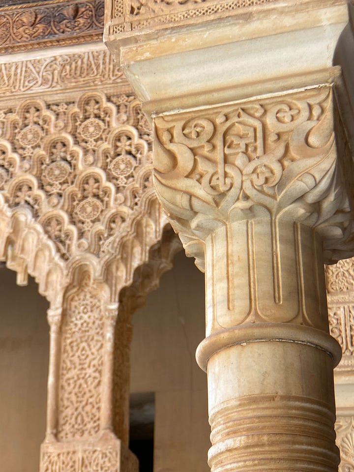
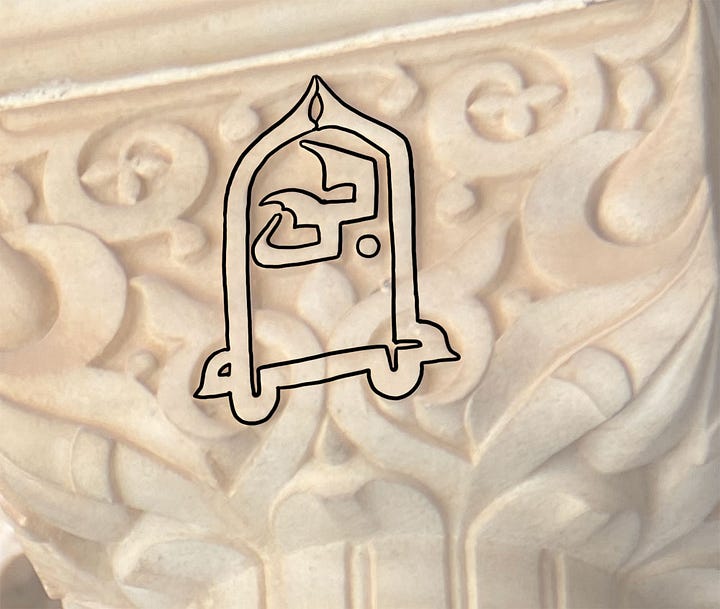
While the letter shapes can look so unfamiliar as to be confusing, they are in fact completely consistent – if a little exaggerated – with the inner logic of this script, which is itself very different from modern Arabic styles.
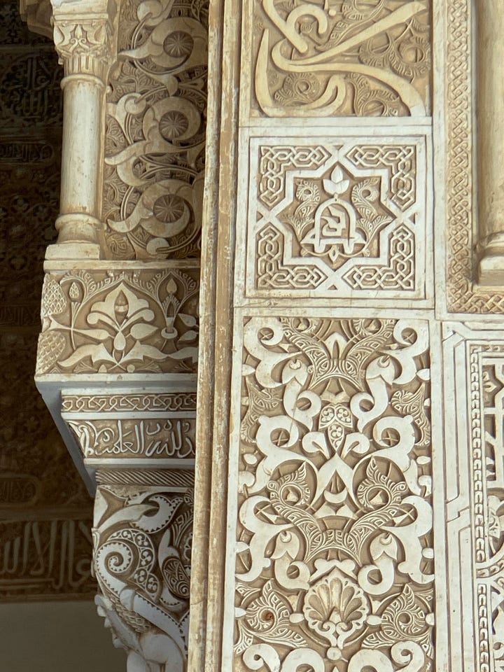
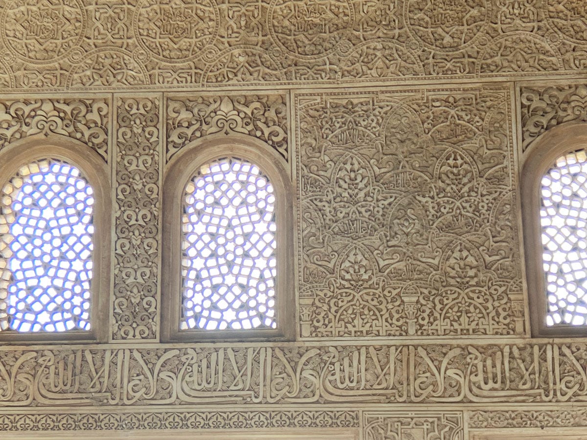
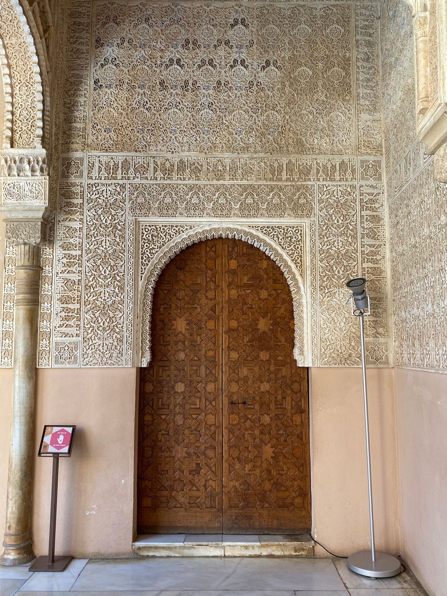
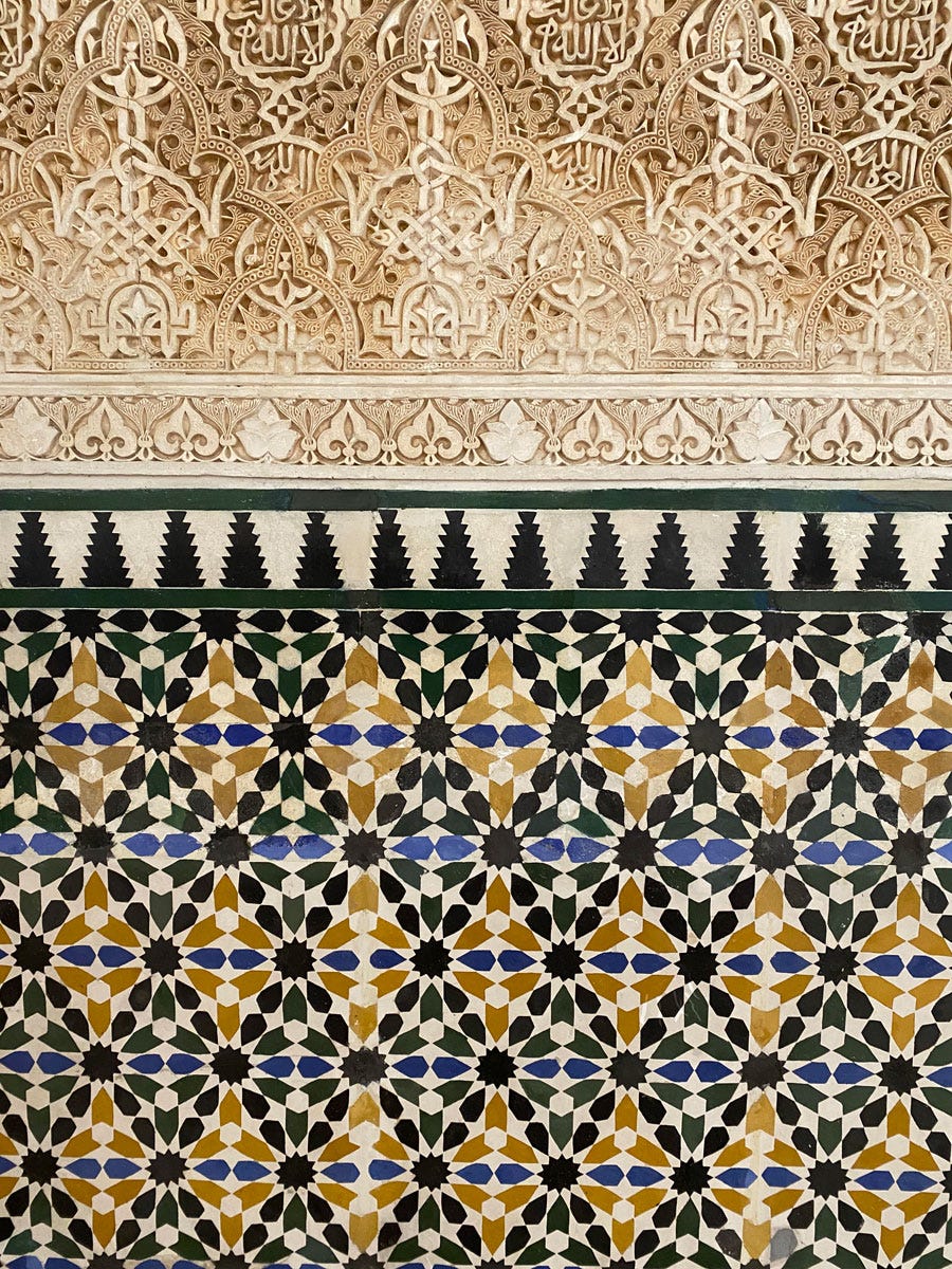
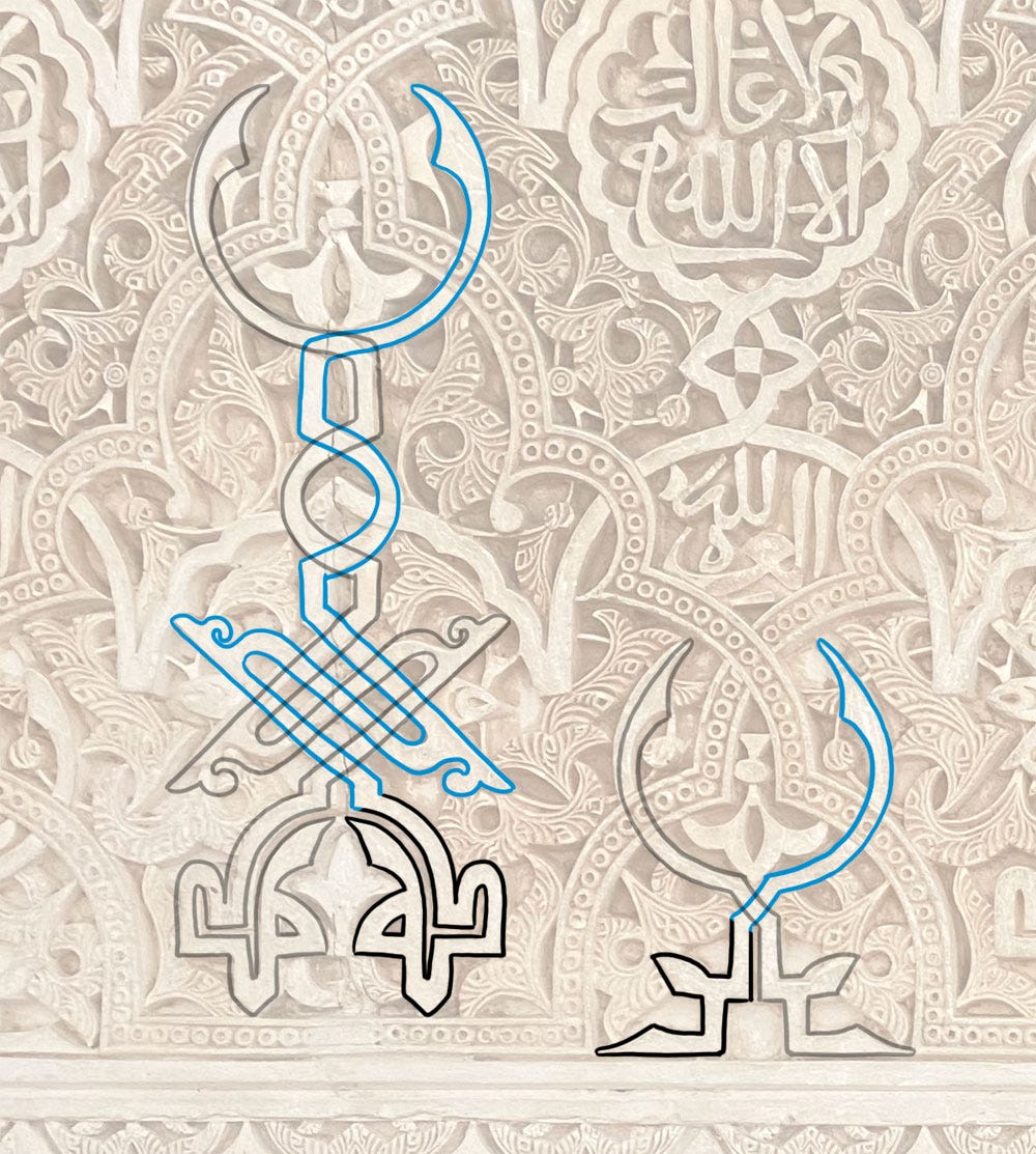
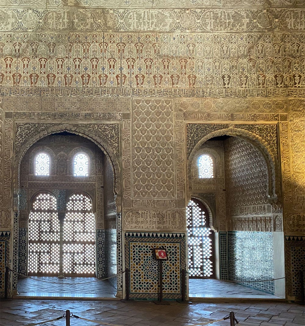
I saved the most eye-popping for last: consider the band above the doorways, four layers of running arches deep with touches of red.
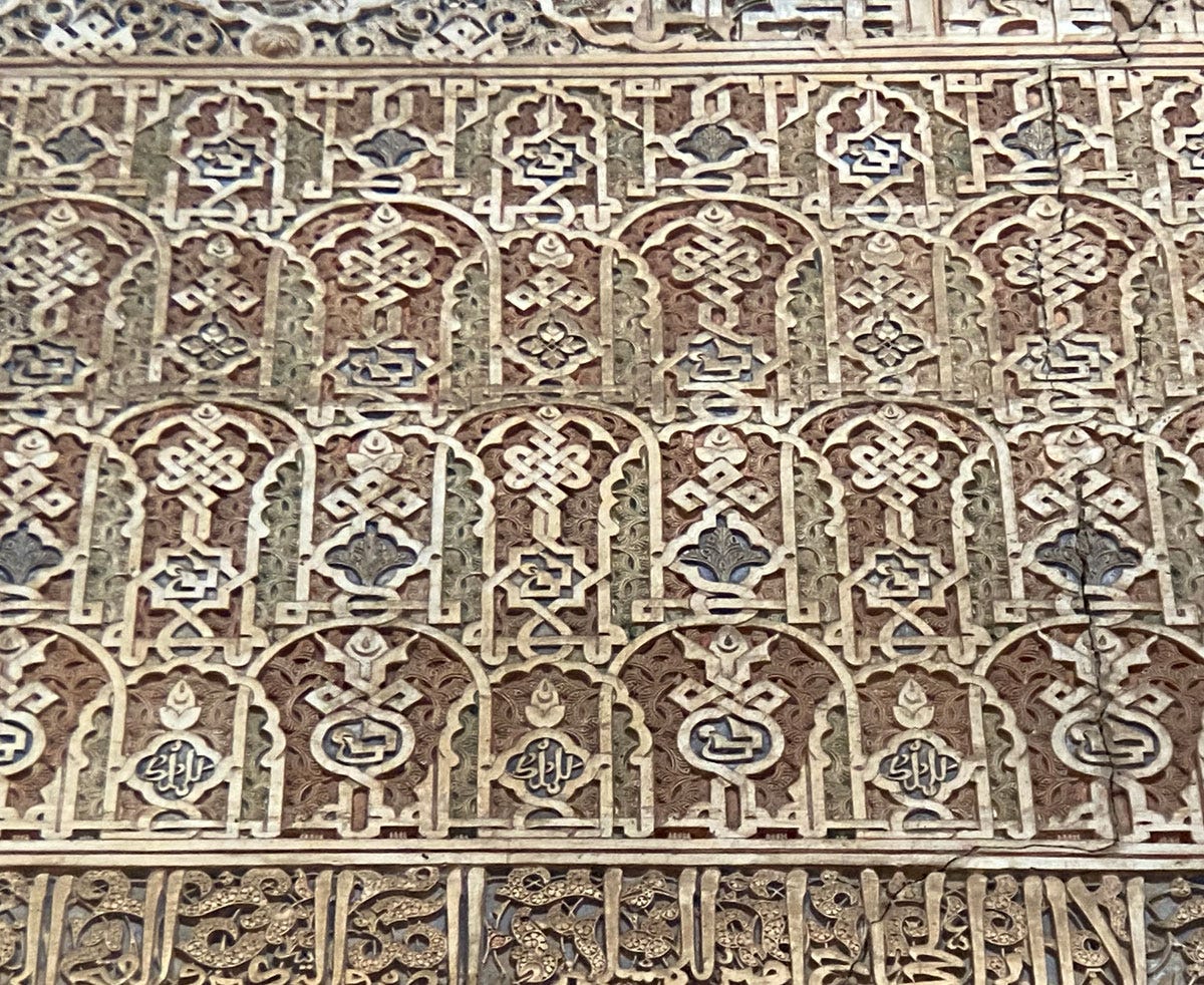
This has three different baraka designs, interwoven with an al-mulk lillah الملك لله (“God has dominion”, in red below) in such a tight formation I only saw it when I could examine my photo closely.
I don’t believe it was intended to be intelligible to someone standing in the room, even if they had time on their hands: once more we find text the purpose of which is simply to be there and work its magic, not be read.
There are other well-wishes to hunt for through the Alhambra walls, but for now, let us exit through the garden…
One last thing before I go: On the subject of creativity, I found this read by
relevant to our ongoing conversation: What's the Value of Teaching Art in Schools?The name preserves the Arabic pronunciation, al-ḥamra, “the red”, from القلعة الحمراء “the red citadel”. I overheard a tourist telling their companion the name came from a ruler called Something the Red. I don’t know where they fish this nonsense; for that to be in any way plausible, that ruler would have had to be a woman, as ḥamra is a strictly feminine form.
For fuller details I’ll simply refer you to the Wikipedia entry.
Don’t quote me on this; I use all these retro-applied labels reluctantly. The later standardised scripts (Naskh, Thuluth etc) were named as they were created, but for earlier and Western Arabic scripts, the historical nomenclature is far from clear, was probably never widely agreed on, and so all the names we use for them are modern decisions – and still not widely agreed on.
Though I only discovered the parallel on this trip, this is how I have always worked with the script myself, so I felt right at home.
There is one room that is still today known as “the Hall of the Boat” even though it’s understood now that this was based on a laughable misreading of baraka بَرَكَه as birka بِرْكَه. I ask you.





Thank you Jumana🙏🏼your contribution to understanding islamic art is so precious🧡
Wow what a wonderfully detailed study. And thanks so much for linking to my article Joumana, I really appreciate it!