Apologies for the silence, I had to attend to some urgent life changes and it’s been taking all my attention and energy.
This is the penultimate chapter in examining the details of six manuscripts illustrating Haft Peykar, the epic poem that tells of Shah Bahram and his seven brides (fully introduced in Patterns under the Black Dome).
Previously in this series:
Below are the images1 for the fifth stage of Bahram’s journey. Each is linked to its source page where you can zoom in on the fine details. You might want to read this post in a browser rather than email, so you can see the enlarged images.
Why “Sandalwood”?
Sandalī, or “sandalwood-like”, is simply a term Nizami uses to describe a rich reddish-brown, exactly like “orange” is a term describing a bright yellowish-red. The translation “under the brown dome” would have been equally accurate, but it would lose the nuance of Nizami’s choice of wording: sandalwood is a medicinal tree, and was believed to originate in China (just like the princess in this tale). Introducing the image of a healing tree to the poem may have been a meditation on the Tree of Life, an image of the manifestation of Divinity throughout the universe.
Why the colour brown should be one of the seven “primaries” at all is down to the history of glazed bricks, of all things. Going back many centuries, Mesopotamian clay architecture was characterised by the enamelled brick facings, a technique that reached full maturity in the 7th-6th century BC (in the famous Gate of Ishtar). The tile colours were then: turquoise, night-blue, green, yellow, tan, white and black. In 538 BC, the Achaemenid Persians became masters of babylon and adopted glazed brickwork, absorbing both the system of seven colours and that of the Seven Heavens. The link between the two was already hinted at in Herodotus’ 5th-century description of the seven-walled city of Ecbatana. For this reason red (a more difficult glaze to achieve, hence not found in the original palette) replaced night-blue among the Haft Rang (“Seven Colours”), rather than chaging their number to eight2.
The Sandalwood Dome
On Thursday, Bahram visits Yaghmā-Nāz, Princess of China, clad in Sandalwood, under the sign of Jupiter, Lord of Tin.
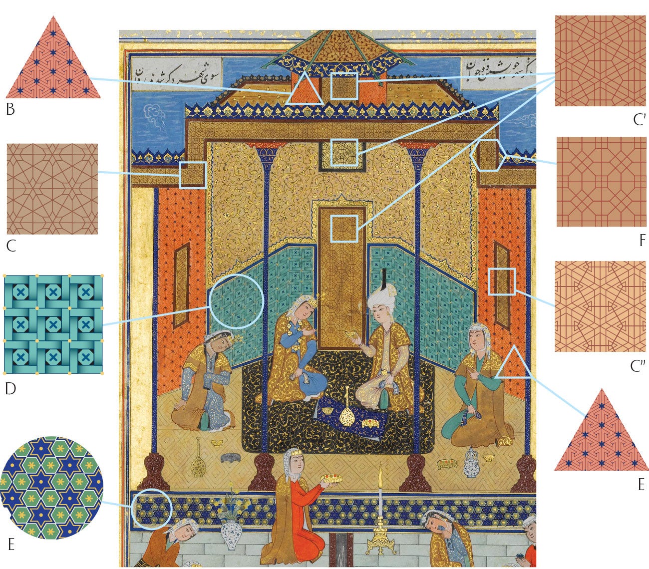
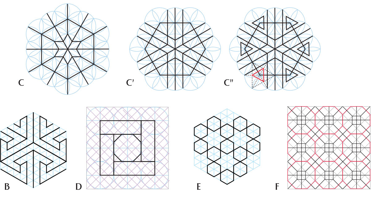
Chester Beatty Library
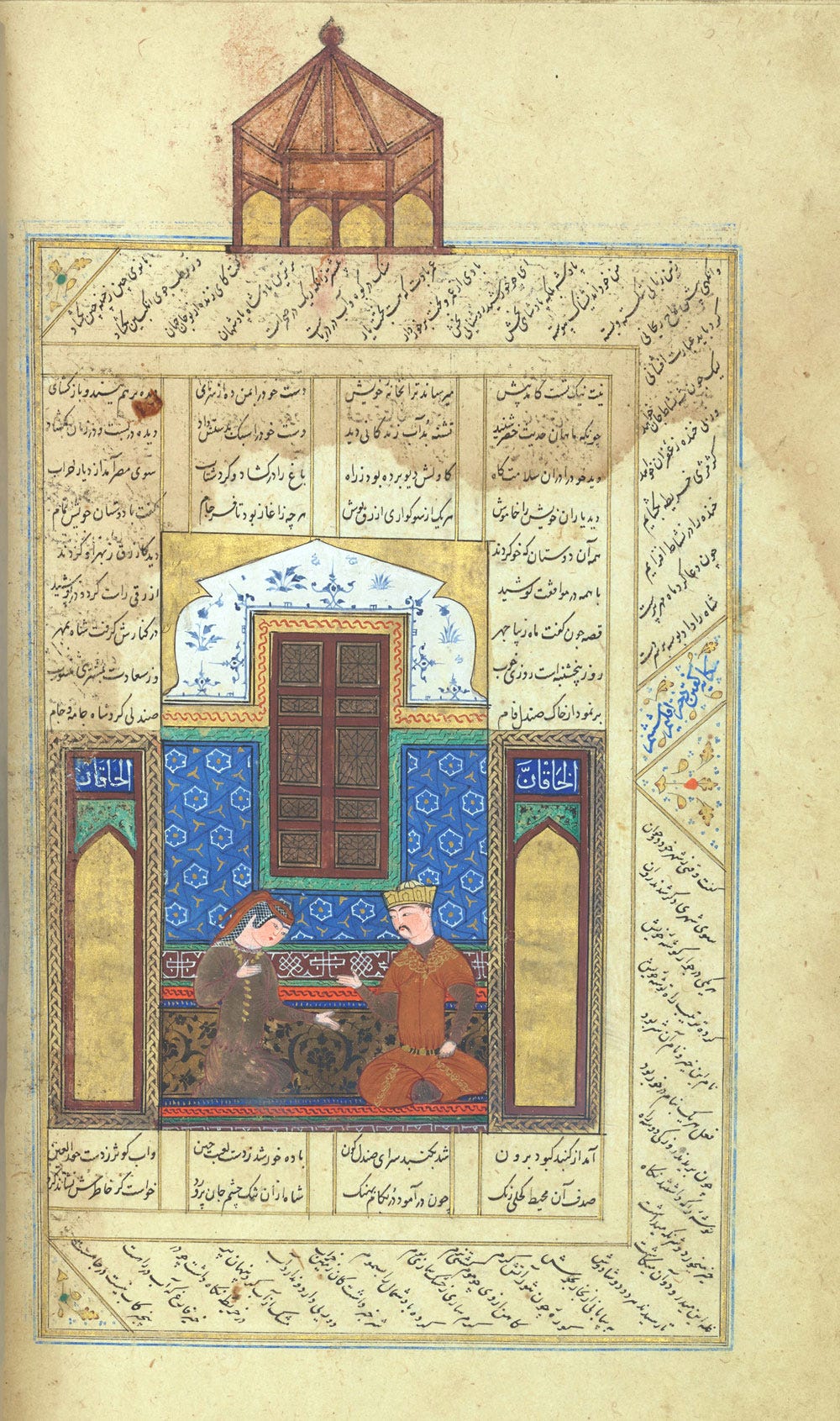
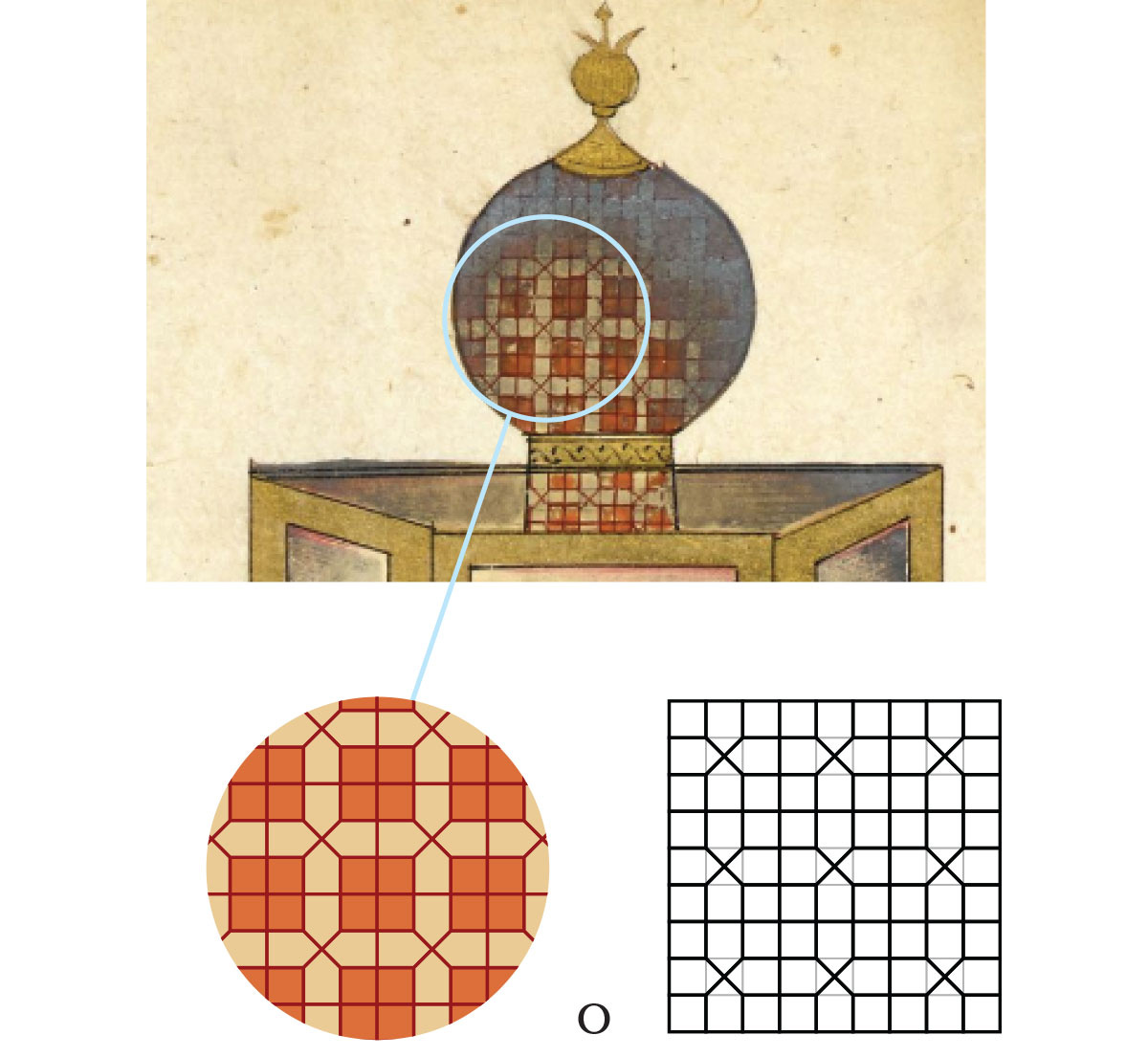
Notice how that the sandalwood dome is here represented as a literal wooden “dome”, constructed differently from the usual ceramic-clad domes. It seems the illustrator took the term sandalī literally rather than as the author’s intended colour metaphor.
We are by now familiar with this manuscript’s patterns of choice. That the patterns is a more classic blue is interesting. I don’t want to read too much into it, but it’s as if this particular artist was not familiar with brown as a glazing colour.
Metropolitan Museum of Art
This seems to be another literal interpretation of “sandalwood”, though this manuscript also had this type of construction for the turquoise dome chapter (maybe the artist took that one literally too!)
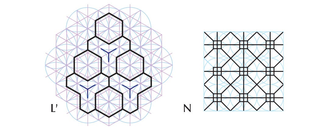
All of the patterns have appeared before, except F which is compeltely new. Despite the distortion, it’s probably the simple Grid of Squares elaboration below. The number of patterned wooden surfaces represented may itself be a sandalwood reference, as there aren’t usually so many.
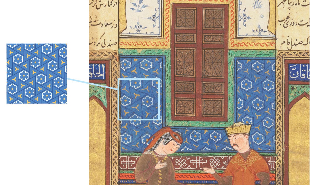
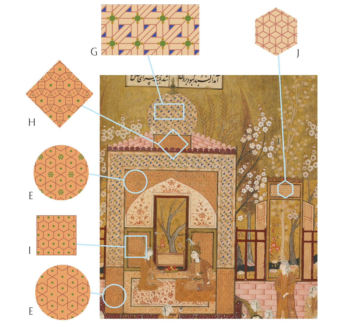
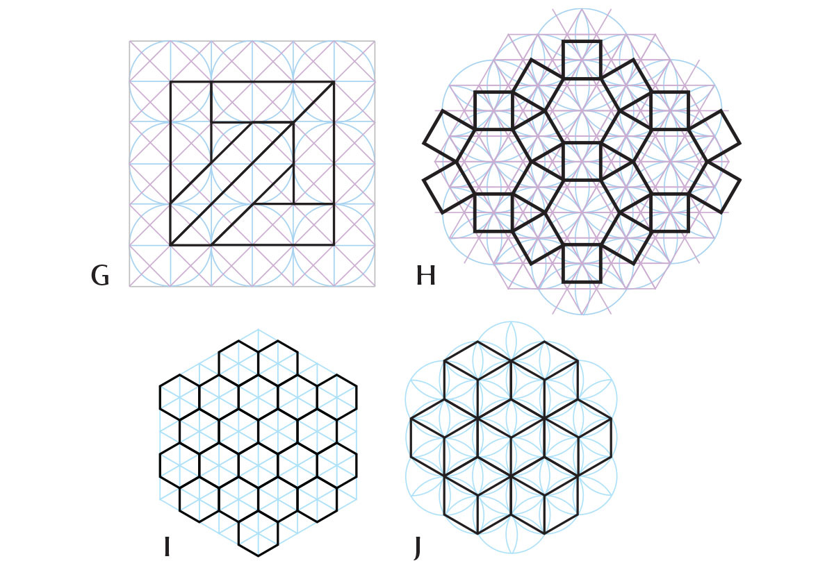
Smithsonian National Museum of Asian Art
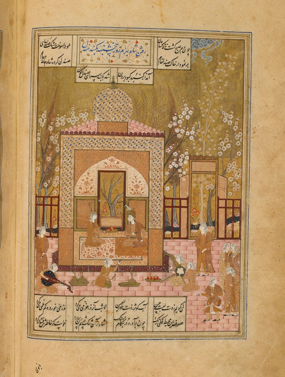
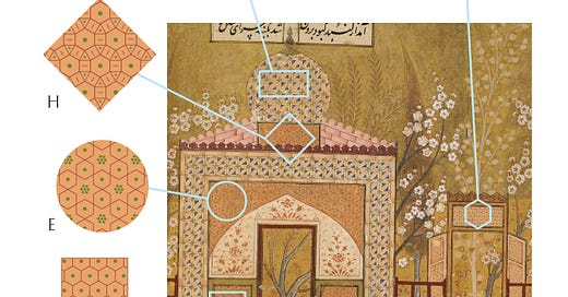
G here is a brand new pattern, and H a rare take on this particular grid. The colour scheme is unambiguous to say the least, and I wonder what type of pigments were used, whether they were a mixture, or simply ochres. Difficult to tell from a digital image!
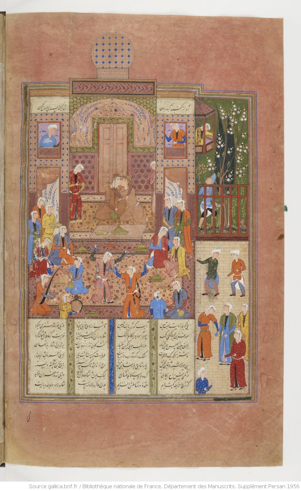
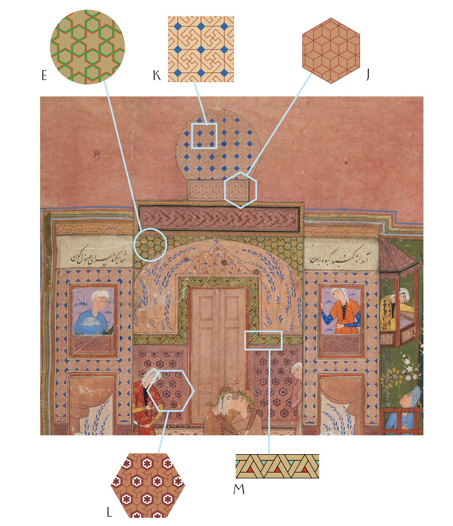
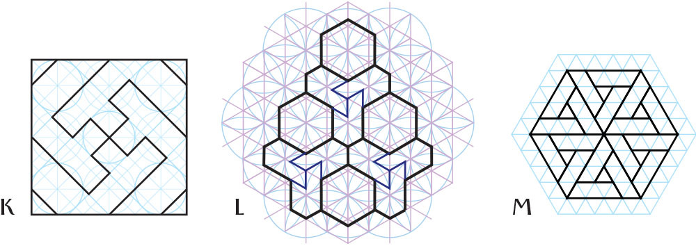
Bibliothèque Nationale de France
No surprises here, and once again a colour scheme focused on the dome in question, but I find it really interesting how the palette in this manuscript is consistently different from the others (as was particularly visible with the turquoise dome). And in this case, even from the digital image, it’s very clear that this brown was obtained by mixing pigments. Its particular hue looks very much like an admixture I’ve used before after finding it described in a 13th century text: cinnabar, lead white and orpiment.
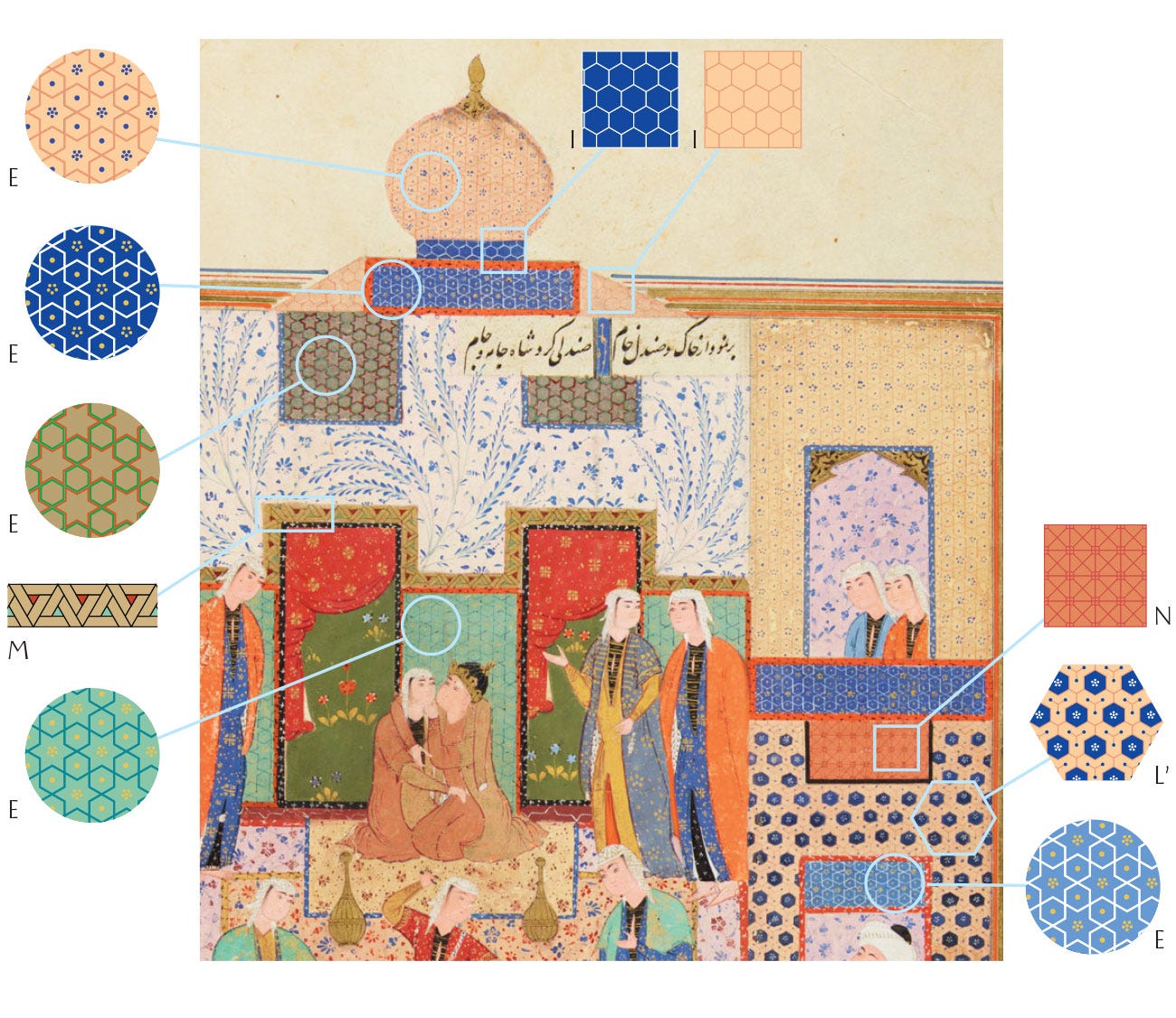
Cambridge University Library

Once more for this colourful manuscript, the dome and caftans of the two main characters are the only clue as to where we are in the story. The patterns are equally familiar, with no new iteration.
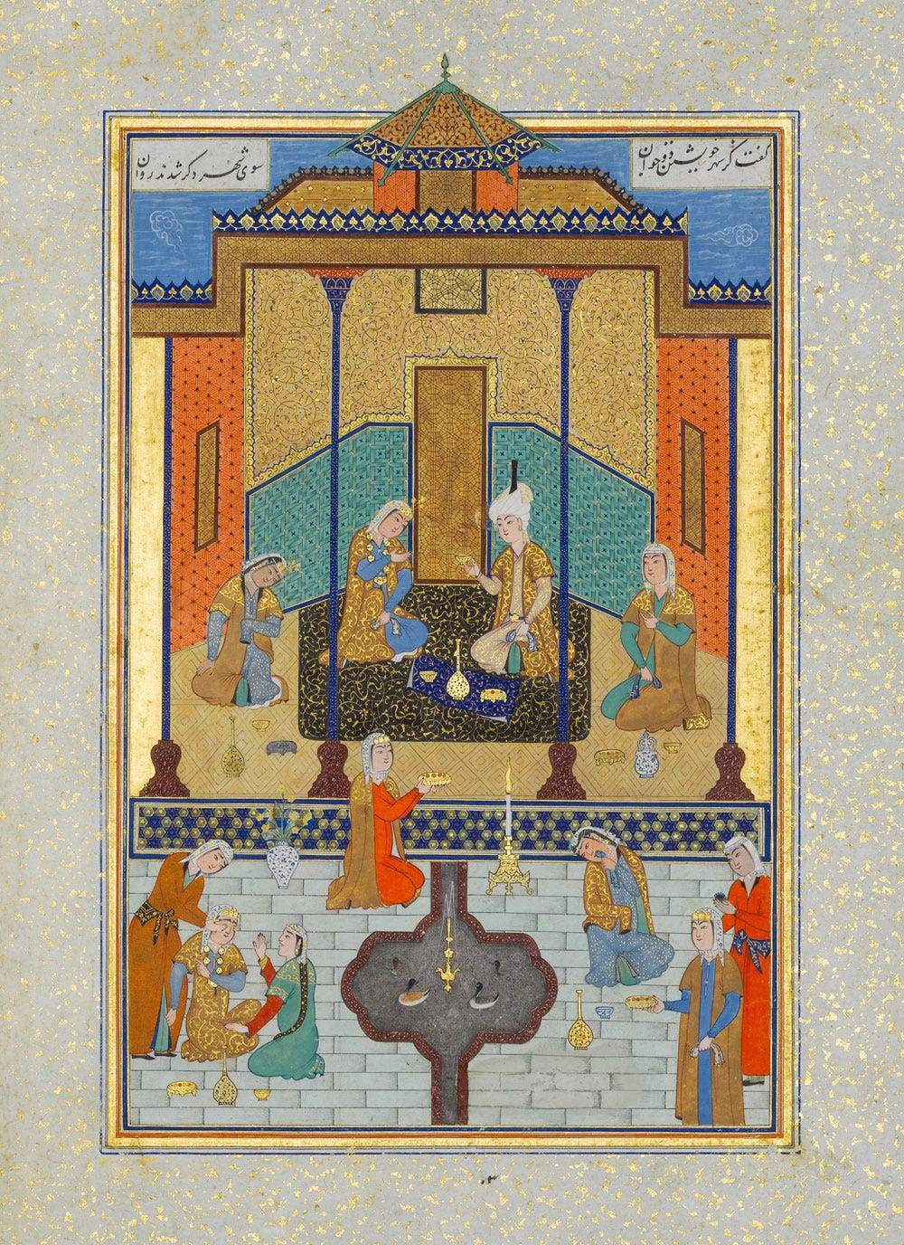
British Library
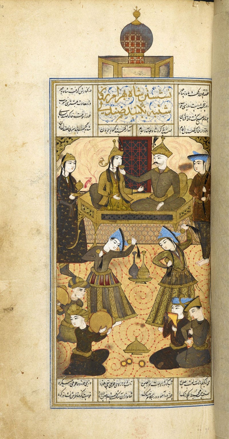
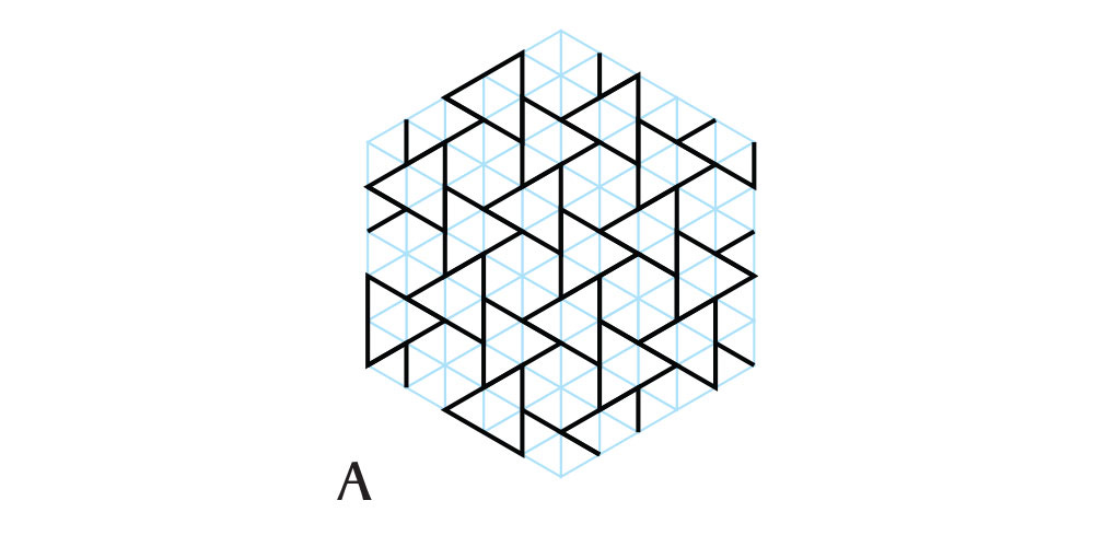
We are back to this manuscript’s recurring dome pattern, but in view of the proportions I propose below a different grid to construct it.
Only one chapter left to go: next time this series will conclude under the White Dome.
The sources of these images are the following manuscripts, from the oldest to the newest:
Chester Beatty Library, Per 171 (AD 1492, AH 897), unknown artist.
Metropolitan Museum of Art, 13.228.7.8 (AD 1524, AH 931), painted by Shaikh Zada.
Smithsonian National Museum of Asian Art, F1908.271 to 277 (AD 1548, AH 955), unknown artist
Bibliothèque Nationale de France, Départment des Manuscrits, Supplément Persan 1956 (AD 1560, AH 965), unknown artist
Cambridge University Library, MS Add.3139 (17th c. AD, 11th c. AH), unknown artist.
British Library, Add MS 6613, ff138v-196r (AD 1671, AH 1076), painted by Ṭālib Lālā.
In the 17th century, Isaac Newton felt the same when he discovered the dispersion of light: “Newton originally divided the spectrum into six named colors: red, orange, yellow, green, blue, and violet. He later added indigo as the seventh color since he believed that seven was a perfect number as derived from the ancient Greek sophists, of there being a connection between the colors, the musical notes, the known objects in the Solar System, and the days of the week.” From Wikipedia






Always so fascinating. I appreciate your scholarship and dedication to analyzing and showing us these lovely patterns. On another note - another Substack recently renamed to the same name as yours. Hmmm. 🤔