This article is a brief version of a talk/demonstration I gave in October 2022, which you can watch here.
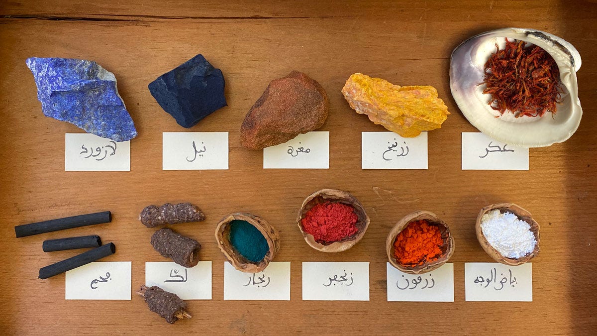
A couple of years ago I completed the translation1 of ‘Treasures of the Select’ by Abu Bakr Muhammad al-Qalalusi, who lived in Malaga, modern-day Spain, in the thirteenth century: a compendium of recipes and techniques which the author describes as necessary skills for writers and book artists. It’s a fascinating and comprehensive treatise from the Western edge of the medieval Islamic world, firmly rooted in that tradition but with evident exposure to a few European techniques. The book ends on a list of twelve core pigments, their substitutes, and further hues that are mixed from them:
“Know that there are twelve tried-and-true colourants: cinnabar, minium, red ochre, lead white, indigo, lapis lazuli, lac, verdigris, carthamin, orpiment, charcoal, turnsole. This is the complete set, and from each of these colours can be mixed another colour so they become twenty-four.”
I’ll briefly go through the list here for a glimpse into the art technology of that time and place. I should specify that this particular chapter in ‘Treasures’ is about colours used for painting images (such as in the photo below, from a workshop I recently animated), which is a slightly different palette from the one by scribes for writing and titling.
Images are from my book Inks & Paints of the Middle East, which delves deeper into this topic.
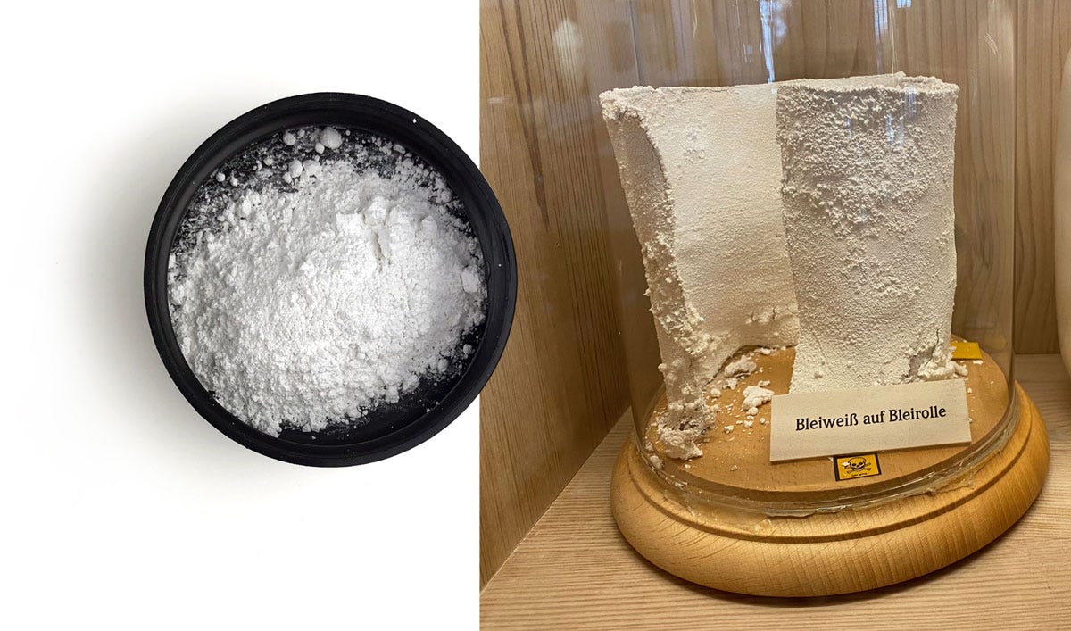
1. Ceruse بياض الوجه
There are many Arabic names for ceruse, known to European painters as lead white, but the one used here means “white of the face” and is a somewhat alarming reference to its past use as a cosmetic.
The process al-Qalalusi describes for making ceruse could have produced the much more recent result shown above right2 : Take a wide-mouthed wine jar and fill the bottom third with wine vinegar. Roll lead sheets into pillars and place them inside so they don’t directly touch the vinegar. Seal the jar well then buy in manure for several days, or until all the lead has transformed. Pour out the vinegar, then grind and wash the ceruse with water.
There was at the time no known substitute for ceruse in terms of whiteness and covering power; al-Qalalusi mentions gypsum for some applications. Interestingly, he also specifies that ceruse is replaced when painting walls and whitening paper, which is very wise given the dangers of heavy exposure to a lead product!
2. Vermilion زنجفور
The natural mineral cinnabar, source of an intensely red pigment, is a mercury sulphide. Vermilion is exactly the same material, only manufactured, and this word is more appropriate here because the text provides the method for making it, as follows: 1 part sulphur and 4 parts mercury are put in a shallow dish over a low fire and mulled until they coalesce. Little cakes of clay are placed at the bottom of pots made of sound glass, and these are then filled with the mixture. These pots then go in a specially prepared kiln and the heat is increased. A lot of smoke issues from the pots, and they must be covered as soon as this stops. Al-Qalalusi advises that if this is done too soon, the pots will shatter, but if it’s done too late, either the contents will spew out, or the pots will go flying. He also specifies, and I quote: ”Don’t try to shake a pot like so many ignoramuses do.”
3. Minium زرقون
This is also a lead product: lead tetroxide, also known as red lead. It’s a much brighter, frankly garish, orange-red than cinnabar, and also less stable over time. In fact it’s so over-bright that in order to replace cinnabar, it needs to be toned down with red ochre. This time two different preparation methods are provided!
The first is to take lead with a little tin and soda ash. A custom kiln is built and the mixture is heated in it until all the ingredients have liquefied, then it’s stirred until solid. The resulting mass is then ground to powder and distributed into open containers. They are heated in another kiln until the powder has turned to red minium. The author even notes that if the product turns yellow instead of red, this means air was getting into the kiln. This lead-tin yellow would later be used by European painters (and it’s a lovely pigment to use!), but was clearly of no interest to al-Qalalusi’s peers.
The other method is what he calls “quick vermilion”, and consists simply in firing together 1 part lead white and 1/2 part vitriol in a kiln. This, I understand, is basically the way red lead is mostly made today – by heating lead white until it turns red.
4. Red ochre مغرة

Red ochre is iron oxide that forms in the earth when subjected to pressure and heat. It’s found everywhere on earth3, albeit in varying amounts and qualities, but this text specifically mentions Byzantine red ochre, Fes clay, Armenian clay.
5. Lac لكّ
Lac as a colour comes from the lac insect (Kerria lacca) which invades trees and secretes a resin that can completely cover the branches. From this resin we get shellack, a very versatile natural resin, and the red dye is a by-product of that. Depending on pH, the final colour could be more purple or more scarlet, and a substitute for lac is sappanwood dye, which behaves in the same way.
6. Carthamin عكر
I wrote a whole article about this one previously with more details and photos, so I’m keeping it brief here.
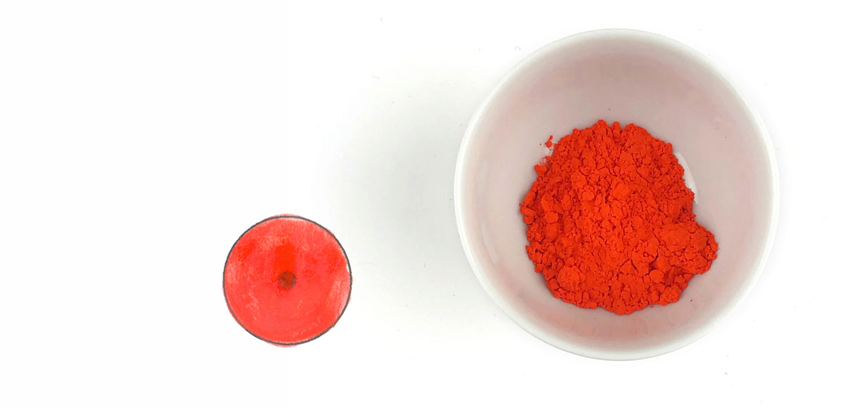
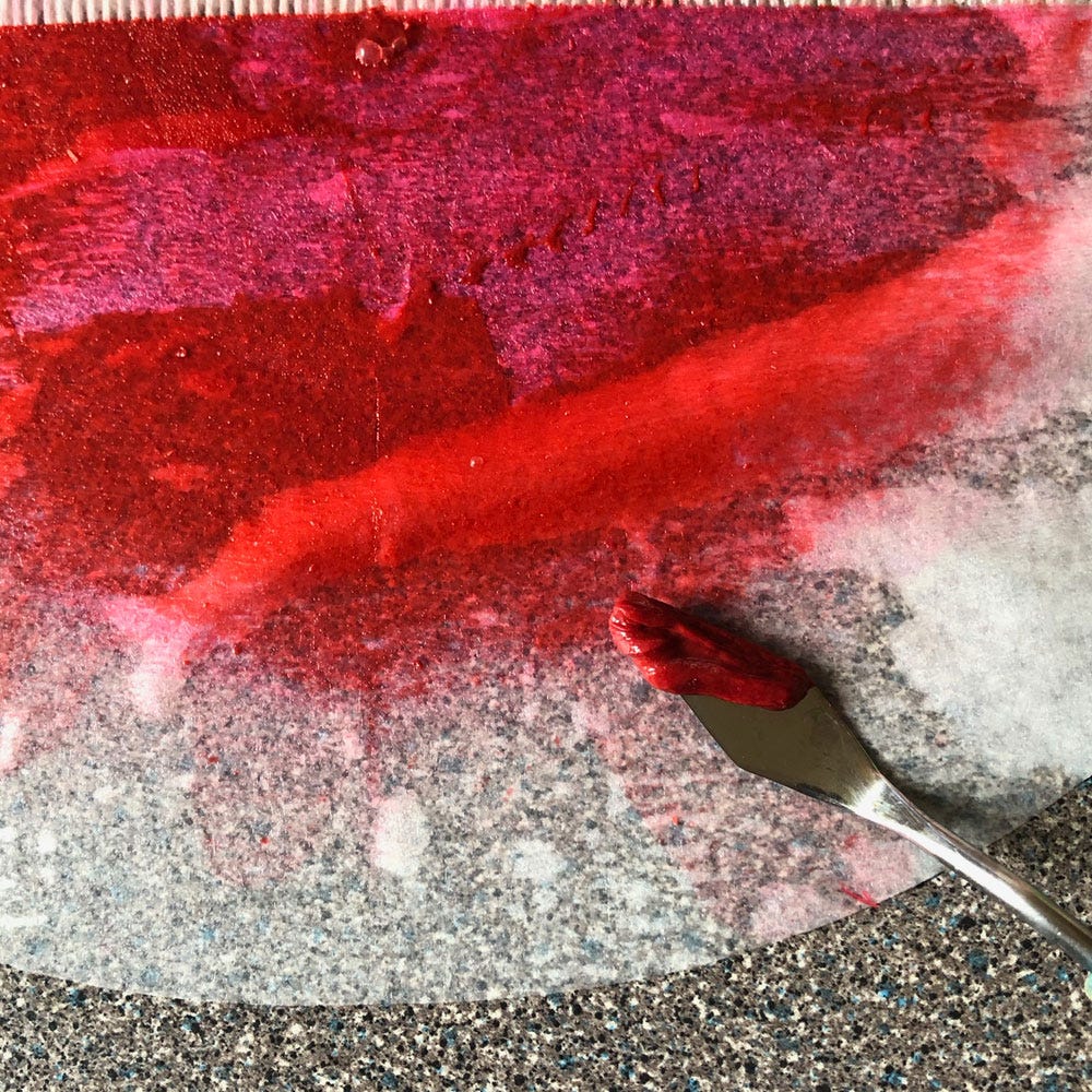
Carthamin or safflower red, in Arabic also referred to as “the jewel/essence of the safflower”, was the most laborious colour to extract. It also requires a large quantity of flowers for a very small yield. Al-Qalalusi’s description is very detailed, but in essence the flowers are dried, powdered and left to soak a day and a night. The yellow dye is discarded and the soaking is repeated until none of it is left. An alkali is then rubbed into the flowers very thoroughly: this brings out the red carthamin. Then this dye is very carefully collected, and vinegar is added to neutralise it. At this point it looks like the photo on the right, and once it’s been allowed to fully precipitate, then drained of most liquid, it achieves full strength as below.
7. Orpiment زرنيخ
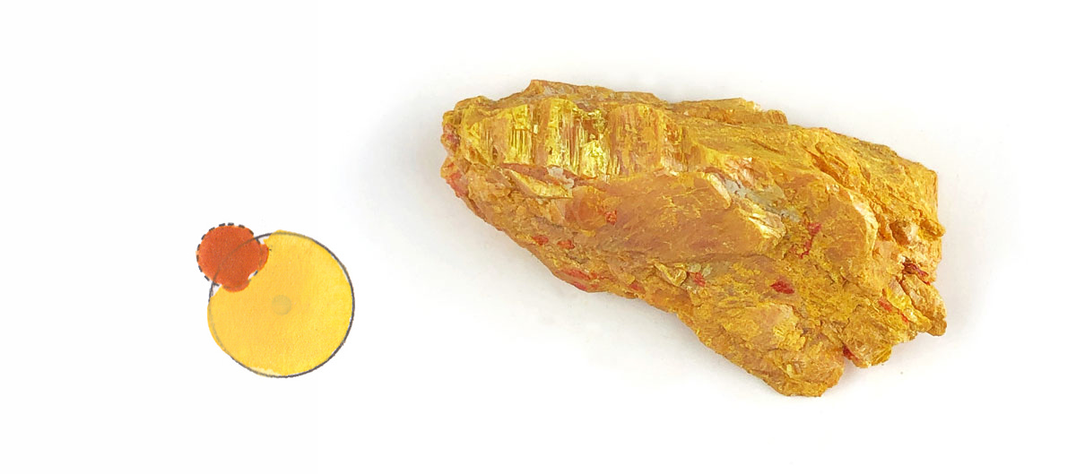
Zarnīkh is actually an arsenic sulfide and it was used in its two forms: orpiment, which is yellow, and realgar, which is orange. This is by far the most acutely toxic of all historical pigments, but it was for a long time the brightest inorganic yellow, and as such irreplaceable.
8. Verdigris زنجار
Verdigris is a broad term for a green pigment that comes from the weathering of copper, including brass or bronze. The exact composition varies depending on the kind of acid used, whether salt or other are present. The method described here makes a pure copper acetate: Pour good vinegar into a wide-mouthed jar and insert pillars of good copper so that they don’t touch the liquid. Seal it well; every 10 days or so you can scrape off the verdigris that has formed.
The corrosive effect of verdigris was known but its incredible hue was completely irreplaceable, and at that point in time no other green material was known or at least mentioned at all, other than some mixtures of orpiment with either indigo or lapis. Pure verdigris is not a good painting pigment as it behaves more or less like an ink when it’s wet, but it can be mixed with some other pigments to make interesting admixtures – provided they’re used immediately. Attempts to store those mixtures even for a few days can result in brown sludge.
9. Lapis lazuli لازورد
Another I’ve written about in detail recently, so I won’t linger on this well-known semi-precious stone. Suffice it to say there is no substitute for its clear deep blue, although the text does provide one… but it’s illegible in the manuscript!
10. Indigo نيل
The pigment indigotin can be extracted from a number of plants that have no relation to each other. The best-known of these is now true indigo (Indigofera tinctoria), but the original source of indigo blue dye for Europe and the Middle East was woad (Isatis tinctoria). The cultivation of indigo started reaching the region and spreading west in the early days of Islam.
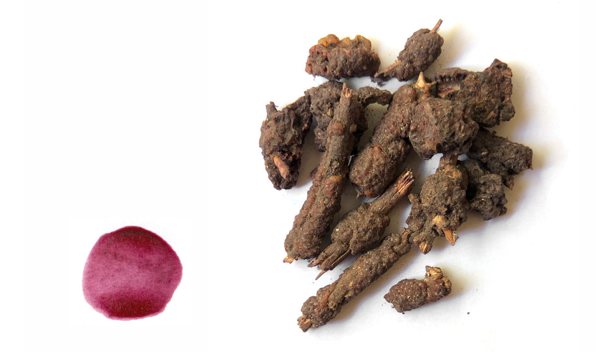
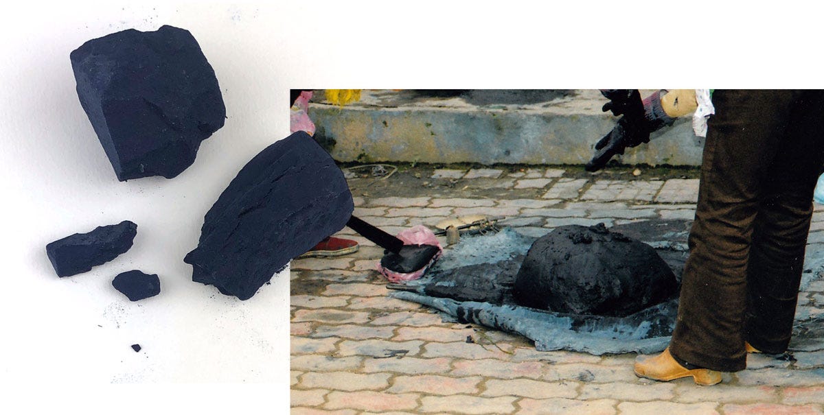
Unusually for an organic colour, indigotin is actually a solid. In the photo above right, which I shot in Vietnam in 2005, you can see freshly extracted indigo being gathered and packed in a dense block prior to shaping and drying. Being solid, it can’t actually be used as a dye without a complex operation to dissolve it. But it can be ground to a powder just like a mineral (and it really is hard as a brick!) and mixed with a binder to be used as a paint. The difference is in the final hue: the paint doesn’t result in the range of deep bright blues that indigo-dyed fabric is famous for. In fact it’s so dark that its substitute is charcoal!
11. Charcoal فحم
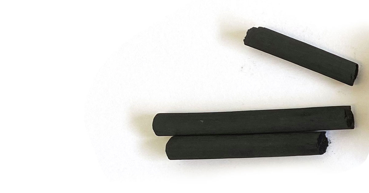
Charcoal is of course pure carbon. It’s a bit curious that al-Qalalusi should specify charcoal in this list, when soot is the favoured source of carbon black in the rest of his book, but this is probably down to the intended use of the colours on this list – which is illustration – while soot is preferred in calligraphy ink. What is the difference? Charcoal is made by burning something in the absence of oxygen. Usually wood, pine cones, old linen rags, date pits, and so on. The charcoal pictured here is made from willow wands but the Arabs made the same from parts of palm trees. The charred material is ground and you have charcoal black. Soot, on the other hand is made by an indirect process: it’s the carbon that is emitted by burning something, usually lamp oil or similar, and it is incomparably more pure and fine.
12. Turnsole طُرنَشول
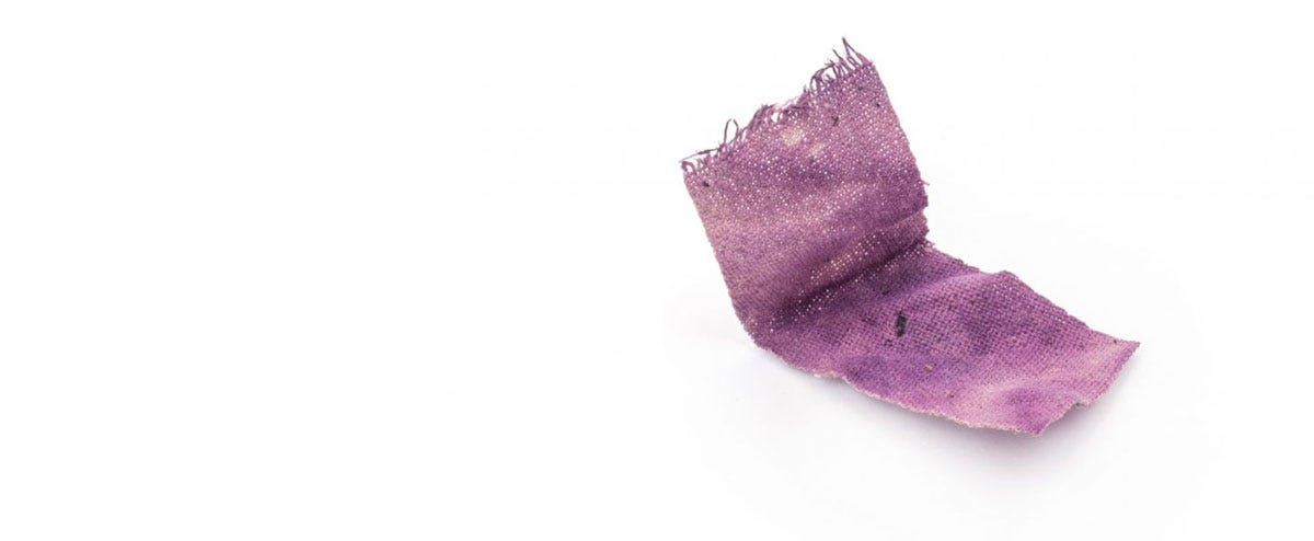
The final pigment is a bit of a surprise: tornashūl4 which is none other than turnsole or folium. This is a purple extracted from Chrozophora tinctoria, used in western illumination as a substitute for the incredibly expensive Tyrian purple (murex dye). But it is firmly European in origin and use, and the author only mentions it this once in the entire book. He doesn’t mention it when he discusses what pigments don’t mix, what binders go with what, or how to preserve them. So I don’t think he actually used it himself, but added it for the sake of rounding up the list to a dozen.
Admixtures
The number of admixtures from the above list doesn’t quite amount to 24, at least not in the surviving copies of the text, unless we’re intended to count all the substitutes. But here they are, with the names assigned to them by the author:
Cinnabar + white = rose
Minium + white = rose
Red ochre + white = rose
Minium + red ochre = cinnabar substitute
Cinnabar + soot black = red ochre substitute
White + indigo = cloud-grey
Orpiment + indigo = pistachio green
Lac + white = violet
Saffron5 + white = frankincense
Carthamin + white = [illegible, but a peachy pink]
Orpiment + saffron = antique gold
Roasted yellow ochre + a little opriment = realgar substitute
Indigo + orpiment + cinnabar = wild thyme
During my demonstration, I painted a full chart based on this chapter, which I foolishly forgot to photograph – so I’m reduced to sharing a screenshot of the final result. The substitutes are outside the main circle of colours, the admixtures inside:
My translation, which includes copious notes, is available as a pay-what-you-want digital publication here. I would also recommend the shorter, but seminal, Zinat al-Kataba.
Which I photographed in the Albrecht Dürer House in Nuremberg in 2022, and shared in this earlier article.
My first ever post was dedicated to it.
I can’t be sure of the vocalisation of the word, which is completely unknown to Arabic, but based on the rest of the text we can assume a Latin- or Spanish-derived pronunciation.
Saffron is not on the list of core colours despite being an essential ink ingredient; this was probably because it’s not much good on its own.








Agh, this is so good. I rushed to look up turnsole and found it is a euphorbia, which is very pleasing. Thanks again for a wonderful piece. Sad you didn't take more pictures from the final admixture session, that must have been great to see.
Your posts - scholarly, every time - are always, always dreamy. Thank you, Joumana. Deep bow.