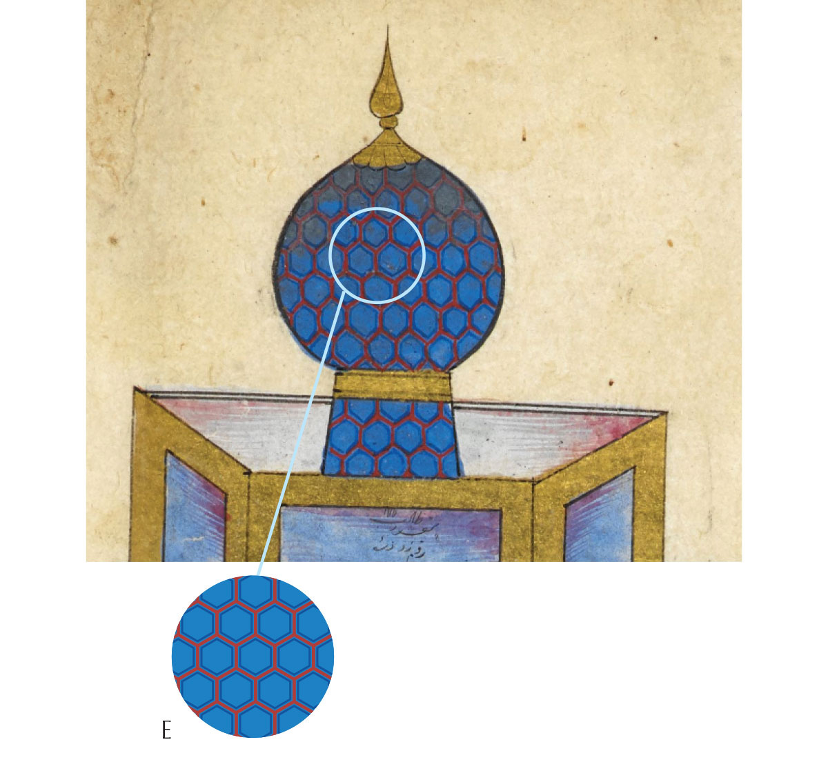
We’re still looking at the details of six manuscripts illustrating Haft Peykar, the epic poem that tells of Shah Bahram and his seven brides. As we’re starting to near the end of this series I’m looking more closely at turning it into a how-to pattern book, so please look for a poll at the end of this email regarding formatting preferences!
Previously:
Part 1 with full introduction to this romantic epic/tale of initiation: Patterns under the Black Dome
Part 2: Under the Yellow Dome
Part 3: Under the Green Dome
Part 4: Under the Red Dome
Below are the images1 for the fifth stage of Bahram’s journey. Each is linked to its source page where you can zoom in on the fine details. You might want to read this post in a browser rather than email, so you can see the enlarged images.
Note:
You may have seen this part of the poem translated as “the blue dome”, and you may also notice that in the images below, the colour seems to vary from green to blue. Indeed at first glance it’s very easy to mistake some of them for images of the Green Dome from two stages ago. This is because the original colour word used is firūzi, which refers to the colour of the turquoise gemstone, and this is of course a variable shade of blue-green, sometimes more pale blue and sometimes more intense green. This difficulty to pinpoint the colour happens to be an aspect of Mercury, which is always changing and eludes certainty. The reason it’s a “primary” colour in the Persian system is due to the importance of ceramics: the colours on paper only approximate the colours available as ceramic glazes, which answer to very different rules than pigments.
We also have to take into account the fact the colours seen in these images may have looked different when first laid down, something that would require close examination to reconstruct, but I’ll point out clues when I see them. Within the books, the sequence of images guarantees you can’t confuse the green and turquoise domes, but even out of context, the word فروزي firūzi can usually be spotted near the top of the text! (as opposed to green: سبز sabz).
The Turquoise Dome
On Wednesday, Bahram visits Āzar-Gūn, Princess of the Maghreb, clad in Turquoise, under the sign of Mercury, Lord of Quicksilver.
Chester Beatty Library
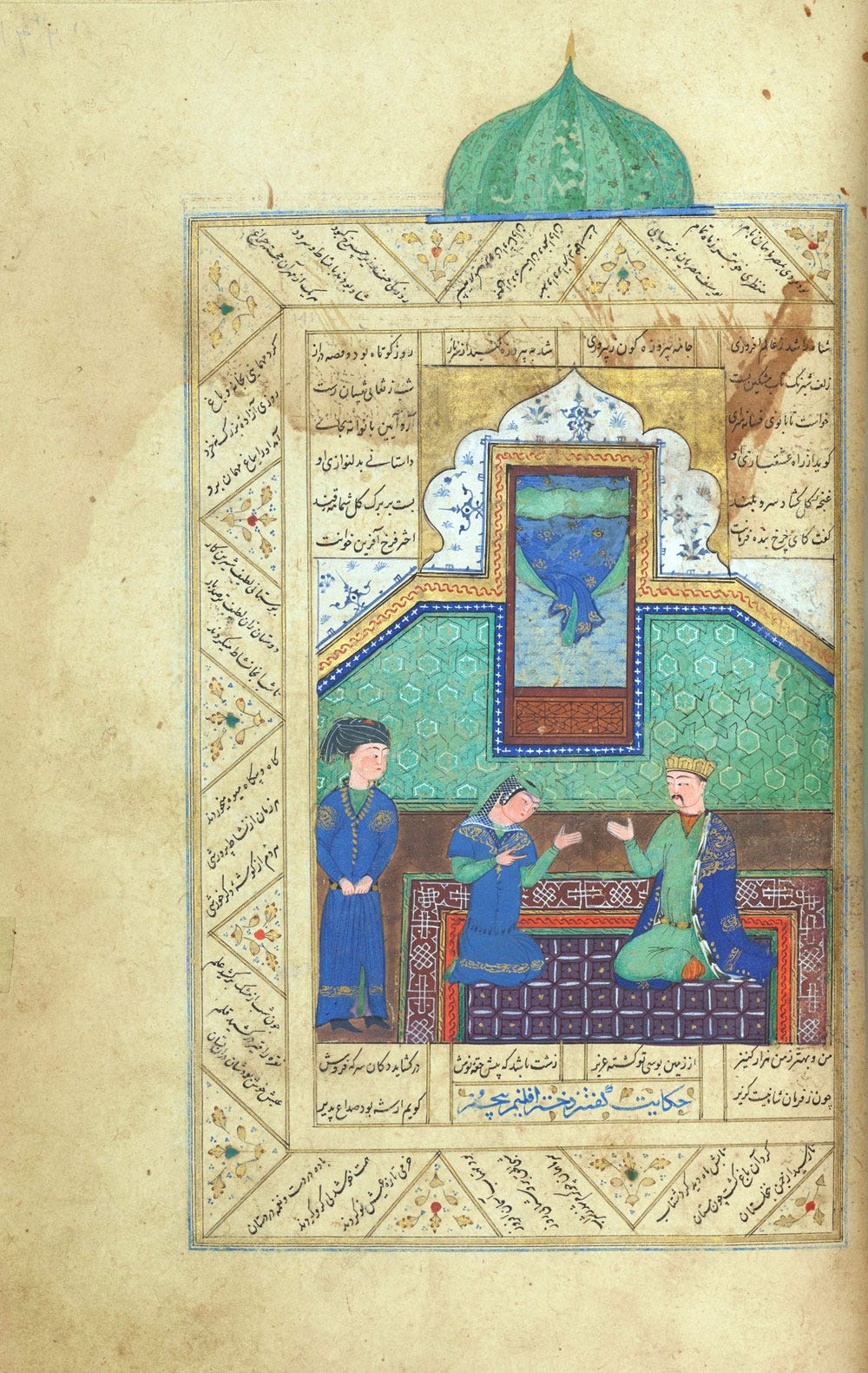
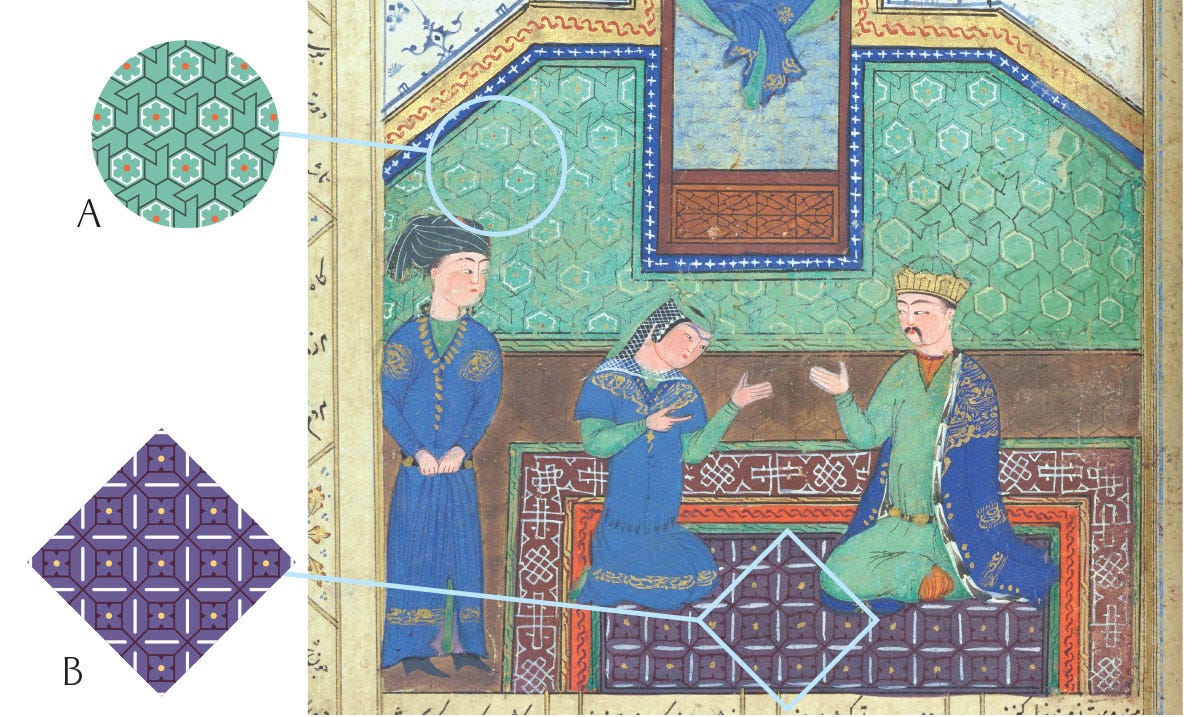
I can’t be completely sure from a digital image, but the tones of green we see in this and following pages seem to me to show the use of malachite as a green pigment2: when finely ground it yields opaque pastel greens with a bluish tint, sometimes quite bluish-green, as opposed to the vivid, yellow-tinted green of verdigris we saw for the green dome. Malachite was not originally used in the early Islamic palette but started overtaking verdigris, at least in Europe3, in the 1400’s, before this or any of the images below were painted.
The CBL manuscript sticks to its two-pattern scheme but does branch out with pattern B here, which is new for it:
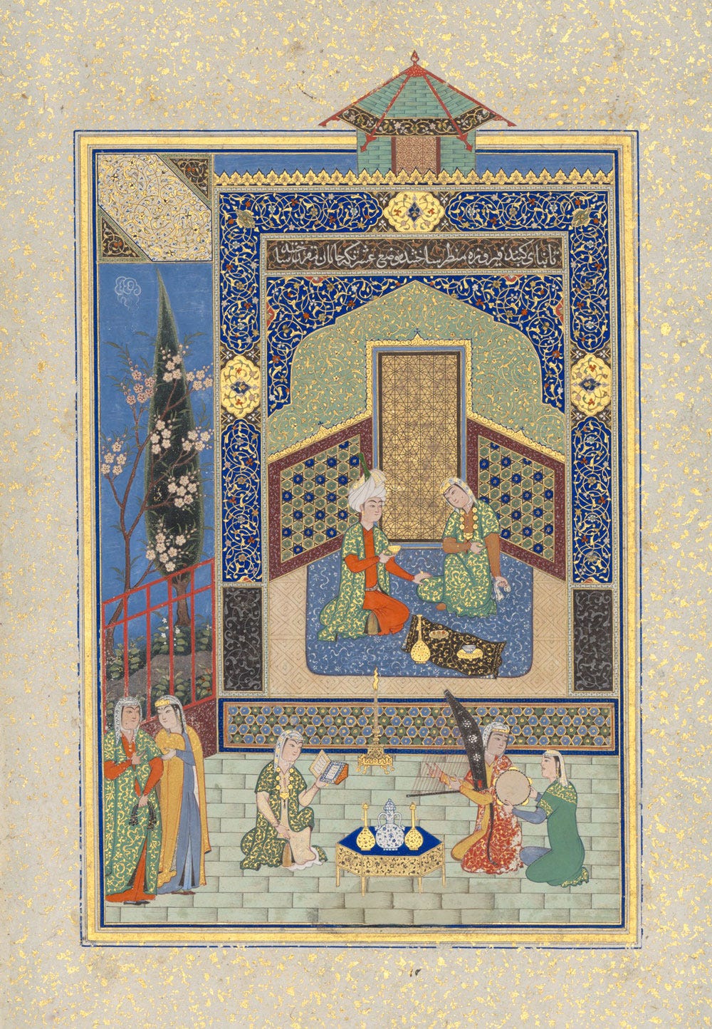
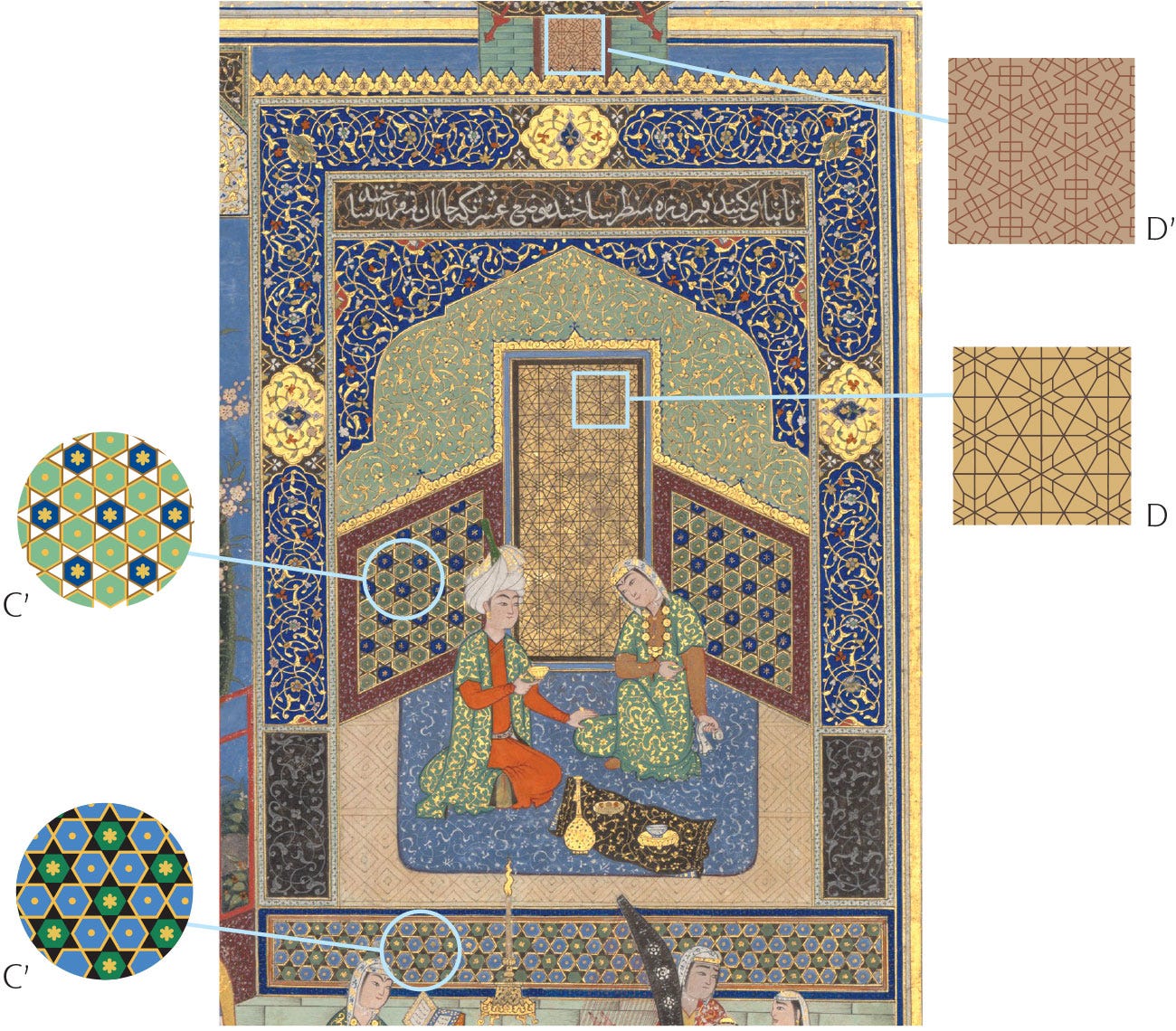
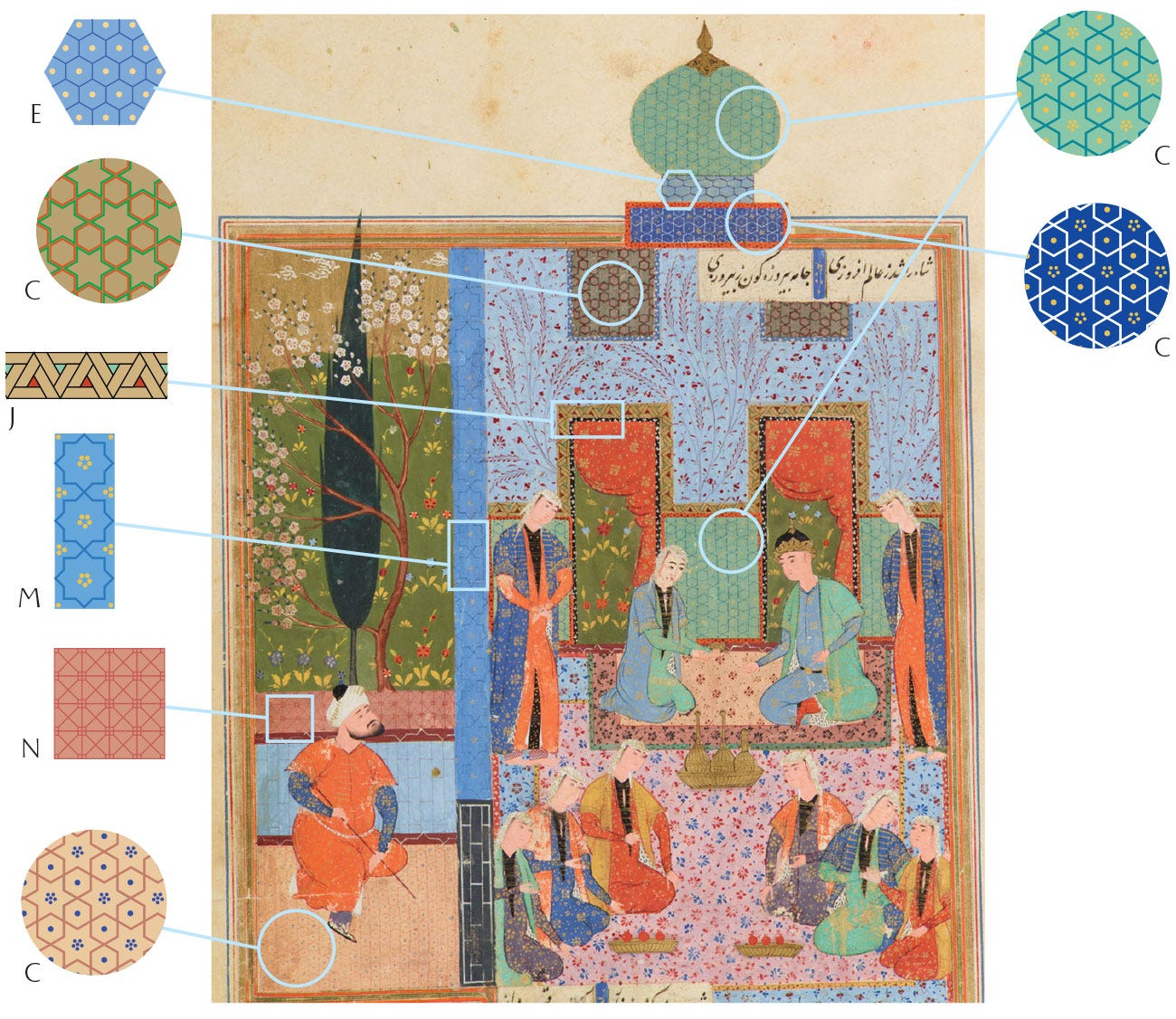
Metropolitan Museum of Art
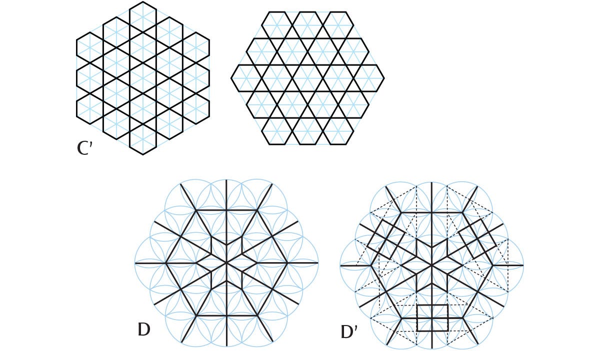
This page is uncharacteristically sober in geometric patterns, but displays a surprising amount of gold! You can only just see it, but even the central door was painted over with a fine layer of gold before the lines of the pattern were drawn over it.
The two versions of C’ are simply a 90 degree rotation, changing the orientation of the hexagrams.
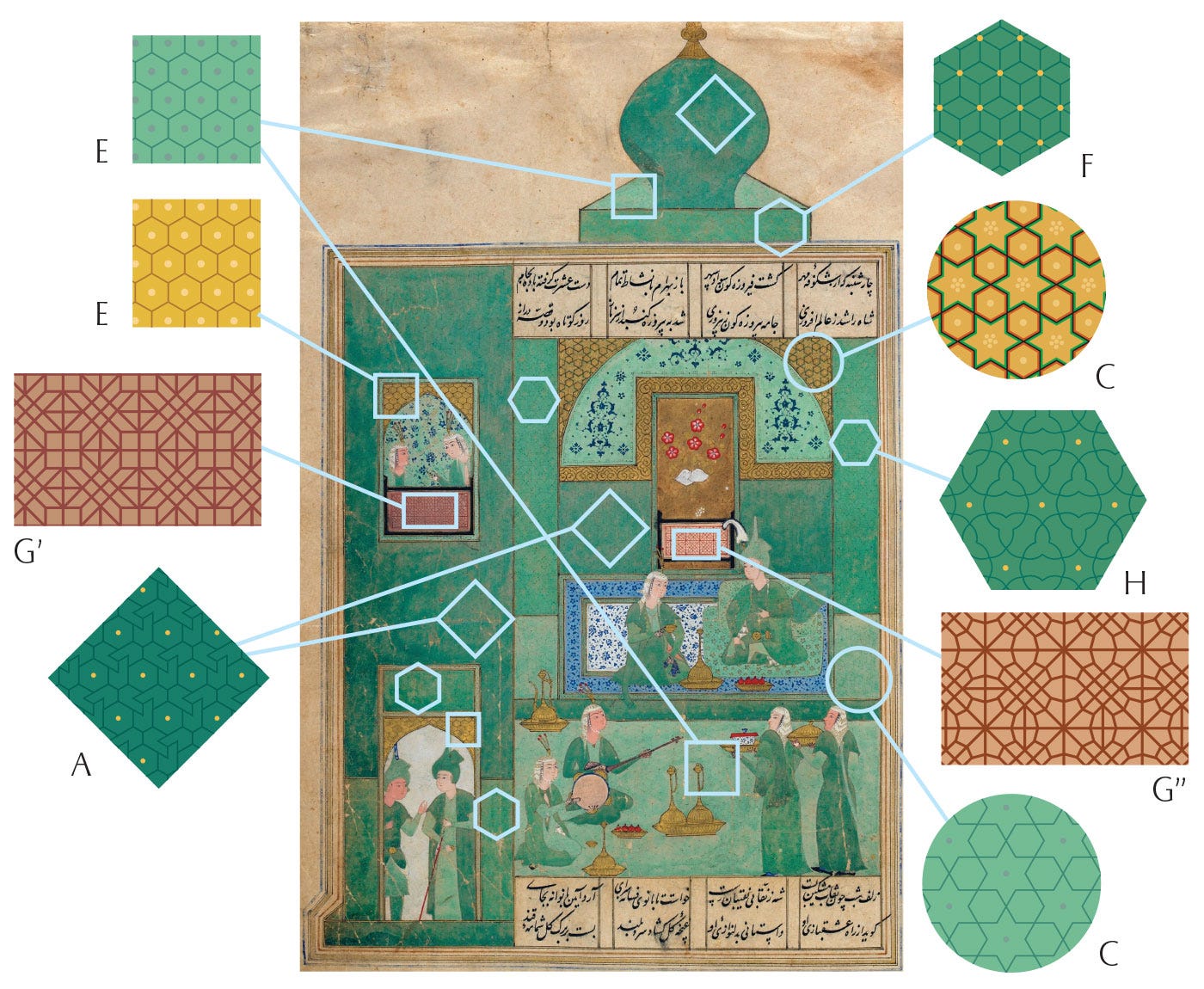
Smithsonian National Museum of Asian Art
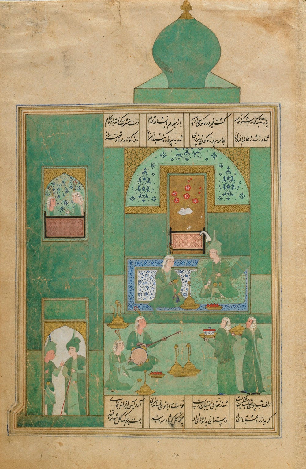
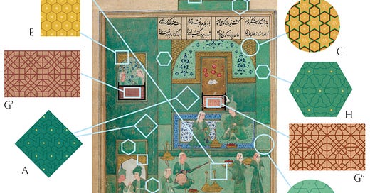
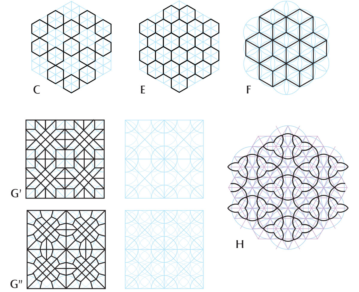
The intensity of the greens in this page is incredible! Three tones of green are used: the palest may be pure malachite. I wonder if the other two are mixtures of malachite with verdigris, but I can’t honestly say and I don’t see any trace of the damage usually associated with verdigris (though being in a mixture could prevent it). I do think there’s been some alteration of the colours, at least in the pattern lines, because the patterns in the green areas are so difficult to see! Yet there is a wealth of different patterns hidden in there, as you can see below.
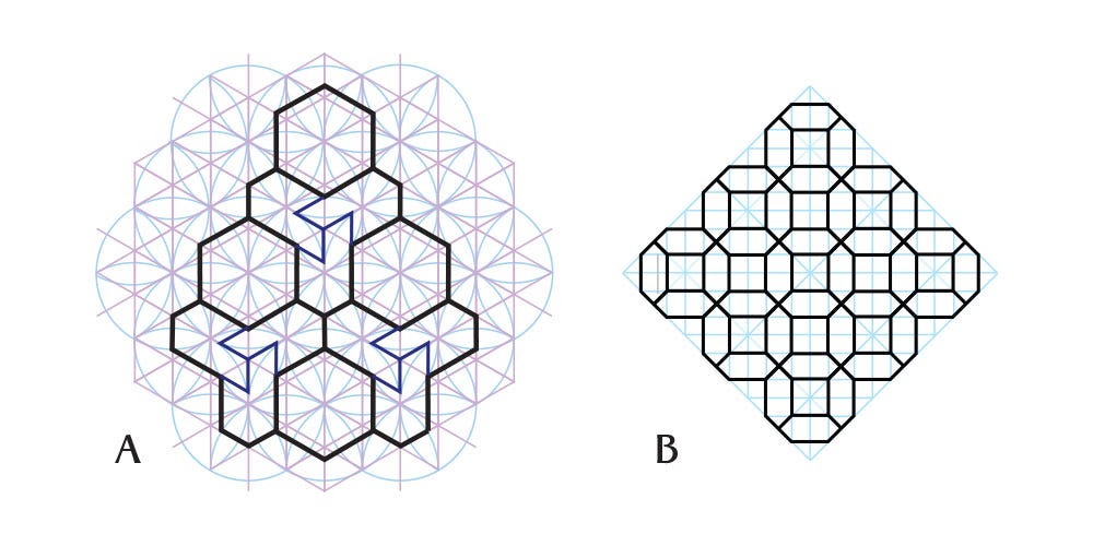
Pattern H is really interesting and the first time I see it, though it really is hard to make out. The base grid is the same one as A above, but the artist used curves where there would be straight lines to end up with trefoil shapes around puckered hexagrams.
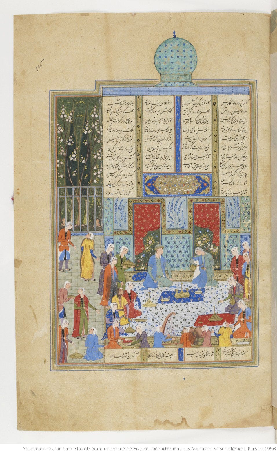
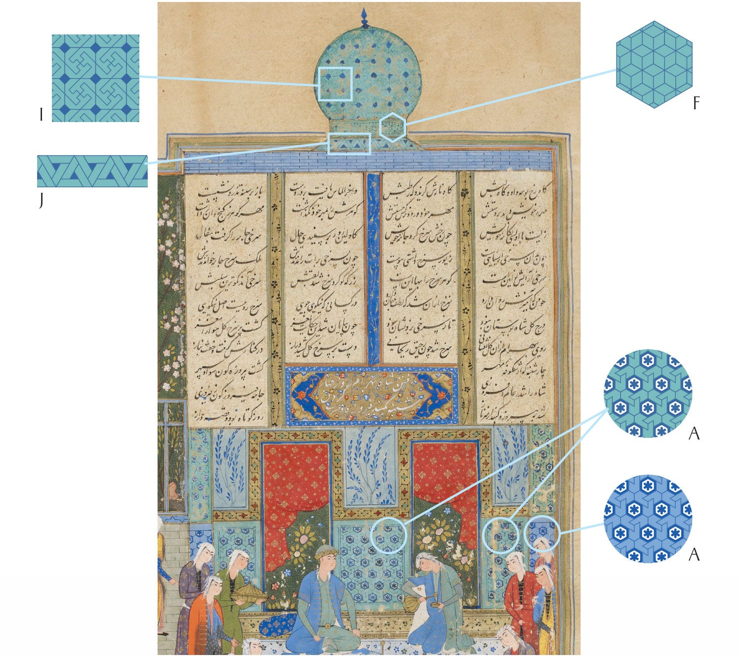
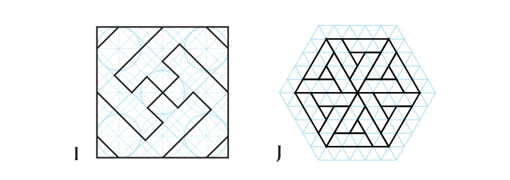
Bibliothèque Nationale de France
The delicate and unusual colour palette here is quite lovely! As usual for the BNF manuscript, all of the patterns are reflecting the theme of the day, and very definitely not green.
Cambridge University Library
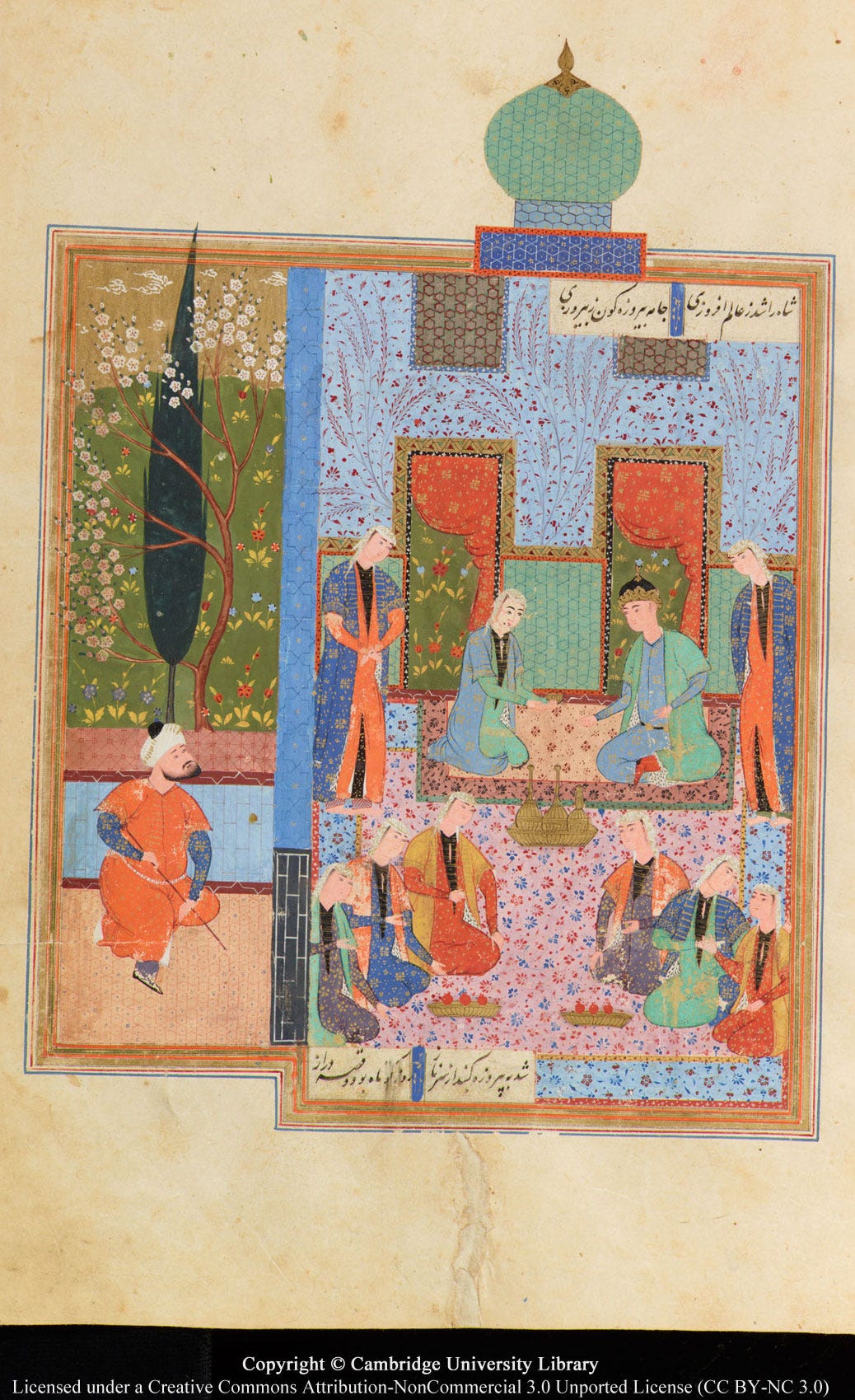
Cambridge MS has a colourful set of patterns that it reuses in each image, with only the dome and caftans indicating the specific pavilion where this part of the story takes place. Since the colours are so consistent, I wonder if each pattern was painted across all seven pages at once, rather than preparing colours afresh each time? That’s how I would do it…
British Library
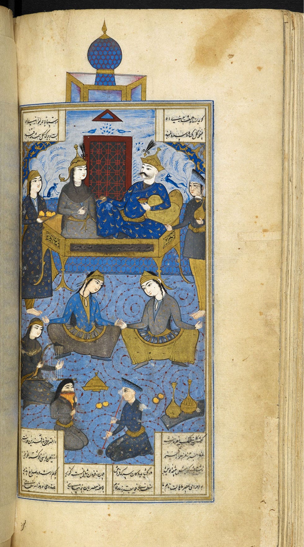
Unexpectedly, the BL dome pattern changes altogether here. And there is no attempt to keep with the turquoise concept; this 17th-century artist went frankly lapis lazuli blue, mixed with white for the paler hues. I suspect this mirrors the evolution of ceramic glaze colours, but that would need to be confirmed by a proper study!
The next, and penultimate stage of Bahram’s journey will take place under the Sandalwood Dome…
As mentioned above, below is a poll to help me consider how best to format atutorial book for this series. Here are the pros and cons for each:
Printed book: Pros: It’s the most beautiful and satisfying format, and the easiest to work from. Cons: Mainly the price, which would have to reflect printing costs, and to that would be added shipping to wherever you are. I’d have to keep it as concise as possible to keep both costs down.
Digital ebook: Pros: No printing costs for me and no postage cost for you make this the most affordable option. No concerns about page count for the same reason. I can update the book (e.g. to add extra patterns) anytime and you’d be able to just download the latest version. Cons: Working off a screen is never fun. I could solve this by planning the patterns so that those pages are easy to print – so you could just print the pattern you want to work on when you need it.
Print-at-home file: This isn’t the same as an ebook because it would be formatted so it can be printed at home, folded and stapled into a book. Pros: Same affordable price as a digital file but you can still have a printed book to work from. Cons: The size would have to be A5 so it’s within the capabilities of home printers; lower printing quality whatever you do; printing the whole thing would not be quite so cheap given the price of toner; I would have to keep the page count as low as possible.
With that in mind, let me know what you think!
The sources of these images are the following manuscripts, from the oldest to the newest:
Chester Beatty Library, Per 171 (AD 1492, AH 897), unknown artist.
Metropolitan Museum of Art, 13.228.7.8 (AD 1524, AH 931), painted by Shaikh Zada.
Smithsonian National Museum of Asian Art, F1908.271 to 277 (AD 1548, AH 955), unknown artist
Bibliothèque Nationale de France, Départment des Manuscrits, Supplément Persan 1956 (AD 1560, AH 965), unknown artist
Cambridge University Library, MS Add.3139 (17th c. AD, 11th c. AH), unknown artist.
British Library, Add MS 6613, ff138v-196r (AD 1671, AH 1076), painted by Ṭālib Lālā.
Turquoise itself is not really suited for use as a pigment. Like many minerals, it just loses colour when ground: this example of genuine turquoise pigment is as good as it gets.
Malachite has been detected with certainty in a 16th-century Persian manuscript. It doesn’t mean it wasn’t used earlier in Persian lands, but relatively few manuscripts get their materials analysed, and in turn only a fraction of those results have come my way. I don’t see what else could have possibly been used for painting the large areas of distinctive pale green we see in these images!


