All photos and diagrams in this post are my own. Open in your browser to see larger images. New subscribers please note that articles are free to read for 4 weeks before they go to the paid-subscribers archive.
It’s been a while, but we haven’t yet exhausted the walls of Alhambra! In the two previous installments focused on this site, we went hunting for Baraka and other secular words of blessings. Today I’m looking at a classic Islamic register, invoking and praising God.
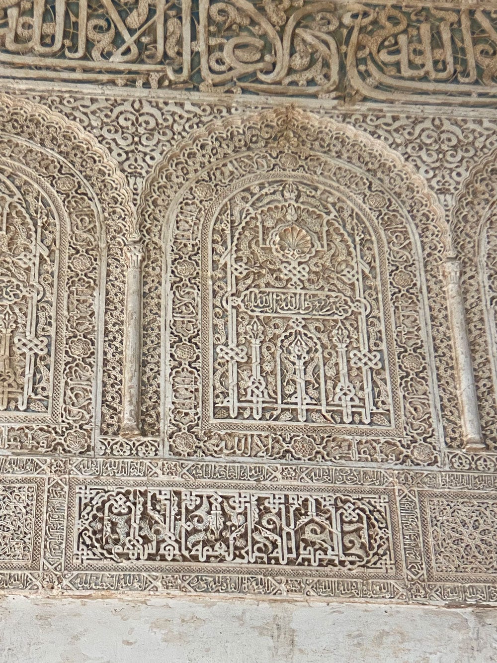
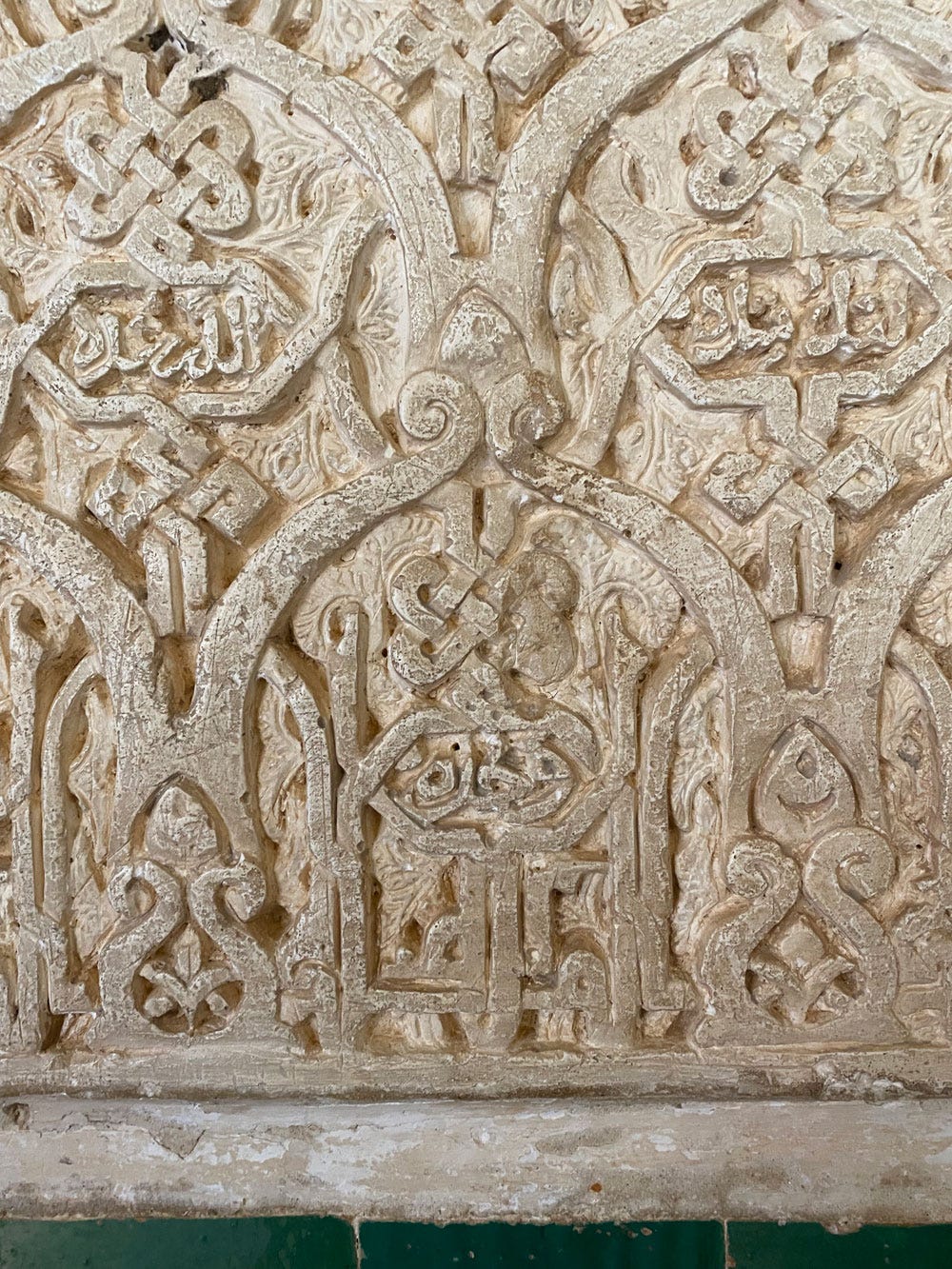
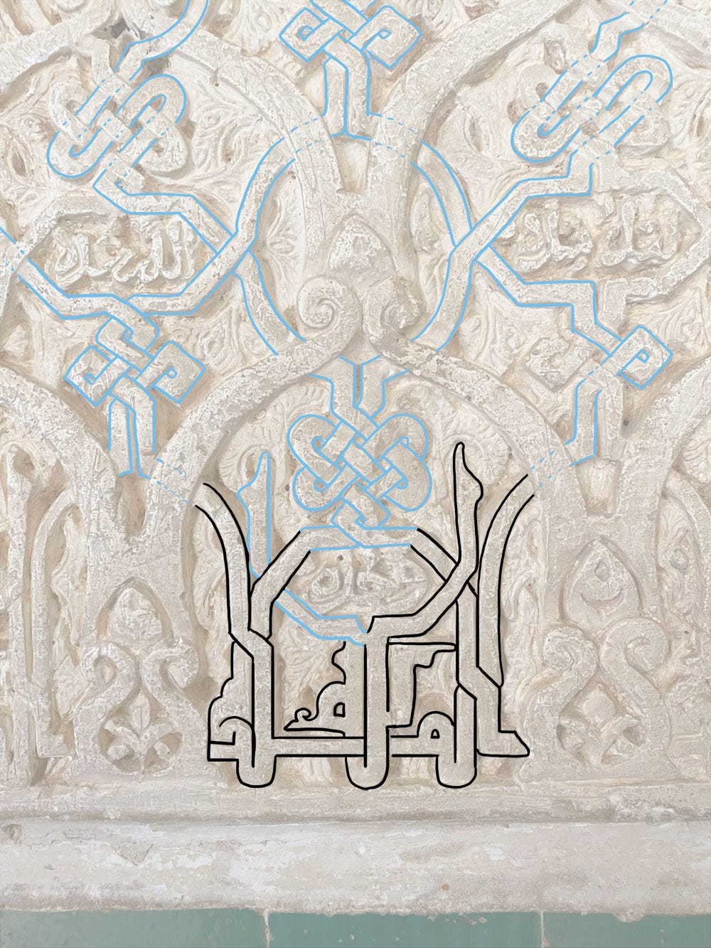
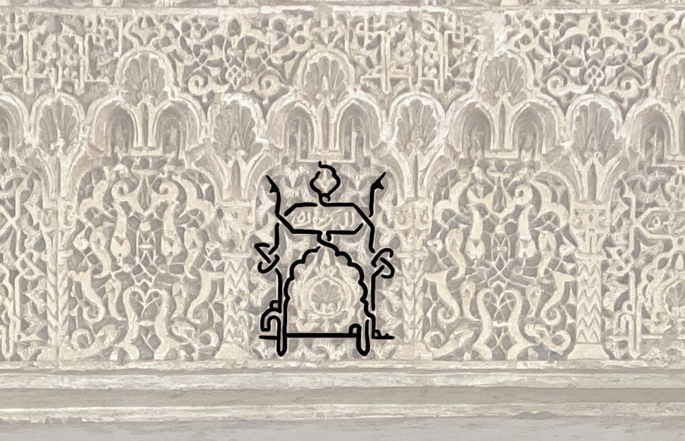
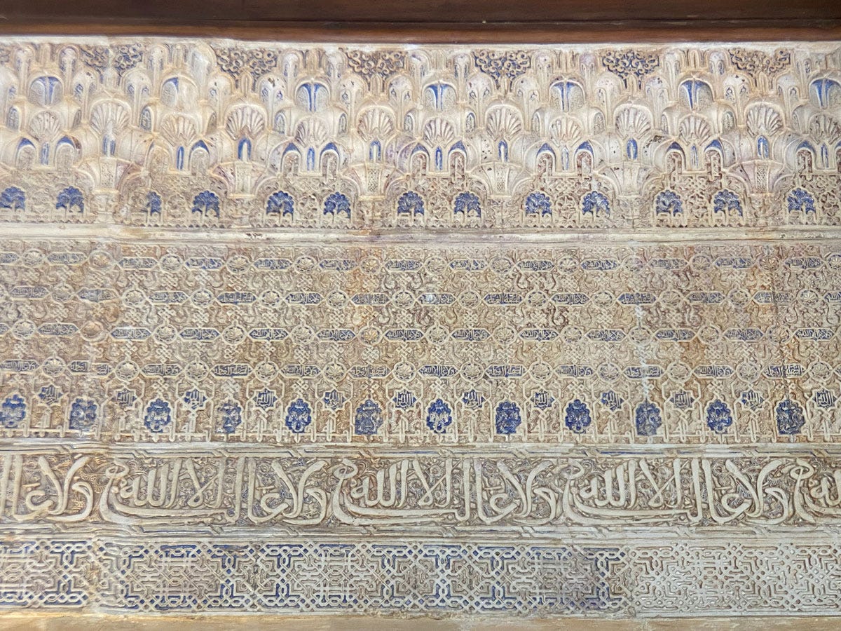
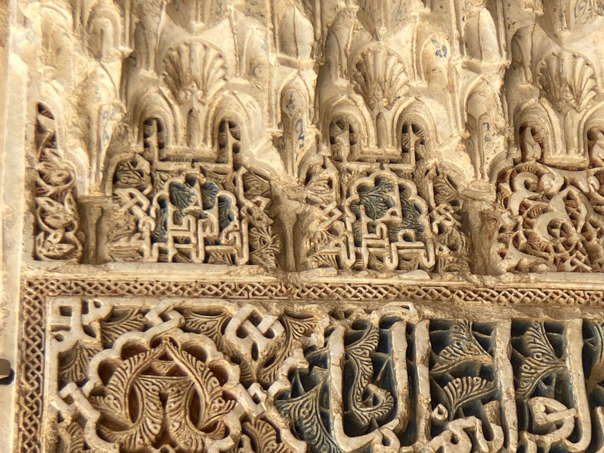
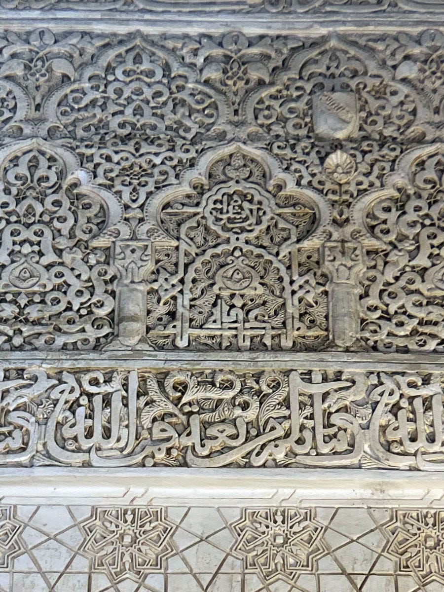
The shahāda or profession of faith is the well-known Lā ilāha illā-llāh لا اله الا الله (“there is no god but God”) which is frankly a calligrapher’s dream, with its beautiful rhythm of shapes. The fact it’s made up principally of vertical strokes makes it a creative goldmine, but also means it can be tricky to spot on the palace’s densely decorated walls. It’s entirely possible I missed a few, but I only spotted one definite example – and it’s a whopper.
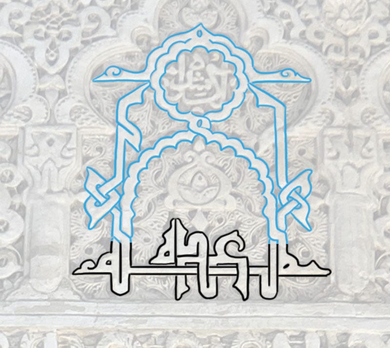
How much of the contents of the arched panel above is involved? Why, all of it!
The sentence itself is worked into a symmetrical ensemble at the bottom: the final الله is the framing word that stretches the entire length of the panel, while لا اله الا is distributed along its baseline. Absolutely all of the bands in that space are continuations of the letters’ shafts.
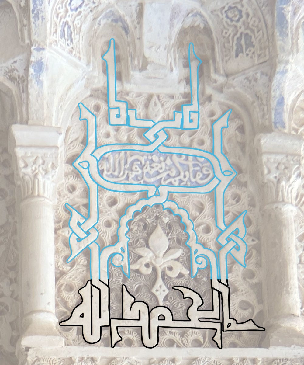
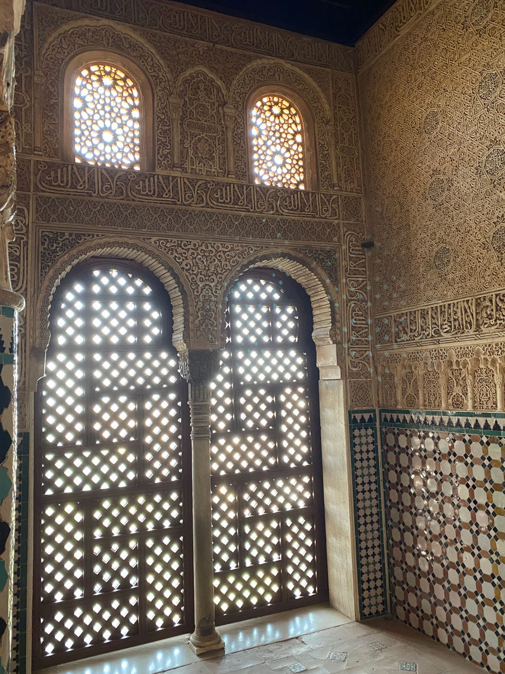
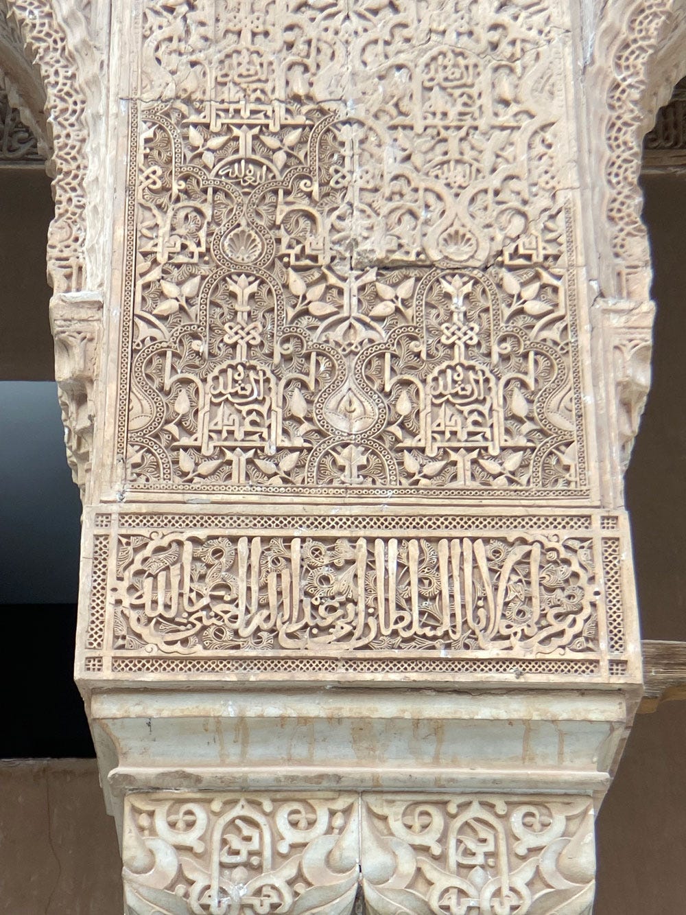
Here’s a very common expression I’ve seen featured on many walls: Al-ḥamdu lillāh الحمد لله (“Praise belongs to God”):
This sentence doesn’t present the same plastic possibilities as others we’ve seen, so it’s treated simply, with a focus on using its two pairs of vertical strokes to create an elaborate and symmetrical motif.
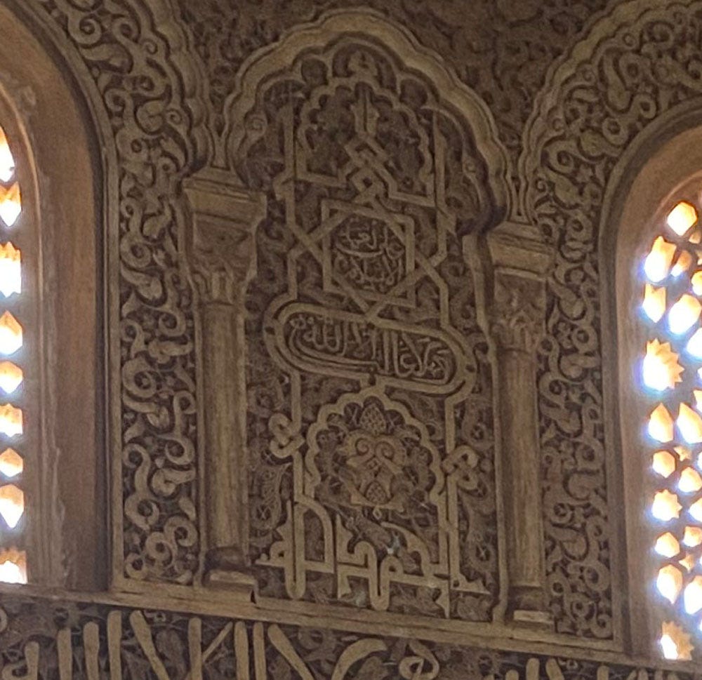
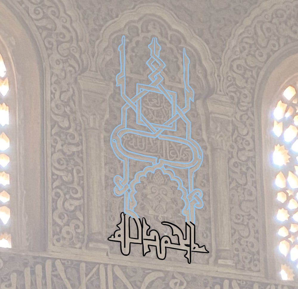
Below is a particularly grand one:
The design of the sentence itself is the same as previously, but the bands do a lot of work to create two cartouches.
Where Al-ḥamdu lillāh goes, you will usually find its close companion: Al-mulku lillāh الملك لله (“The Kingdom belongs to God”).
Here, the trend is to use al-mulk as a framing word over which lillah can sit. In this particular example, I’m sorry I don’t have a photo of the larger context because there is some complicated intertwining with the bands from adjacent words…
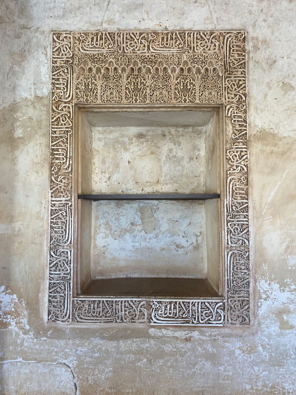
This lovely niche has an unusually tiny example…
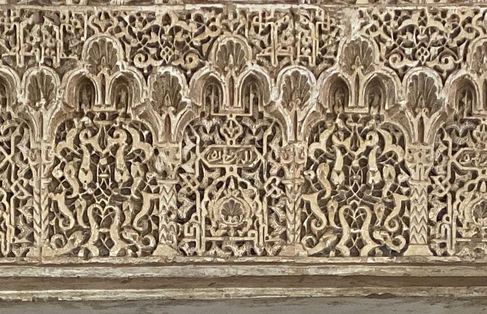
Even in close-up you can tell it’s tiny. In this case only al-mulk is used, with lillah written in cursive in the cartouche.
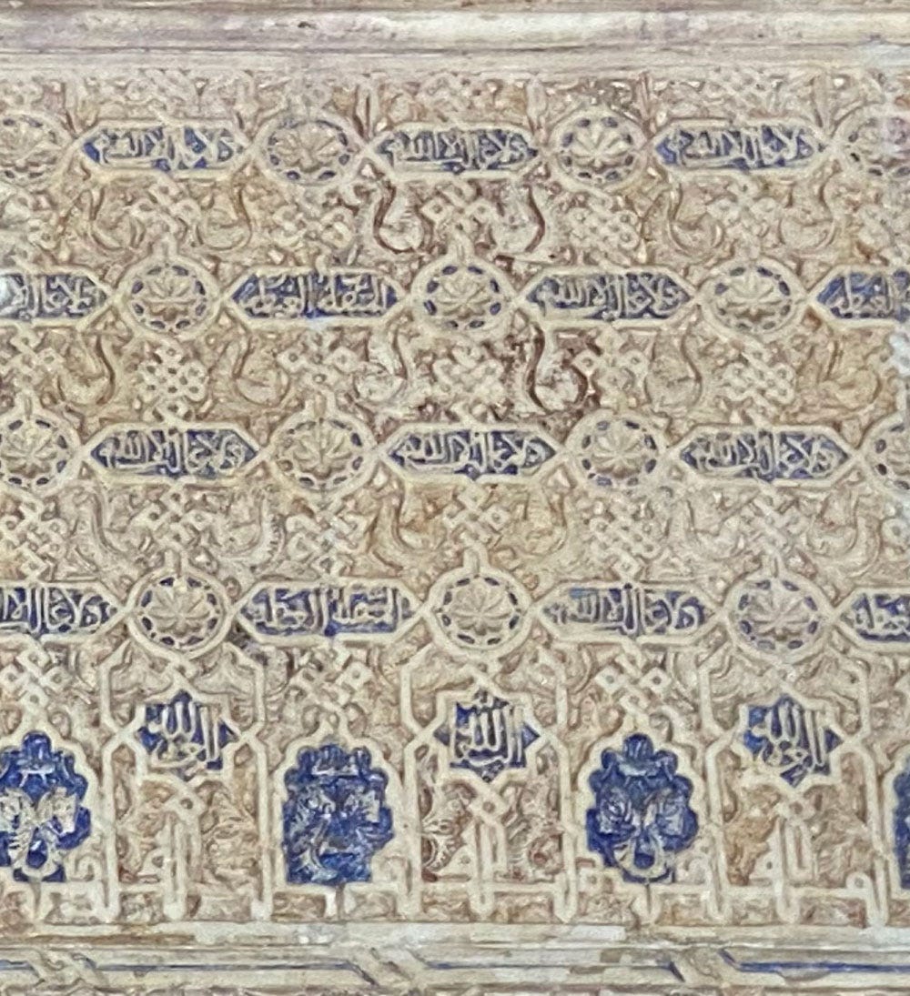
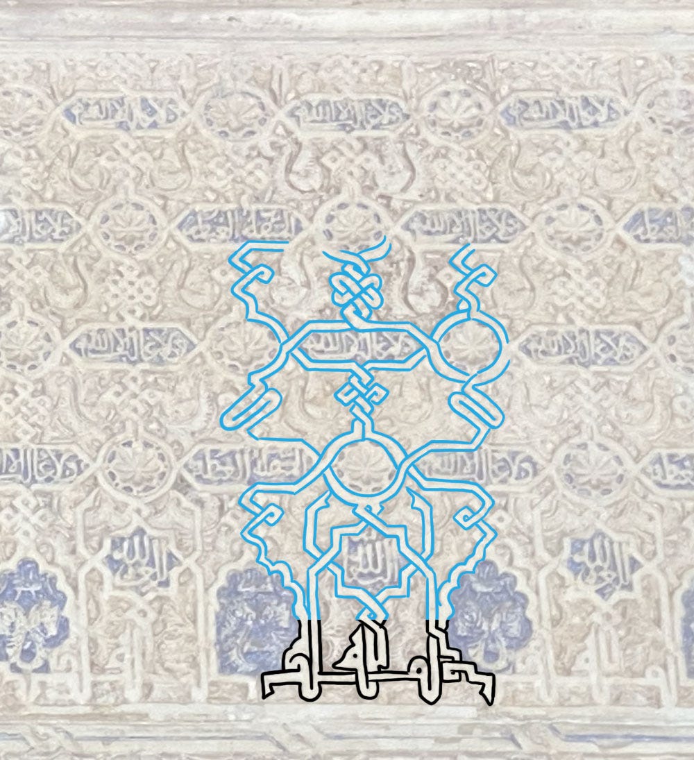
As for this impressive pattern, I didn’t know what it said when I took the photo, but see the very bottom line:
While the sentence is treated in the simple nesting way we saw above, the bands are so complex I gave up trying to draw them fully, given the poor resolution of the very blown-up photo. You get the picture though: the entire vast panel is completely interconnected with plaited bands made of the vertical strokes of الملك لله.
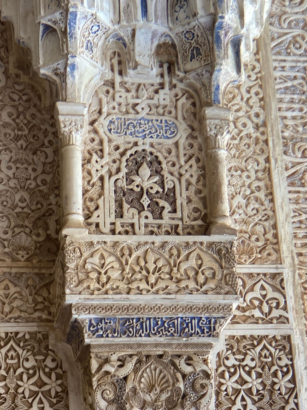
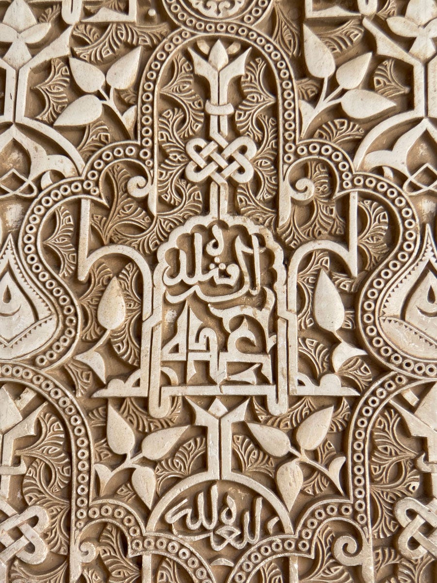
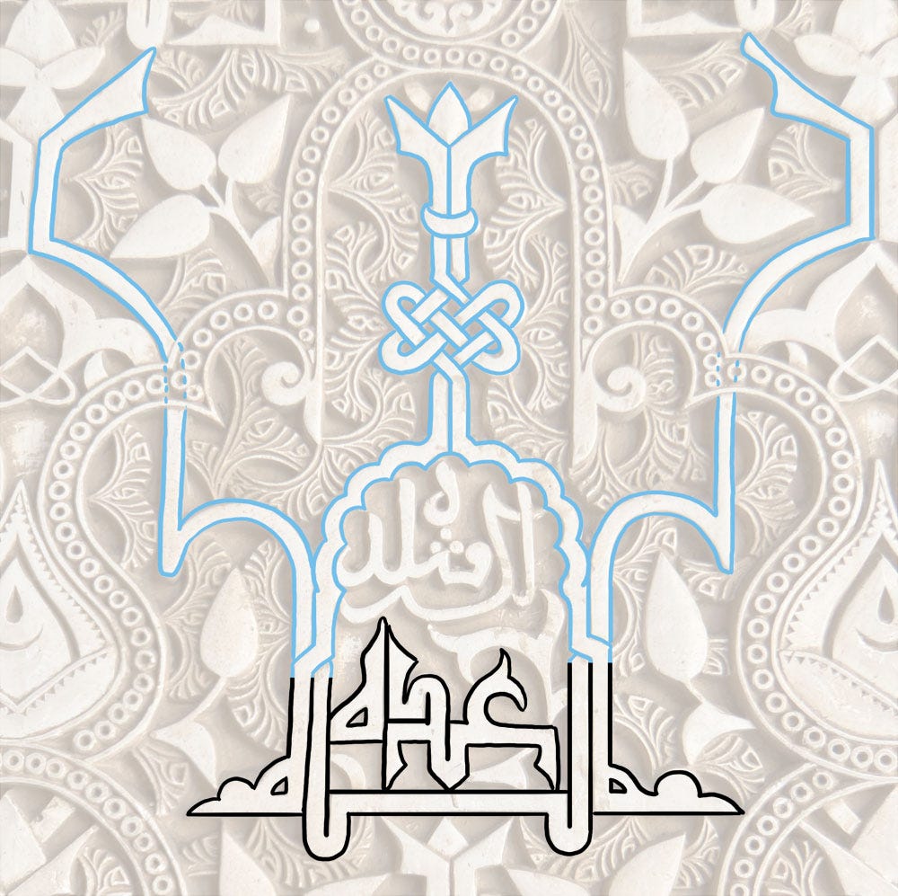
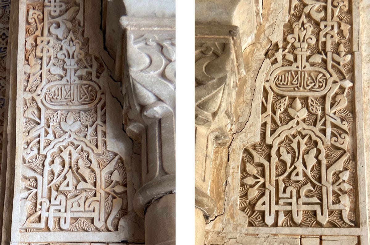
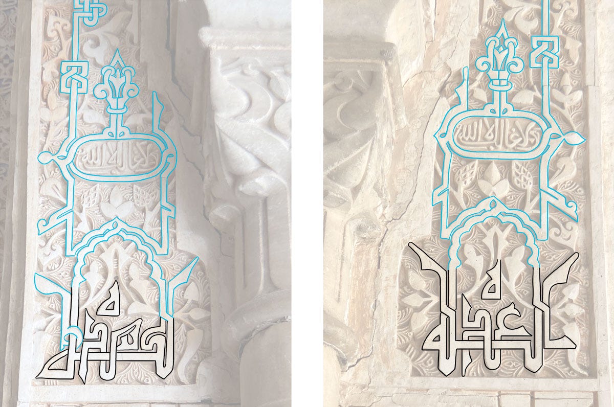
Finally, here’s a short formula that isn’t often encountered: Allah 'udda الله عدّة (“God provides”), sometimes followed by li-kulli shudda لكلّ شدّة (“in any tough situation”).
Either of these would be tough to manipulate into a symmetry (or would it? Let’s see), but the two together are simply too long, and in this first solution the designers made the most of the repeated letters to create a balanced pair.
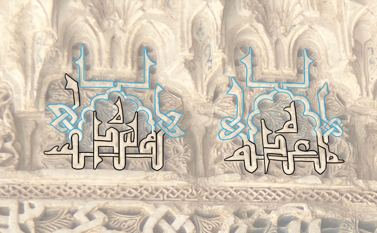
Another option was to place the second sentence in a cartouche, as was done here:
The word Allah with its wonderfully plasticity is here shaped into a framing device, but in this case the desire for symmetry required a small violation of normal script rules. See if you can spot it before looking up the answer in this footnote1.
We have a very similar design below, where the word ‘udda is pushed down so it can be pleasingly interwoven with the baseline. (But this time no script rules are broken.)
As a bouquet final, this is my favourite instance of this formula, with the two halves of it facing each other across the archway they are a part of.
In both cases, the final, detached ه is moved up above the word so the whole can fit better into the available space.
On this note, let’s leave this wonderful place, till the next time…
Answer: the final ﻪ is completely separated from the preceding letter so that it mirrors the beginning of the word perfectly. By normal script rules this is a nonsense that is only justified here because the result is so perfectly seamless it’s worth it.


