

Kasane
The most refined art of wearing the seasons

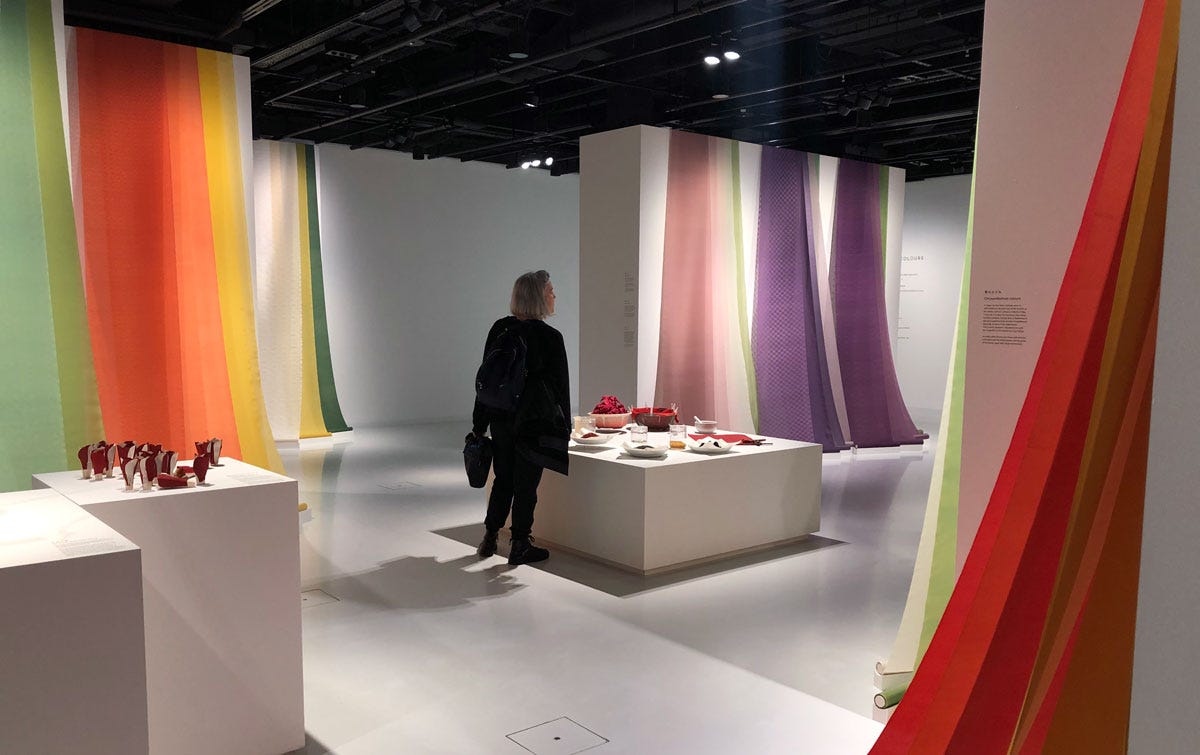
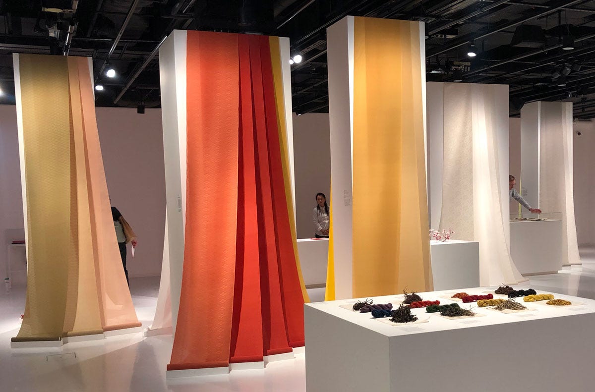
Back in 2019, Japan House in London organised a lovely exhibition in collaboration with the Yoshioka Dyeing Workshop in Kyoto, which under the guidance of master dyer Yoshioka Sachio1 has been bringing back to life techniques of natural dyeing from different periods in Japan’s rich history. I was only marginally interested in dyes back then, and hadn’t started my own work of historical recreation, but at least I had the good sense to take many photos (but not nearly enough for present me’s liking). The exhibition was titled “Living Colours: Kasane—the language of Japanese Colour Combinations” and this word, combined with my photos and the fact I’m now researching Japanese art materials, sent me down a new rabbit hole of colour.
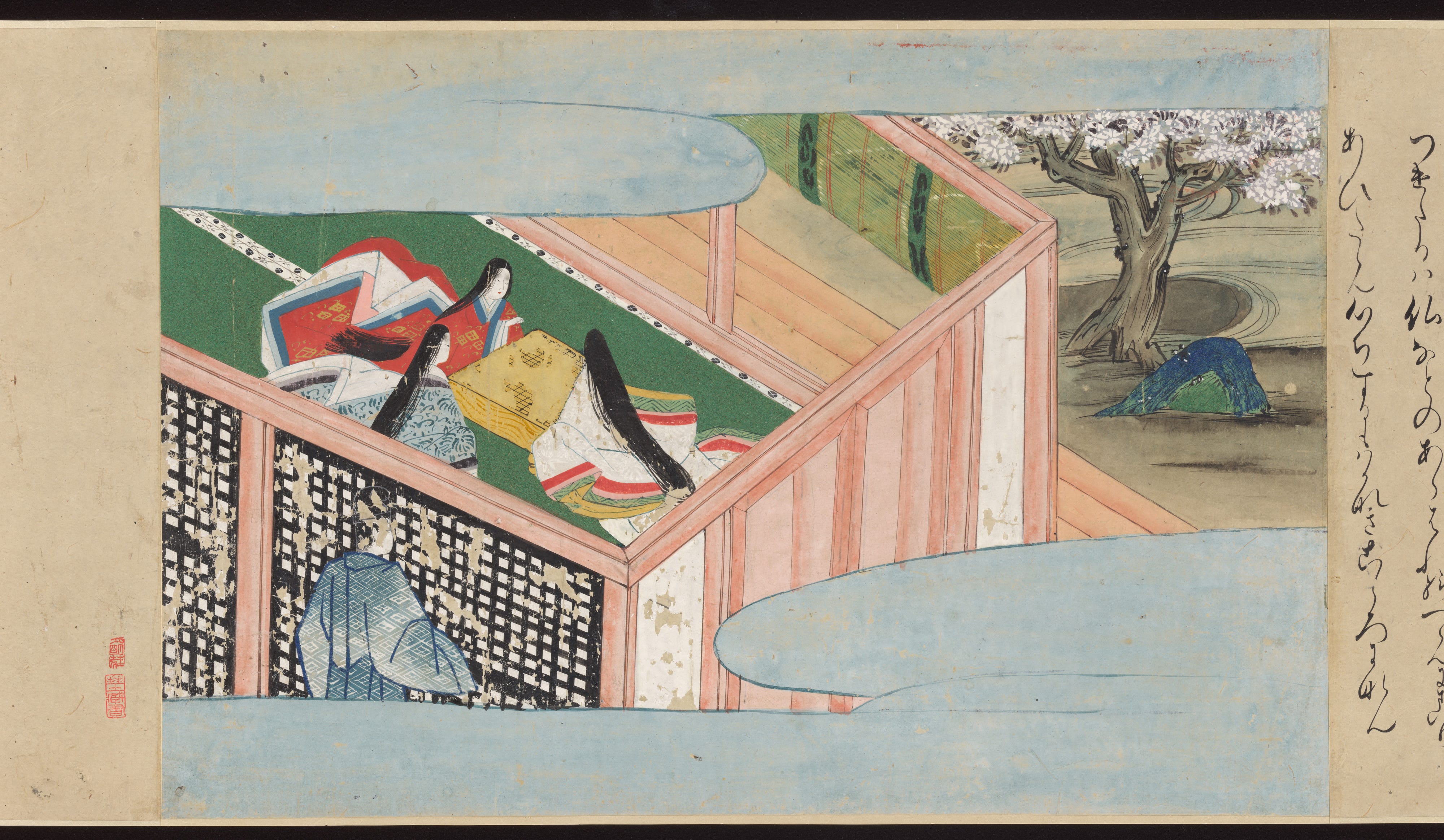
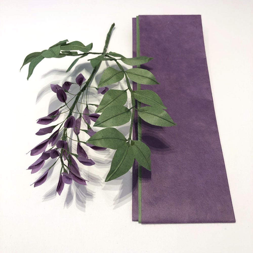
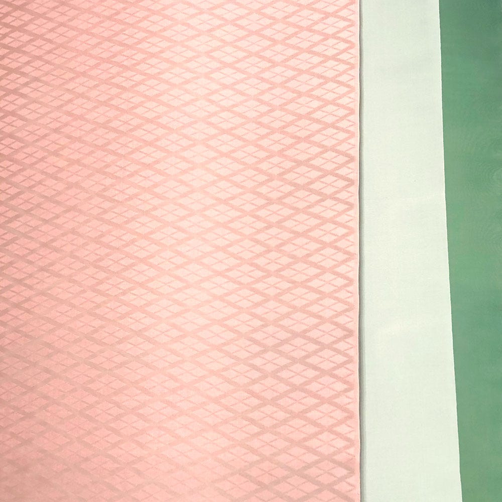
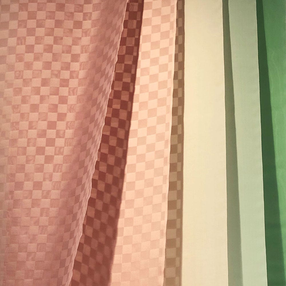
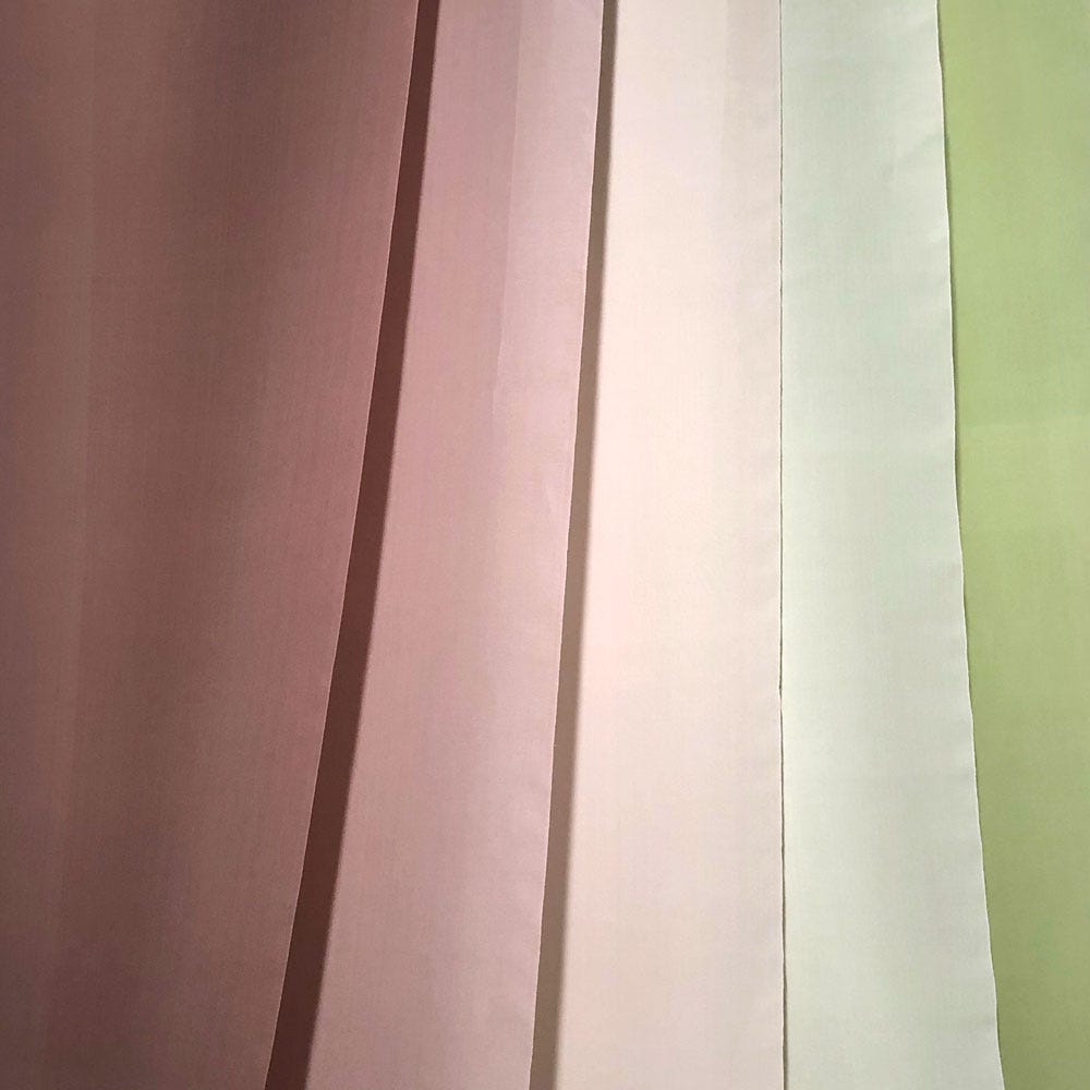
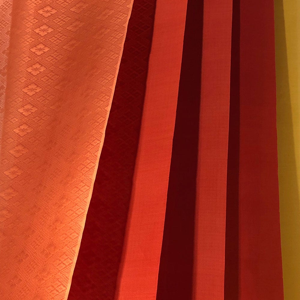
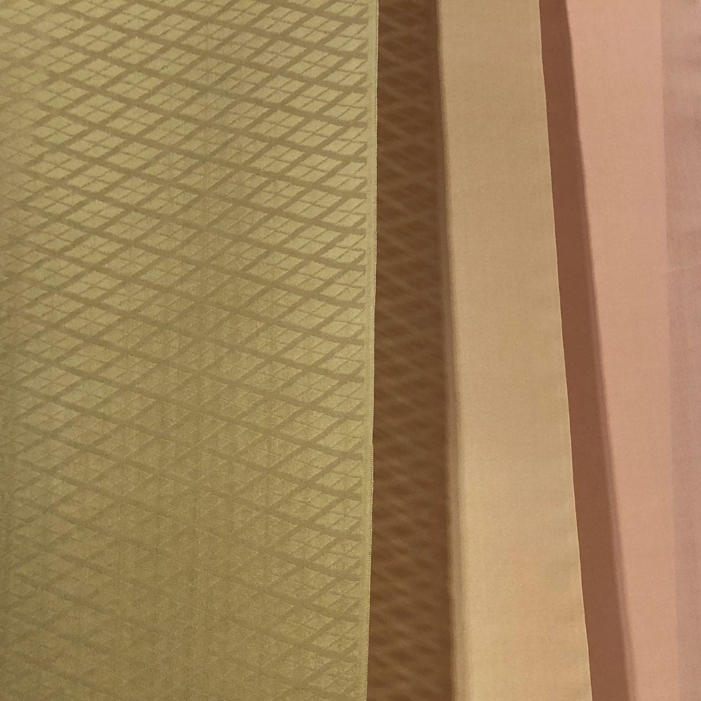
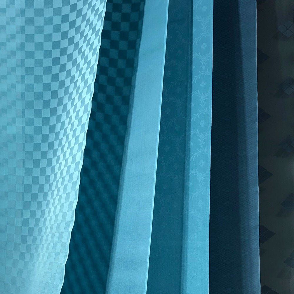
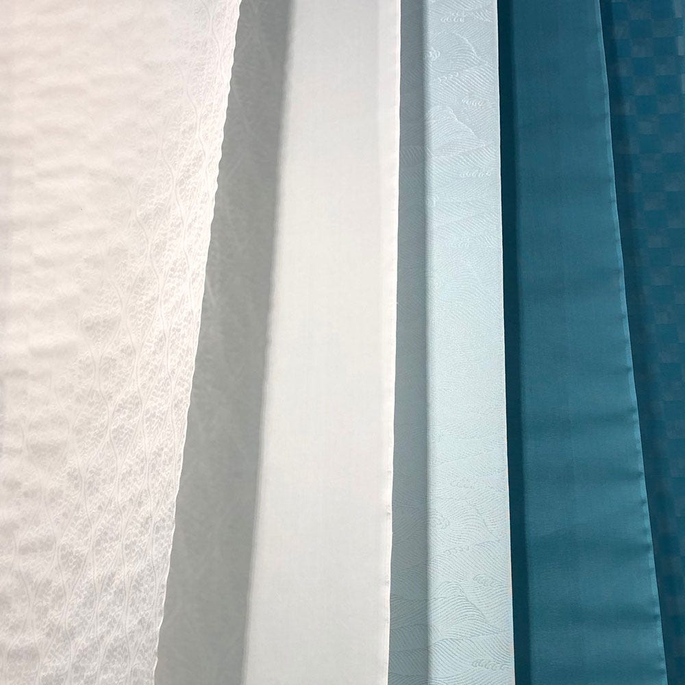
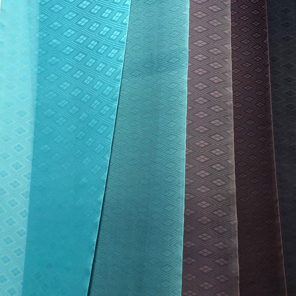
Kasane is an art of layering colours that first developed among the aristocracy during the highly refined2 Heian period (794-1185 AD). Colour combinations were created to reflect what could be observed in the natural world throughout the year: budding and blossoming, leaves falling, changing landscapes. Textiles and paper were particularly suited for this: correspondence could be folded within coded layers of coloured paper, adding meaning to the written words. But what really defines kasane is its use in textiles. Court ladies of the time wore robes over several layered robes (kinu) of sheer silk. Each kinu was cut slightly shorter then the other, so that at the sleeves and collar layers successive bands of colour were revealed.
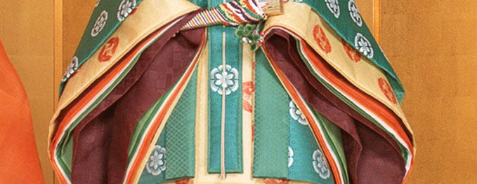
An added layer (no pun intended) of complexity was that each of these sheer robes was lined3, and the lining could be identical to the facing layer, but it was often a different colour. I’ll come back to this point.
By the mid-Heian period, the colour sequences of these layers had been highly codified in a rather impressive number of seasonal combinations, called irome4. Knowing the names and wearing correct irome for the time of year and occasion was a matter of court ceremony and etiquette, all the way up to the Edo period. In fact, for the sake of a very young Empress Tashi, master of court ceremony Minamoto no Masasuke compiled for her a list of appropriate irome for each season, gifting future generations an important reference.
The many-layered court robes are now only seen during court ceremonies or reenactments, but the concept of kasane is alive and well. It has spilled out into other applications of seasonal palettes and more generally, the sensibility for irome.
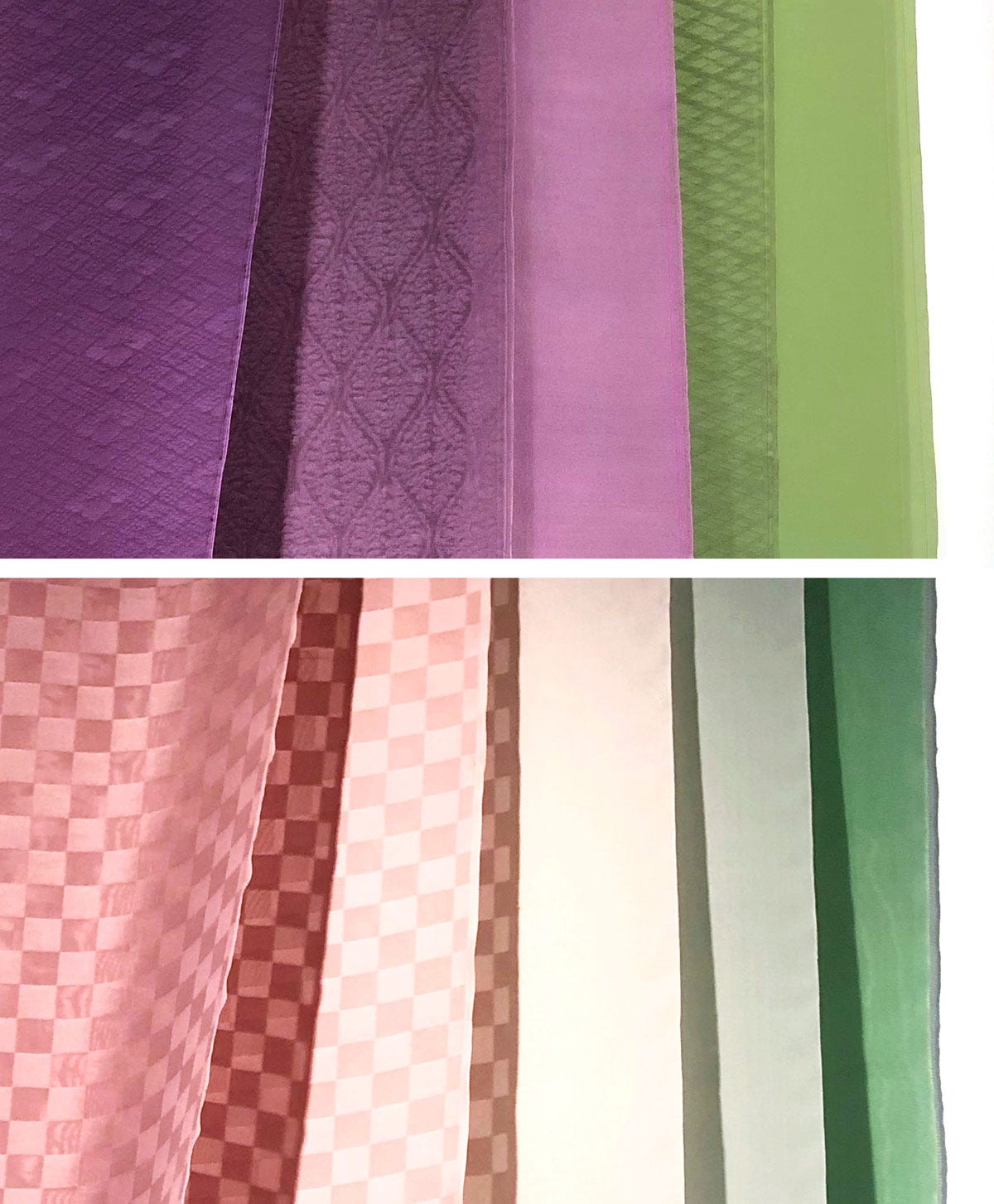
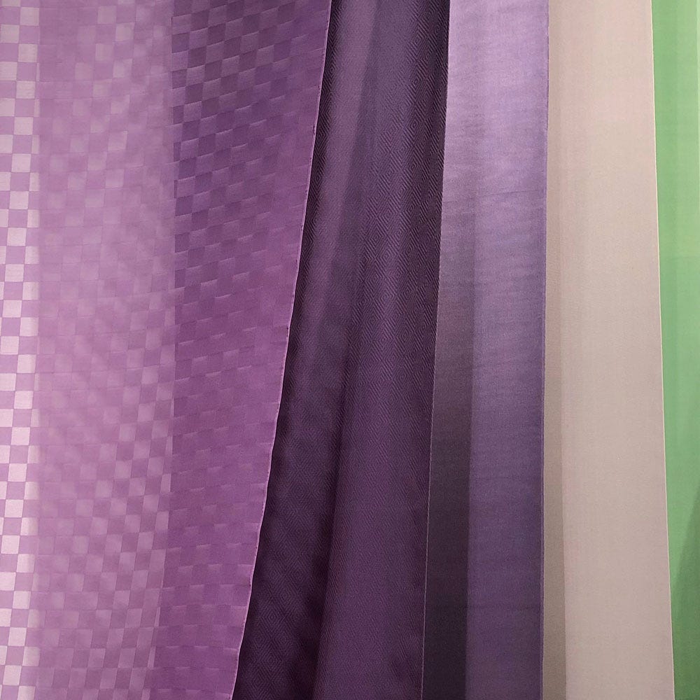
Kasane is practiced in three ways: juxtaposing colours is the simplest, as useful for getting dressed in the morning as it is to design marketing material. Weaving colours together, with different hues for warp and weft, may be the most subtle. The most interesting, to me, is the direct descendant of the lined silks of the Heian period, and that is layering diaphanous layers of colour so that the bottom one shows through the top one.
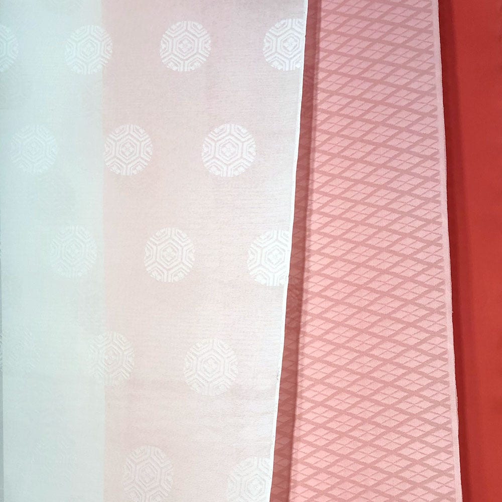
One thing that makes classic irome so interesting to me is that they involve several levels of colour: conceptual (or perhaps poetic), in the aspects of the natural world that the combination are designed to evoke; optical, in the tones of the dyed silk or paper; essential, in the actual dyes that have been used and sometimes overdyed to create these hues. There’s a fourth, ethereal layer, a sort of “combination tone” that results from layering two optical colours; it has no name but is arguably the whole point of kasane layering.
The other thing is that even their digital iterations, these combinations look back to the natural dyes that were available in medieval Japan (and later). The bewildering catalogue of irome, nearly two hundred of them, actually draws on a very limited core palette of the heian period I’d like to unpack here.
To begin with, the number of colours proper is multiplied by four degrees of intensity: the “regular” intensity is unmarked (today it can be noted as 中 medium), then you have 濃 deep, 淡 light, and より淡 lighter or pale.5
For instance, the following colours turn up:
紅 kurenai / beni • 濃紅 kokibeni • 淡紅 awakikurenai / 薄紅 usubeni • より淡い紅 yoriawaikurenai
All of these are shades of one hue—crimson—in its regular, deep, light and pale iterations.
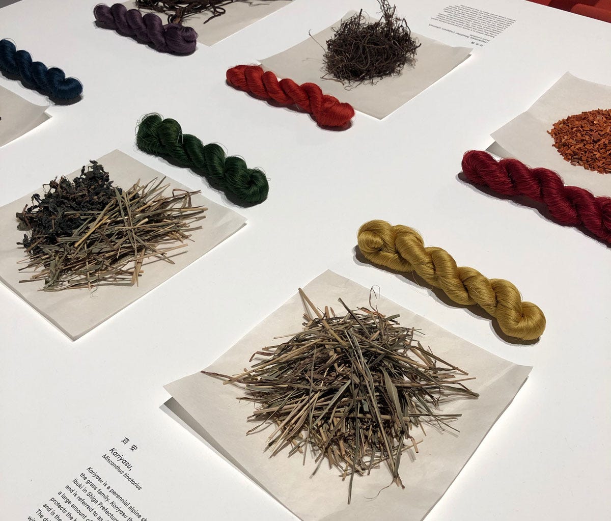
Taking these degrees away from the many hues that make up the list of irome, we’re left with merely twelve colour names, which I discuss below along with the dyestuffs that produced them.
1. Shiro 白
“White”, which in this case is the white of undyed silk. (Whether the silk was originally bleached to be snow-white or was left in its natural ivory colour, I can’t really say.)
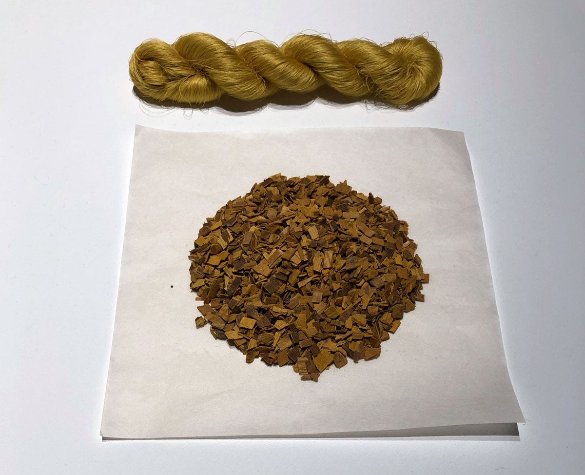
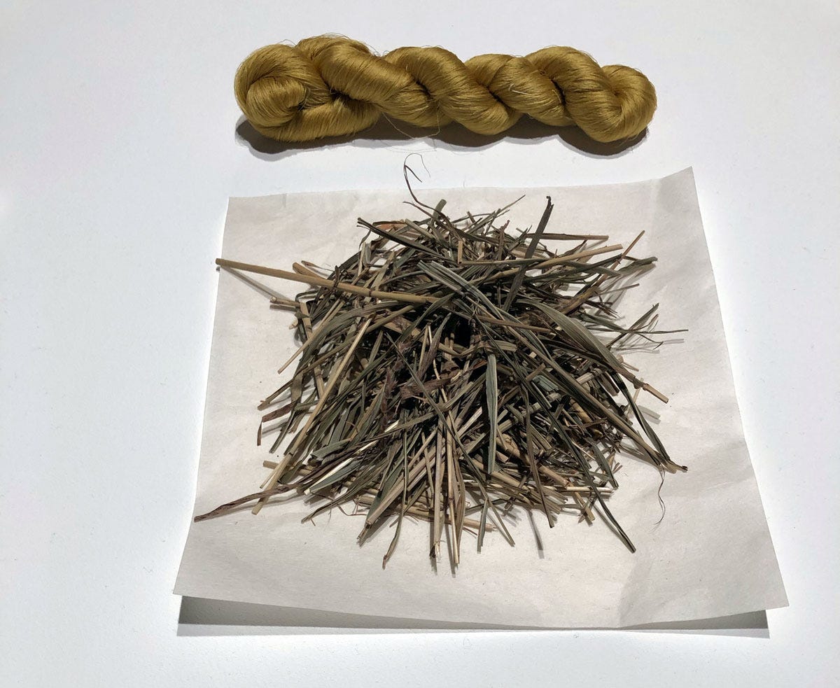
2. Ki 黄
Ki simply means “yellow” in a broad sense, and as a basic hue was obtained from several sources.
One of those at play here is the inner bark of Amur cork (kihada or ōbaku 黄蘗 – Phellodendron amurense). This dyestuff was used all over East Asia, as in addition to its colouring properties, it is antibiotic and antimicrobial: precious documents dyed with it were protected against insect damage.
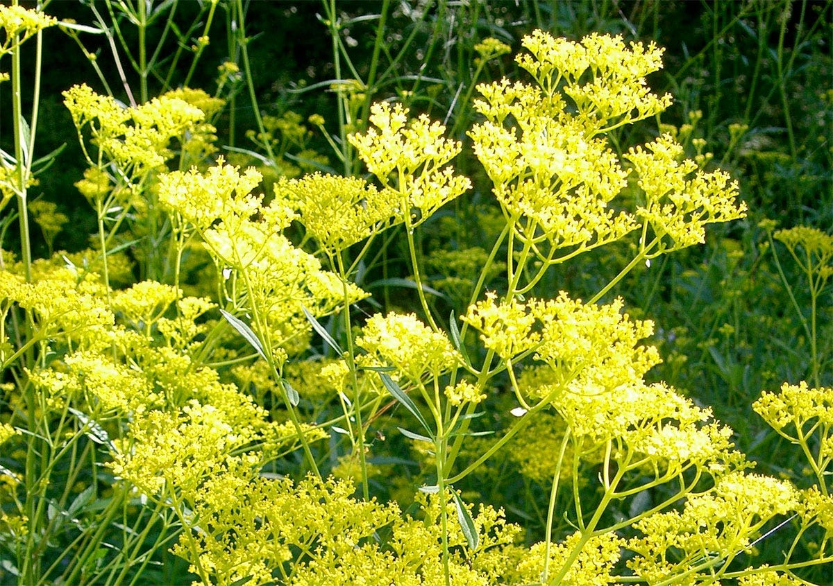
Another important source of yellow of that period is Japanese pampas grass (kariyasu 刈安 – Miscanthus tinctorius) which yields a yellow tinged with green. The grass’s flavone contents gives it high resistance to UV light, so it’s a good lightfast yellow.
Finally, as far as our list is concerned, a third source is the fruit of the gardenia (kuchinashi 山梔子 – Gardenia jasminoides), this beautifully fragrant flower that grows abundantly on shrubs in late spring6. As far as I know, it’s not used alone but mostly used as a “bottoming” dye (destined to be overdyed with a different colour).
3. Ao 青
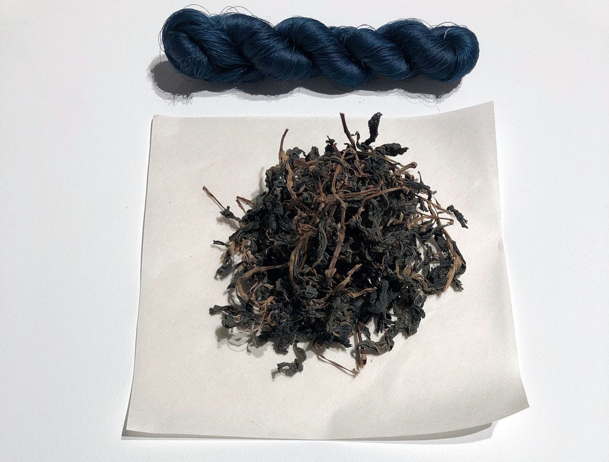
While the word means “blue” today, in this context ao is a bluish-green made from a “bottom” of yellow Amur cork dye, overdyed with indigo (ai 藍) to the desired intensity7. It’s somewhat surprising that straight blue (hanada 縹) is nowhere to be found on this list, since indigo, made from the indigenous Japanese Indigo (Polygonum tinctorium aka Persicaria tinctoria) was abundantly used. Whatever the reason for this early lack of interest, hanada would achieve glory several centuries later.
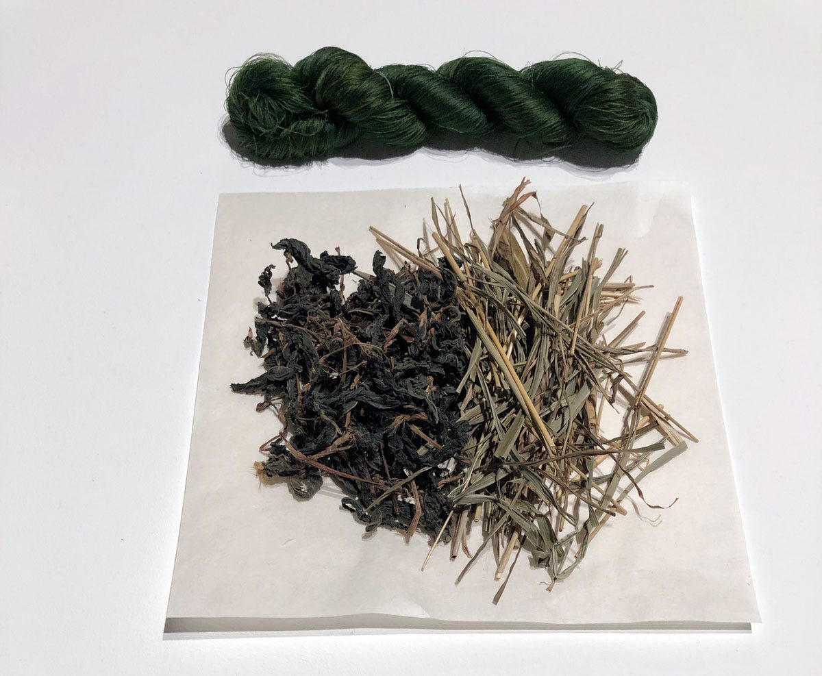
The list does include instances of midori ao, where midori 緑 is “green”, as in the green of foliage. It seems to indicate the same mixture, but with a lighter dip in indigo so the result can be more green than blue.
4. Moegi 萌黄
In contrast with the bluish ao, moegi is a much yellower, light green evoking young buds, much more yellow than ao. Yumioka Katsumi, author of the wonderful Kimono and the Colours of Japan8, describes it as a “brilliant yellow-green like the flush of spring.” but sadly provides no indication of how it was made. In all likelihood it was the same method as above, a bottoming of yellow before a dip in indigo, but using kariyasu for a greener yellow, and dipping in a weak indigo vat in order to merely touch the yellow with blue.
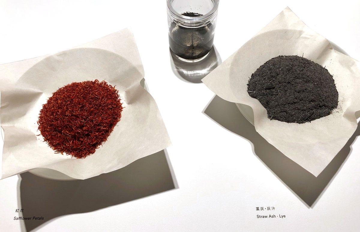
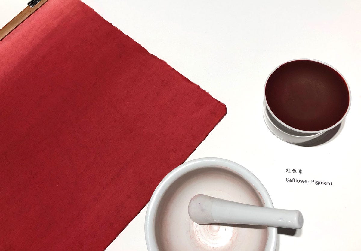
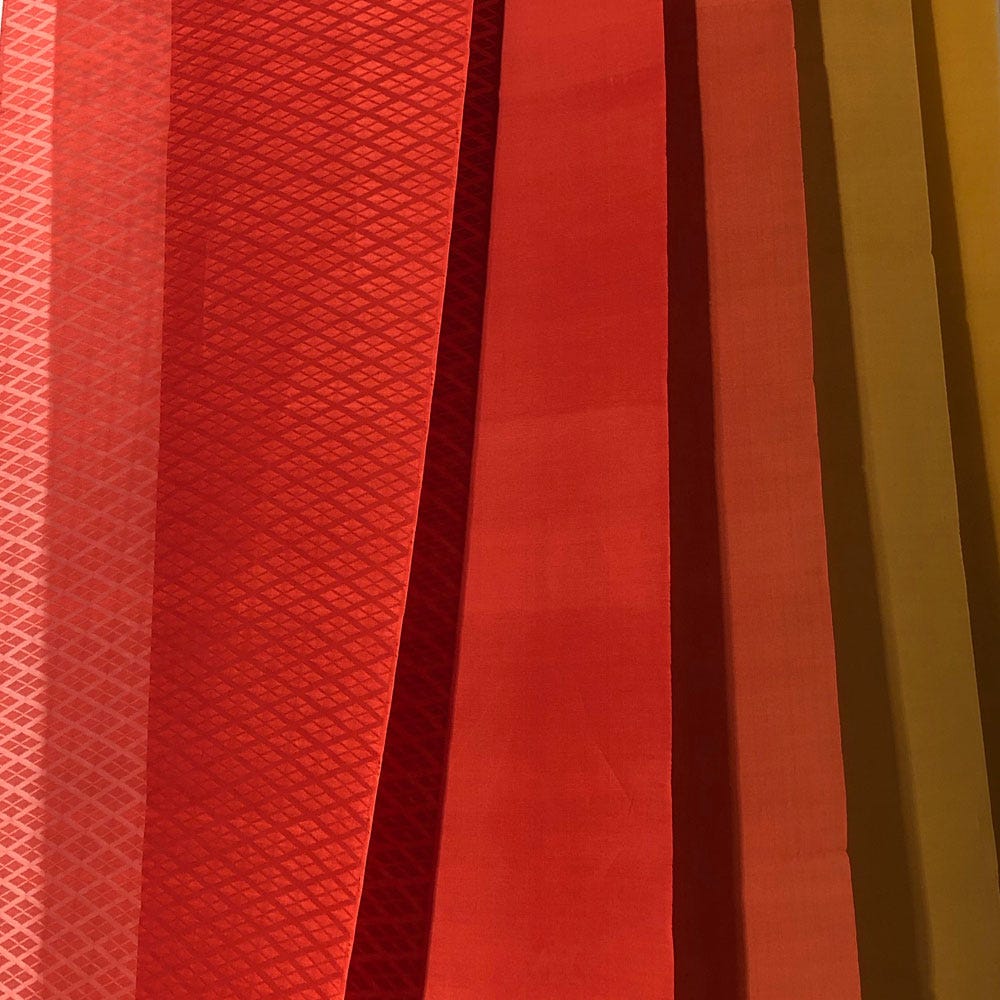
5. Kurenai 紅
Translated as “crimson”, this is the incomparable rose red of safflower (beni 紅 ), an intense pink that is without a trace of yellow when extracted to a high standard9. This is the red and pink of the cherry blossom palette above, and of the paper flowers below.


Safflower enjoyed a more detailed display, commensurate to its sophisticated extraction.
6. Kuchiba 朽葉
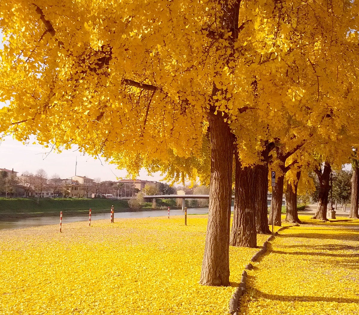
The colour of “fallen decaying leaves”. The exact tone denoted by this term has evolved along the centuries, but in the Heian period this referred to a bright yellow tinged with red, based on gingko leaves when they fall in autumn, and obtained by combining gardenia and safflower dyes (see also 12. Ōdan).
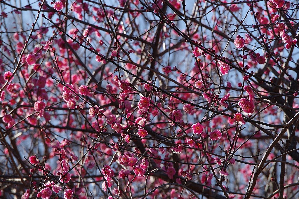
7. Kōbai 紅梅
A dark pink tending to purplish, the colour of ume10 blossoms. While ume (Prunus mume) is conventionally translated as “red plum”, it’s actually an apricot, which can cause confusion! As far as I understand, this hue was also achieved using safflower; when purified repeatedly of its yellow components, the pink on silk becomes noticeably purplish.
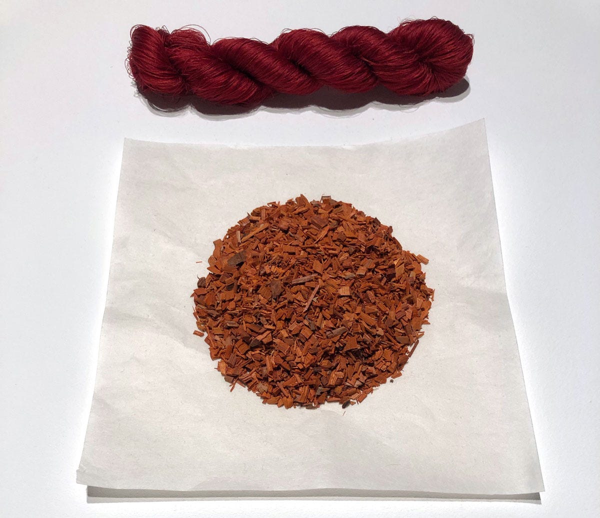
8. Suō 蘇芳
This red tending to purple, a deep raspberry red, is named after the dye that produces it: sappanwood (Caesalpinia sappan), imported from India.
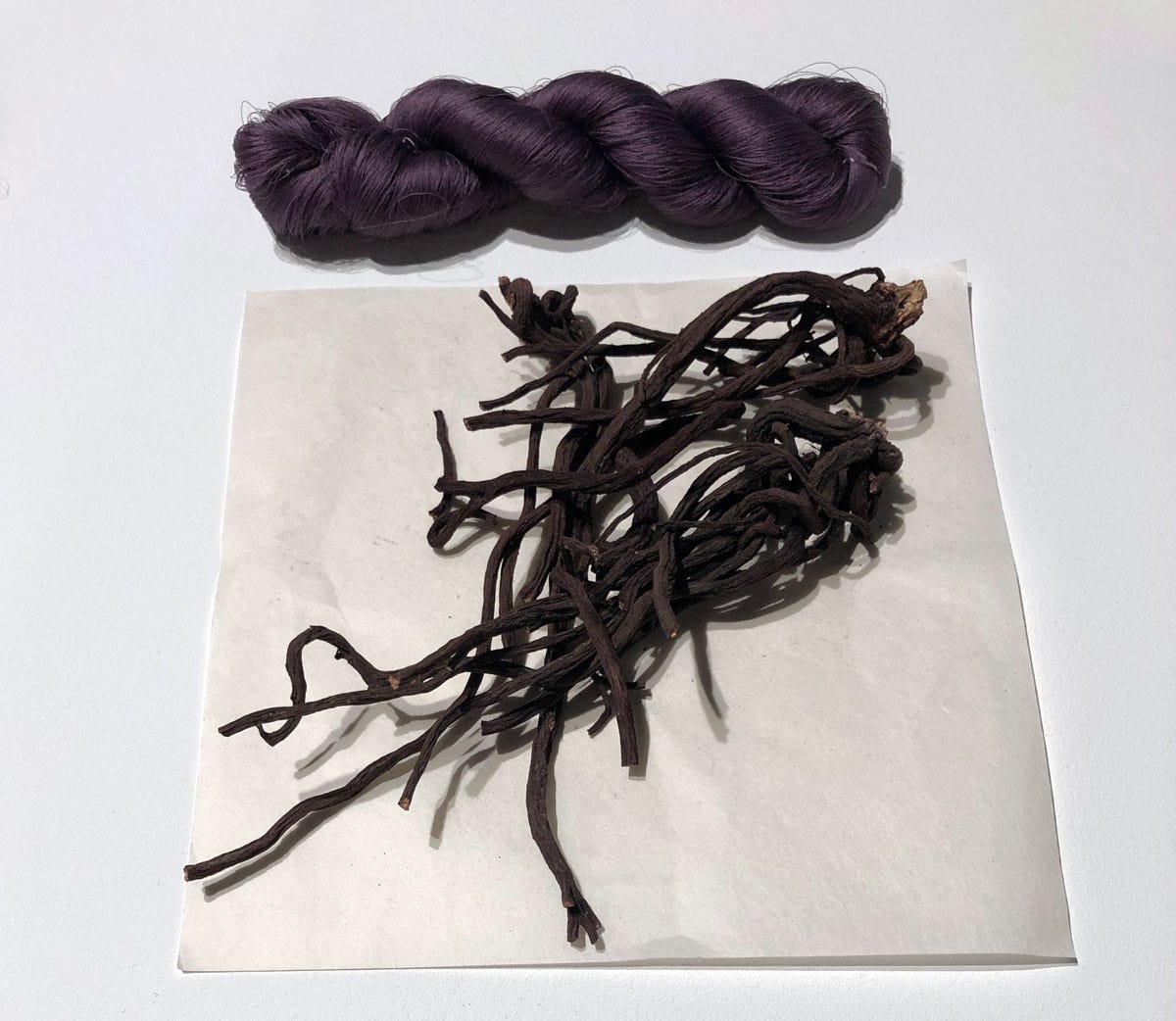
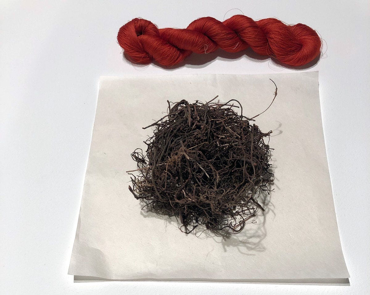
9. Murasaki 紫
Pure and frankly enviable purple from the roots of murasaki or purple gromwell (Lithospermum erythrorhizon11). It’s also known as shikon 紫根 which simply means “purple root”. This luxury dye, difficult to work with, was dropped the moment synthetic purples reached Japan in the nineteenth century, and the plant itself is now critically endangered. But in the Heian period, it was highly desirable as a colour (to the point the author of The Tales of Genji chose Murasaki for her pen name), and also used as medecine.
While the above nine colours make up most of the irome palettes, three more appear on the list, but much more rarely:
10. Ominaeshi 女郎花
This name refers to the eastern valerian or golden lace (Patrinia scabiosifolia), which is not itself a dye plant but one of the much loved “Seven Flowers of Autumn” (aki no nanakusa 秋の七草). The colour associated with it is a bright lemon-yellow, but I could fins no information about the dye used.
11. Shu 辰砂
Shu or shinshu is the colour cinnabar, the bright red mercury sulfide pigment that came to Japan from China. The pigment itself could not have been used to dye anything, so its colour would have had to be recreated with available plant dyes. As a dye colour, Yumioka describes it as “a rich red tinted with yellow” but doesn’t provide the possible components. I would suggest however, that as Japanese madder akane 茜 (Rubia akane) was already known and widely used in the Heian period, and furhermore has a yellowish tinge, this would be the natural choice to emulate cinnabar red.
12. Ōdan 黄丹
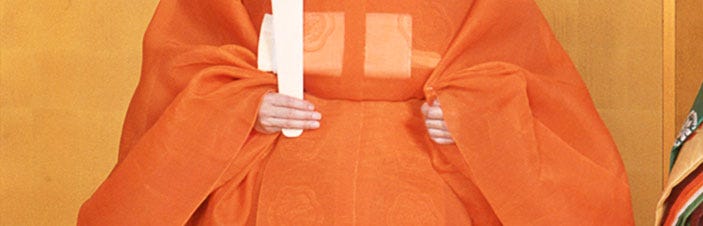
This is the colour of tan, also a pigment: red lead or minium, which ranges from orange-red to vivid orange. This hue was reproduced on fabric by layering safflower red and gardenia yellow. An interesting note about ōdan is that it was added to the list of Forbidden Colours12 in the tenth or eleventh century (presumably after the court irome list became established); ever since, it has been the exclusive colour of the Crown Prince.
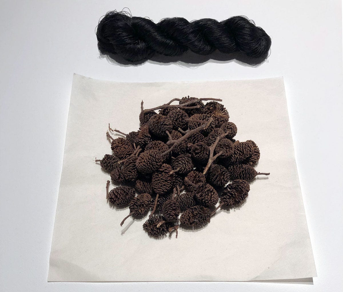
Japanese dyes naturally did not remain suspended in the twelfth century, and many more natural materials came into use in subsequent periods, only starting to decline in the Meiji era. Some ancient ones, such as the alder catkins below for making black and greys, did not enter the irome lists for the simple reason that these hues were reserved for mourning; the closer to the deceased, the darker the grey.
I have only scratched the surface and my very Virgo brain is dying to draw up the full array of historical combinations, fully annotated, but that’s a mad project for another day. For now I’ll leave you with more photos of seasonal colour schemes from Living Colours at Japan House, and these words from Shimura Yoko13:
“Colors dyed from plant-based dyes do not fade, but rather change as time passes. The colors subtly increase in depth and the kimono begins to show a distinct character. It is as if the colors are living.”
The V&A made four short films about Yoshioka-sensei’s work, which can be watched as a compilation on YouTube.
The refined aesthetic sensibility of the Heian period is called miyabi.
Except for the final under-robe (hitoe) which was unlined.
This word is nowadays also used to refer to hues that are considered to be “traditionally Japanese”. Traditional Japanese colours “often feature muted, earthy tones instead of bright, saturated hues which gives them a calm, understated elegance and aesthetic unity.”
In dyeing terms, “deep” means a highly concentrated colour resulting from many dips in the dye, while on the opposite end “pale” would be a brief dip or make use of a near-exhausted dye bath.
I grew up surrounded by gardenia; Beirut is practially carpeted with the shrubs and they all blossom in unison in May. I have never in my life seen a fruit, though, because no flower is ever left on the bush to fruit! They’re collected as they bloom to place in homes or string up to hang in cars and so on, so that the delightful scent can be enjoyed every moment of the short season.
Blue as a colour holds different places in different cultures, and prior to European influence was quite often not regarded as a colour in its own right. To some it was a shade of black, to others it was a kind of green. (In the same way that orange and pink only belatedly achieved the status of discrete colours, being previously simply “red” or “light red”. If there is interest in this topic I can write more in detail about it.)
Yumioka, Katsumi. Kimono and the Colours of Japan 着物と日本の色, Pie Books, Tokyo 2005.
I have written about this process here, though by now I could rewrite it with far more detail and examples.
Ume (Prunus mume) is usually translated as “red plum”, but it’s actually an apricot.
Not to be confused with L. purpurocaeruleum which is also known as purple gromwell but grows strictly in Europe.
I've been drawn to kinu since reading Liza Dalby's delightful novel The Tale of Murasaki. So I knew it was generally based on seasons, but never took the opportunity to go deeper. I'm thrilled not only to have better understanding but also to see the photos -- and read your description -- of this sublime exhibit. More, more! (I have Shimura Fukumi's book on my wishlist now.)
I love all of this. The plants, the colours, the sensitivity of the Japanese culture to all the nuanced layers of beauty. The idea of living colours really sings to me, and is something I've been playing with recently as I make my own natural inks and art. Thank you.