Illuminated Numbers 4
Wrapping it up
Thank you all for your patience while I got completely submerged by the writing of my monograph, Stories of Abjad. I am done!! and looking forward to returning to more regular posting as my mind is free to visit other topics again. You can preview the book here, where it’s available to pre-order for a short time until it goes to print.
Let’s complete our survey of the Baybars Qur’an’s verse markers with another visual feast, and a few observations! The chief of which is that volume one, which was illuminated by Muḥammad ibn Mubādir, is by far the volume where the most effort and creativity was lavished onto the verse markers. While the other 6 volumes still display the same level of skill, their punctuation is much more standardised, which is why I’m able to include all of it in one post.
If you’re reading this in a browser, you can click on the images to see them in full size.
Volume Two
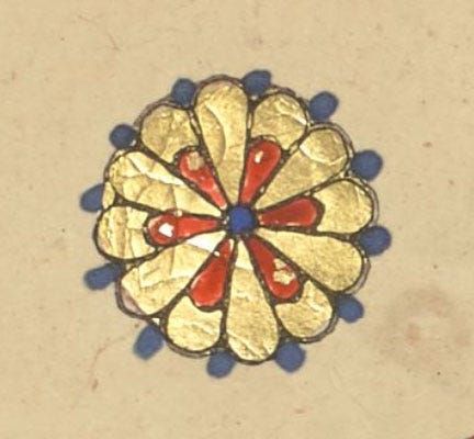
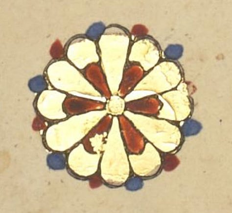
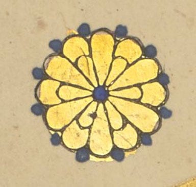
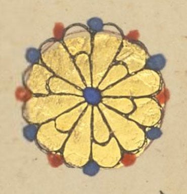
The illuminator hasn’t signed this volume. The array of single-verse marks still shows diversity, but mostly through different applications of colour – compare with volume 1!
Single-verse mark

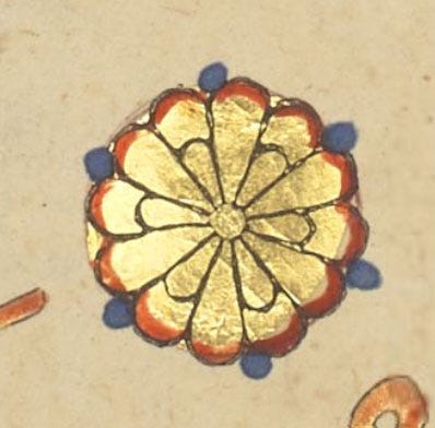
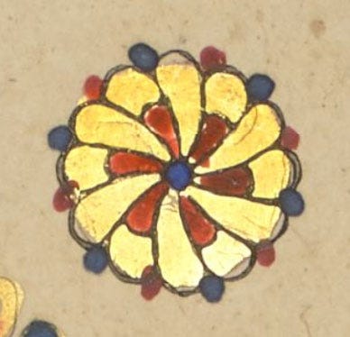
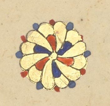
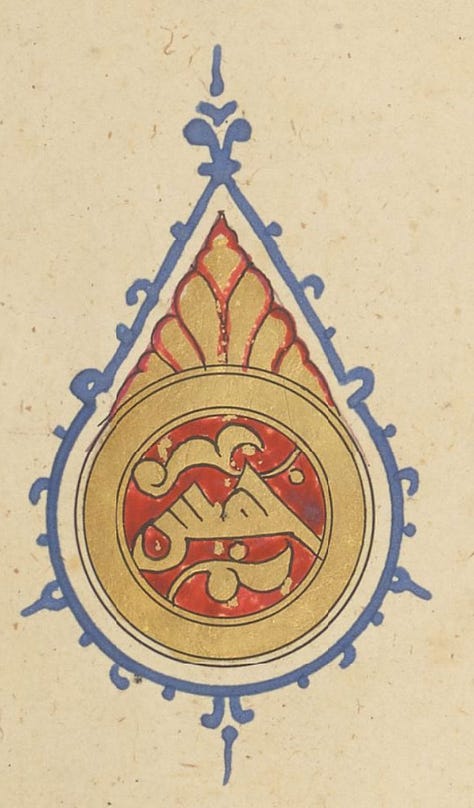
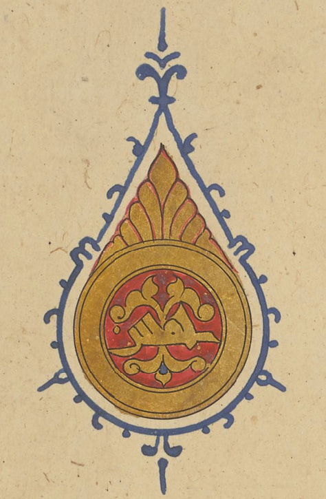
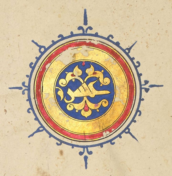
Five-verse mark خمس
These are now very standardised, down to two main designs. The first two images are the same design, with a very slight change.
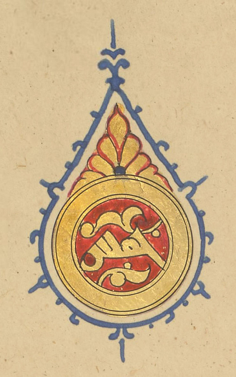
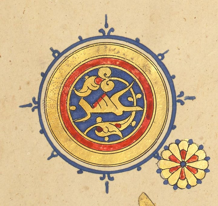
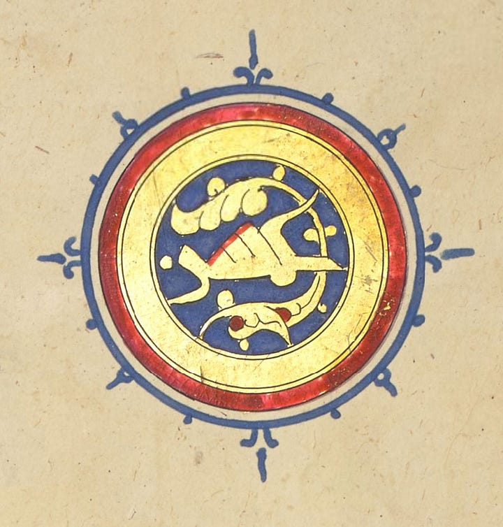
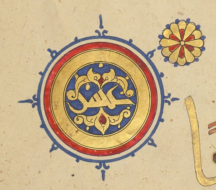
Ten-verse mark عشر
Similarly, looking only at the plant motif, there are two main designs, each with slight variants.
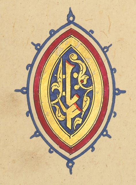
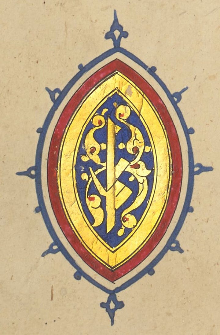
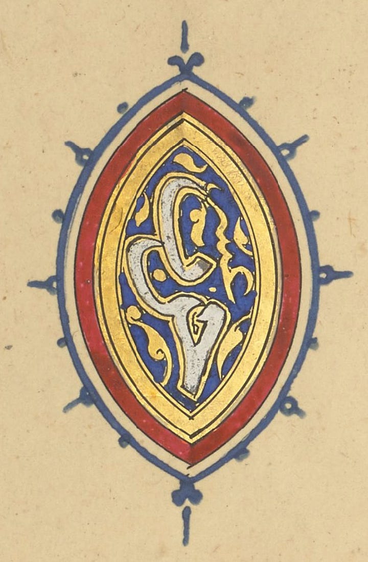
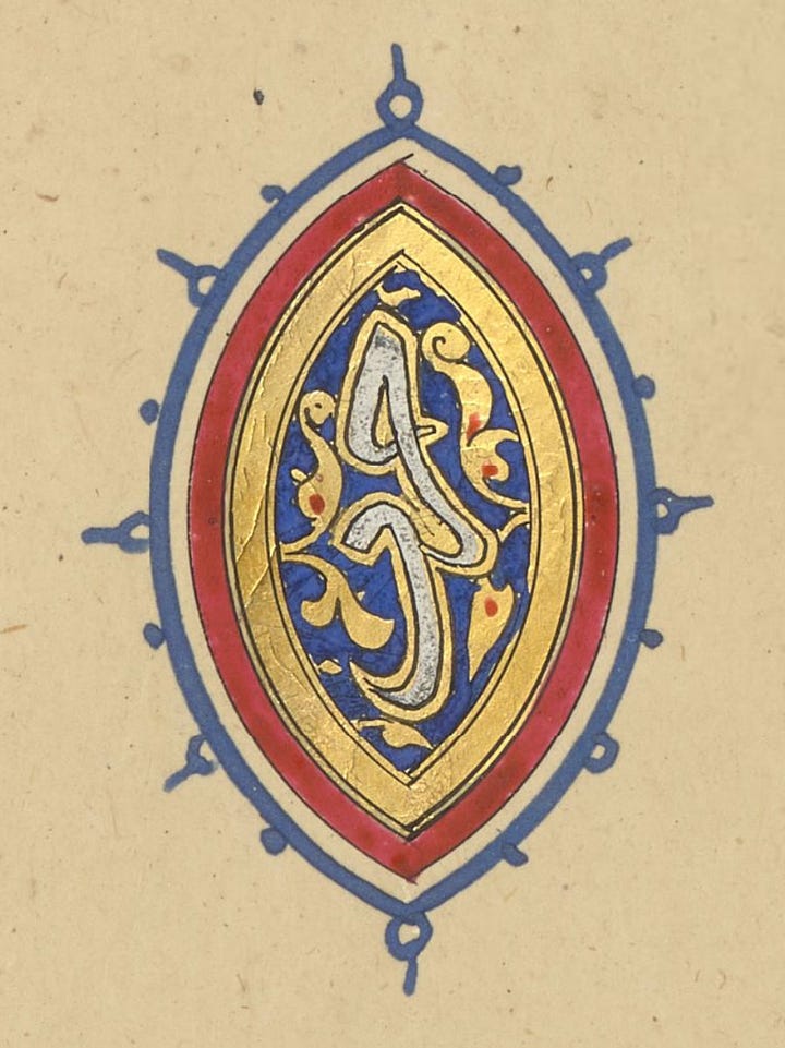
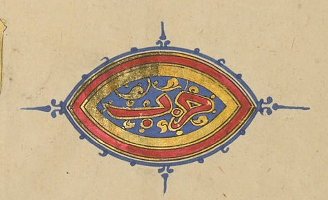
End of section حزب
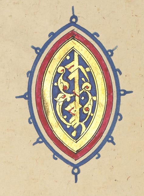
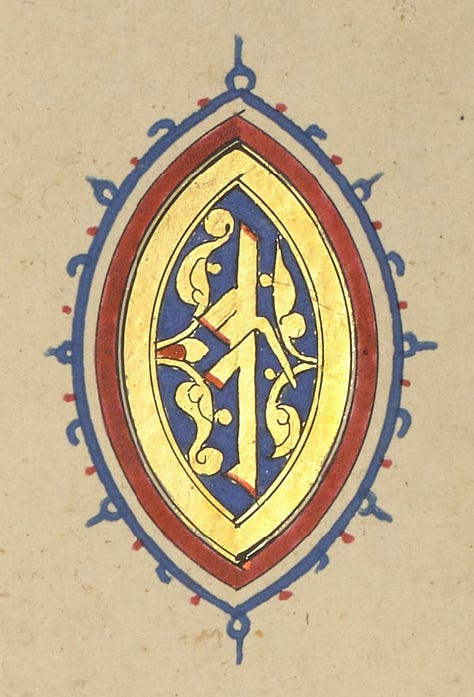
These are all the section marks in this colume; the first one says “fifth section”. It’s interesting that a code-switching takes place in the final one, with a different calligraphy style and the use of white (which we’ll see in the next volume is there to colour-code this marker.)
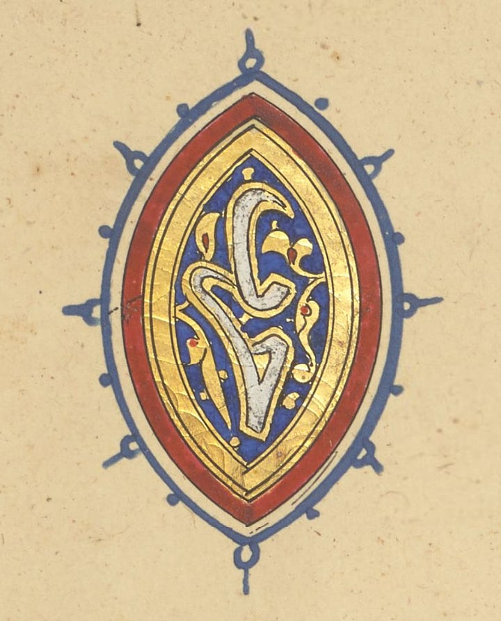
Volume Three
This and the fifth volume are signed by the illuminator Abu Bakr, known as Ṣandal (“sandalwood”). In both of these we see the punctuation at its most standardised and conservative.
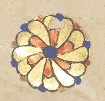
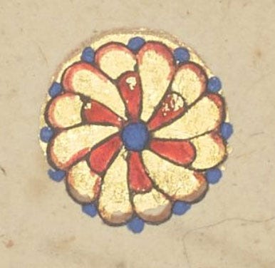
Single-verse mark
This is the extent of variation we see for this marker. But look at the gold in the second one: here we see clearly the process of drawing these. First a simple circle was done in gold, and only later did the illuminator add the black strokes and colours. Sometimes these three steps were done by three separate specialists.
Five-verse mark خمس
In this and the ten-verse mark, the calligraphy is noticeable for its wonkiness: the final letter is distorted to fit the circle in a way that only someone copying shapes would do (as opposed to someone writing). This artist wasn’t familiar with this (Eastern Kufic) style at all, and shows much more familiarity with the (muhaqqaq?) script used in the sajdah and hizb. We see here a sign of the decline of Eastern Kufic, which was already on the way out, and only survived in titles for a while as the round scripts (such as the one this Qur’an is actually written in) take over.
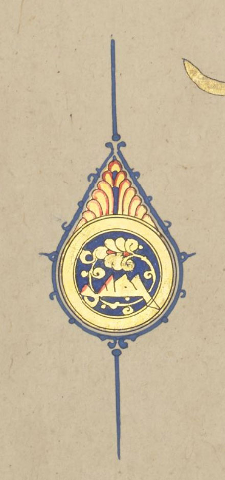
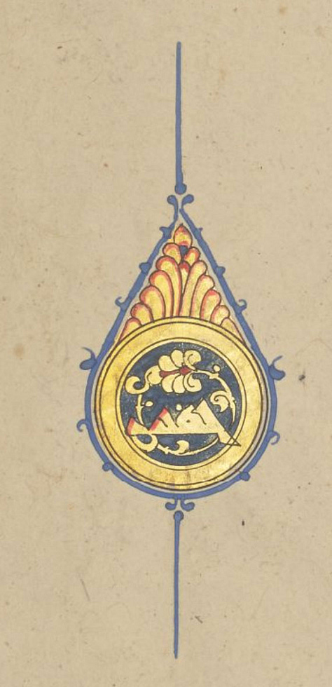
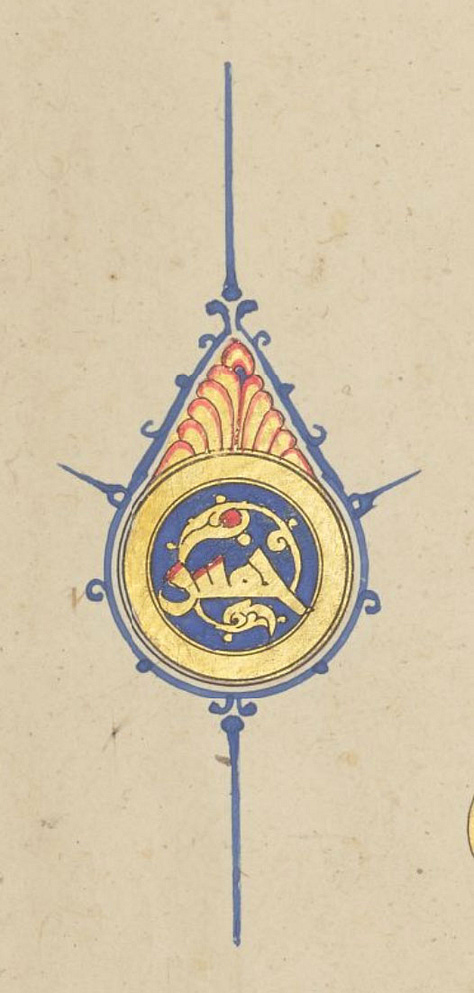
Ten-verse mark عشر
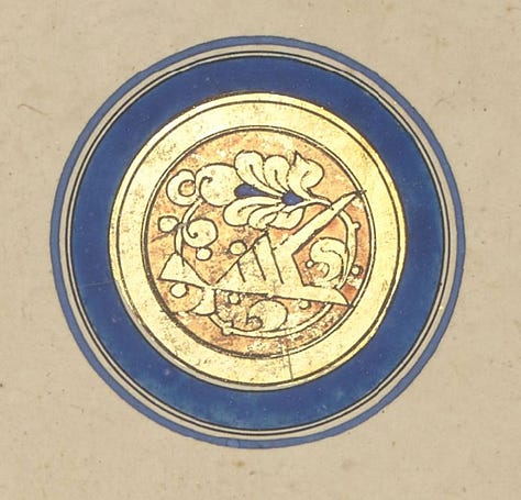
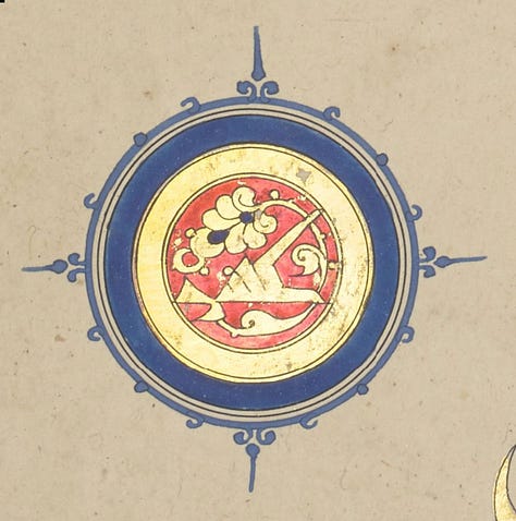
There are only small differences between these, though the first one is clearly a different, safflower-based red. It’s also unlikely it was left as a plain circle on purpose, it must have been overlooked, but this gives us another process insight: those last details around the edge may have been added to all markers at the very end. But look at the last example: this blue looks very different from the others. There is a slight chance that this is only an optical effect in the photo, due to the yellow gold showing through a more transparent grade of lapis lazuli. But it’s also possible some indigo is mixed in, as this dark hue that tends ever so slightly to green is very typical of that pigment, and it was very present in the palette (usually mixed with orpiment to make shades of green).
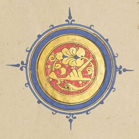
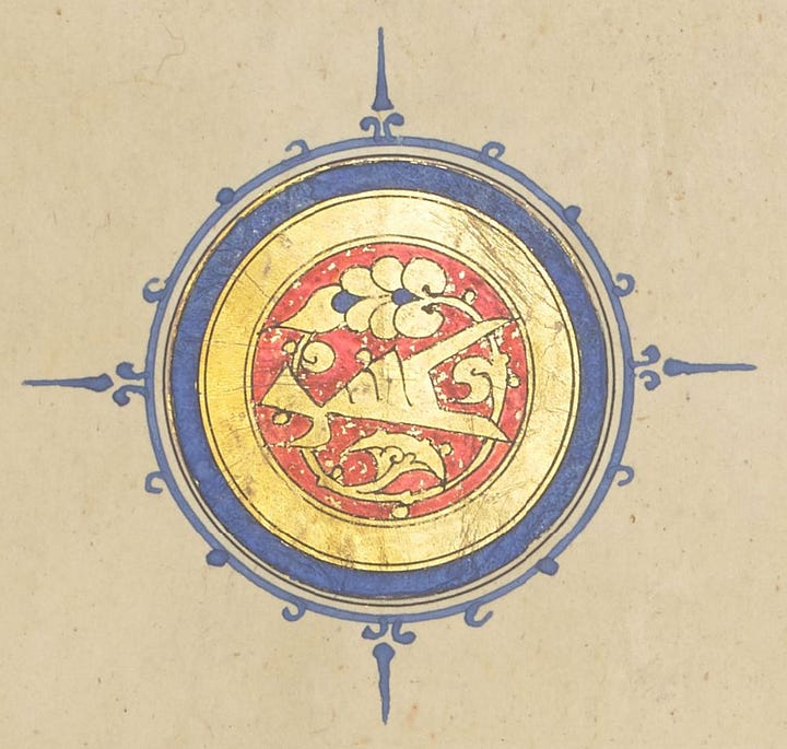
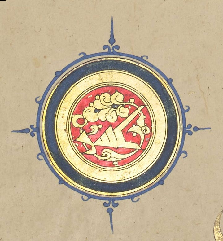
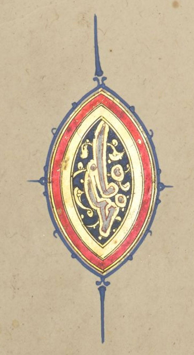
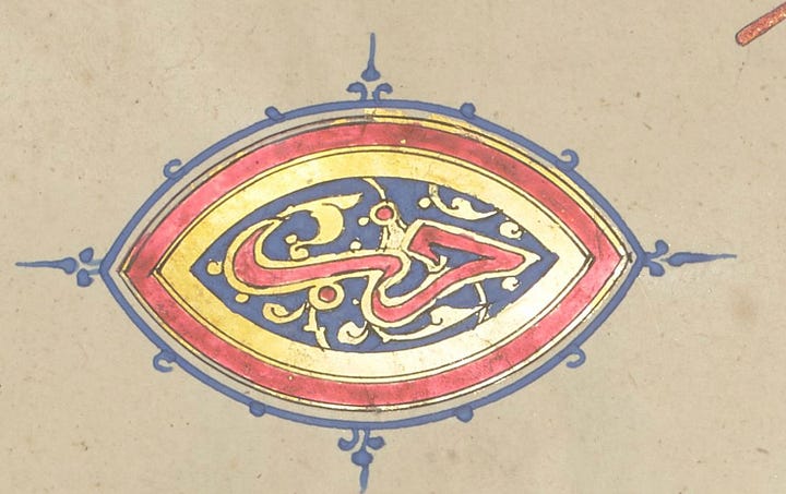
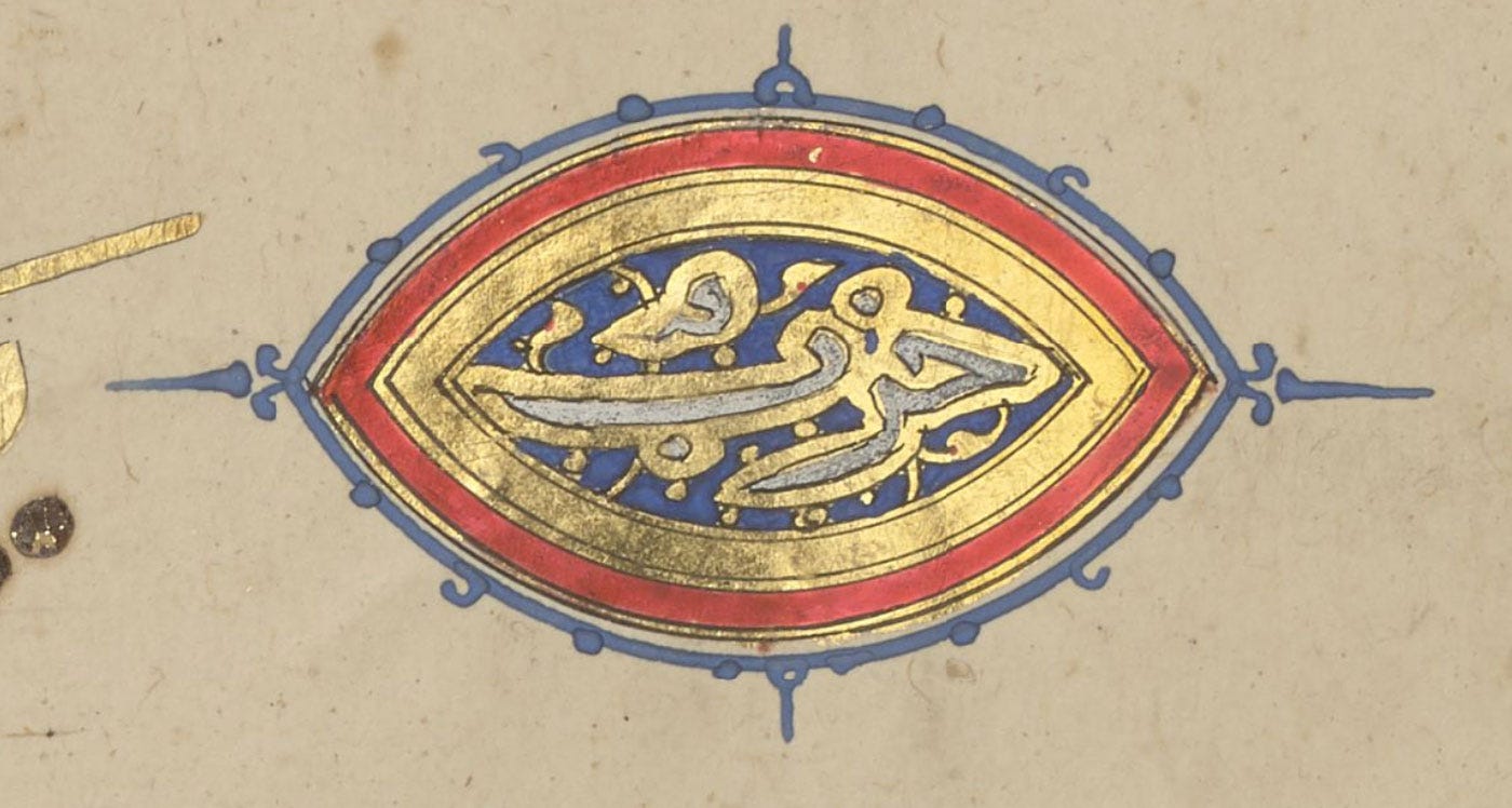
End of section حزب
The white text marking the section mark is clearly established here, but note once more the unusually dark blue in two of these.
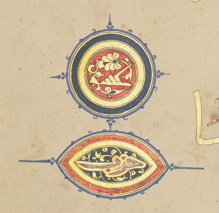
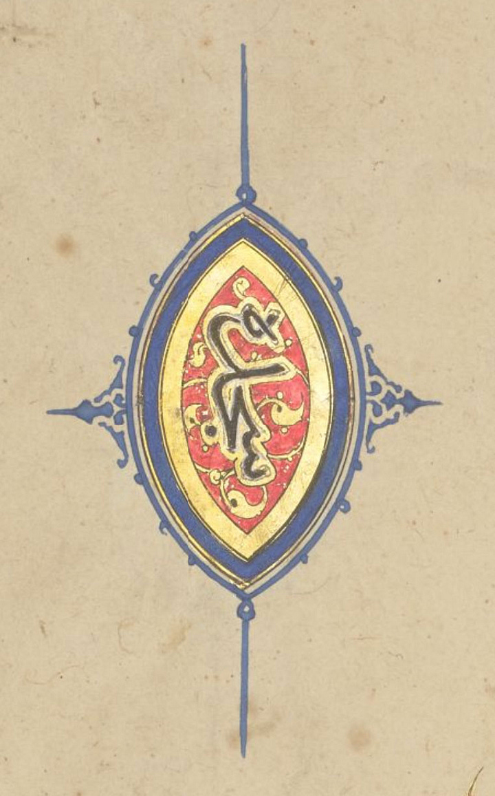
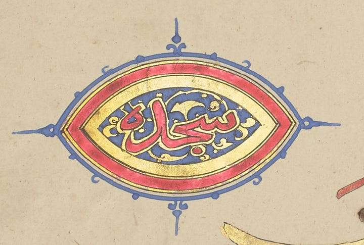
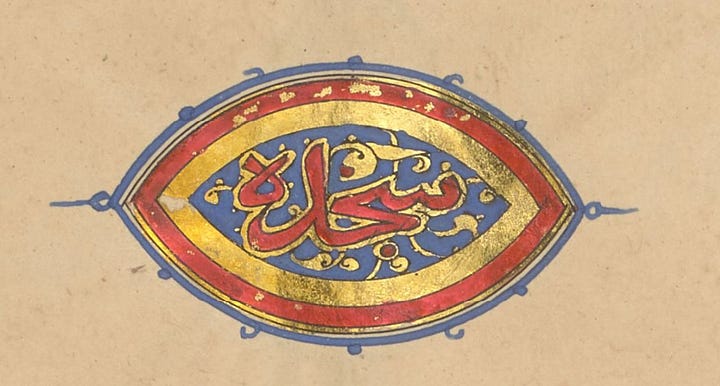
Prostration سجدة
For the first time now, we see prostration markers in the text, and note how the calligraphy is coloured black! As both this and the section mark are almond-shaped, with very little difference in the design and colouring, this simple but effective coding served to differentiate them at a glance.
Volume Four
No signature in this one, but based on the artwork (and a calligraphic hint I’ll describe below) I think it’s the same illuminator as vol. two, and that they are possibly the same as the artist of vol. one.
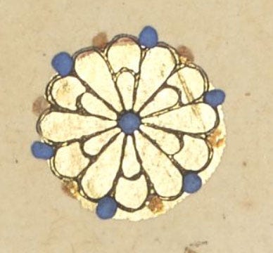
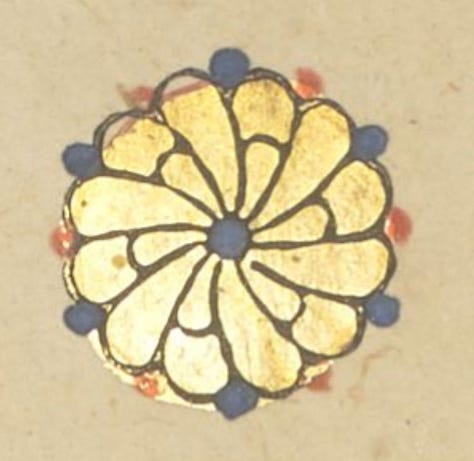
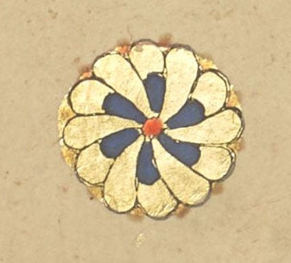
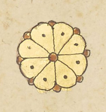
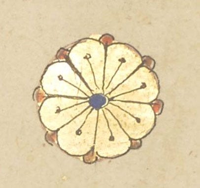
Single-verse mark
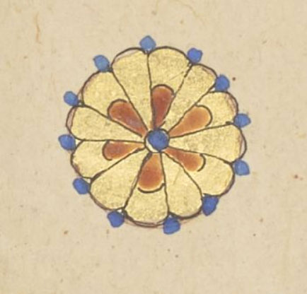
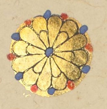
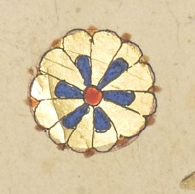
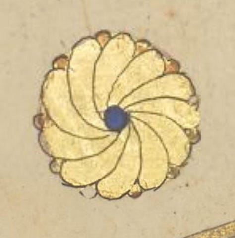
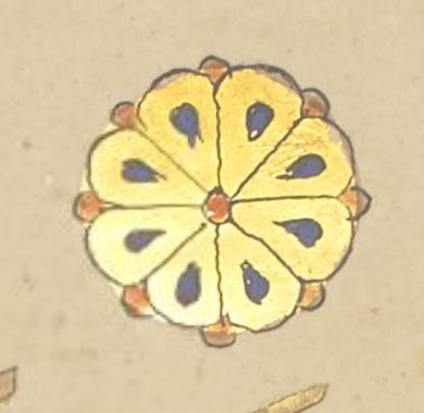
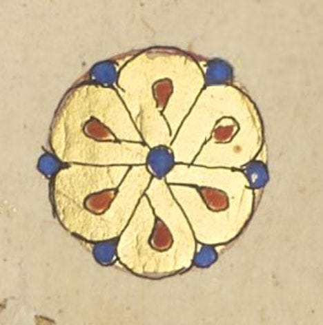
These show a flash of spirit again! And some quite distinctive designs hark back to those in vol. 1.
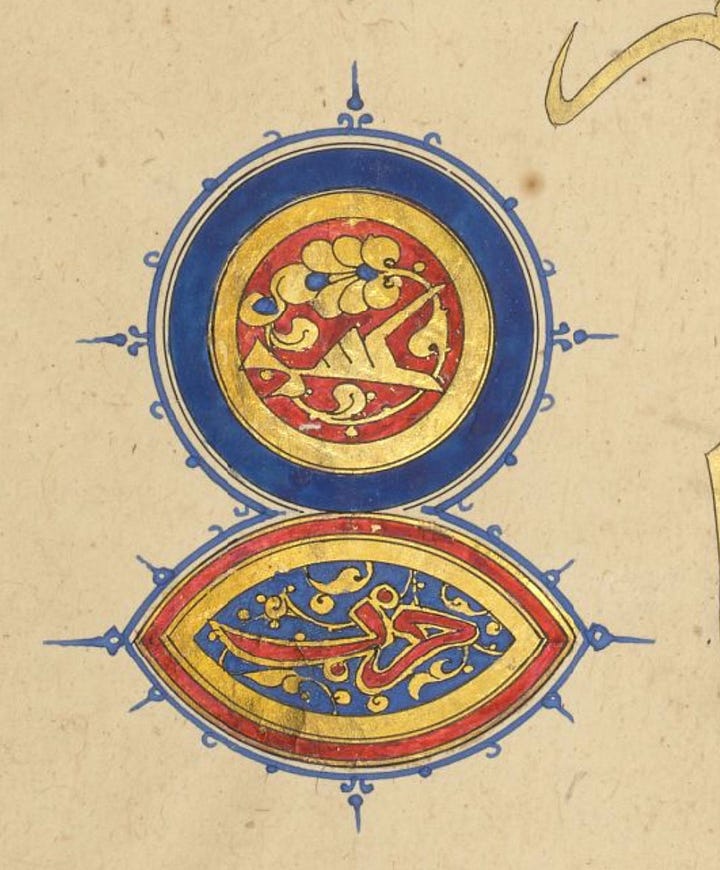
Five-verse mark خمس
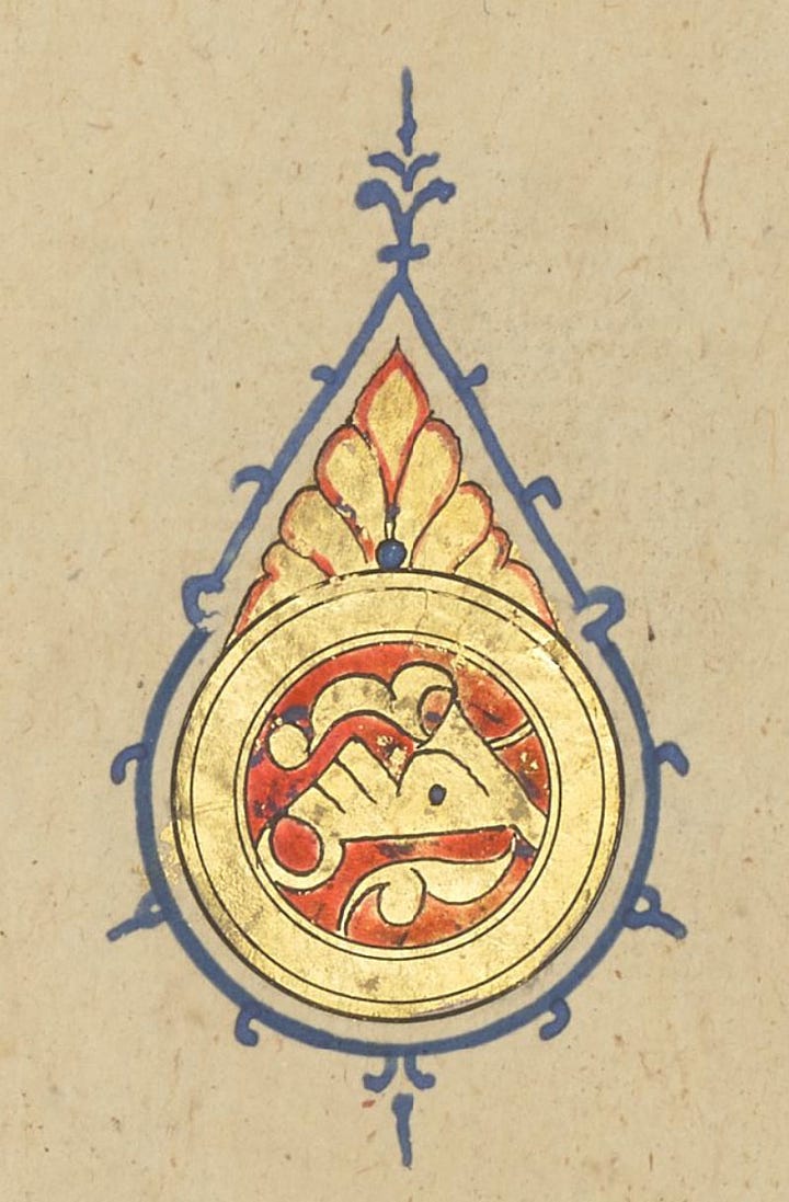
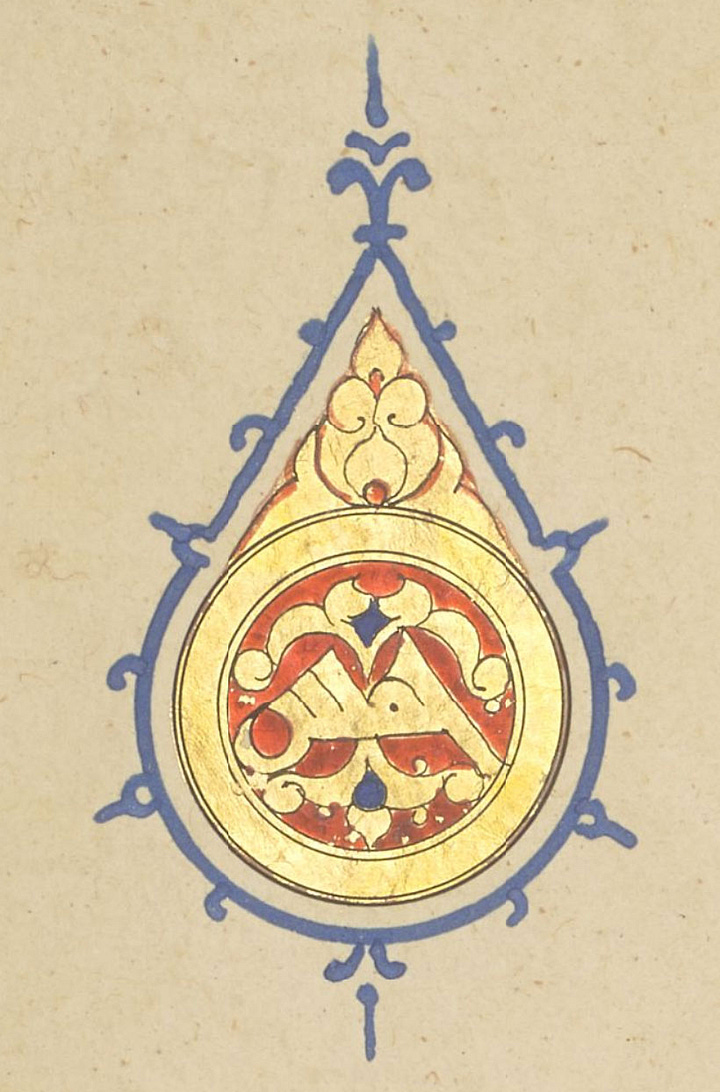
Again, only two basic designs (both in the medallion and in the triangular shape above it), and here’s the calligraphic detail I wanted to point out: the way the tail of the final letter curves up. This happened a few times in vol. 2 (and 1) and is not at all a feature of this style. His calligraphy shows he understands the letters, but that rounded tail is definitely a personal touch.
Ten-verse mark عشر
Once more, there are only two types. Most of the diversity in vol. 1 was in the colourful floral border added around this central motif.
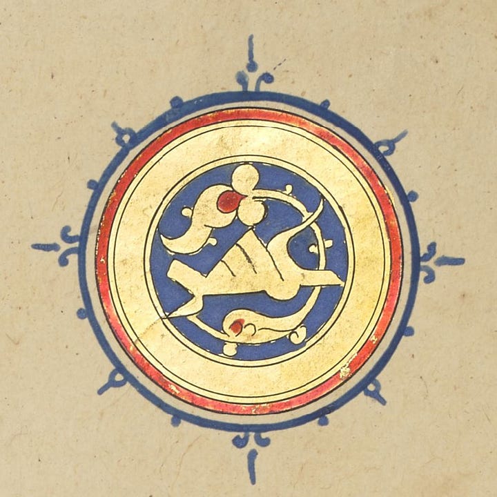
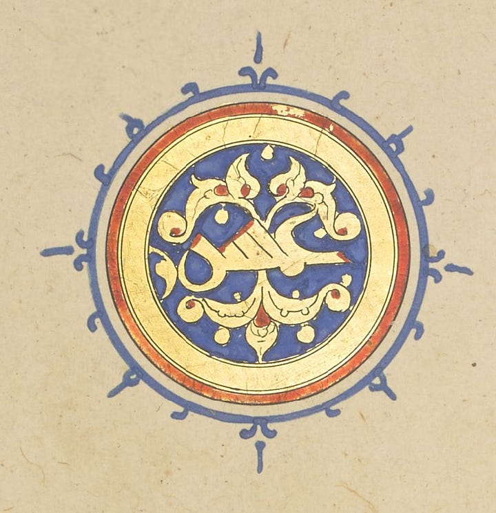
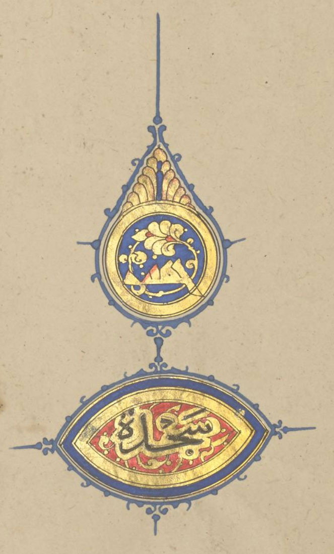
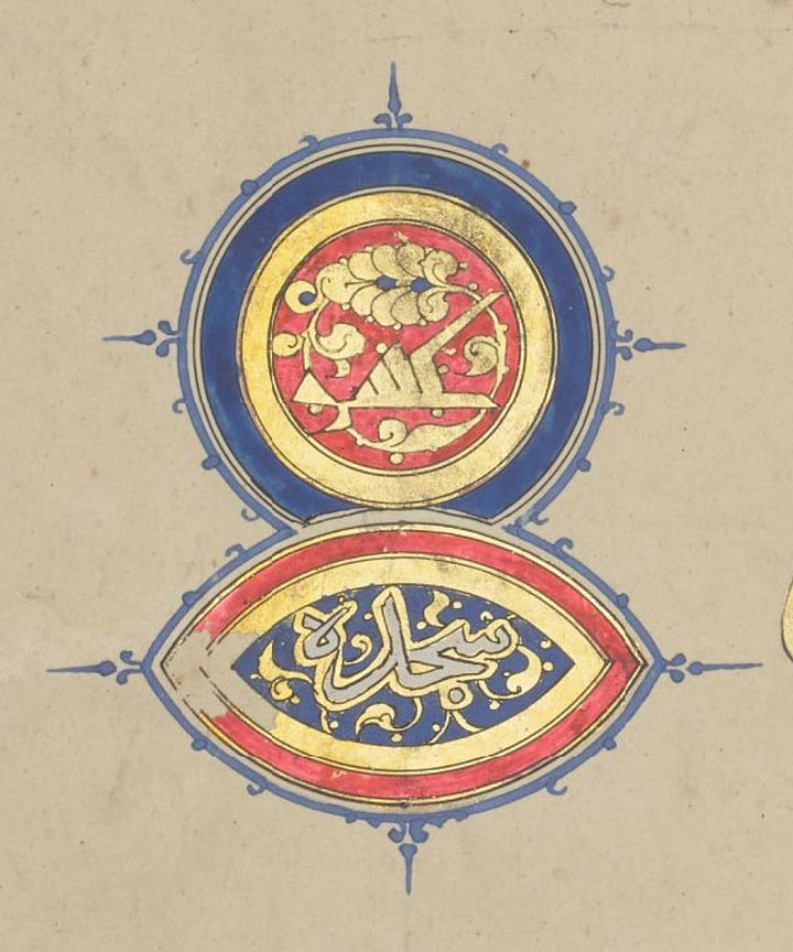
Prostration سجدة
The sajda now has its very own cartouche shape, made of two circles. This seems to have been the preferred solution for this illuminator to distinguish it from a section marker.
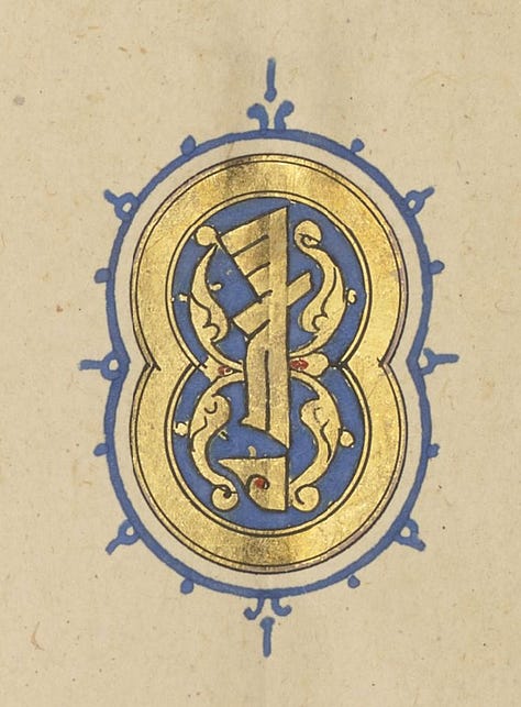
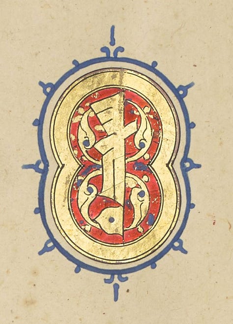
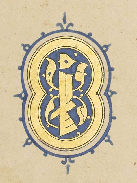
End of section حزب
The mixture of section marks (and in particular the absence of white on some of them) is curious; it’s possible both illuminators worked on this volume, and they clearly weren’t working to the same convention. But look at this glorious final image…
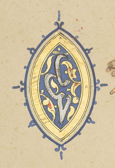
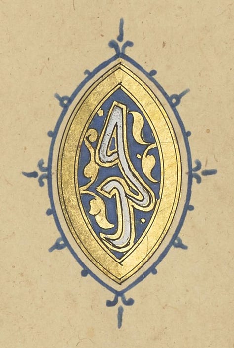
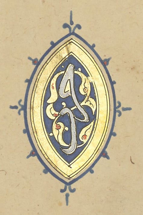
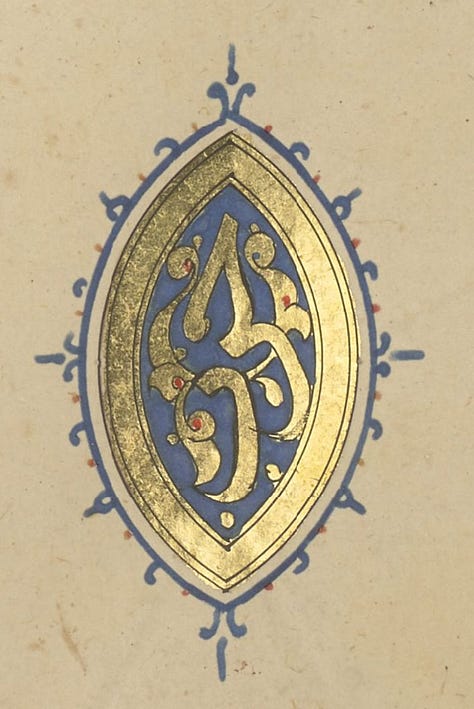
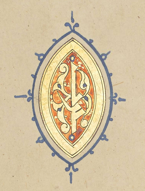
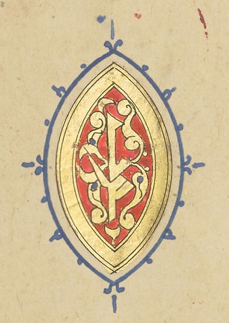
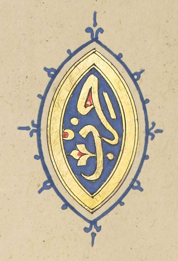
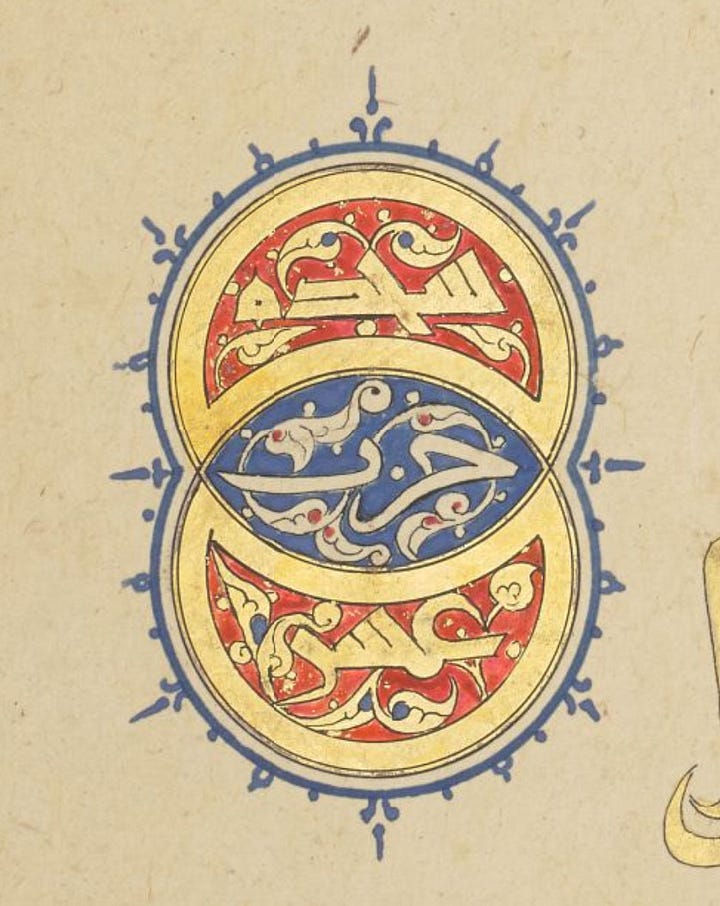
This last one is a combination of prostration and “section ten”, beautifully combined by allowing the two circles from which the almond shape is formed, to be retained as parts of the design.
Volume Five
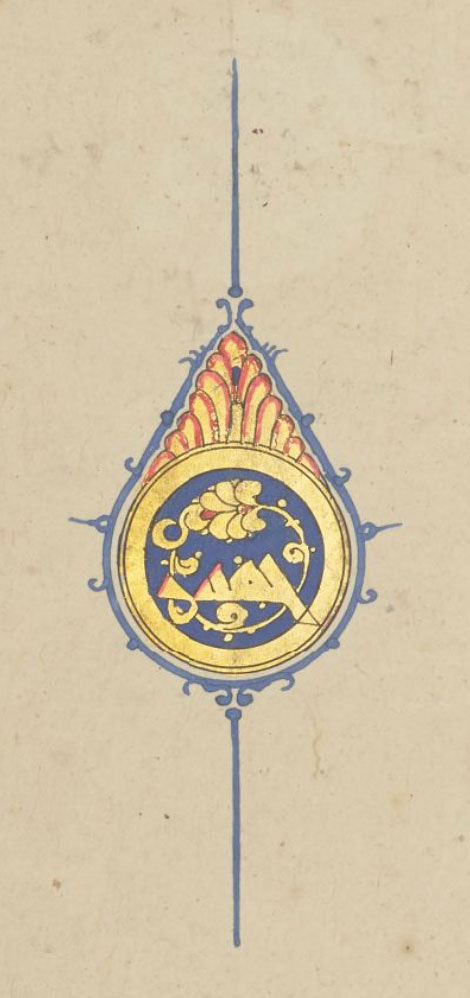
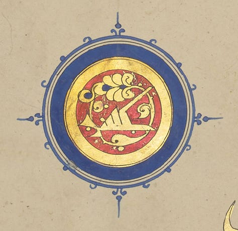
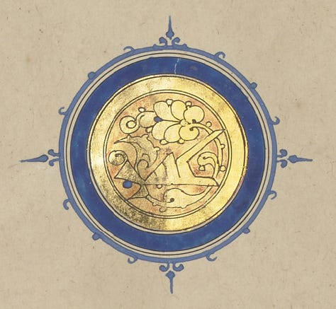
Signed by Sandal again, it’s so similar to vol. 3 I’m only including a few images to give you a sense of the general look. Note the colour-coding is lost as section and prostration marks are indifferently coloured red or white.
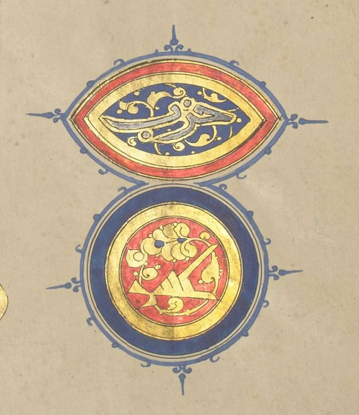
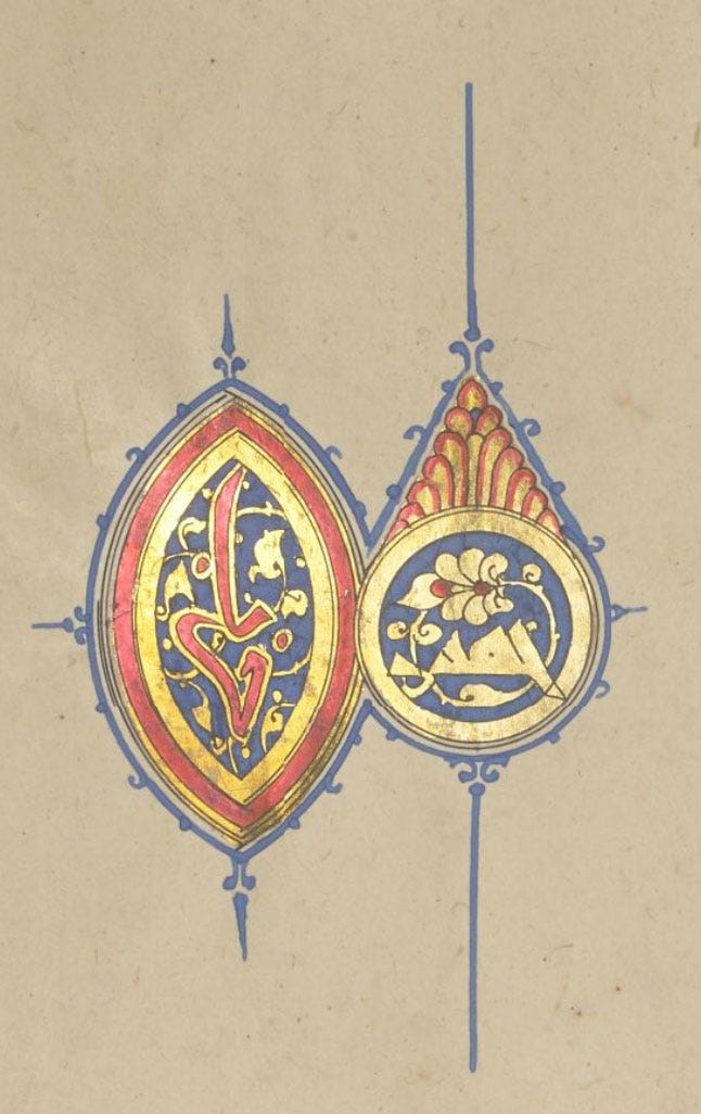
Volume Six
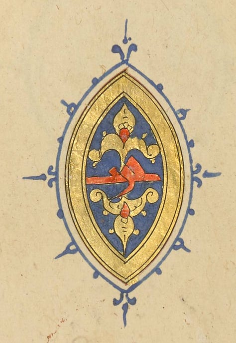
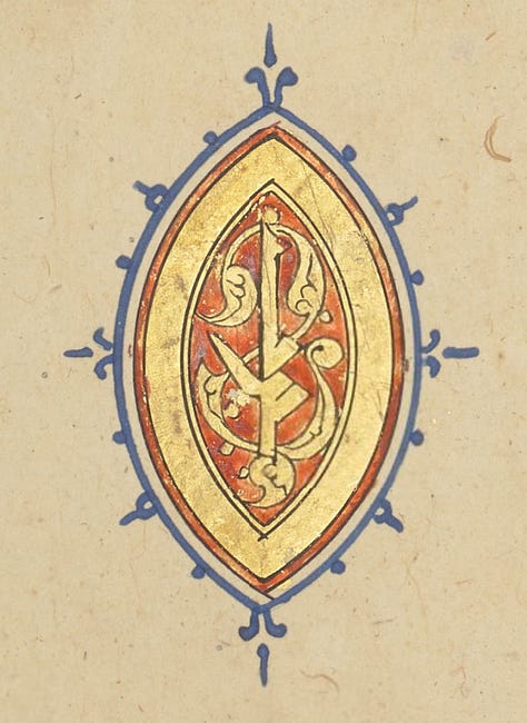
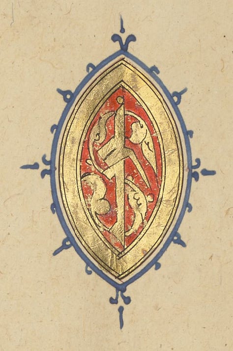
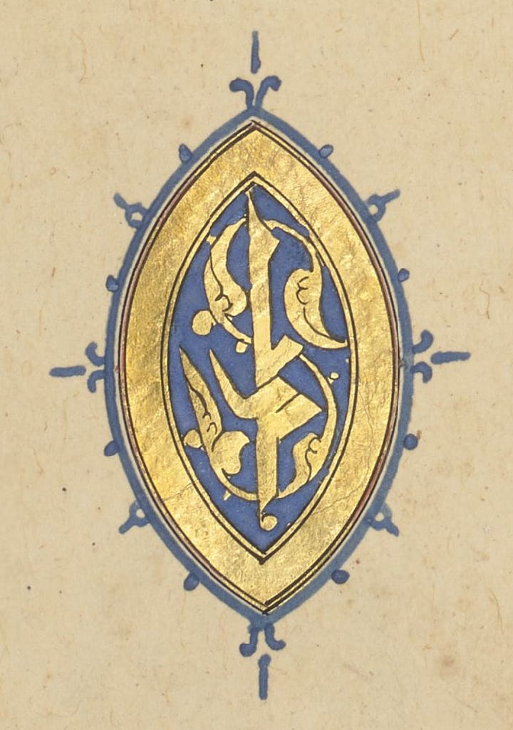
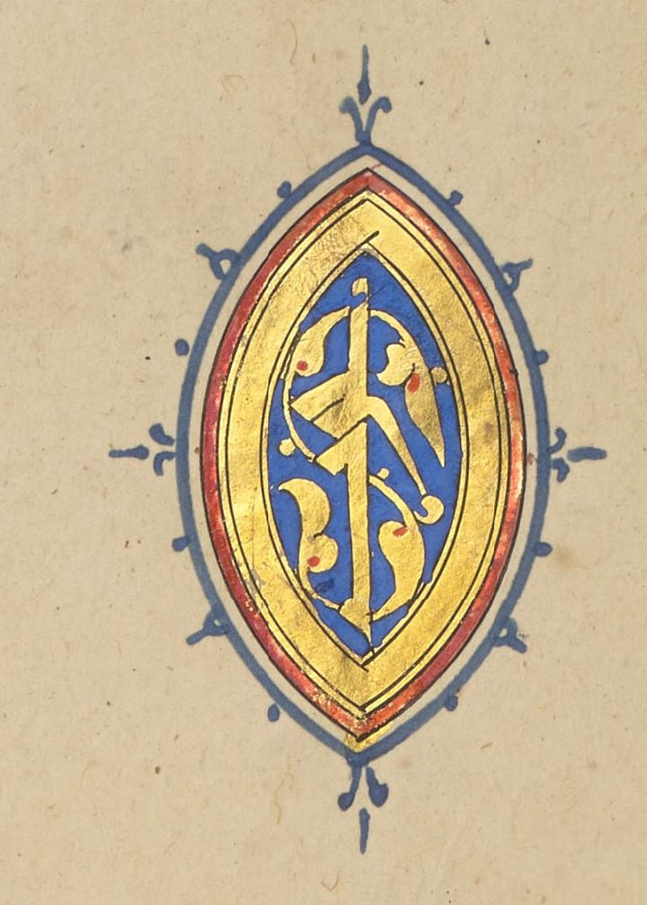
This volume is unsigned but has the look of vols. 2 and 4, whose illuminator may have been Muhammad ibn Mubadir like vol. 1. The first three sets of marks require no comment, this is the extent of their variety – five and ten are more standard than ever with only one design each:
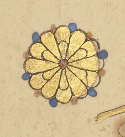
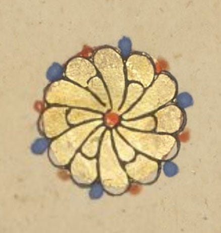
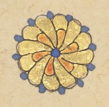
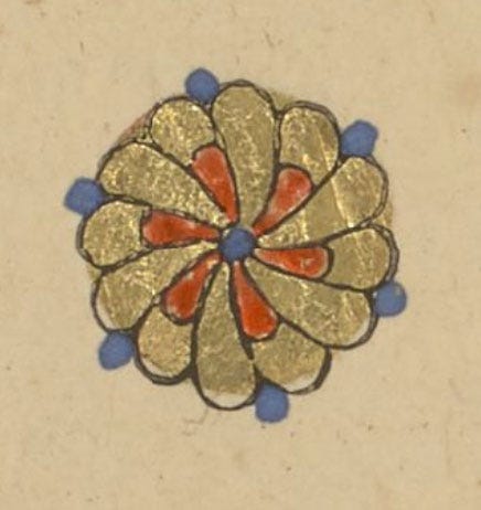
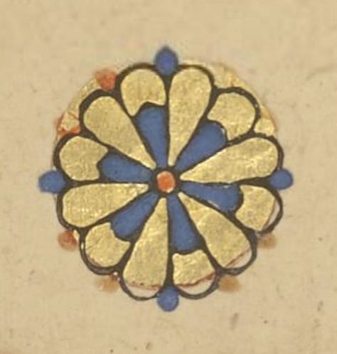
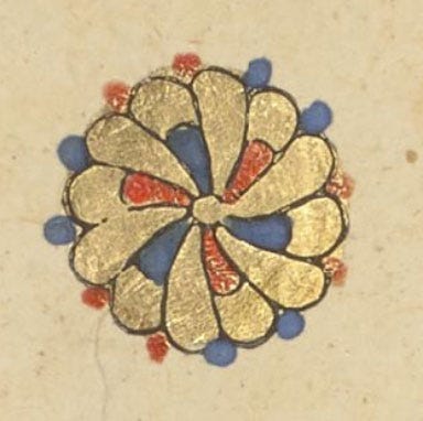
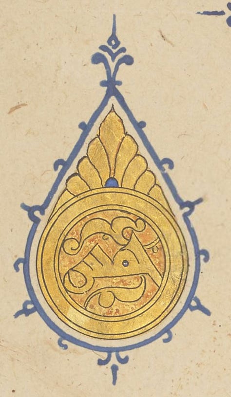
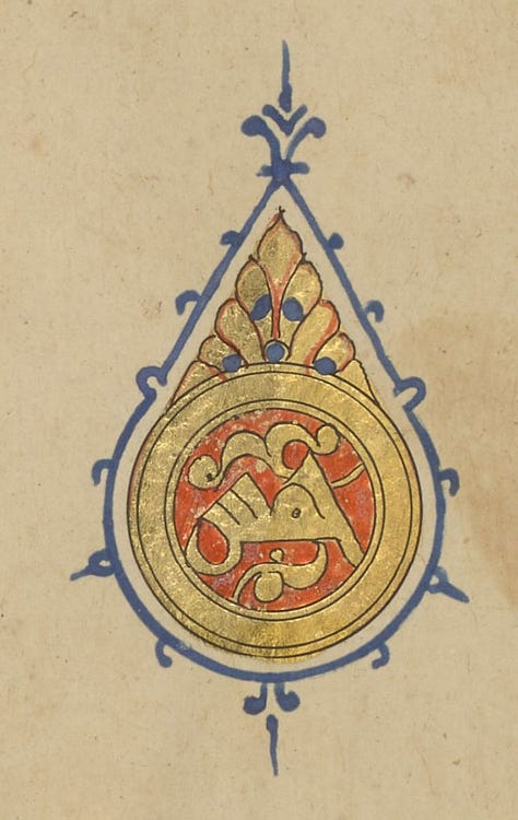
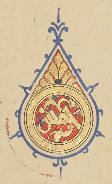
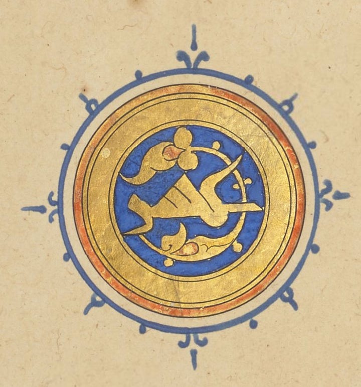
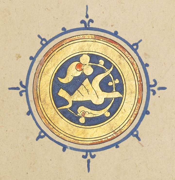
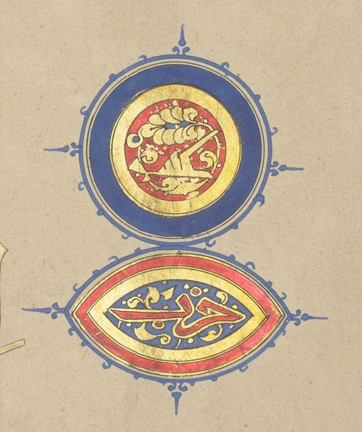
Here’s the geminated-circle prostration mark again, and it does seem that this illuminator really preferred his calligraphy to be gold against the red or blue background, not Sandal’s white or black.
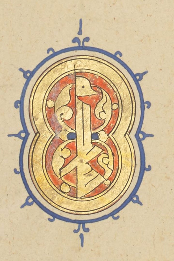
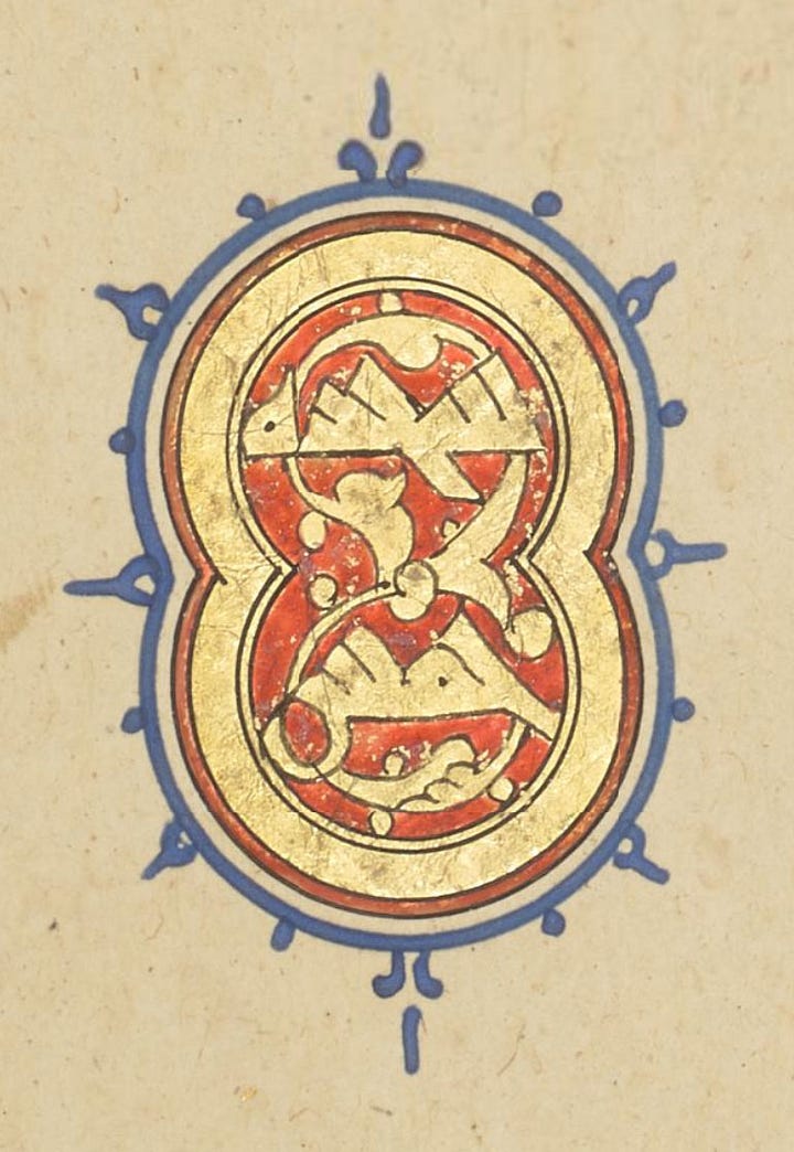
This is born out by the section marks, with one exception.
Volume Seven
The final volume is equally unsigned, but the calligraphy betrays Sandal’s hand! And it’s the most standardised of them all, with nothing we haven’t seen earlier.
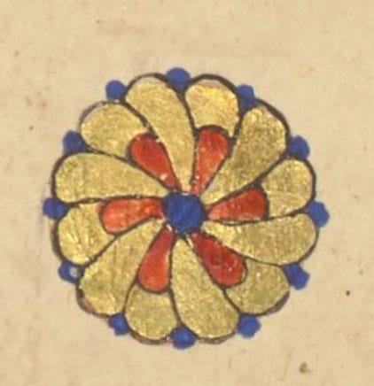
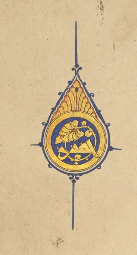

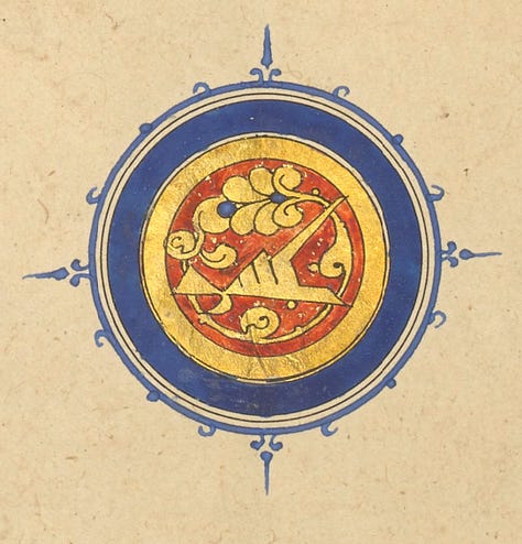
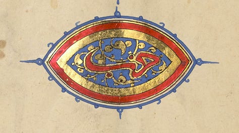
This completes our exhaustive survey of the verse markers across all seven volumes of the Baybars Qur’an! There are other aspects of it that deserve close scrutiny (I’ve only tantalised you with glimpses of the magnificent frontispieces!) so we might visit it again in future. I hope you found it illuminating (sorry) and inspiring.


I do not understand the writing (Arabic) but I love the artistry of the calligraphy and thank you for explaining the patterns in usage (such as the 'hidden' color codings) and what the materials and processes can tell us about the history of that book (which is also a work of art).
I’m becoming more and more fascinated with calligraphy. Thanks for sharing. Any book recommendations on the history of calligraphy?