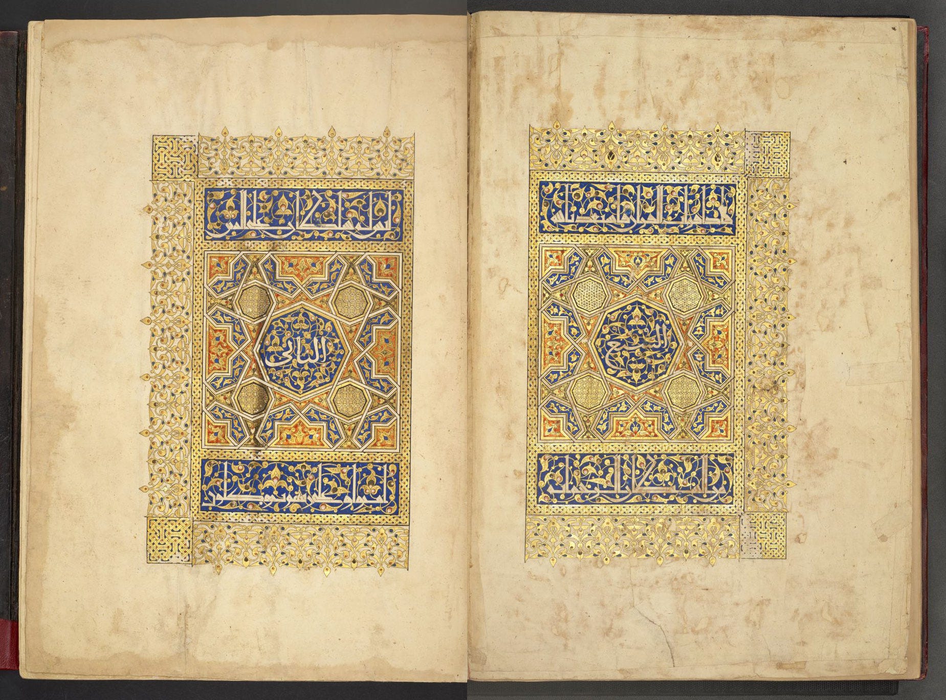
Earlier this week I visited the British Library with artist and illuminator Ayesha Gamiet to take a closer look at a very special book in the collection: the magnificent, seven-volume Mamluk Qur’an known as the Baybars Qur’an, after Rukn al-Dīn Baybars (later Sultan Baybars II) who commissioned it in 1304.
We were preparing a workshop focused on this particular manuscript for the School of Traditional Arts’ Geometry Summer School programme, and needed a closer look at some of it (4 of the 7 volumes) to see the materials and workmanship properly. Let me say in passing it’s such a gift that historical manuscripts, even such a precious one, are available for readers to access with so little fuss.
[All photos and details of the manuscripts are from the British Library’s own digitisation1. Studio photos are my own. Viewing this post in a browser is recommended so you can see the images full-size.]
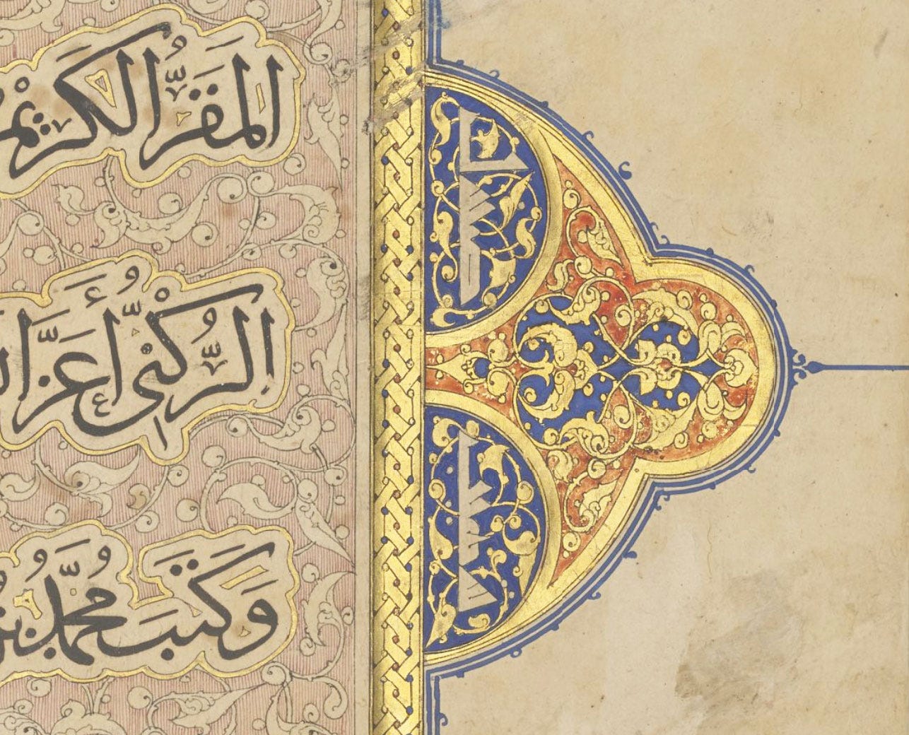
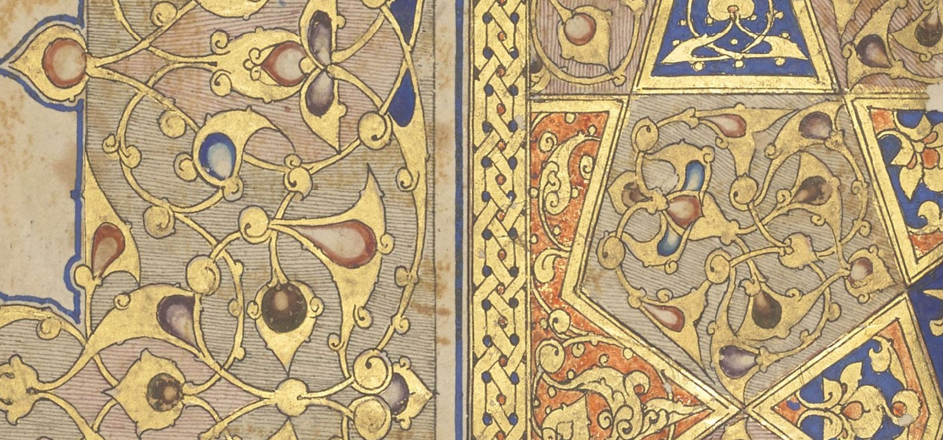
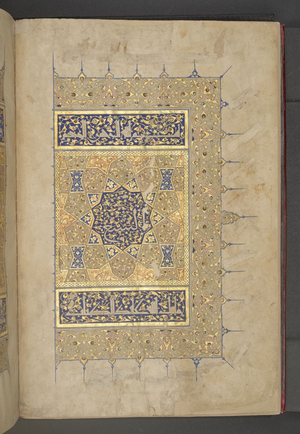
When we opened the first volume and landed on the fully illuminated opening spread, I gasped as a feeling of awe washed over me.
The manuscript is very large, about 48×32cm (18.8”×12.5”) and while its digitisation captures every detail in glorious hi-res, it cannot give any real idea of the way the gold glitters and colours shine at you and come to life as you turn the pages. No matter how intensely both of us had been exposed to illuminations, we were both quite overcome.
Our examination turned out so much more than we expected, and I then spent some time in the studio testing out those theories. This post is about what we observed and my conclusions, but I present this with the usual disclaimer that some of what follows is only educated guessing unless a lab analysis can confirm the nature of the materials (the reason this is rarely done is that it’s complicated, costly and often damaging to the book).
When examining an Islamic manuscript, the principle I go by (which may not be foolproof, but is my best guess with the info available to me) is that there is a core palette of materials that are consistently used in Quranic illumination, and while many more colour materials exist—particularly from locally found plants—this extended palette was not used for prestigious holy books: these were simply not the place for experimentation and cheap substitutes, and we can expect them to display continuity in using the best known materials.
So when I’m looking at this early 14th-century, Egypt-made volume, my framework is that all the materials are most likely part of this classical core palette. Before reaching outside that, I try to figure out if non-conforming colours are due to discoloration, which can be expected in such old works on paper, or simply to admixture. If I can.
Let’s explore the colours of the Baybars Qur’an, from certainty to mystery.
Blue
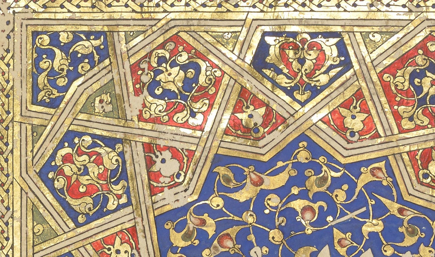
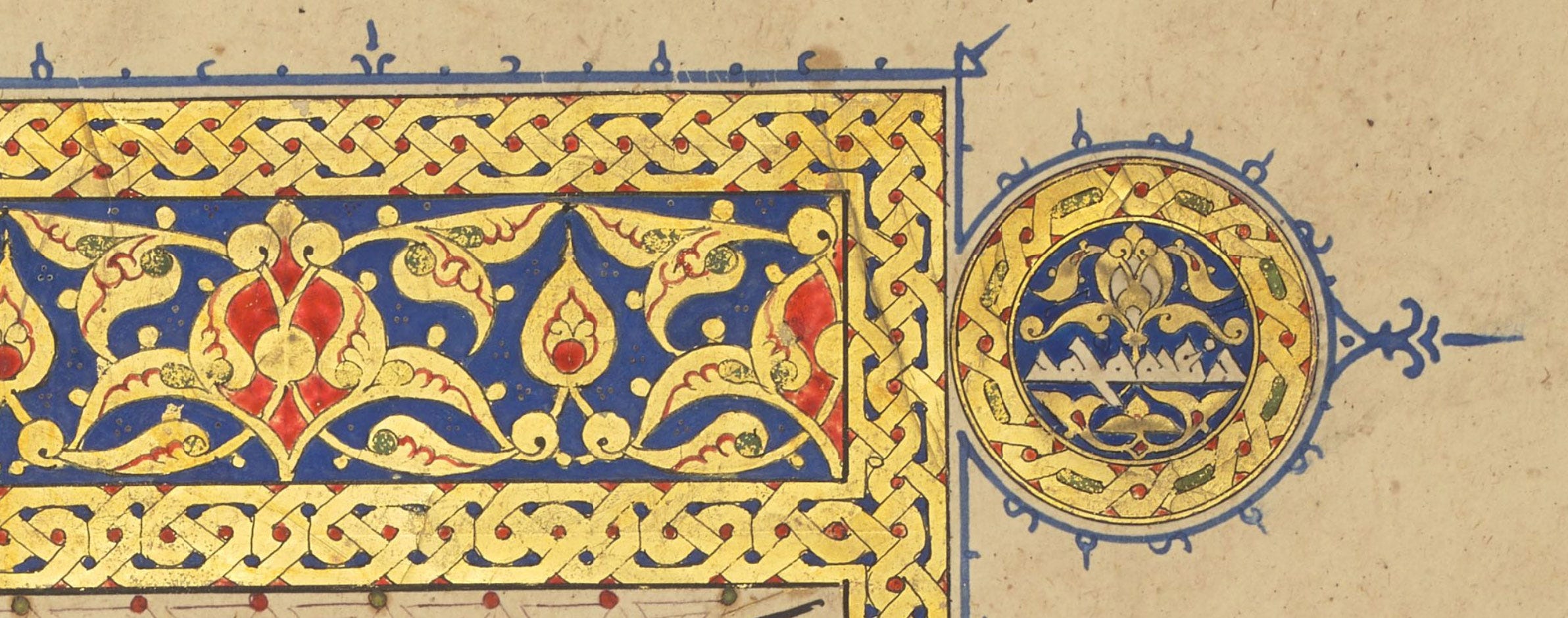
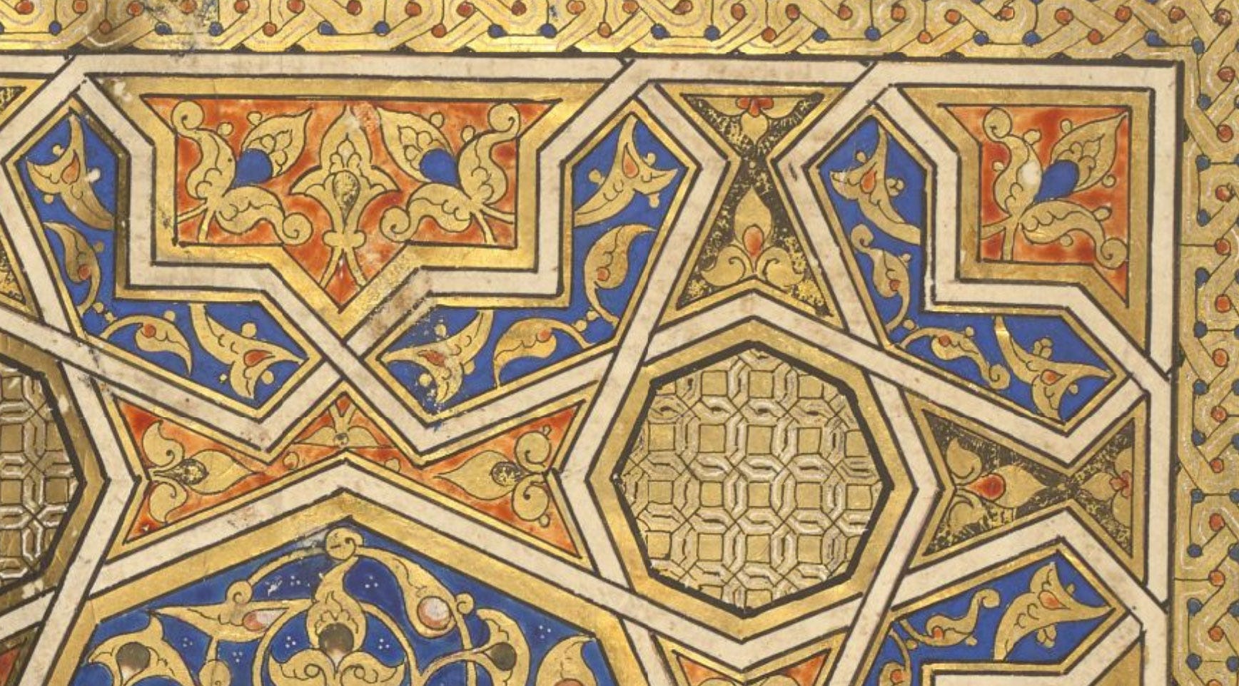
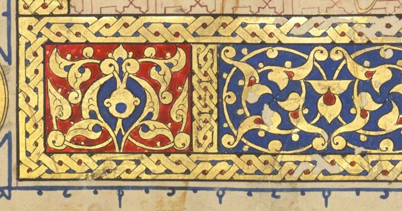
No guessing is necessary where blue is concerned: it’s always lapis lazuli, and there’s no substitute for it. The only other comparable mineral blue is azurite, and while it may have entered the islamic corpus later on, it has a greenish tinge and coarse texture that make it umistakable, and as far as I know was never used to flood backgrounds in the way we see here.
Gold
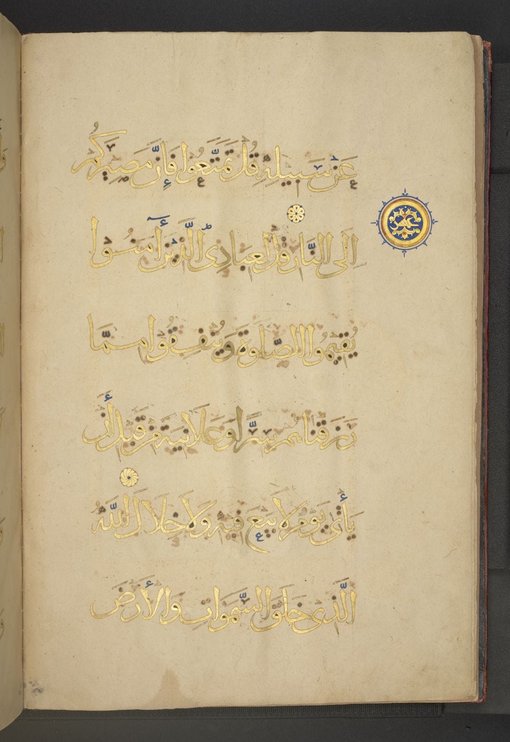
This Qur’an is entirely written in gold, and while there’s no question about the nature of the material, we had to wonder whether it was used in shell form or gold leaf?
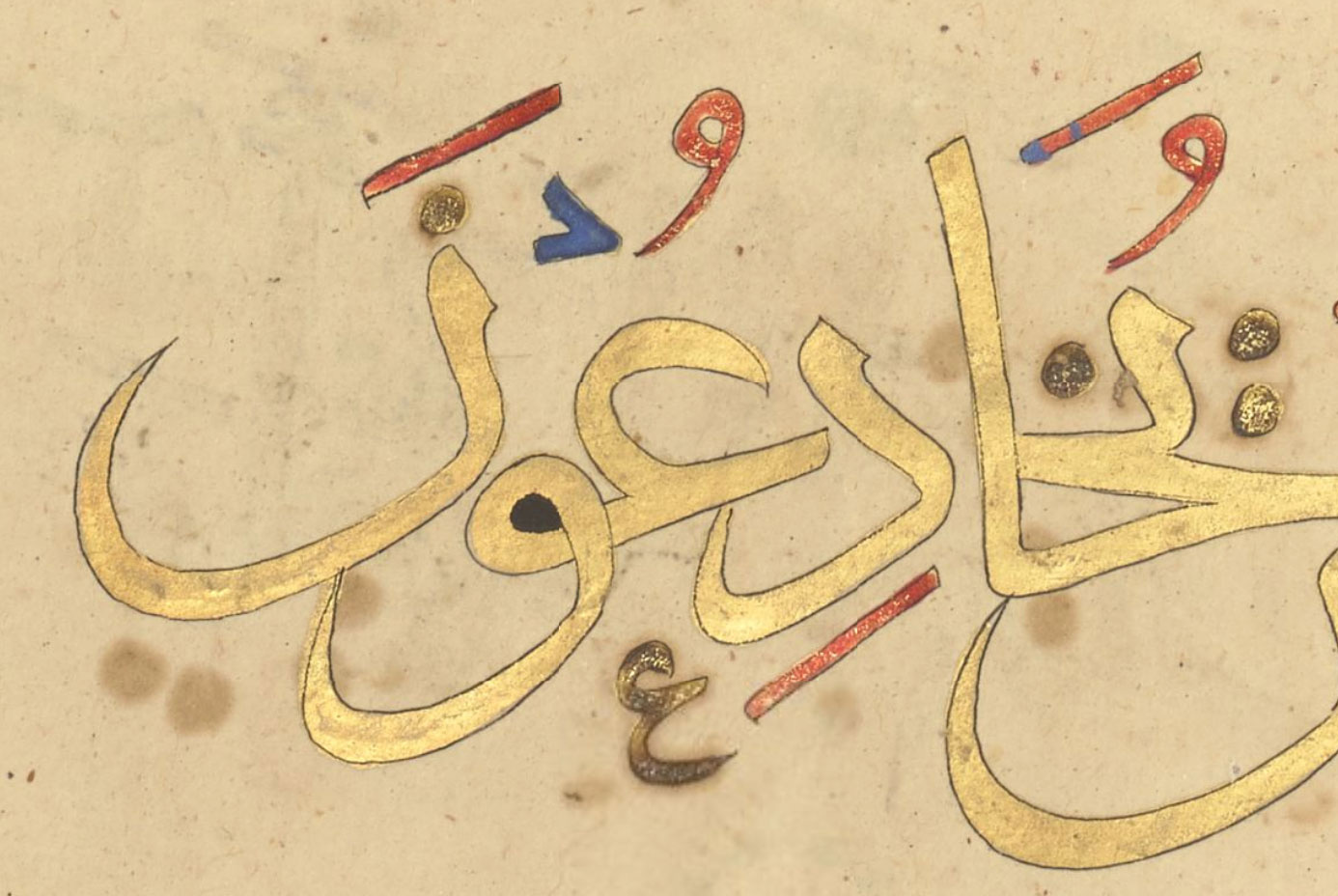
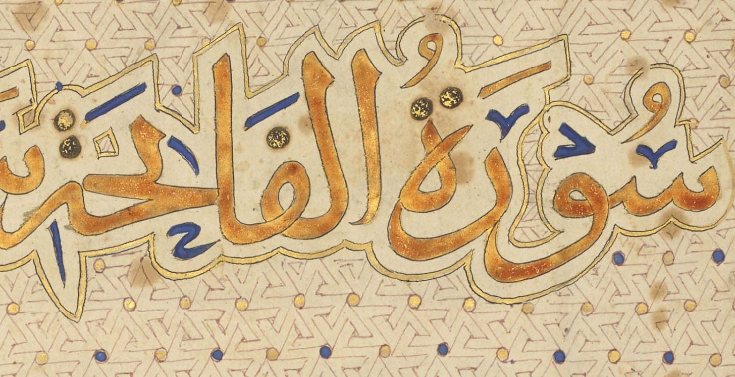
When very fine shell gold is used and the burnishing is very good, it’s truly difficult to tell the difference with the naked eye. Gold is self-soldering so if it’s applied in a highly concentrated way, the burnishing basically recreates a gold surface. We figured the text, where less burnished areas are sometimes visible, was burnished shell gold. The calligrapher simply dipped the pen in the finely ground metal, prepared into a fluid ink, and wrote with it, after which it was outlined in black.
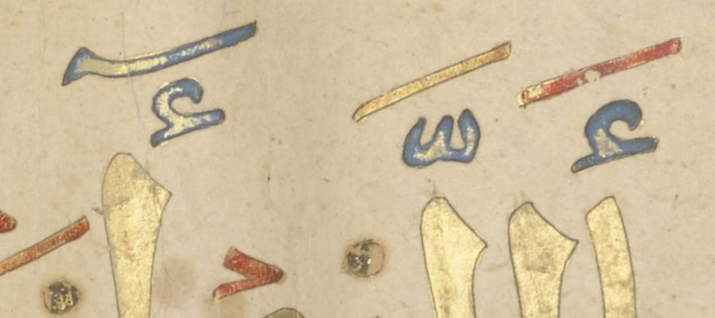
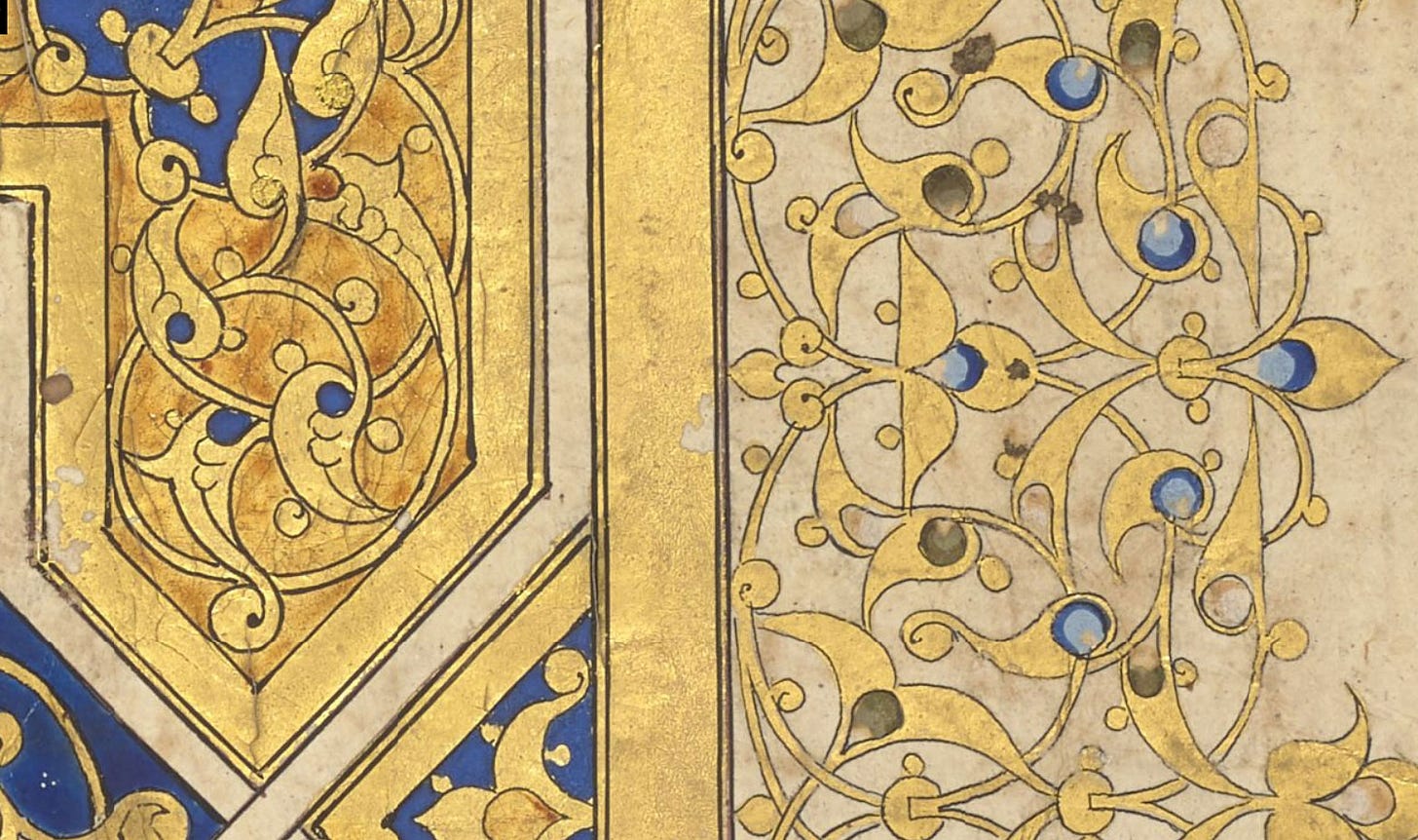
But the verse markers simply must be gold leaf: they’re so bright and shiny they look like hot foil stamping, or like freshly made, highly burnished, raised gold work. We couldn’t take photos to show the effect at an angle, but when the pages are turned they glitter like pieces of jewelry. Here’s a detail showing how solid the gold is in the markers:
And below, the bright white areas show where the gold was so shiny it was glinting under the lighting during the digitisation process (compare with the gentle, diffuse aspect in the letters above).
Another clue: The damage to the golden areas below feels typical of gold leaf, because entire chunks of gold are missing. This happens when the size onto which the gold is applied sticks to something and is ripped off the page, or perhaps dries out so that the gold leaf falls off. Shell gold is powdered gold in a binder; it can be scuffed and partially rubbed off, but it doesn’t come off in such large clean areas.
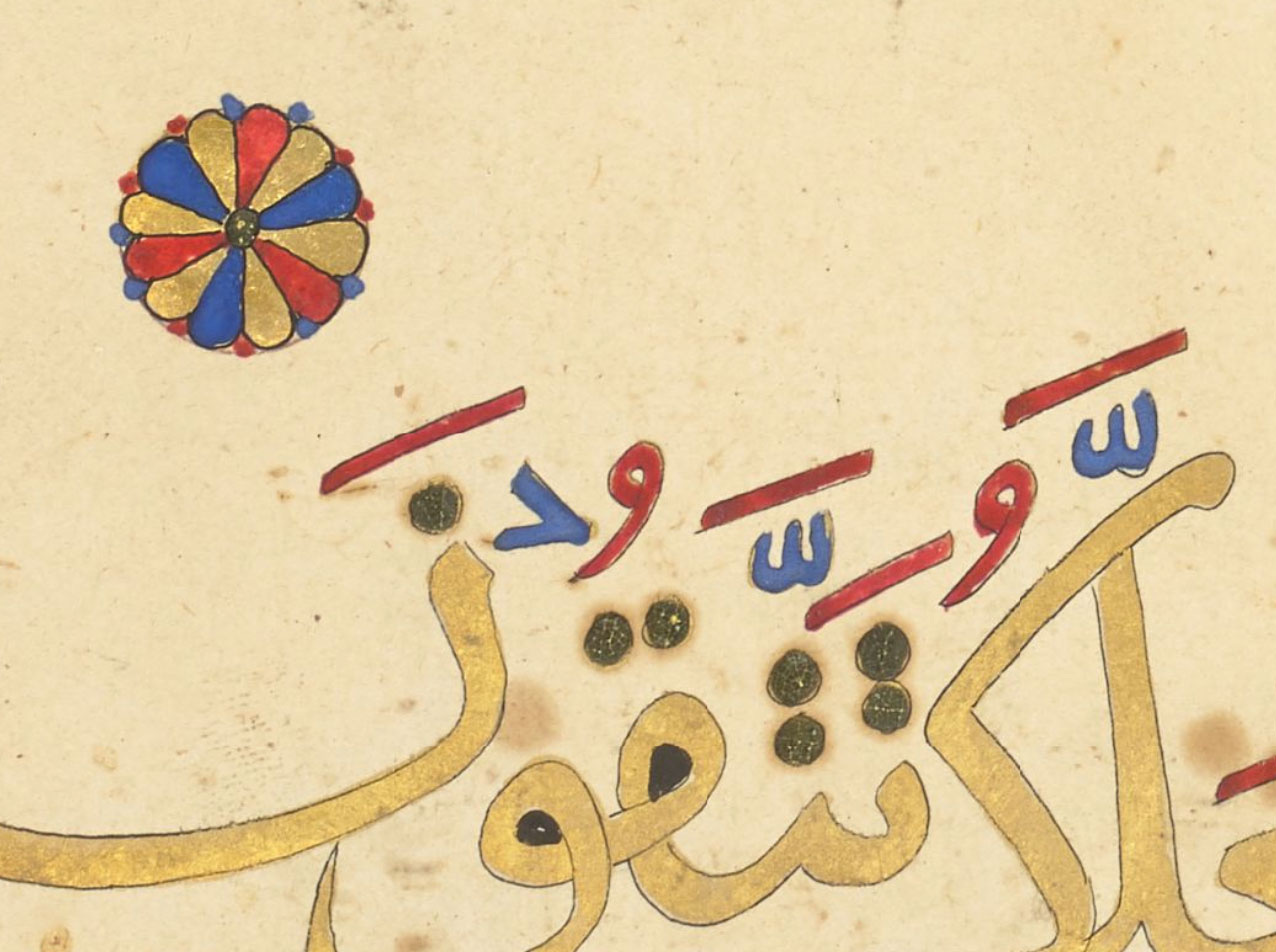
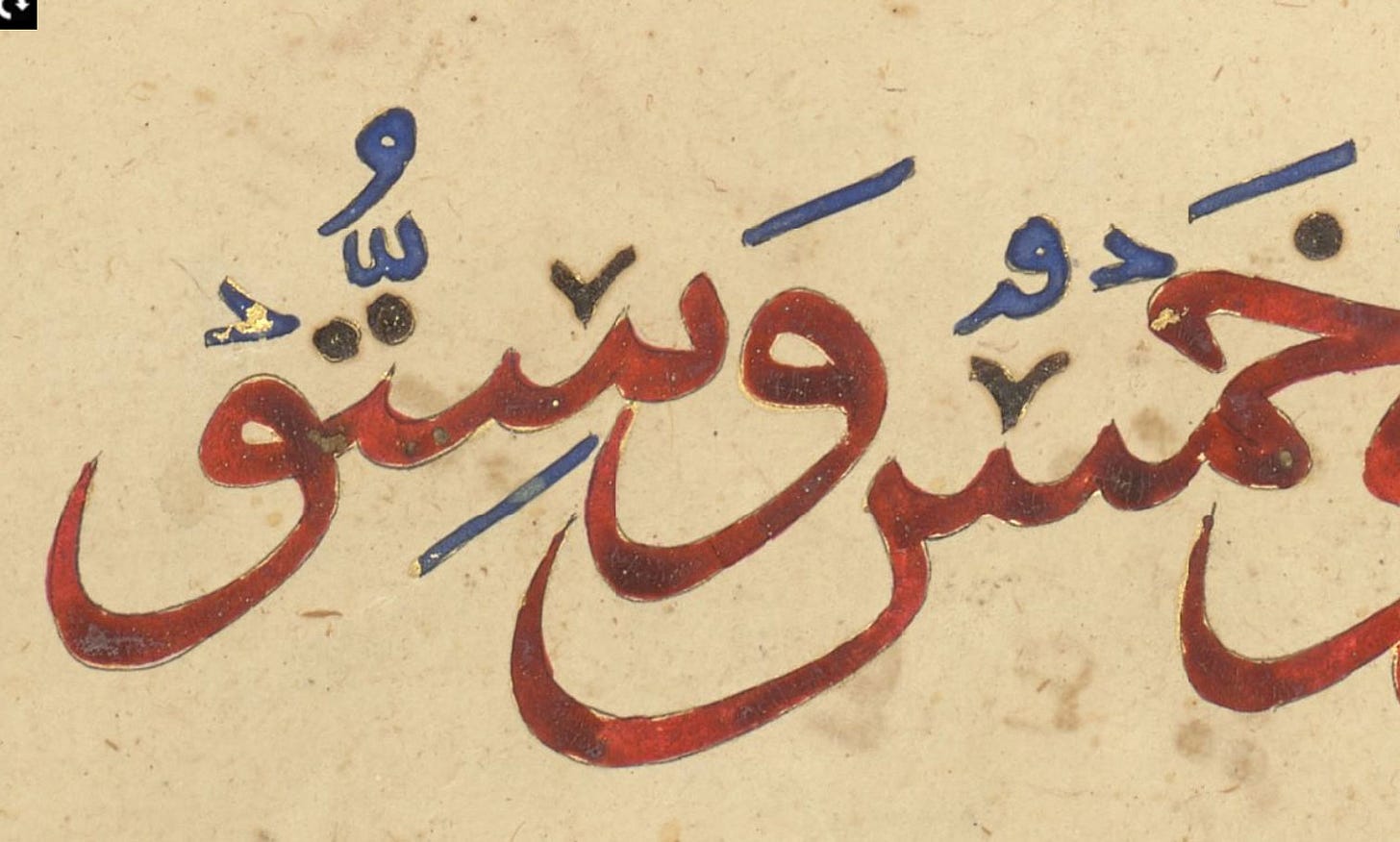
At other times, with only a small magnifying glass to help, we simply couldn’t tell which it was. Note, by the way, how the diacritics in the text are colour-coded. Although this is here done over the gold, it’s a display of the continuity I mentioned. Hold on to that thought, it will be helpful in a bit.
White
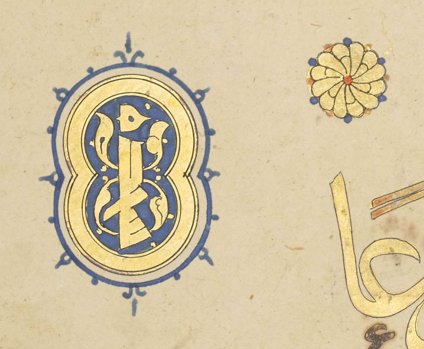
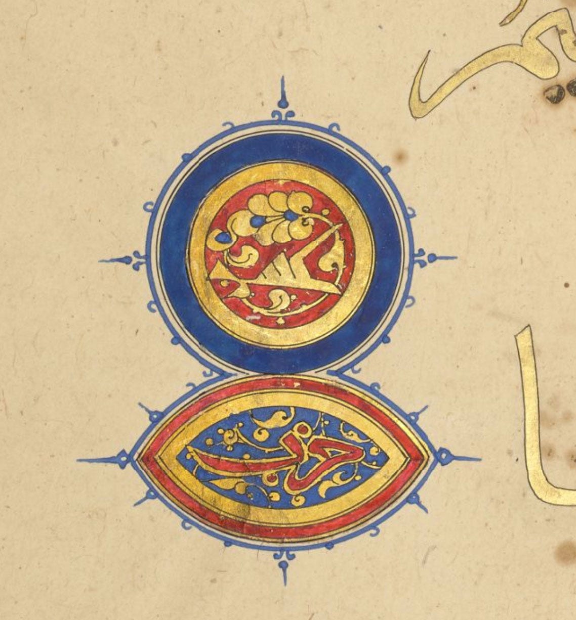
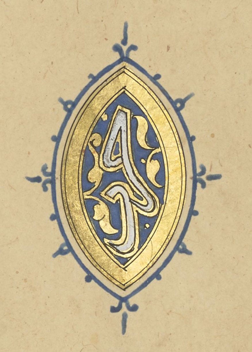
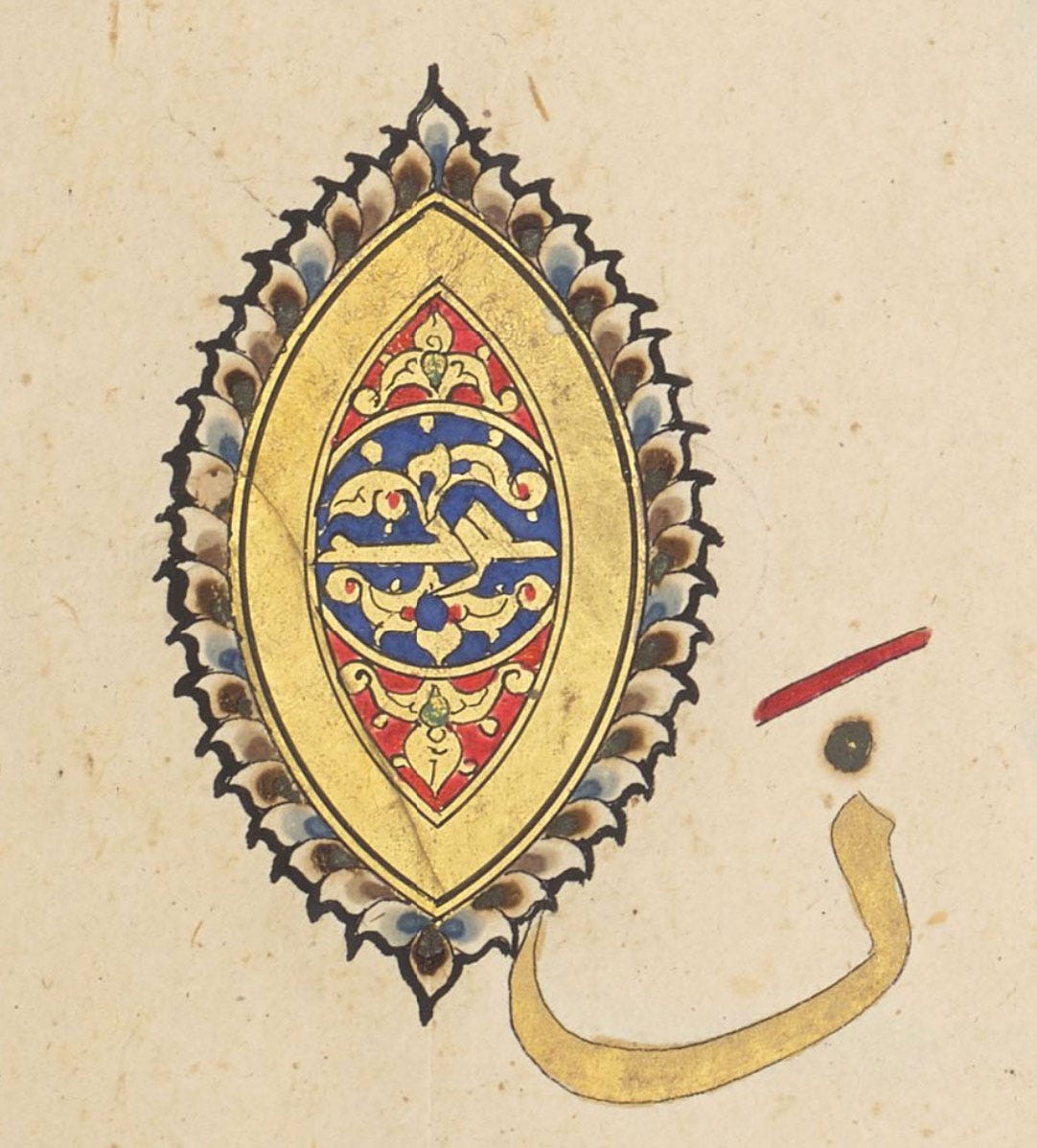
This is another easy one. You can barely see any white in the digital photos, where it sometimes looks like the white of the paper, but it’s there, filling some plaitwork bands, any white text (such as the illuminator’s signature, written vertically in white Eastern Kufi in the lapis lazuli medallions), and for the occasional detail. As it’s so opaque, I have no hesitation identifying it as lead white, as other available whites (chalk or zinc white) are far more transparent. Also, I think it has darkened in some small details, which is a signature of the lead-based type.
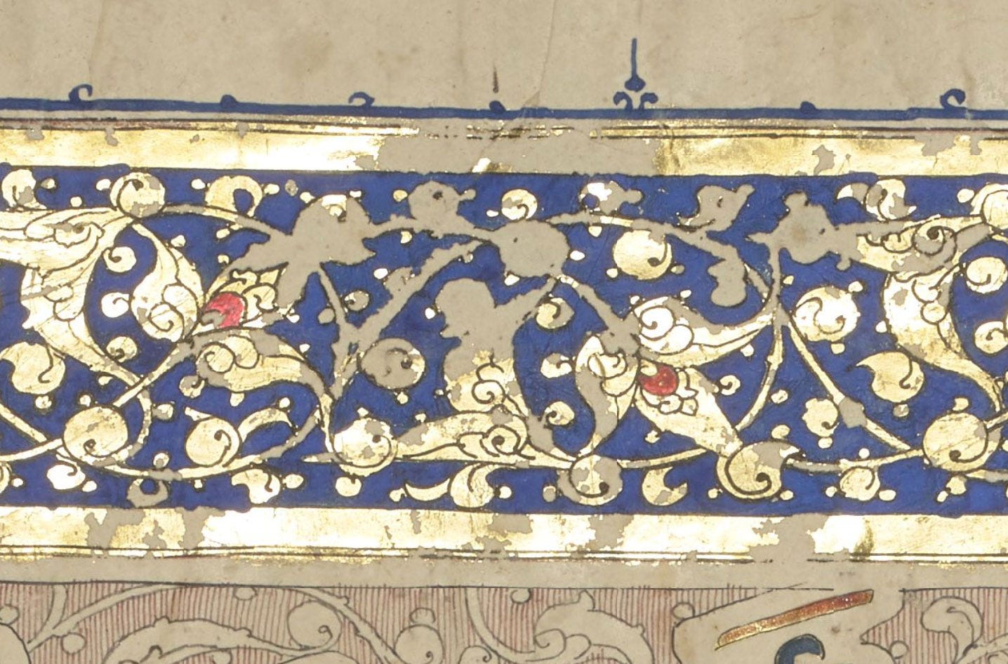
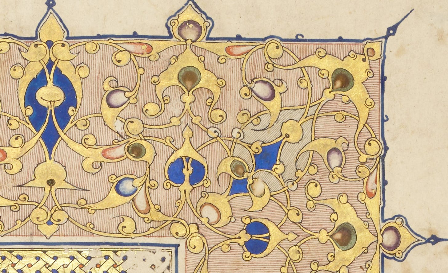
White is also very present in the outer bands of botanical decoration, where bud-like shapes show gradations of various colours mixed with white2. You’ll have no trouble spotting the lapis lazuli + white buds below; I’ll come back to the others.
Green
“What green??” you may ask, as this hue seems conspicuously absent from the 1,900-odd pages. Or, if you’ve been reading me for a while, you can probably guess where this is going. Let me start at the beginning.
When I first looked at the online images, I was troubled by the apparent use of brown in the decoration.
As far as the picture in my mind, formed by studying handbooks, brown was not a thing in Islamic illumination. It could be used to paint animals in illustrations, but on a decorative border? I felt very skeptical, and it was a driving reason for me wanting to see it close-up. In the first volume we examined, this colour was so consistent I briefly wondered if there was a chance it was simply a brown ochre, unlikely as that felt.
But a look at the text pages, filled with burned diacritics, announced loud and clear that verdigris was used there3.
Above you see burned dots where gold-backed green should be, and below, this Sura heading should have looked rather glorious in its original palette of enamelled red and green.
So could this “brown” sludge be just that? It was Ayesha who spotted the finest green crust on some of these buds, and after that we started seeing it everywhere.
In the last volume we examined, quite a lot of this green still survives, both in the munhani and on diacritics to finish confirming this guess. Here is a series of markers from that volume that all used green, arranged from best preserved to most deteriorated. You can practically see how it changed over time.
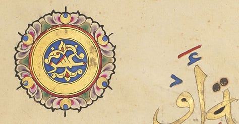
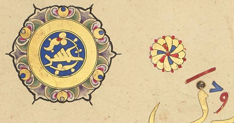
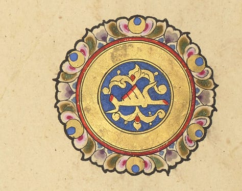
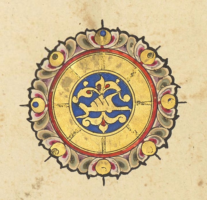
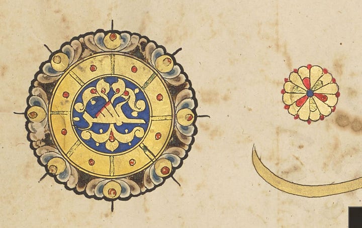
This is what I understand happened. We already know that verdigris is corrosive and will burn a paper surface, as can be observed all over the text. Verdigris is copper acetate, and when dry is crystalline and very brittle, as is gum arabic. Verdigris ink is a mixture of the two, and when applied over gold, is very fragile. In many places, it cracked and flaked off before it could attack the paper. We can still see surviving green on some areas of gold, but in most cases, where it has clung on, it has turned brown.
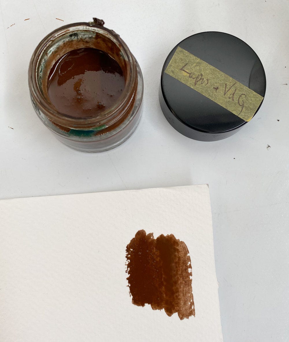
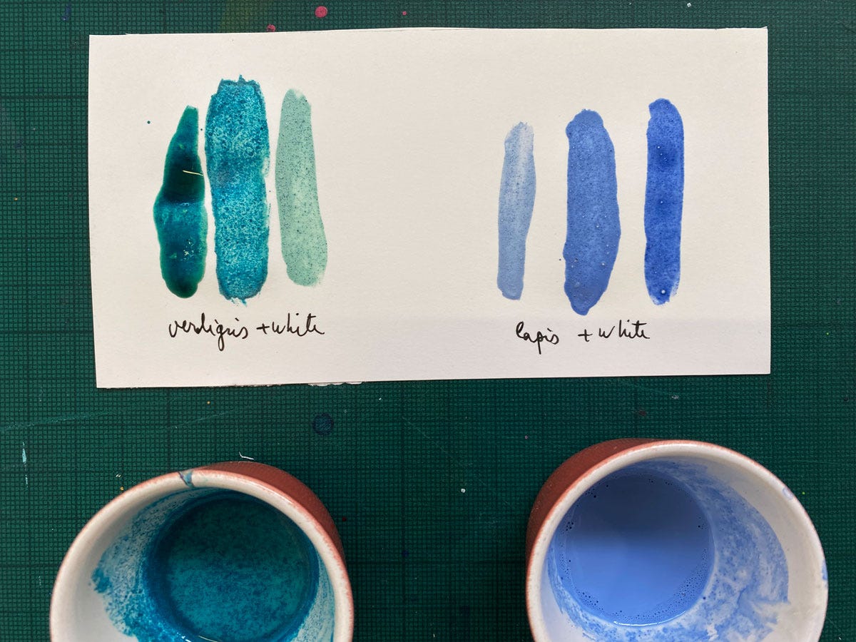
This can happen surprisingly quickly, so capricious is verdigris: I recently prepared a verdigris-lapis mixture for a colour workshop, which produces a lovely turquoise colour – but is evidently meant to be used immediately. I stored it wet for a few days and that was enough for the whole thing to turn brown.
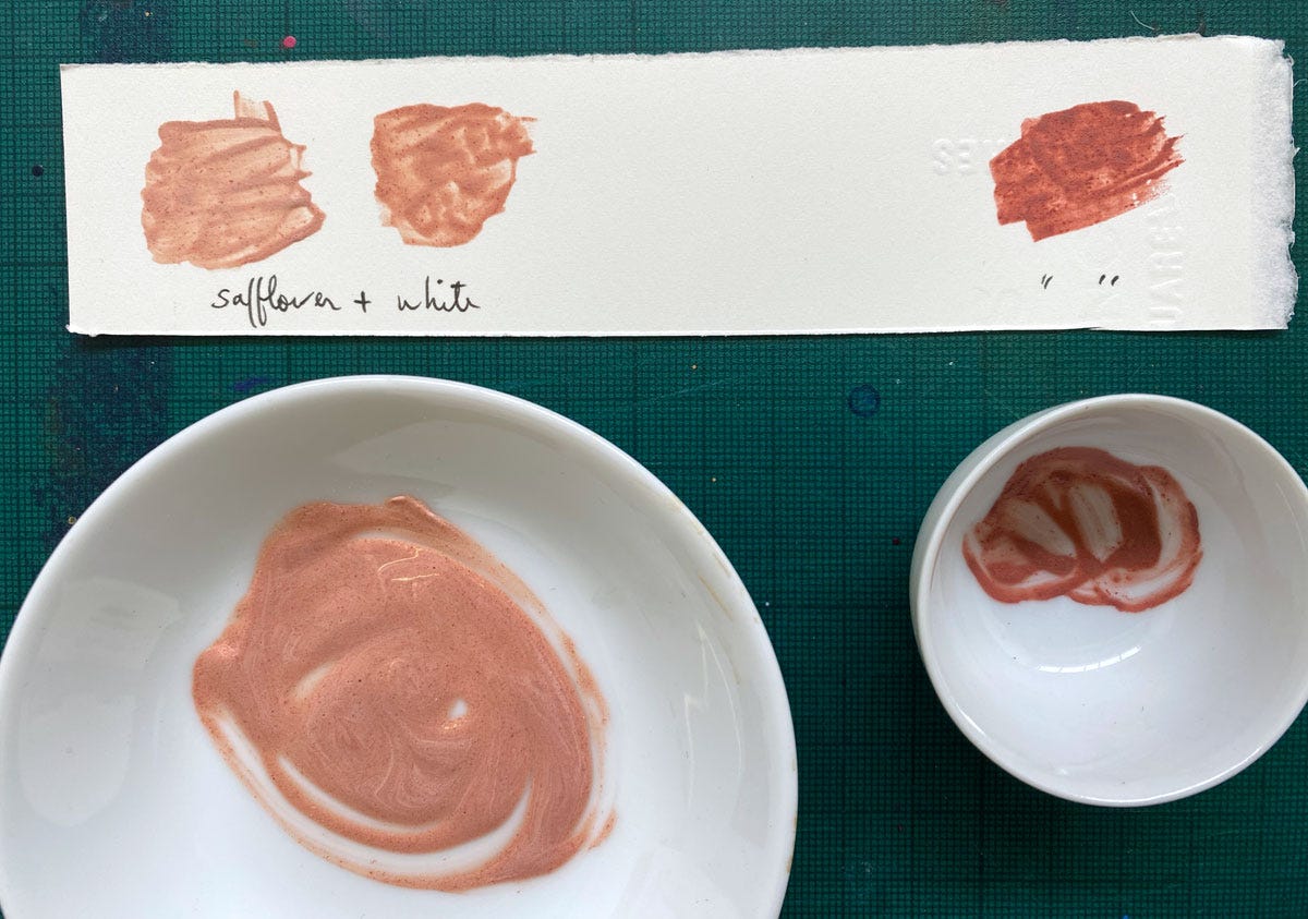
Where verdigris was mixed with white to colour the buds, it didn’t flake off: lead white is very soft! The white has both protected the paper from being burned by it, and softened its brittleness. So in those places verdigris has survived very well, structurally, except it has completely discoloured, skewing the decorative palette for the entire book. Originally its mixture with white must have looked something like this:
The surviving green in what is the first volume gives us a much clearer idea of what it must have originally looked like, and it still shows a brownish halo to confirm what happened to the rest. Below, where pure verdigris was applied over gold, enough of it survives to show the original core palette.
Red
This is where it gets tricky. I was specifically ask to identify, if possible, the red that is used so prominently in the pages. There are a number of reds in the corpus, some mineral and some organic in origin. The former are opaque, and the latter are transparent, so it was, at least, immediately clear that mineral reds could be ruled out for any application over gold. In fact, I could be wrong but I don’t think any mineral red was used in the Baybars Qur’an at all.
It was easy to identify one of the two main reds. You can see it in action below:
It’s a lot more peachy than red, and it can even be much lighter, or perhaps fade to a lighter hue:
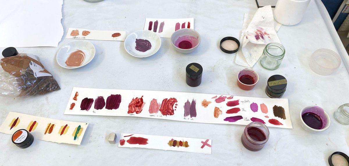
This delicate peachy or buff-leaning red is characteristic of carthamin, the red colourant extracted from safflower, that I wrote about at length in a previous post. It’s a very delicate botanical colour, extremely light-sensitive, but also strongly affected by alkalinity when it’s extracted. Use just a bit too much soda ash and it’ll be more buff than red. Below are two grades I prepared with two slightly different recipes. You see them here mixed with white as I suspect one of the munhani hues in the buds was prepared with carthamin (the paler one looks like it could be a match).
If you prepare it right, you can get it as intense as seen on the marker below. I suspect, without being completely sure, that this is carthamin; but you wouldn’t be able to use this on large areas as a more intense red necessarily implies a much smaller yield.
Please note I don’t at this point have Mamluk ink recipes, so if a specific way of preparing this and other reds has been recorded, I’m not aware of it (I’m still working through earlier texts). To prepare these I’m using the earlier methods recorded and my own experience to modify them till the result looks like a match.
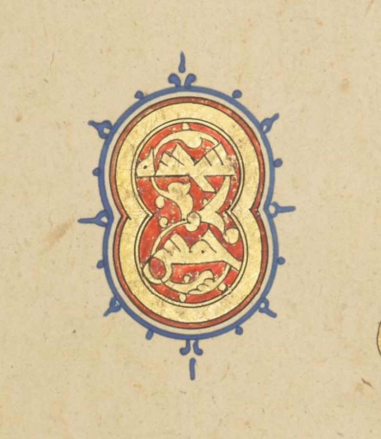
The other red is much more intense:
While this intensity is easy to see in the digital version, what isn’t visible is the purplish tinge that we couldn’t miss in person. This points to an insect origin, most likely lac, the secretion of kerria lacca. Lac is abundantly used in the Islamic tradition, going by how much it features in handbooks, and it has definitively been identified as the red of the central cartouche on this page of the Ruzbihan Qur’an.

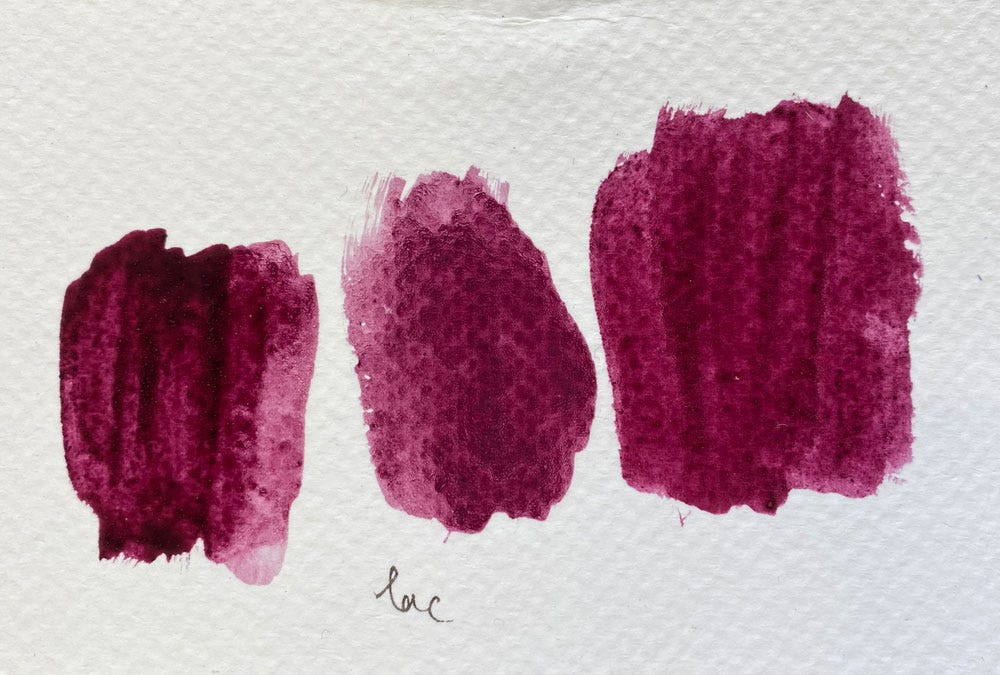
You can see it’s a similar shade of red, so there’s no doubt that this pH-sensitive material can produce it. I have not managed to get it this red in time for this article; even when extracted with alum for this purpose, it’s coming out much more purple, below (and it got even darker since then, because of the alkaline paper surface).
I’ll be trying it again with a lot more alum in the pot to raise the acidity sufficiently. In theory, that should be all that’s needed. But organic matter is organic matter; for all I know the age of my stock of raw sticklack has a bearing on the final result. There are so many variables!
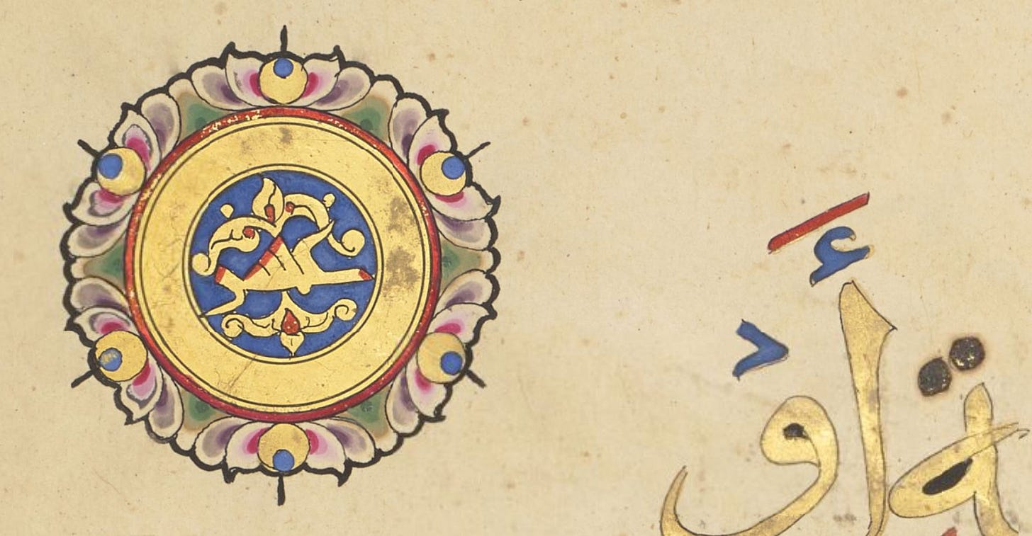
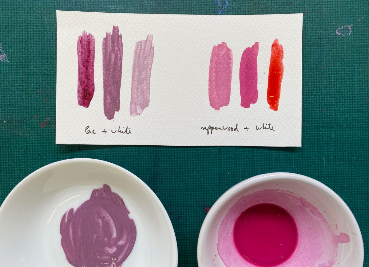
But there’s also a chance a mixture is used, or at least could be used. The reason I’m considering this is there’s one more source of red in the corpus. Can you see the crazy bright pink in details of the verse marker below? Lac cannot produce this; when mixed with lead white it makes a duller violet as its chemistry is affected (I’m fairly certain this is the violet you see in the petals immediately next to the pink). No mineral red can do this either. This artificial-looking brightness is a signature of sappanwood, also known as brazilwood.
Easier to show you:
You can see here that sappanwood on its own, the way I extracted it, is a really bright scarlet, too orange to be our purple-tinged red, but mixing it with white produces a fucshia that is convincingly comparable to the detail above.
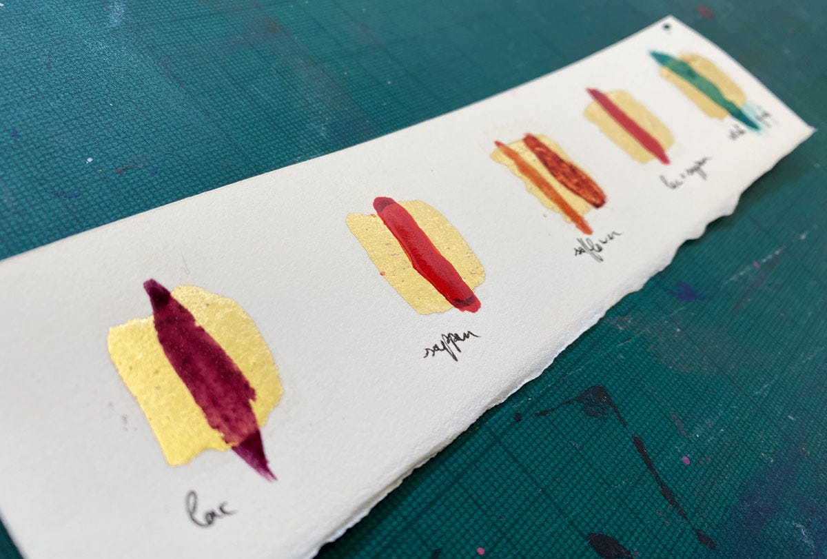
So we know our illuminators used sappanwood, and we know they most likely used lac, and I happen to know of an ink recipe4 that uses both together. And I have to say this mixture makes an easy and convincing approximation of the red we observed, an intense crimson with just hints of purple. To give you an idea of what these colours must have looked like originally, painted over gold, I made the sample below.
The gold naturally intensifies the hues by reflecting light through them, making them look enamelled; and it also makes them yellower and brighter than they would look on the off-white paper.
Our investigation continues, and there’s more to share about details in the Baybars Qur’an, but this post has already turned into a monster so let’s end here for now!
You can leaf through each of the individual volumes: Add MS 22406; Add MS 22407; Add MS 22408; Add MS 22409; Add MS 22410; Add MS 22411; Add MS 22412.
Ayesha identified this as the technique later known in Ottoman illumination as munhani. I’m not sure what the Mamluk term would have been.
Continuity suggested it must be. In a nutshell, vocalisation in Qur’ans started out as a simple set of red circles, which were then supplemented by green, and when necessary blue and yellow in this order. When the diacritics became fully differentiated, the colour hierarchy carried on for a while. It’s particularly visible in Eastern Qur’ans and you can see it in my reconstruction of the “Qarmatian Qur’an” layout. Red always comes first, but green has priority over blue, so the use of blue and red strongly suggested there must also have been green.
From Umdat ul-Kuttab, my next translation-in-progress. The recipe is included in Inks & Paints of the Middle East, p60.






Geometry Summer School!!! Be still my heart! This is now on my list! Will you be there next year as well? 🥰❤️
What a fascinating deep dive!