All photos and diagrams in this post are my own. New subscribers please note that articles are free to read for 4 weeks before they go to the paid-subscribers archive.
In my first glimpse at the well-wishes running through Alhambra, I focused on Baraka. Today I’m highlighting three more such words, and I have to specify these are not unique to this space: elsewhere in the Islamic world, words of blessings were routinely written on objects such as ceramic dishes, inkwells and above all metalware. The list of known words is long, and varies with the intended receiver!
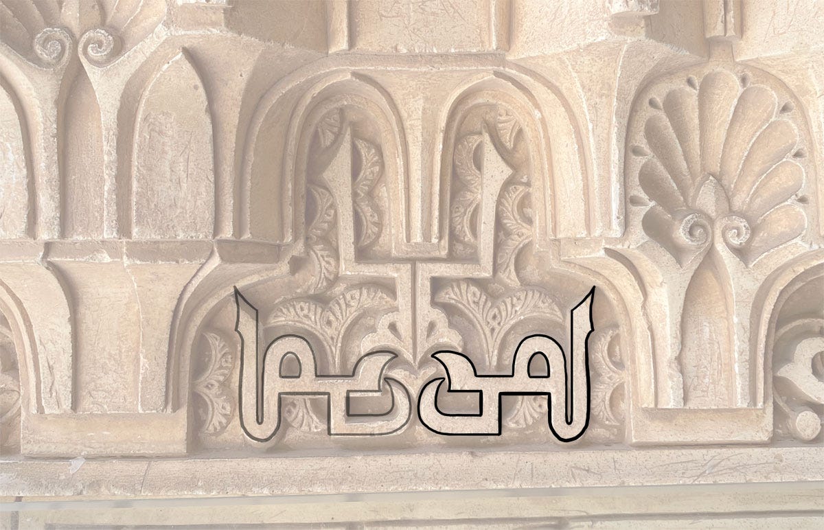
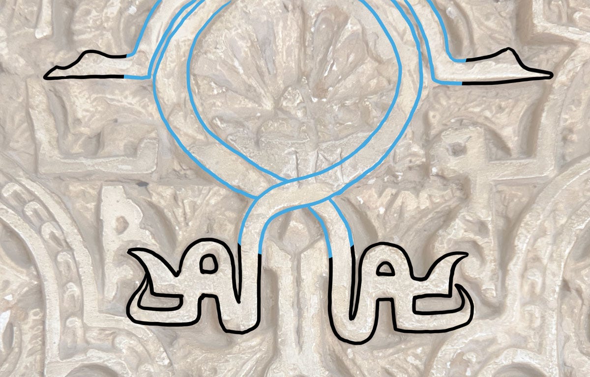
The next most common word after Baraka, possibly because it's so short and simple you can insert it anywhere, is Yumn يمن (good fortune).
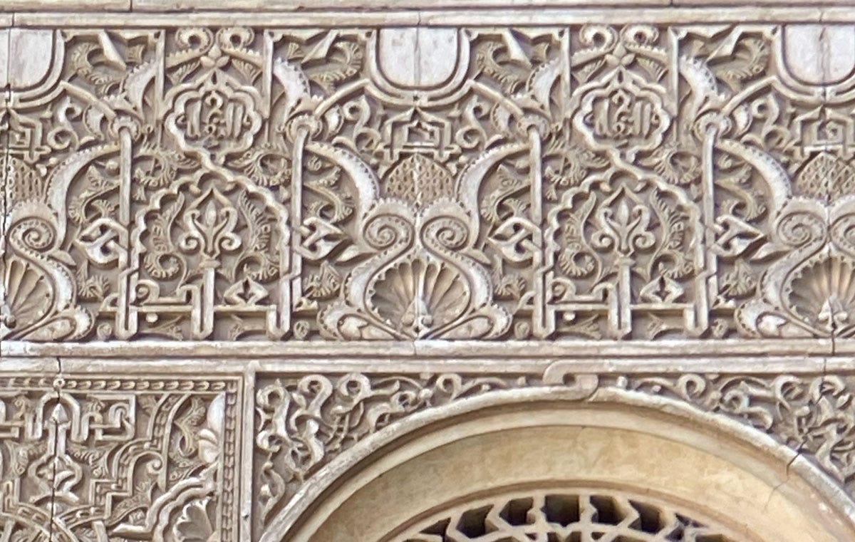
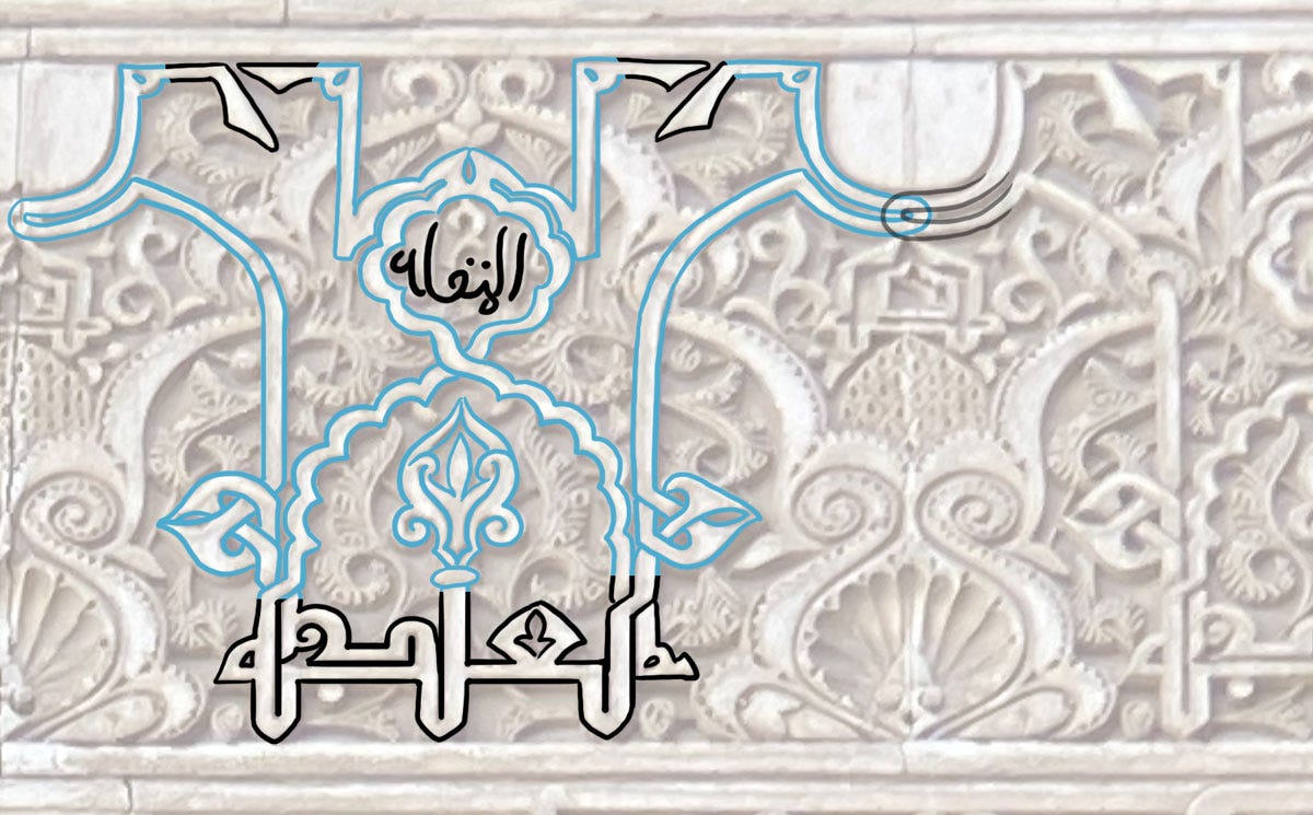
The absence of tall letters is a bit of a drawback, but fake shafts can be inserted, as in this instance.
The alif-looking shapes between this pair is purely graphic. This practice of inserting fake shafts for aesthetic purposes is widespread in architectural Kufi inscriptions1.
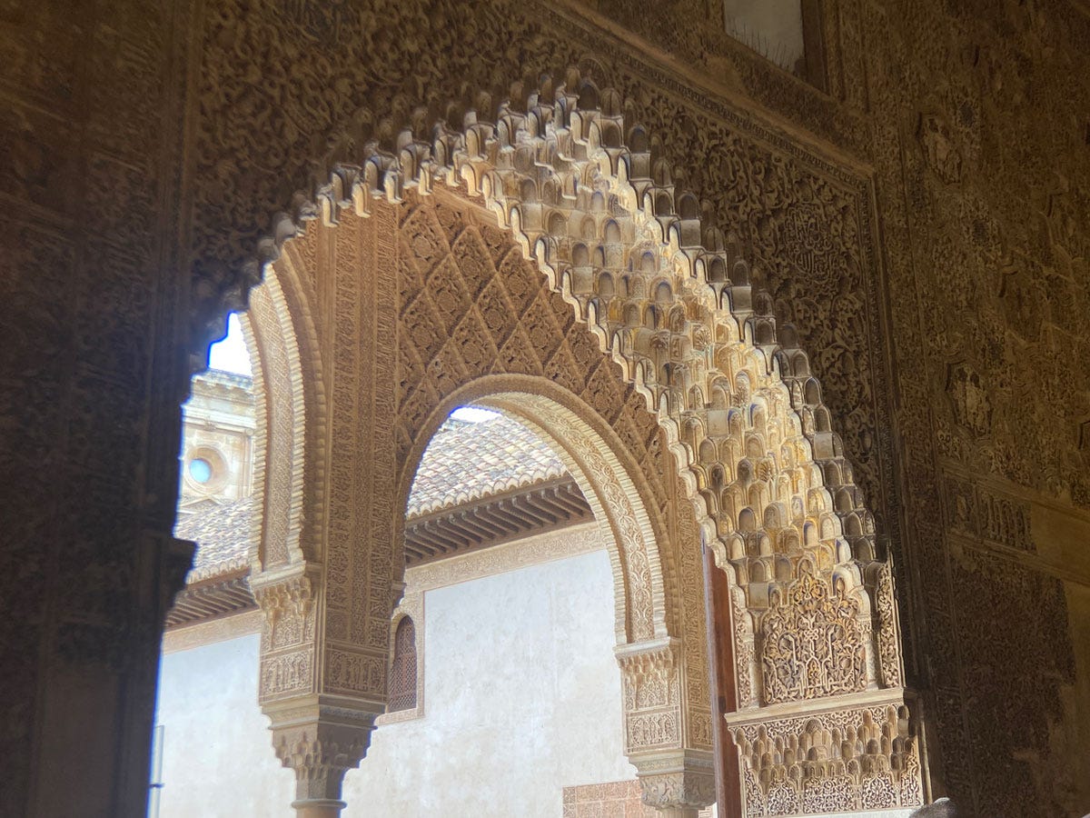
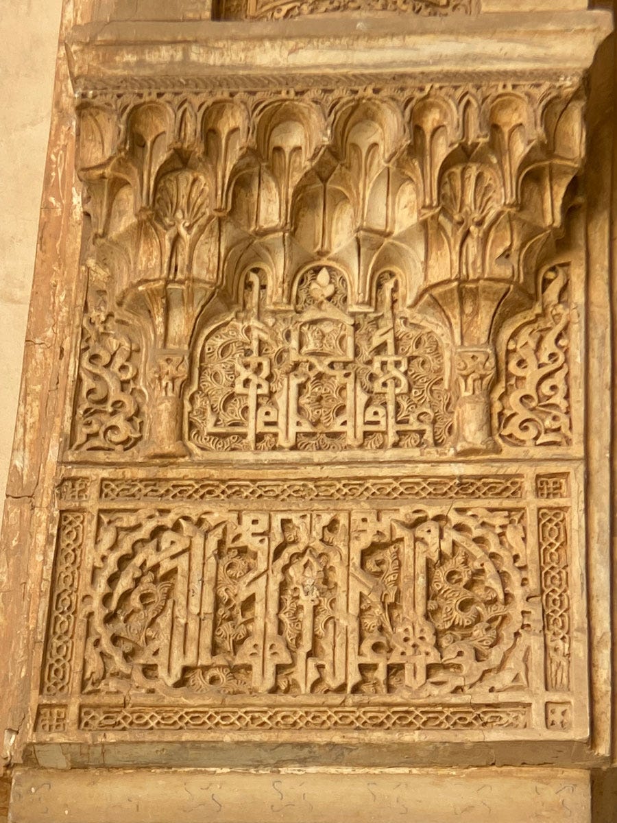
Without inserts, that initial short letter has to do a lot of heavy lifting to stand in for tall letters. See the very top of this photo – Yumn is slightly cut off because I didn't even notice it while I was taking the picture.
This is particularly the case below (where again the picture is cut off because in the moment, I didn’t realise how far the letters extended).
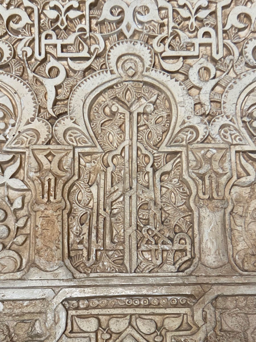
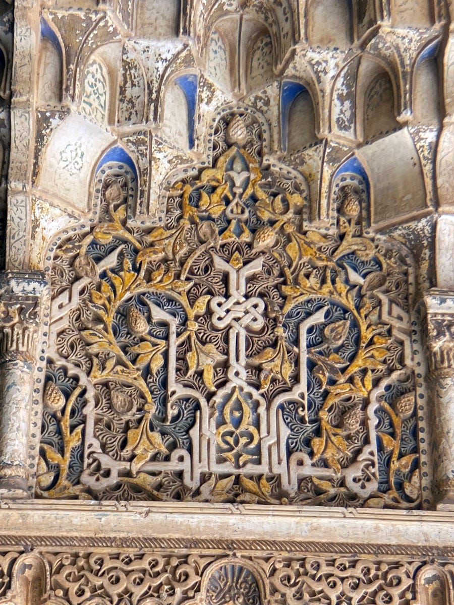
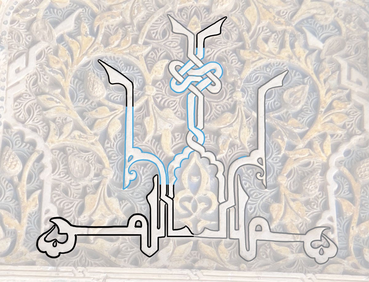
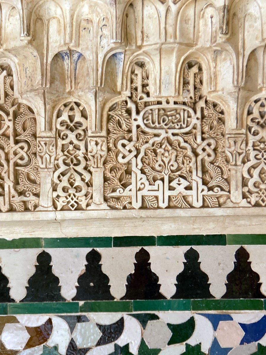
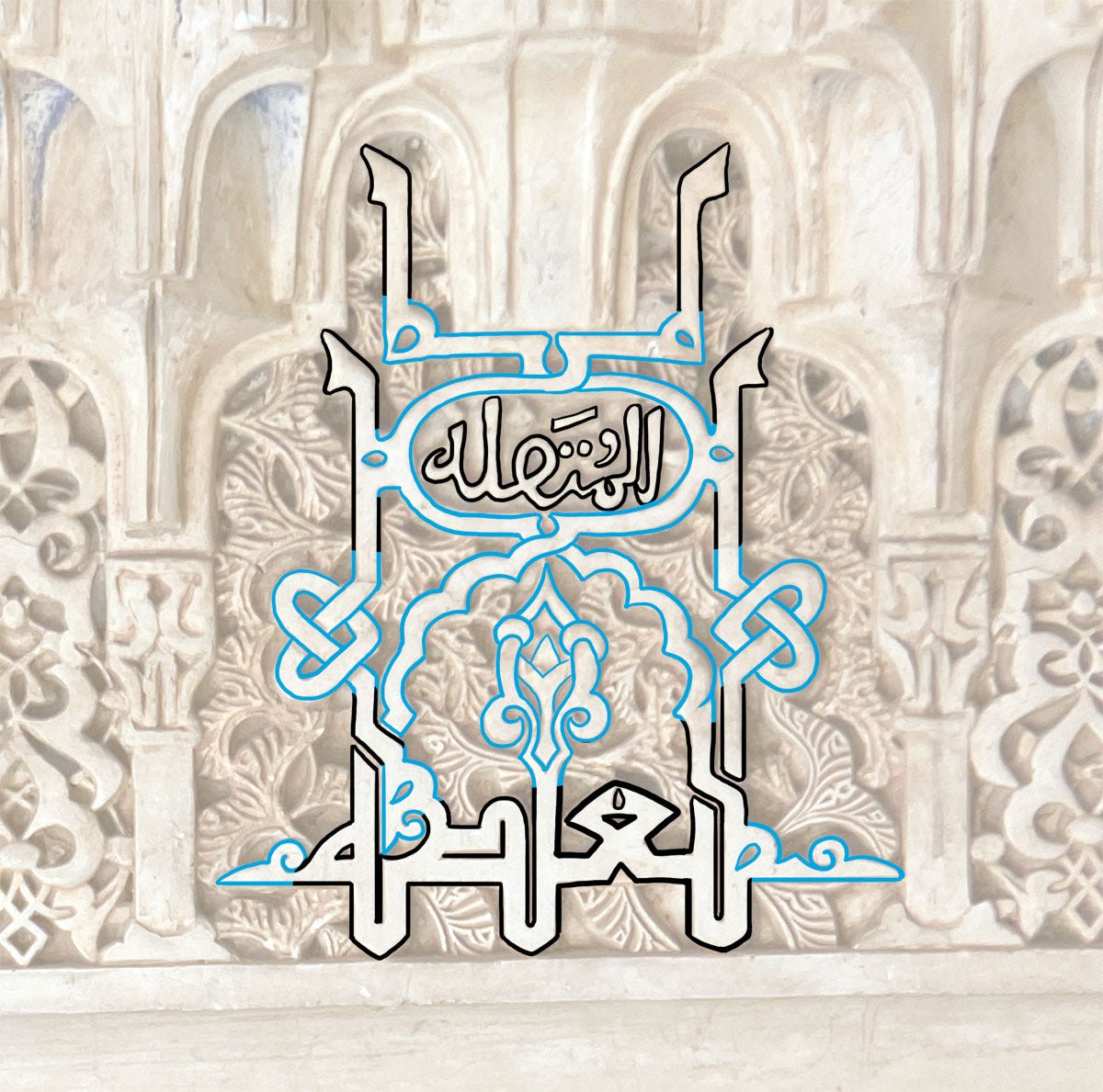
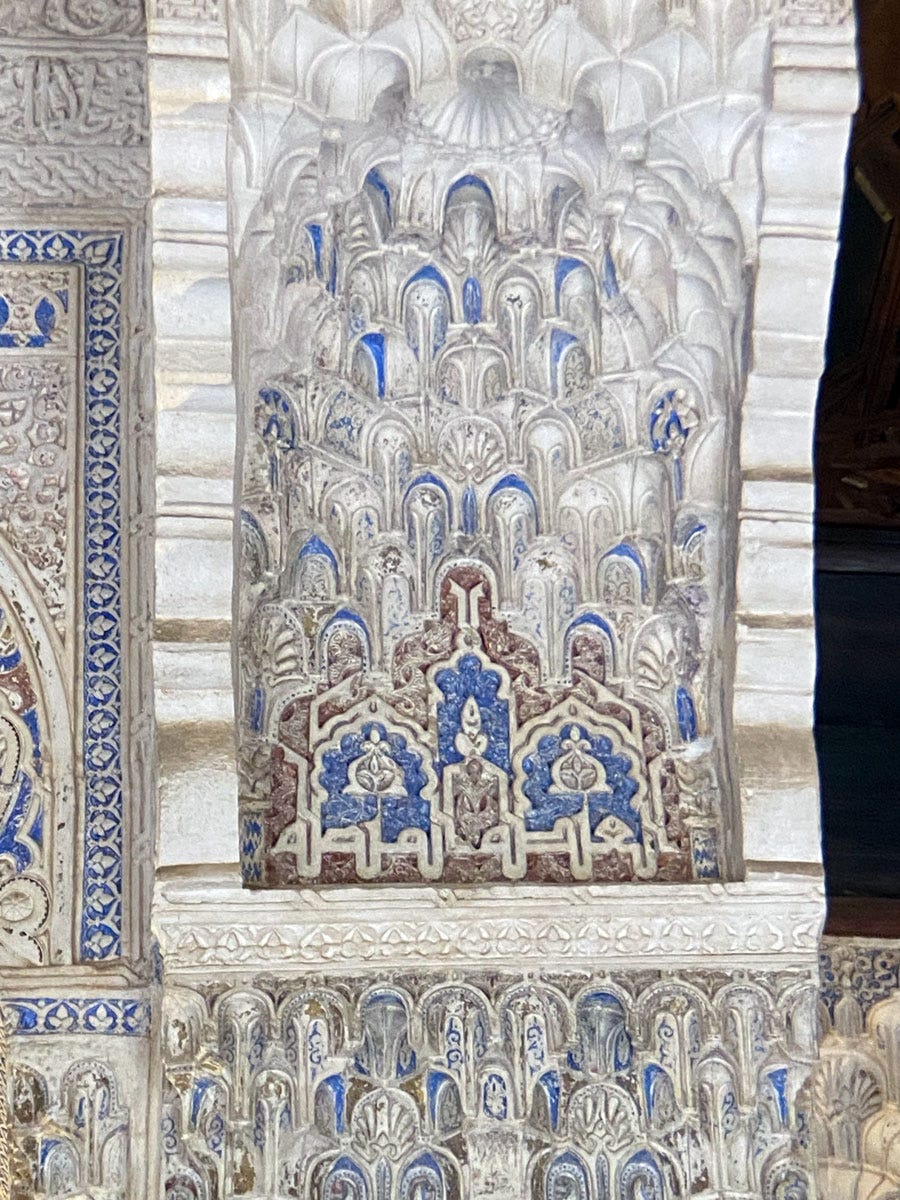
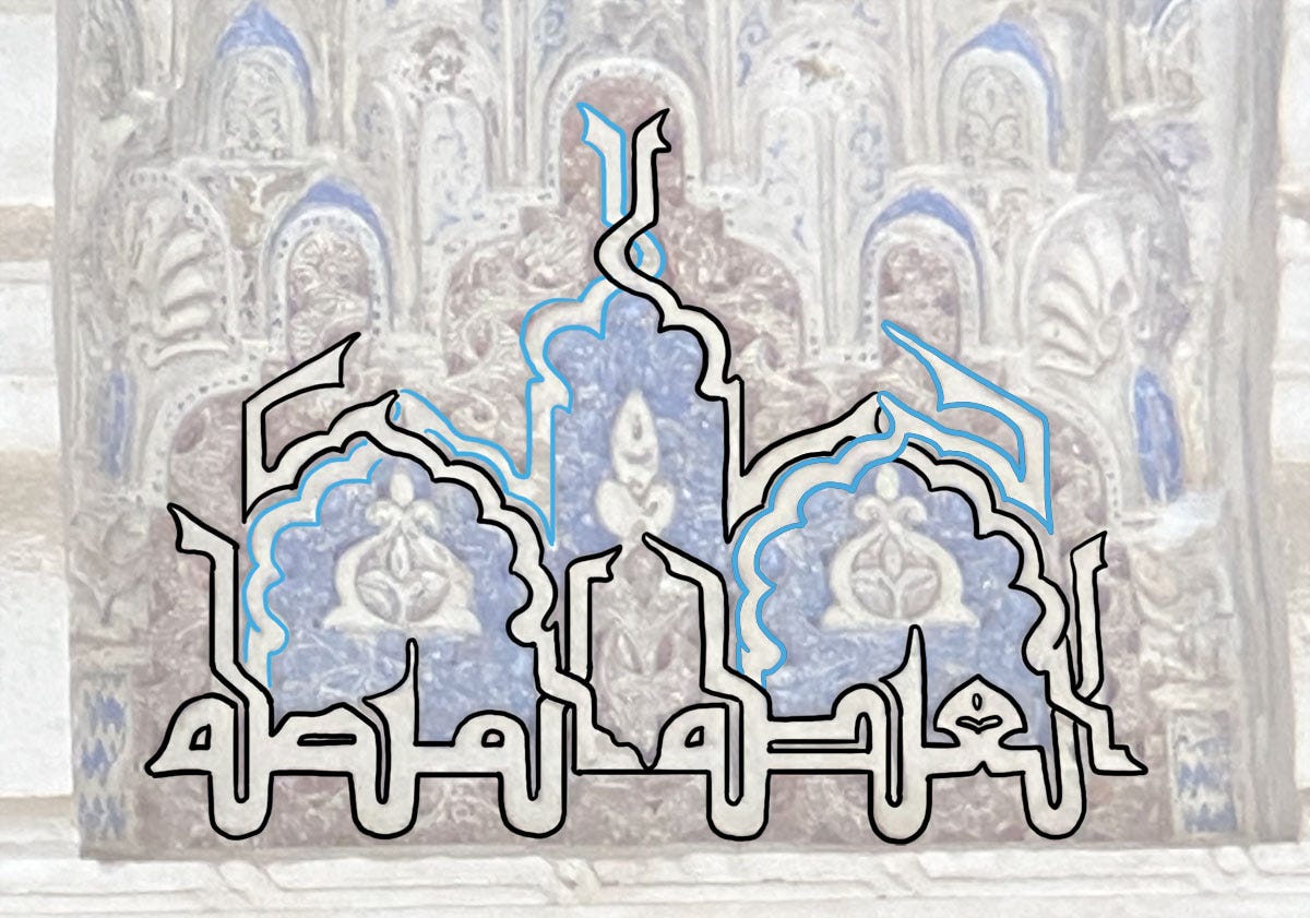
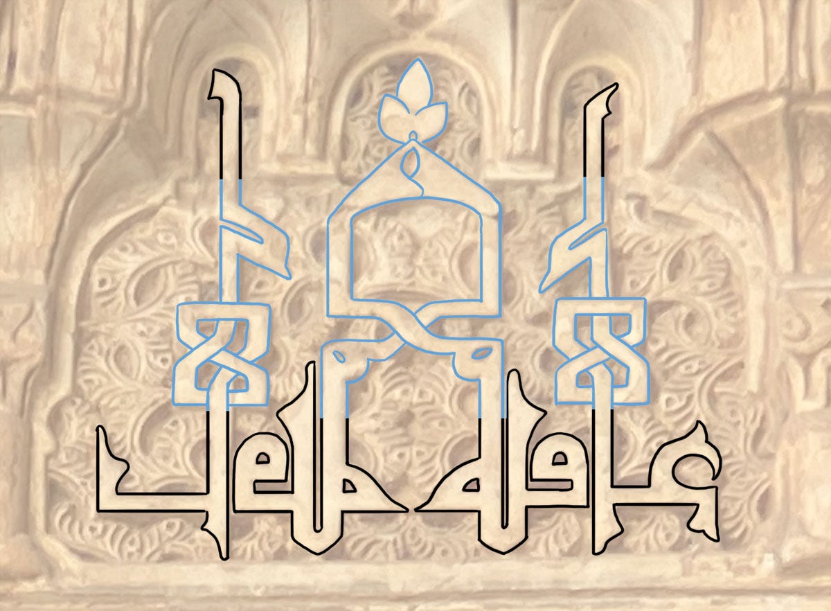
As ever, though, the article al- can be introduced anytime to add more complexity – and how!
The deconstruction shows quite a complex composition, even when you leave out the two outer shafts, which are graphic inserts. Note the special detail: the highest part of the design, which is meant to be the top of the two alifs, is a separate piece, integrated through a bit of knotwork! Very creative!
The next word on the list is Ghibṭa غبطة (“felicity”). Now one feature about blessing words I haven’t mentioned yet is that they’re often accompanied by a qualifier. From observation, the qualifier follows these criteria:
Basic: Qualifier makes sense.
Advanced: Qualifier makes sense and rhymes.
Boss level: Qualifier makes sense and rhymes and is visually similar.
For Ghibṭa, it’s muttaṣila (“continuous”) for a short sentence that reads: غبطة متصلة.
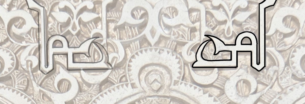
Do you see the similarity? This is a boss level qualifier and we’ll see how that is made the most of below.
First, a simple al-Ghibṭa with the qualifier written in cursive in the cartouche above the word.
Well, I say “simple”…
Another along the same lines:
Lovely interlocking with the previous and next repeats here:
But now we have an example of the pair used to its full potential:
When الغبطة المتصلة is used in full, the two words are visually so similar that the result is effortless symmetry. Other than the general shapes of the letters, both feature two shafts at the beginning and one at the end, so in the composition here an extra final shaft has been added to each to complete the symmetry.
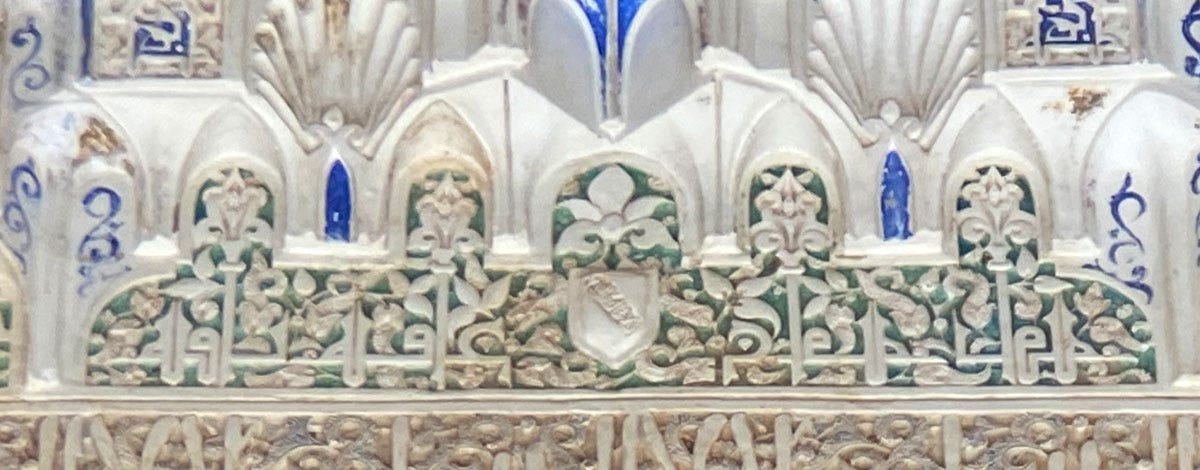
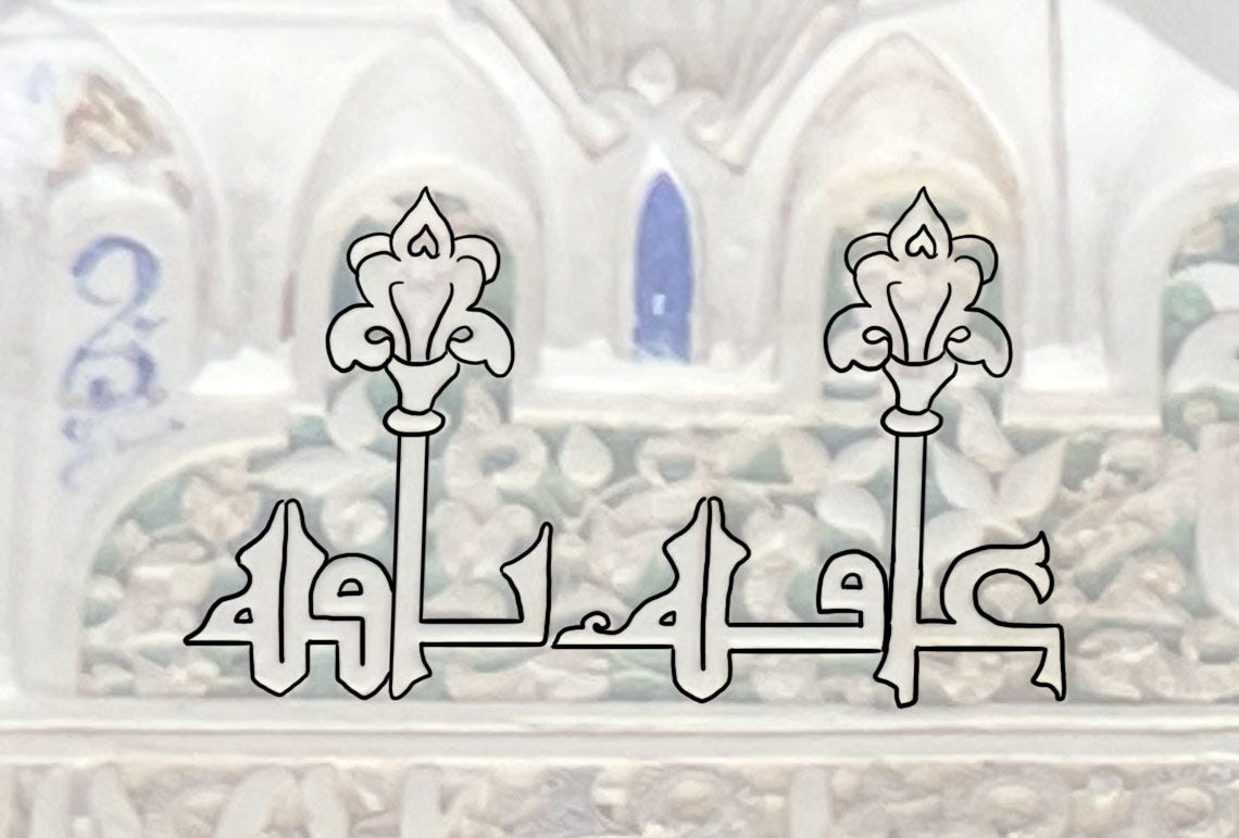
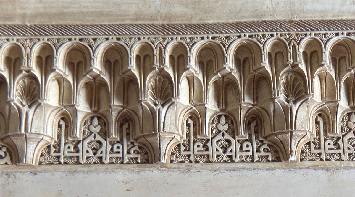
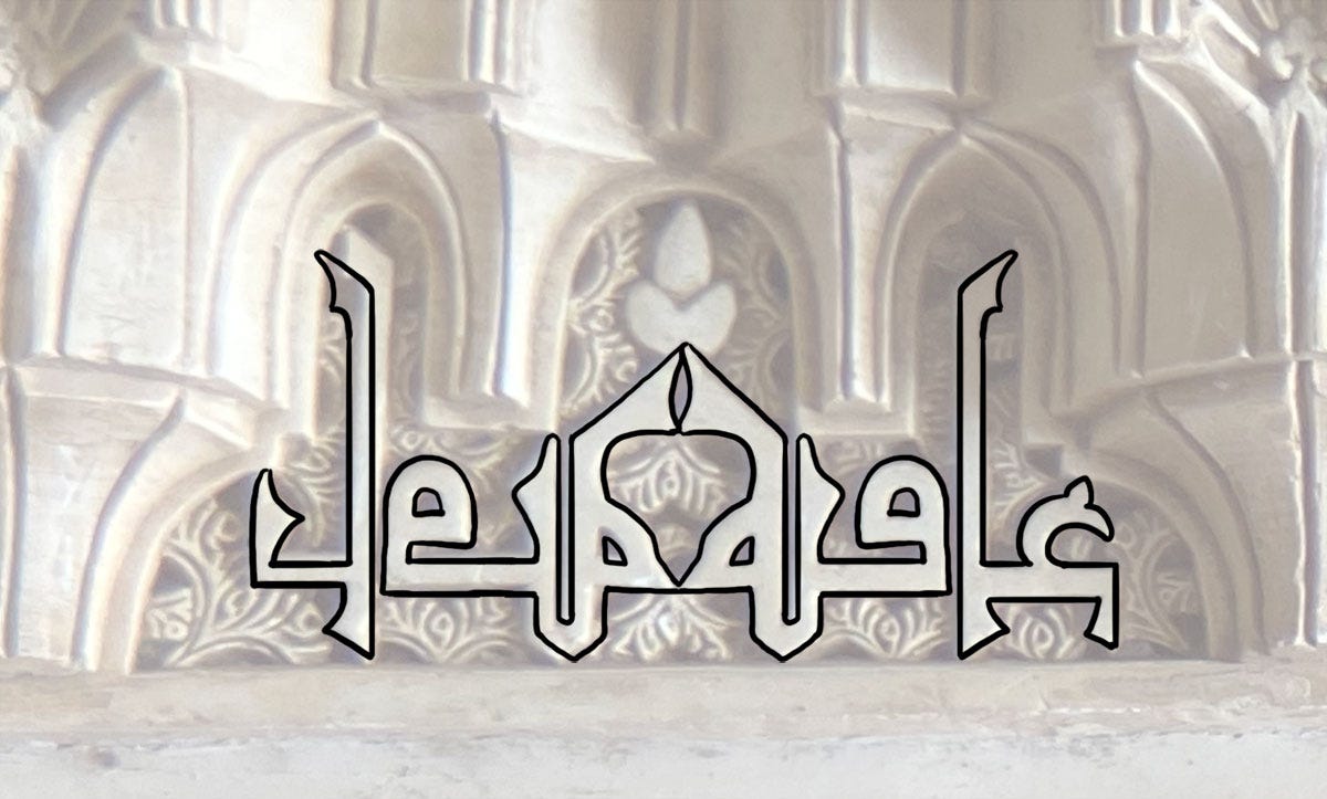
We see the same boss level of pairing with our third word, 'Āfiya عافية (“good health”), usually qualified with bāqiya باقية (“lasting”).
Here they are simply composed to fill out a particular space, and the whole sentence is mirrored.
But the favourite treatment for this pair is the nearly perfect symmetry you can get by flipping the qualifier.
Without a close scrutiny, you wouldn’t even know there are two words here, as opposed to one word and its mirror image.
It’s rather like one of those "spot the differences between the two images" games!
Same idea, with added height and plaiting.
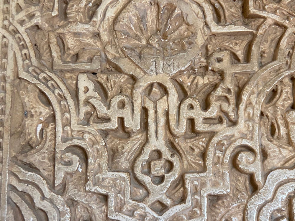
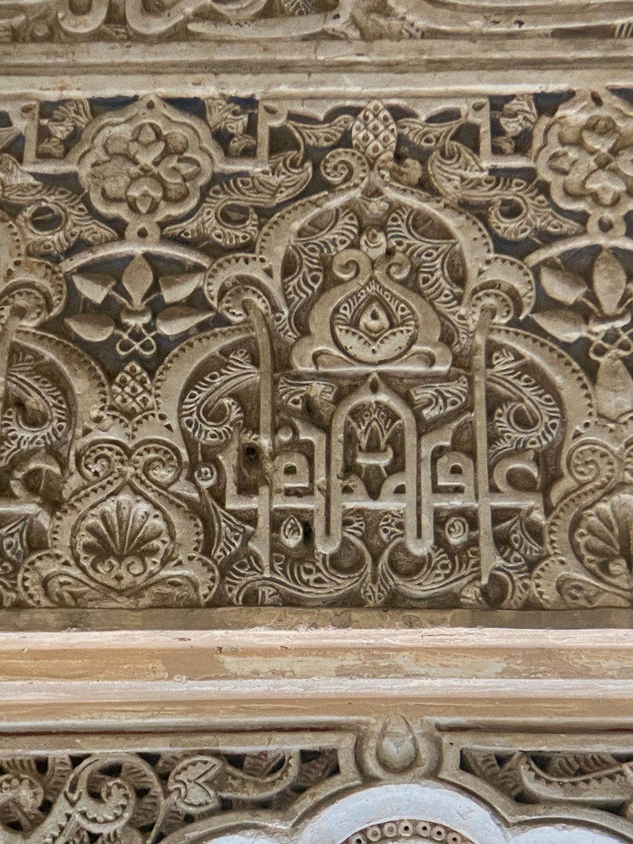
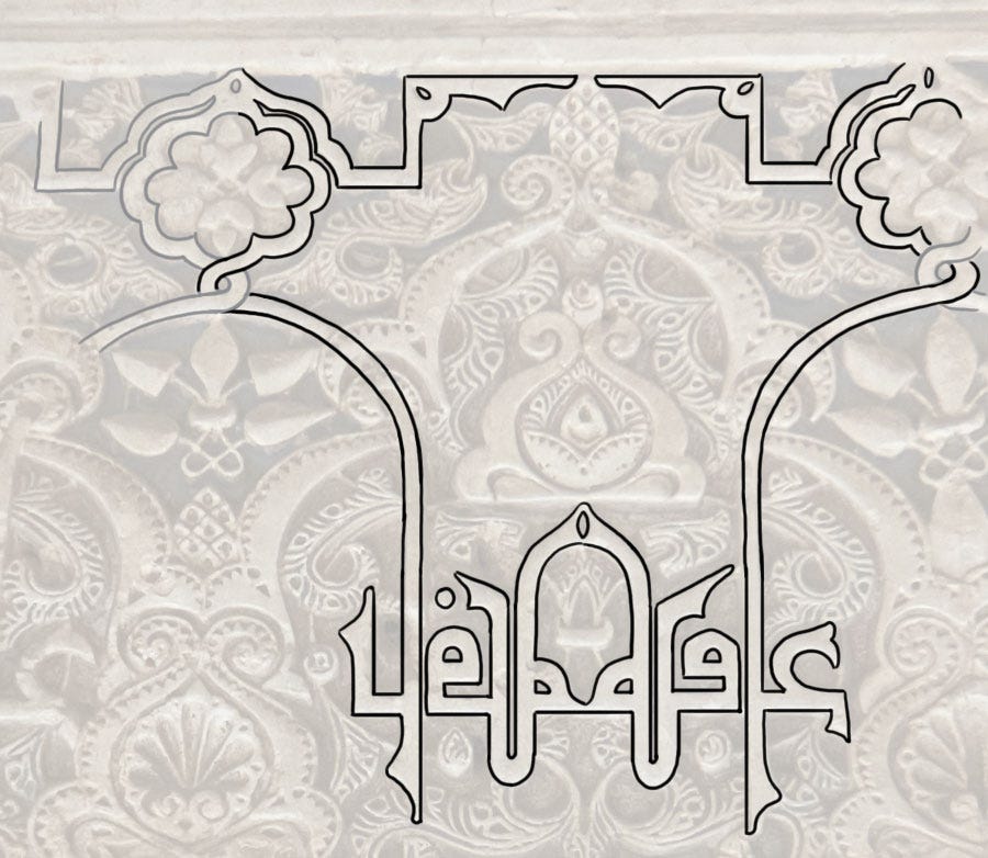
I’ll end with one more, which still has the same basic design (why mess with perfection?) but now stretches extravagantly into the background vegetation.
There’s one extra point of interest here, no pun intended: pointing – the dots on the letters – is very rare in Alhambra, but not totally absent. This design is a rare instance of it, with that dot over the qāf, and clearly demonstrates the Maghrebi style2.
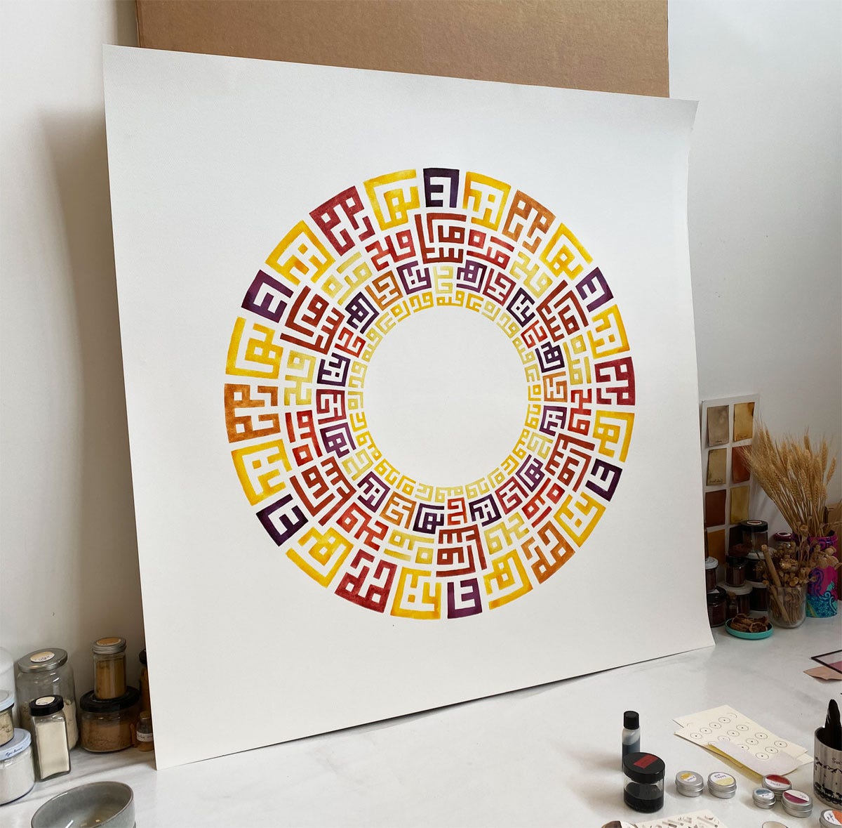
I’ll return in the future to Alhambra, where there are still more words to examine. Before I leave you though, let me share a glimpse of a related piece that’s currently maturing in my studio.
I often work with traditional blessings, but for this one I was reflecting on the many that were historically used but are really rather shallow, wishes for wealth or status or similar. At the same time, I’m building a series of pieces that contemplate a world passing away, and what aspects of it may endure. I’m doing this through using materials that alter with time3.
This piece is a part of that: it’s made up of 11 historically used words: kindness رحمة, power قدرة, charm بهاء, glory عزّ, joy سرور, goodness خير, victory فتح, praise ثناء, authority امرة, health عافية, luck جدّ. They are painted in light-sensitive plant colours, so that most of the composition will fade or degrade. Only three words are painted so that they will endure and remain bright – I'll let you guess which. It’s only been a few weeks and so far one ink has already faded, but it will take several more months of light exposure for it to alter noticeably and be considered finished.
The Arabic script has an incredibly uneven silhouette, so all sorts of devices exist to fill up the gaps (when desired) and create a visual evenness.
One dot above for qāf ڧ, one below for fā ڢ . This is a surviving archaic feature of Arabic pointing; the modern usage, first adopted in the East (as in, from Egypt to Persian lands), is two dots above for qāf ق , one above for fā ف .
I gave a whole talk about this in January 2023, that you can watch here (starting about 20 minutes in).



Great insight into the inscriptions and I loved your talk in the link. The messages/invocations to the reader are beautiful in text and meaning.
Amazing! I love the way you diagram the script. It’s very illuminating - in all senses!