The Story of Kāf
The forgotten metamorphosis of an Arabic letter
Whether you’re from that part of the world or not, you may be surprised to hear that Arabic users know practically nothing about the history of their treasured script. For reasons too boring to speculate about (politics, religion, indifference), in school we are fed stupid myths and generally given to understand that Arabic writing, and spelling, have Always Been as they are today and that’s the end of it. And yet even the dreadful fonts of our school books1 contained the clues of a complicated history that left untidy loose ends, such as the modern letter ك (kāf).
In the British Library there is an eleventh-century Persian manuscript, Or. 6573, with which I have spent so much time I just call it Mahmoud’s MS, my nickname for the unknown calligrapher whose pen I now know so well.
Mahmoud’s is a commentary on the Qur’an, which means it contains verses calligraphied in an early style of Eastern Kufic2, but it doesn’t have the decorum (or budget) of an actual Qur’anic production. As a result, Mahmoud was basically unleashed, and used the little space left to him by the commentary to show off his entire range of letter shapes and flourishes. It’s a total joy to see him run with this opportunity to play with the script.
I’ll share Mahmoud’s flourishes in future, but today the feature that interests me most about the manuscript is that it gathers in one volume a nearly complete picture of the transformation of the letter Kāf from its original Kufic shape (shown below) into today's ك . If you're familiar with the latter, you may have been taught in school (or Arabic class) that it's shaped like a Lām ل with a hamza ء in it. This is utter nonsense. That little symbol inside is itself none other than a Kāf, and by the end of this post you'll understand exactly why it's there.
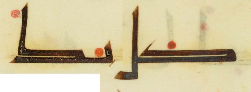
First, let's backtrack to Manuscript Kufic, from which Eastern Kufic is directly derived. In this script, Kāf is a very long letter with two forms: alone or final, it carries a shaft (the tallest stroke, below left), but in initial or middle positions, the shaft turns into an angled hook (below right).
Furthermore, Kāf is at the time in direct relationship with Dāl د (below), which has the body and hook of an initial Kāf. But Dāl never connects to the letter that follows it, so it's not possible to confuse them.
Here they are both, K followed by D: كد
Moving on now to Eastern Kufi, this relationship still exists, although it's now at breaking point. The examples below show the two letters still closely mimicking each other, despite K's shaft taking on a whole other dimension. But both letters, especially K, are undergoing changes, so that if you come to Eastern Kufi without previous knowledge of the relationship established in the earlier script, you might not realise there is such a connection.
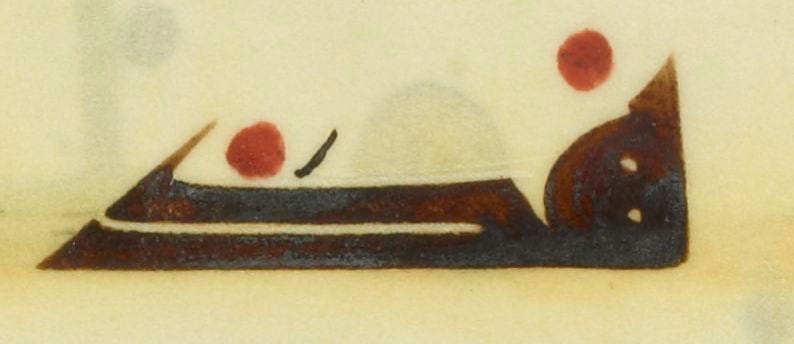
I mentioned all the phases of K's transformation can be found in this particular volume. The original K, as seen in Manuscript Kufic, is present and accounted for, except the final K is no longer marked by a vertical shaft.
Perhaps it was no longer necessary, as D had lost its hook altogether. But this form is not very common in this context. As you can see, it takes up quite a bit of horizontal space. It was even longer in the old script, but then the old book format was landscape: there was a lot of space in which to stretch out. Mahmoud’s follows the new portrait format, which has much less horizontal space to spare.
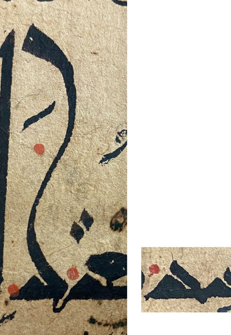
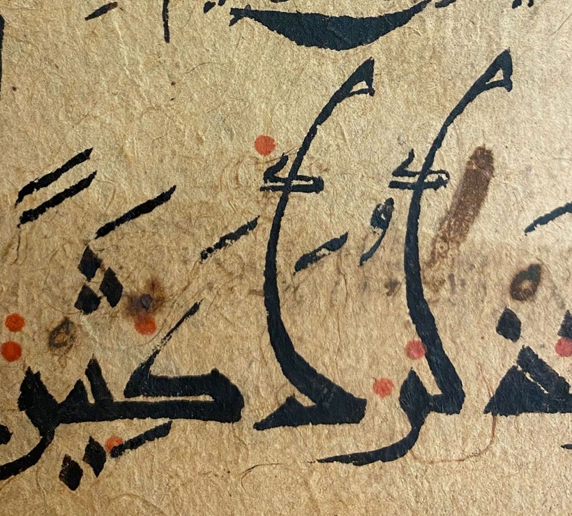
As a result, the calligrapher(s) find themselves looking for ways to fit this troublesome letter into the available space — especially that it’s no longer permissible to “hyphenate” words from one line to the next. Words must be made to fit the line at all costs! Below you see the most basic device to achieve this: stick the long K on a tendril to raise it above the rest of the word.
Below we see this device getting standardised, and the "tendril" becoming a solid shaft, with the Kāf becoming smaller because after all, it doesn't need to be full-size to be instantly recognised.
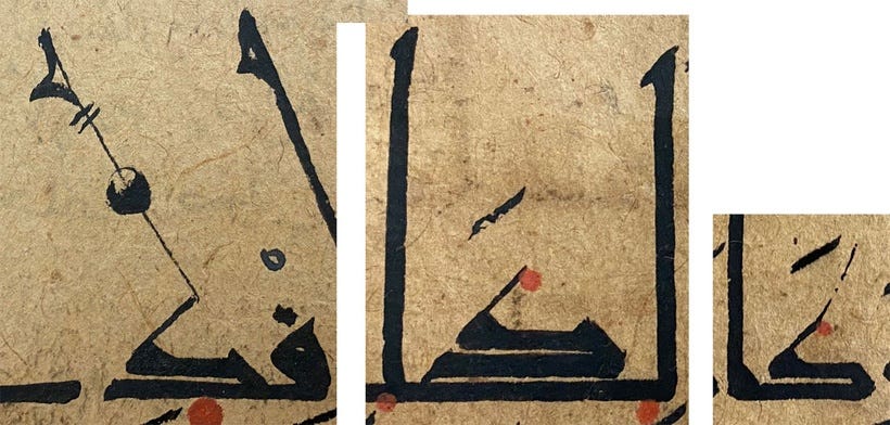
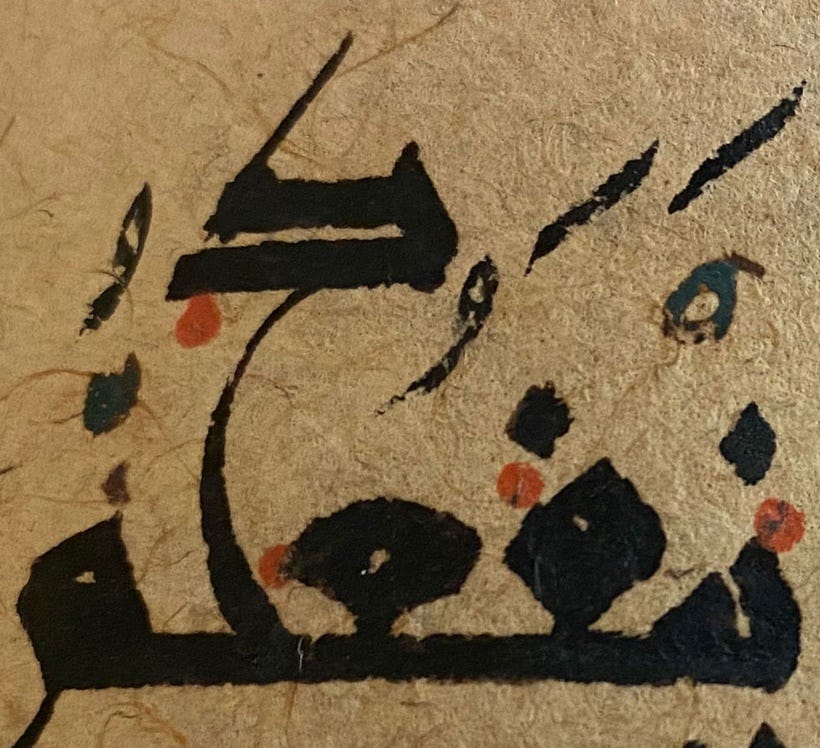
The next step was almost inevitable, a direct continuation of the process, but it's a crucial step. The shaft on its own has become the letter itself, while the small K is now no more than ihmāl. Ihmāl signs are diacritics that work as little reading helpers (just like Japanese Kanji can be accompanied by small hiragana to indicate the symbol's phonetic reading). Typically, ihmāl is added to letters that have no pointing, to confirm that "this letter has no pointing". For instance, in the letters ج ح خ you would have an ihmāl sign on ح to make it absolutely clear it’s neither of the other two3. Anyway, the tiny Kāf below is now such an ihmāl mark, telling the reader that this apparently random shaft is in fact a shortened K.
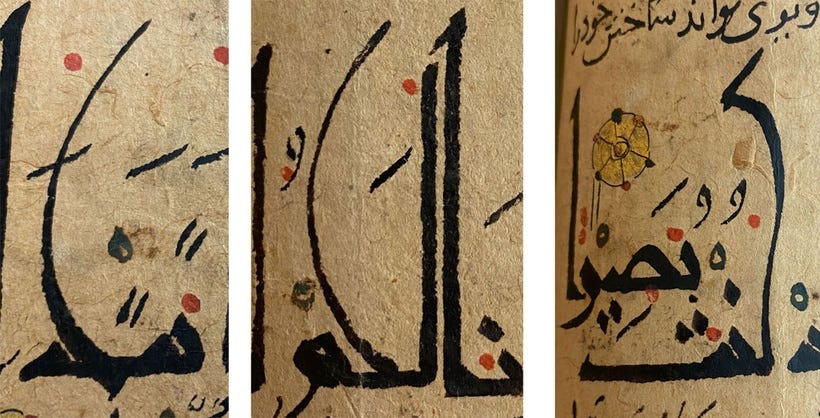
And random it is. The one on the left is starting to look like the modern letter, but otherwise they're just decorative shafts that may undulate one way...
... or the other...
... and inevitably, at some point, the ihmāl marks stop showing up altogether.
The evolution of Kāf continued into the round scripts (via what vagaries, I don't know) until it ended up as the bastardised Lām we know today. The relationship with Dāl long gone (as that letter too was shrunken from its former glory), the ihmāl had to return in the isolated form ك so the reader would know they're not looking at a Lām ل, but a Kāf.
As to why all these different forms are present in the same text, I can't explain it for sure, but it's possible that “Mahmoud” was in fact a handful of different calligraphers who each had their own take on the acceptable ways of shortening K, some more conservative than others. Or perhaps this really was just one person, exploring all the possibilities of this very dynamic script and using every permissible form they know within a project that allowed such creative liberties. Either way, we’re left with a precious visual record of the different stages of this letter’s transformation.
I’m old enough to remember printing before Arabic type design started seeing a creative rebirth at the hands of designers of my generation in the 00’s. The landscape is much more pleasant now but there’s still much work to be done.
Referred to as Qarmatian for convenience. You can see it in action in my recreation of the so-called Qarmatian Qur’an.
Not all Arabic calligraphers today have a clue about this, either: some think these marks are decoration!





Loved reading about the transformation of the letter kaf!! thanks so much for sharing - another brilliant article
the history of the letter K...how amazing!!!!