The Art of Letting Go
Working with living materials
A few days ago I gave a talk in Stanford Libraries for the collegium “Uncertainty and the Handmade” that I’m sharing here in a slightly edited form. You can also watch the talk itself on the Stanford University Libraries channel!
I want to talk about the aspect of knowingly giving up a certain measure of control over our creation in order for something to happen. In other words, embracing uncertainty as a creator, in the sense of not trying to control every aspect of what we make. For me, this comes with the return to historical materials, as well as natural materials that may not be part of the artistic canon. These are all living materials to me, even the inorganic ones, because they do their own thing and they change over time. So for the first half of this talk I’ll tell you about the different personalities of some natural art materials, and then I’ll share examples of my work where these comes into play.
Many of the mineral and inorganic pigments historically used across the Old World are chemically active, so they will react not just to each other but also to the environment.
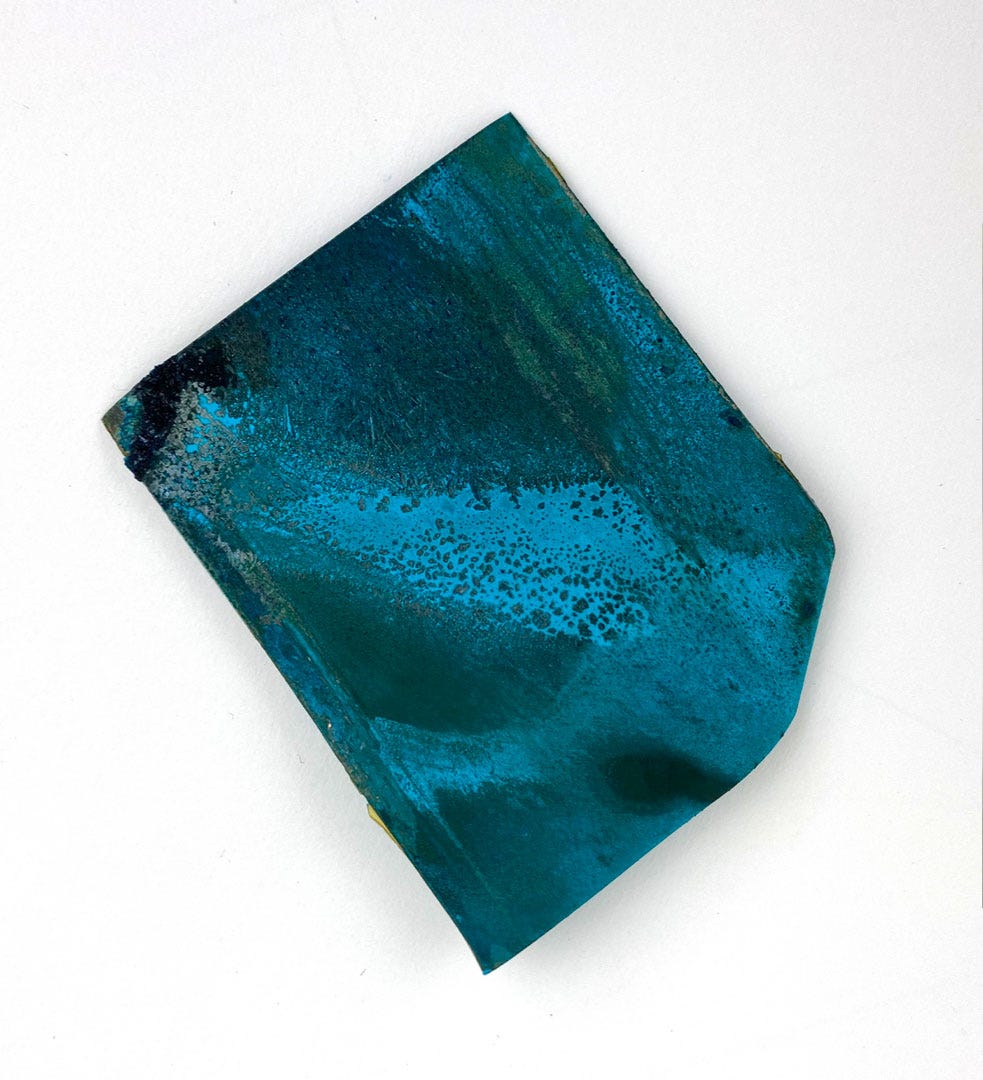
I start with verdigris because it’s one of the worst offenders. Verdigris is actually a general term for a number of chemical compounds made from attacking copper with an acid or other, with or without salt present. There are slight differences in the result but from a painter’s point of view they all basically result in a mesmerising green pigment that is highly corrosive to parchment or paper.
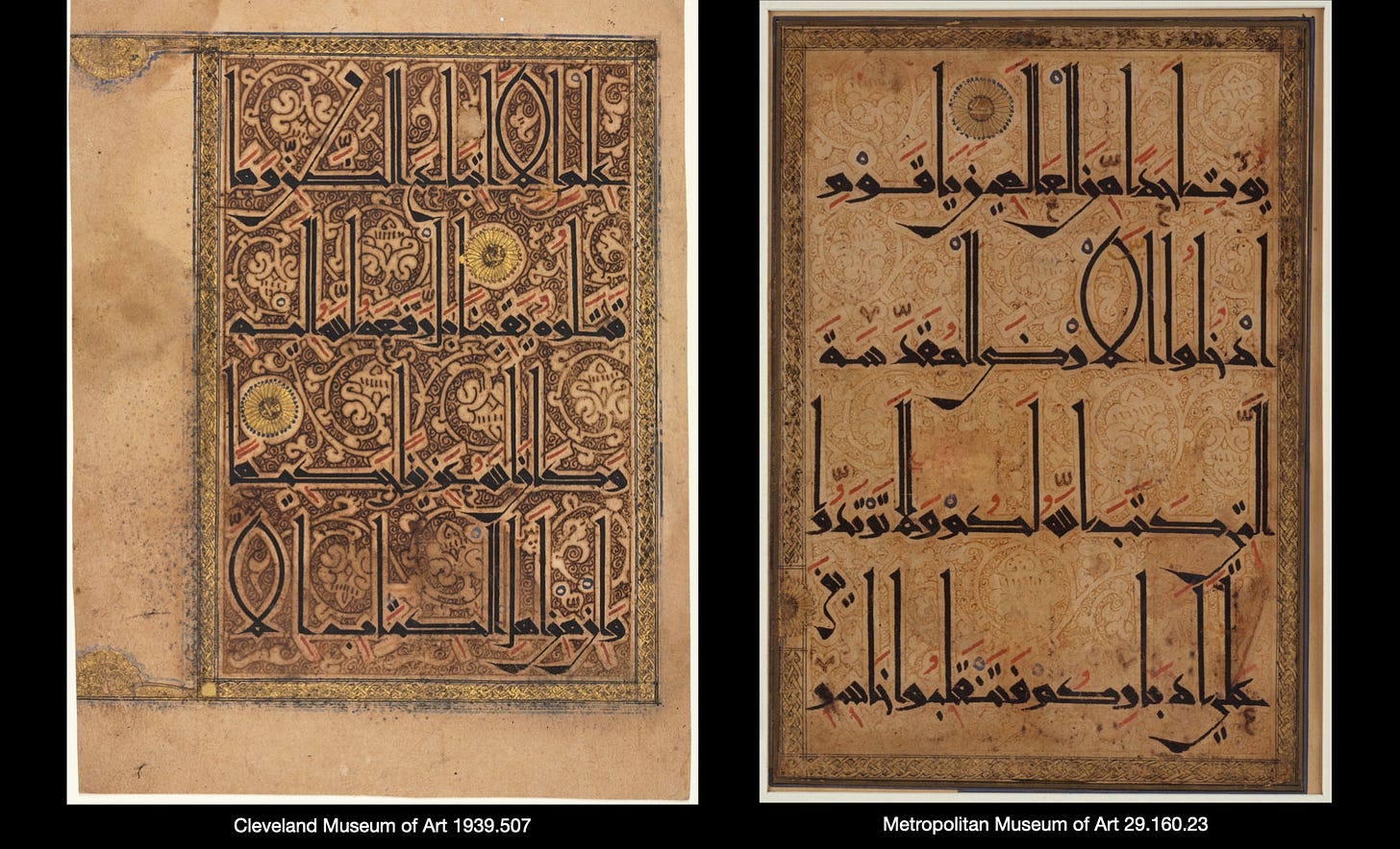
This is a page from a very rare and famous Qur’an nicknamed the Qarmatian Qur’an. As you can see, it makes extensive use of verdigris.
Just kidding, you can’t see it: all of it has deteriorated to brown or eaten through the paper. I’ve gathered about forty photos of different pages for my research and not a single page still shows any trace of green.
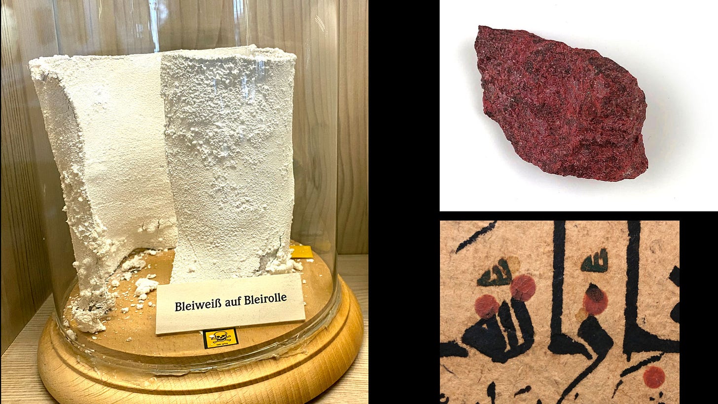
Two more such pigments are ceruse (lead white) and cinnabar1 (vermilion), both indispensable to the pre-industrial artist’s palette. Ceruse is quite an alchemical substance, as its pure white emerged from the blackest metal. You can see here how a sheet of lead is rolled loosely so it can be stood up, and in this state it's exposed to the conditions it requires to oxidise. Cinnabar, the most sought-after red, is mined, but it has also been prepared artificially for centuries, in which case it's known as vermilion. Both of these are liable to turn black when exposed to unfavorable conditions.
What about basic black ink? This can actually be of two kinds. One type of black ink is simply soot mixed with a binder, and it’s not reactive but it’s not waterproof, and can be wiped (or licked) right off the page.
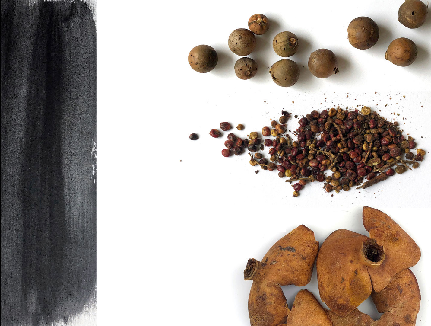
But the preferred ink for a long time was ferrotannic, made from a source of tannin plus ferrous sulphate (vitriol). There are many possible sources of tannin in the plant world, most famous of which are the gallnuts seen here at the top right: a round growth that forms on oak trees when a wasp lays its eggs under the thin bark of twigs. Sumac, below it, is another important source, and all parts of the tree could be used to tan leather. Pomegranate rinds are another really good source. The result is the deep black ink you can see on the left.
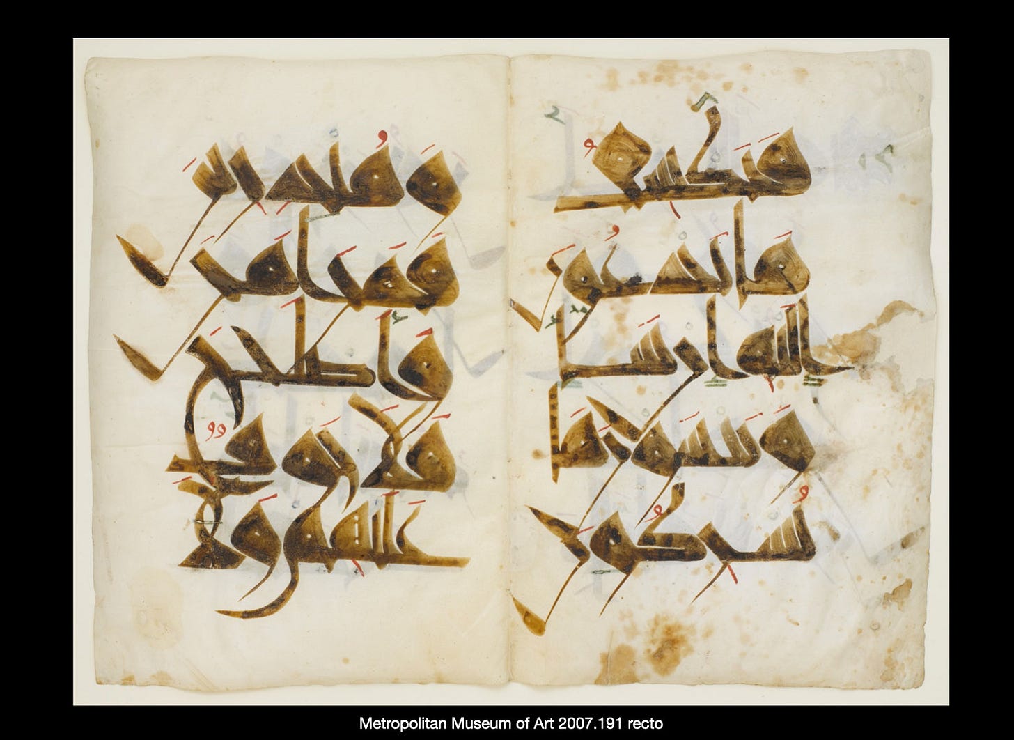
The problem with this ink is that it’s quite tricky to dose it just right for it to endure. What often happens is that it fades back to brown over time, as is very visible in the Nurse’s Qur’an below. It can also corrode the support if there’s too much vitriol and not enough gum to buffer it, especially when it’s used on paper.
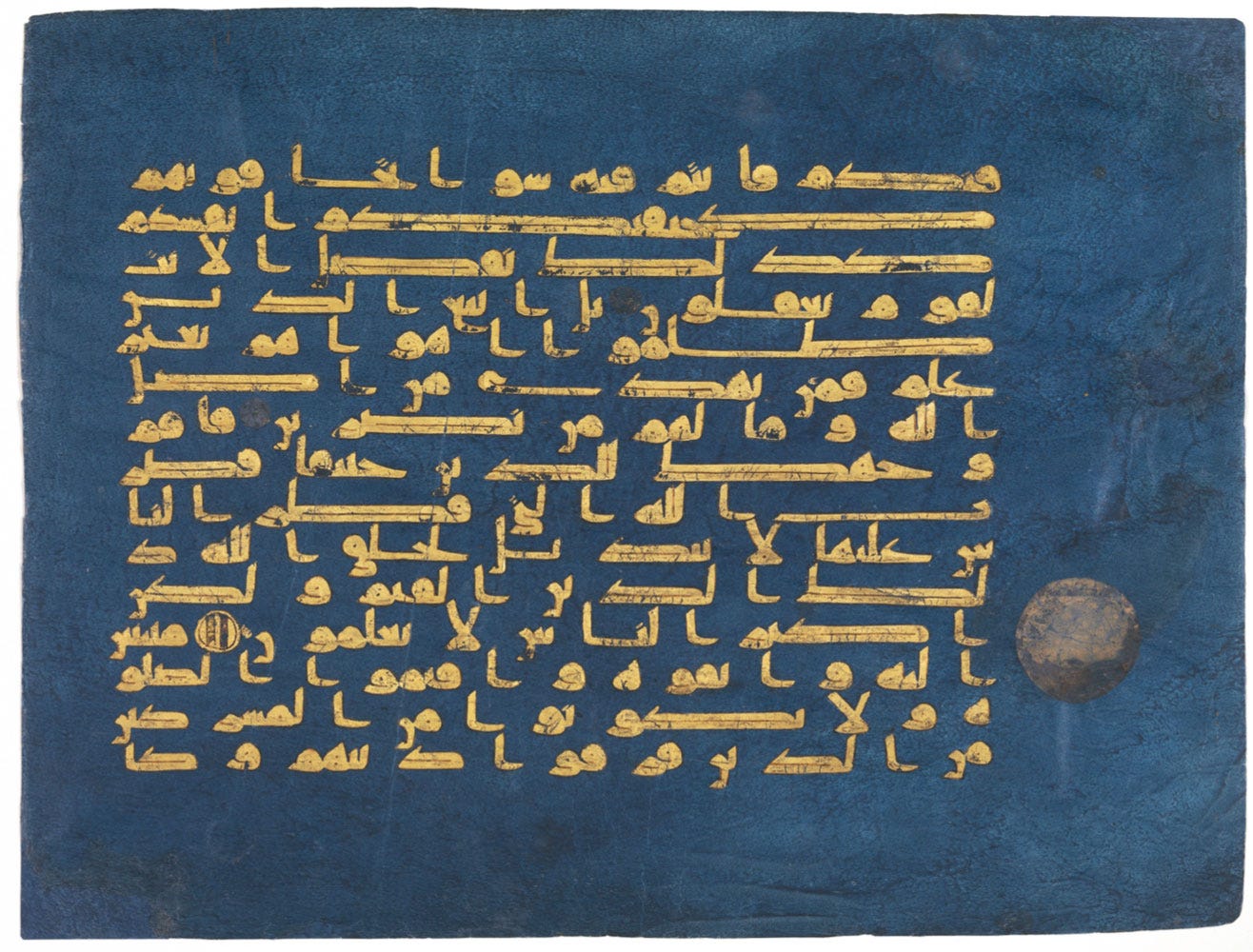
When metals are used, they’re also subject to oxidisation. When silver is used, it eventually tarnishes to black. In this page of the Blue Qur’an, you can just see a medallion that was once bright silver, and is now lost in the dark background.
Gold is of course the exception among metals, one that will never tarnish and is chemically stable. But it’s only as good as the glue holding it on the support, and above, the friction of pages together caused a lot of it to flake off. I think egg white was used to attach the gold leaf, and it’s not a very good size (glue).
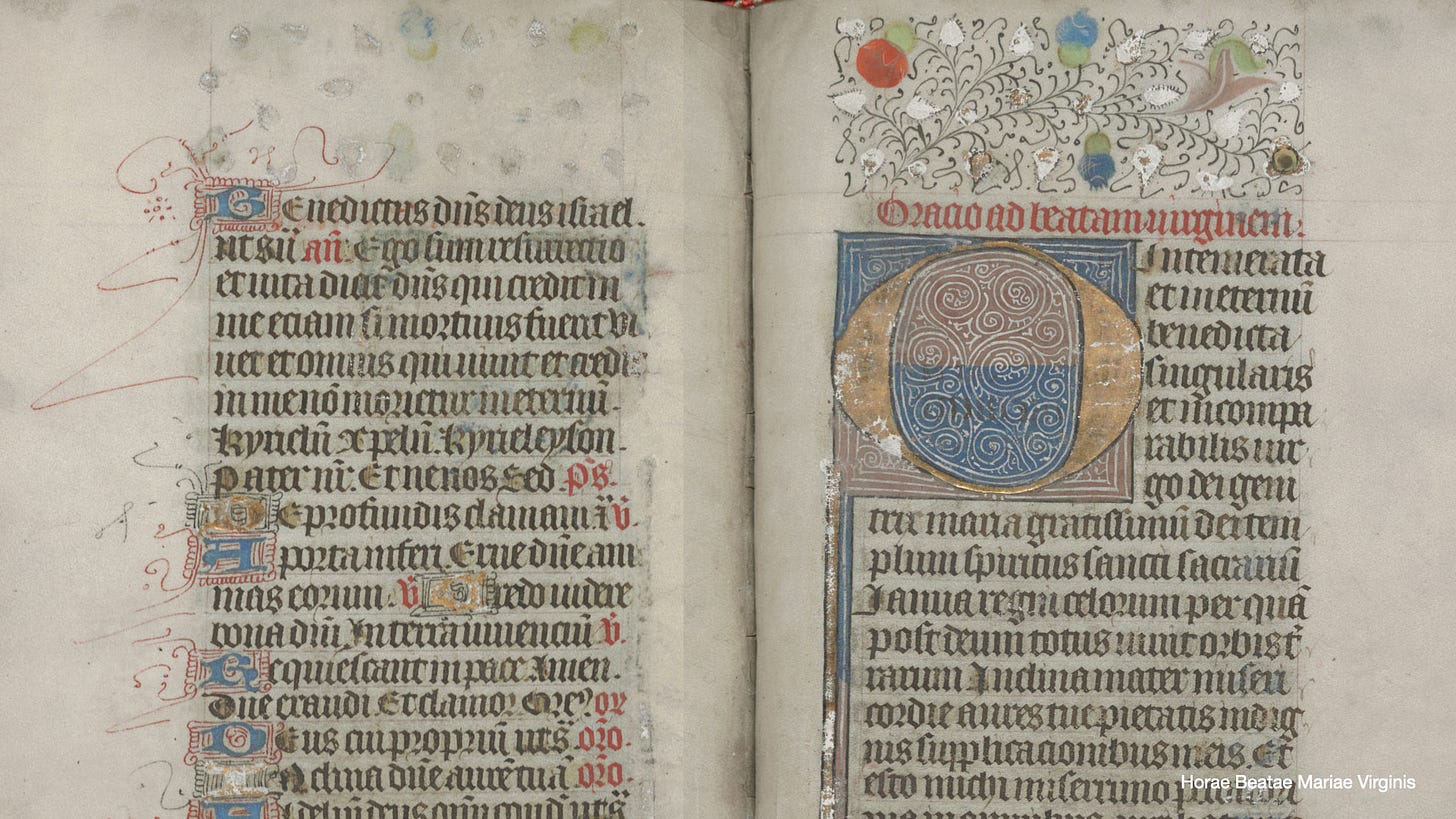
The Hours of the Virgin2 below shows this very well. Throughout the book we encounter white shapes – here the leaves in the top margin, and a capital I at bottom left – are gilding gesso, used for attaching gold leaf to paper, and every one of these would originally have been covered in gold3.
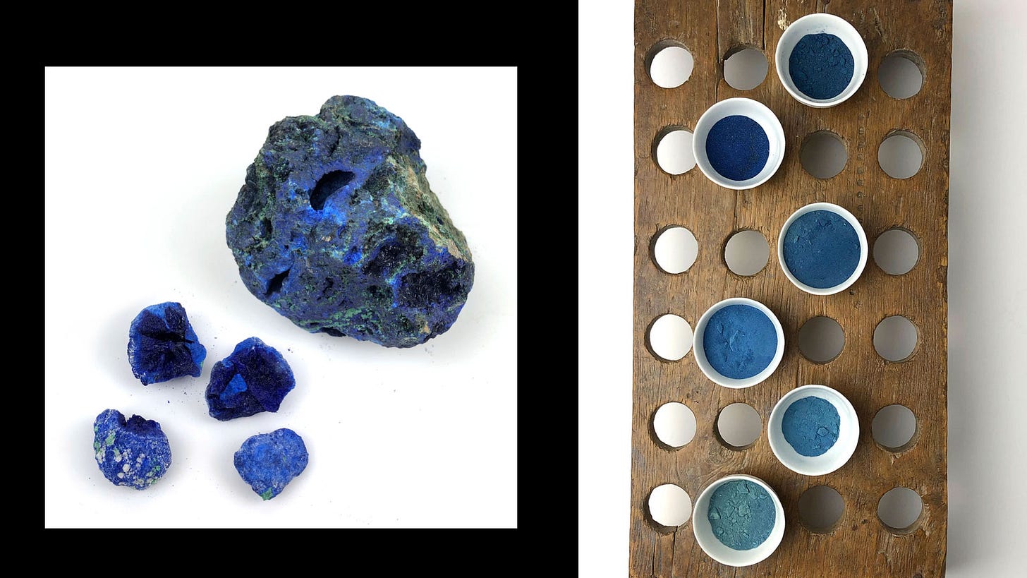
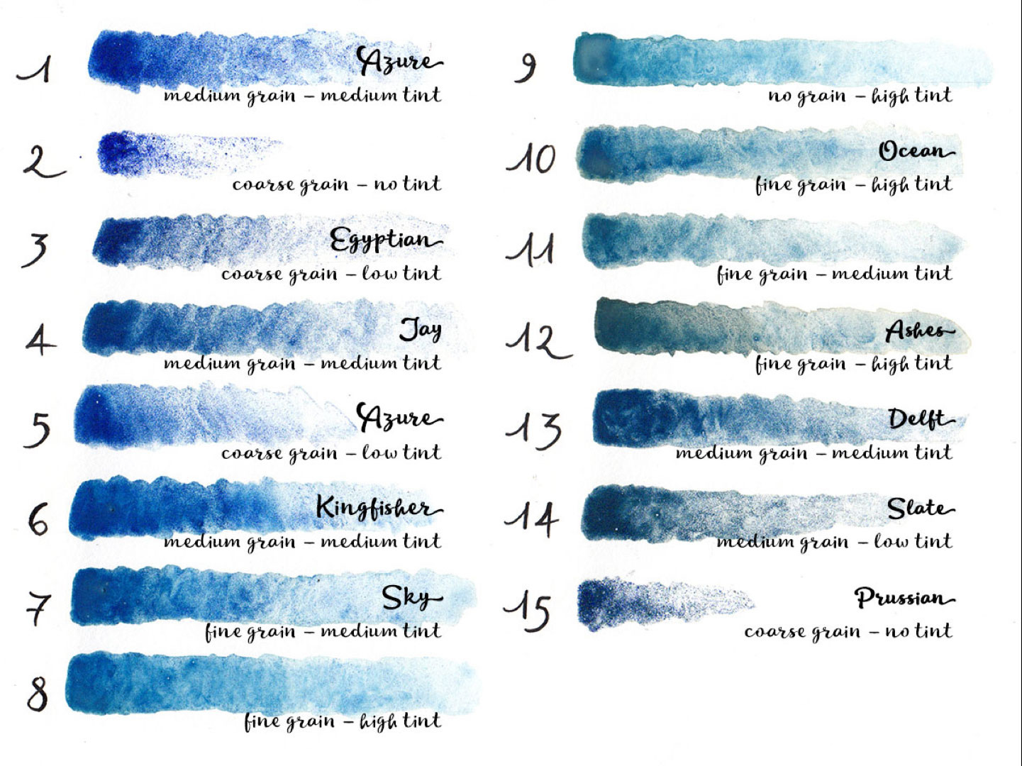
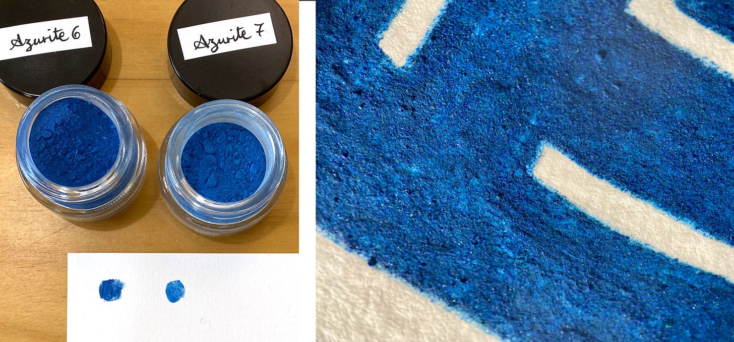
So far we’ve seen quite destructive alteration, but here are some more benign quirks. Azurite is a copper blue that was the only mineral blue in Europe before lapis lazuli (ultramarine) arrived from the East, and it remained a more affordable alternative thereafter. It’s an incredible hue, but it really needs to be ground by hand, the reason being the more you powder it down, the paler it gets. So you need that sensitivity to grind just as much as needed, and if you’re meticulous about separating grades you can get a vast range of hues from one stone.
Azurite has another quirk that only shows up after a few centuries: in contact with humidity in the air, it slowly transforms back into green malachite, of which it’s simply a dehydrated form. There are church frescoes where the sky was once blue but is now all green due to this. This is what I mean about living materials!
I got all the grades below from a couple of stones, and you can see how one of them was quite contaminated with malachite. You can’t control the hue you’re going to get out of azurite, and you can’t get precisely the same hues from one batch to the other. All you can do is choose stones that are as similar as possible.
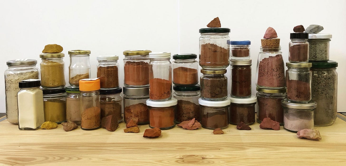
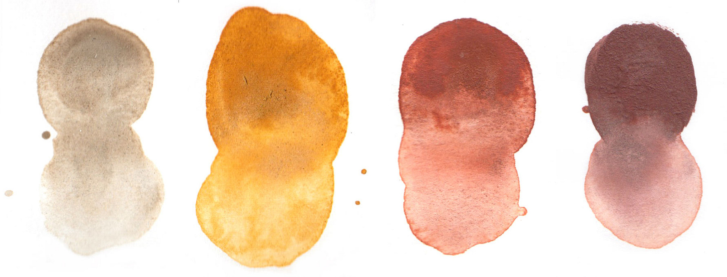
Colour matching is even more difficult with earth pigments or ochres. Below are some of the hues I collected myself from the mountains back in Lebanon.
Provided they’re not subjected to extreme heat, they’re perfectly stable pigments—but they’re such complex mixtures that they won’t give you a simple one-toned paint film: you get duotones, triple tones as the different mineral layers settle on different levels according to density. You can see below how each of these samples contains different hues. And you get a bit of silica in there, some granulation. They are never the smooth plain predictable (boring) paint film of commercial paint4.
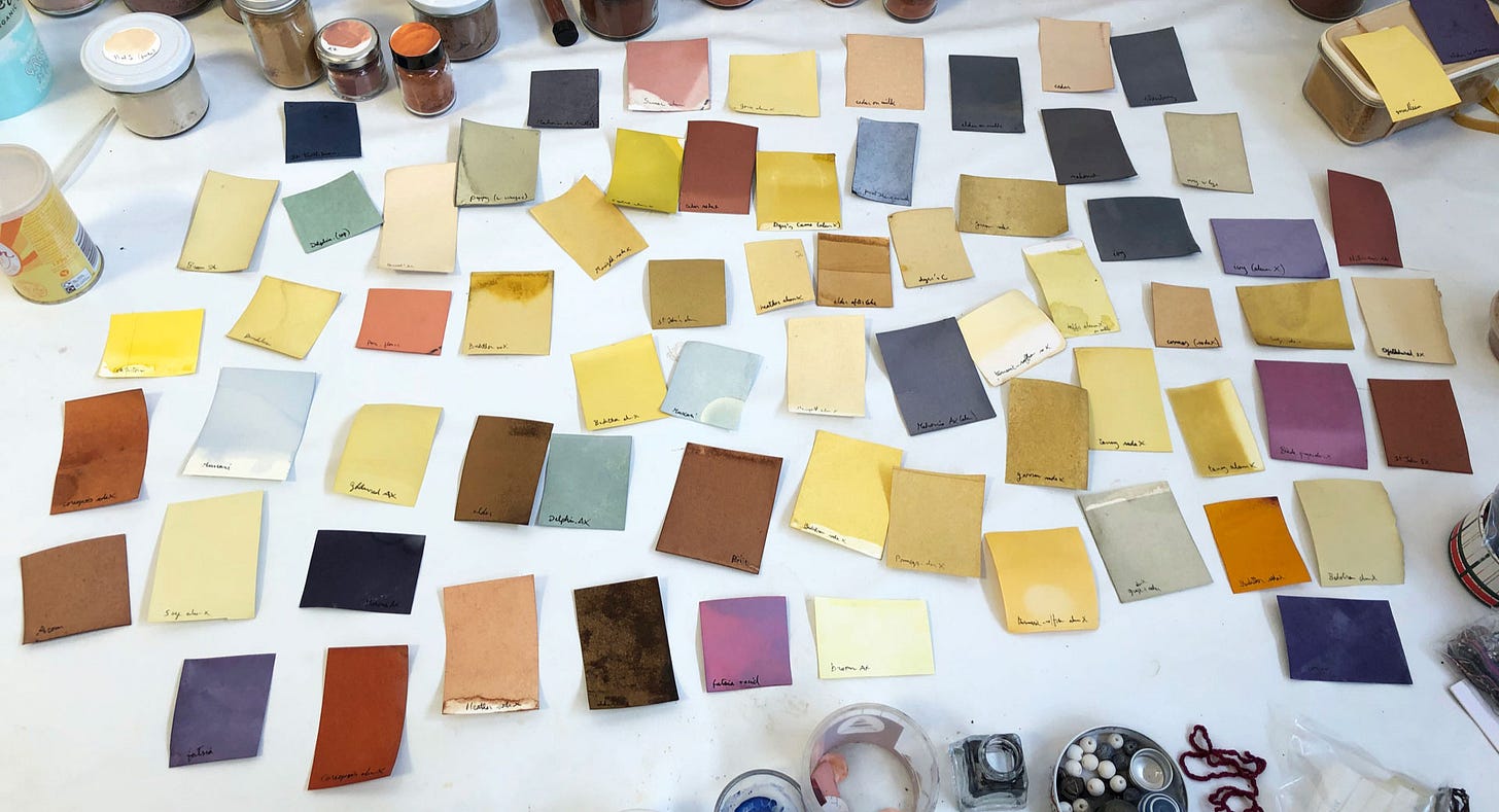
Moving on now to plant colours, that’s where you have so little control that artists who want guarantees have to simply stay away from them. I spent a whole year testing a lot of plants to write Wild Inks & Paints, for which you see just a few swatches here.
If we went into details we’d be here all night, but I’ll mention two big things.
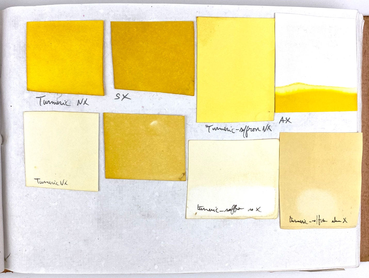
Firstly, plant colours are destroyed by the UVs in sunlight. Even if they’re protected, which slows the process, they’re organic so it’s inevitable they will change and fade over time. Below is a page in my light tests notebook. I dyed paper to make swatches, cut each in half and kept one half in the dark, the other exposed on the counter for several months. In the notebook, the protected swatches are above and the exposed ones below. This particular page shows two yellow dyes people get very excited about and rather imprudent with: turmeric and saffron. As you can see, their staying power is so poor they can vanish completely.
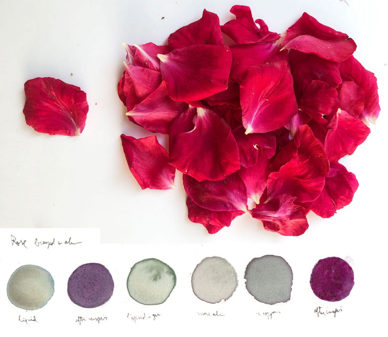
Secondly, plant colours are pH sensitive, which means they’re hugely affected by acidity or alkalinity. In the art world, we’re very careful to use acid-free paper, but this isn’t neutral: its surface is slightly alkaline, wreaking absolute havoc with most organic inks. From the rose petals below I can extract a lovely fuchsia ink, but you can see below what becomes of it when it dries on paper, no matter what workaround I tried.
Now that you have a general idea of how materials really have individual personalities and requirements, let me show you some applications in the form of artwork.
Understanding how materials deteriorate allowed me to recreate damaged pieces, largely for the pleasure of seeing them the way they would have been intended. Let me quickly show you the Blue Qur’an again to remind you of what it looks like after a few centuries: indigo-dyed parchment, gold leaf, and tarnished silver.
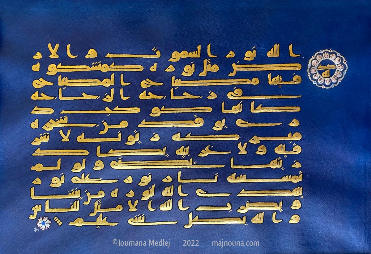
Here’s my recreation:
I used the text of the Verse of Light to recreate it as a contained piece, and now you can see the gold not dulled by friction, the silver verse marker untarnished (more detail here). The indigo looks very vivid in this photo, but this is fairly true to life, because parchment is translucent and therefore the light in which it’s seen changes how bright or dark the background appears. There’s also no question that the centuries have muted the brighter constituents of the dye in the original—this happens to all organic colours.
Now let’s look at the Qarmatian Qur’an again, with brown where there should be green.
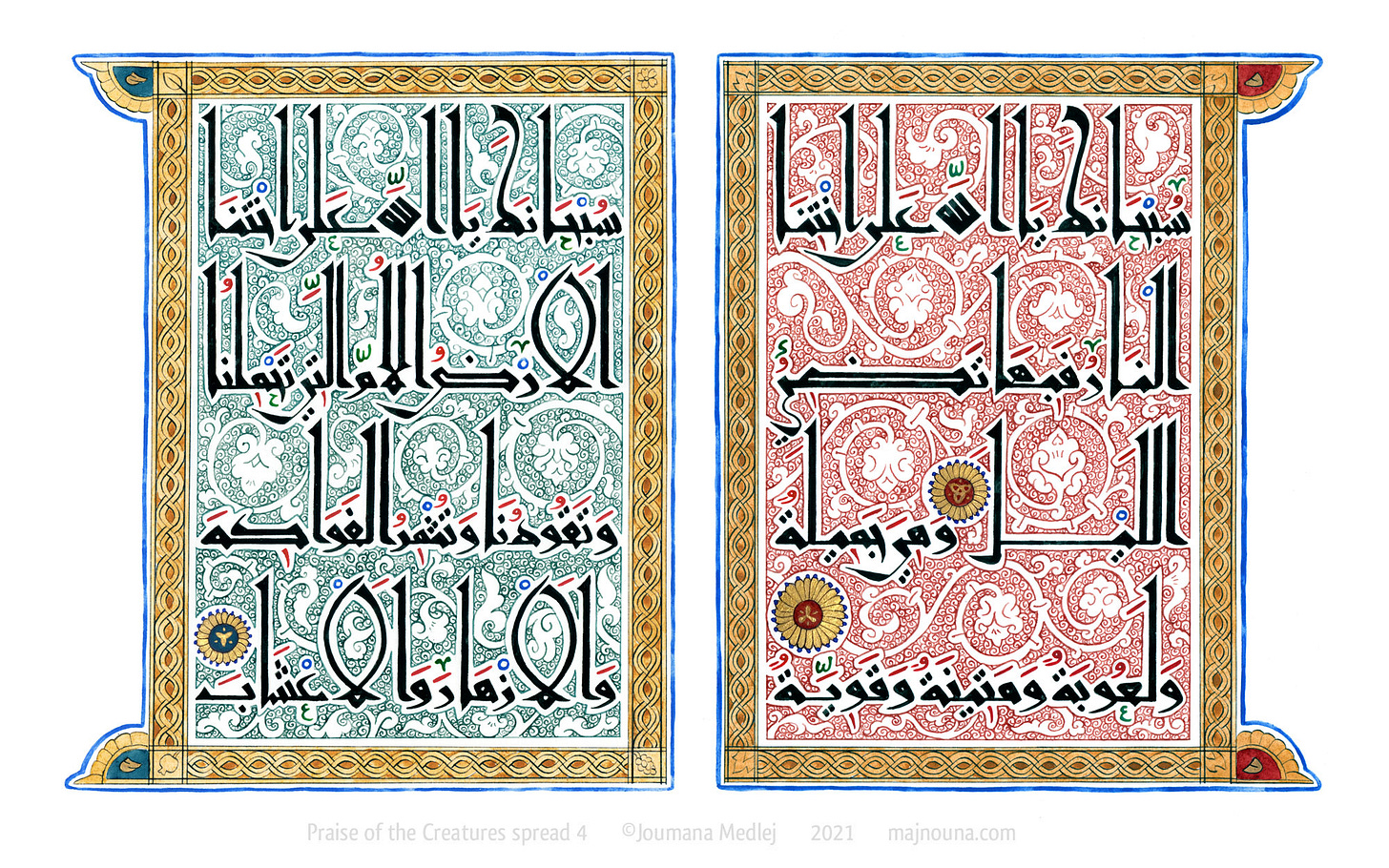
The backgrounds were originally very colourful; some surviving examples show blue and yellow so it’s clear that several colours ran through the volume, with some aging better than others. Those that turned brown or faded (such as above right) were probably organic reds or pinks, though there would need to be a spectrographic analysis to be sure. The very dark brown of above left could very well have been green verdigris, but I would need to see the page in person to be sure). In any case, I’m pretty sure this Qur’an, in its original state, would have looked more like this:
(I should specify though, the paper would never have looked so white. Islamic papermakers always tinted the paper to lessen eye fatigue.)
I reconstructed it as a 12-page book, of which you can see a video preview here. The text is St Francis’ canticle of creatures, which is a very nature-oriented little song where he praises the sun, the moon and stars, fire, water, air, Mother Earth and so on. Each page therefore has a theme, and the background colours are chosen accordingly. They’re all flower-based: green from iris, red from wallflowers, yellow from chamomile, blue from privet… They will still age, but because the book is kept in better conditions, they should age gracefully.
These two pieces were a way of returning the originals to their undamaged state, but I became interested in the aging and changing of materials in itself, as a carrier of meaning, as something with its own kind of beauty, and as a way of letting go of part of the work.
The first time I brought this in, it wasn’t conscious:
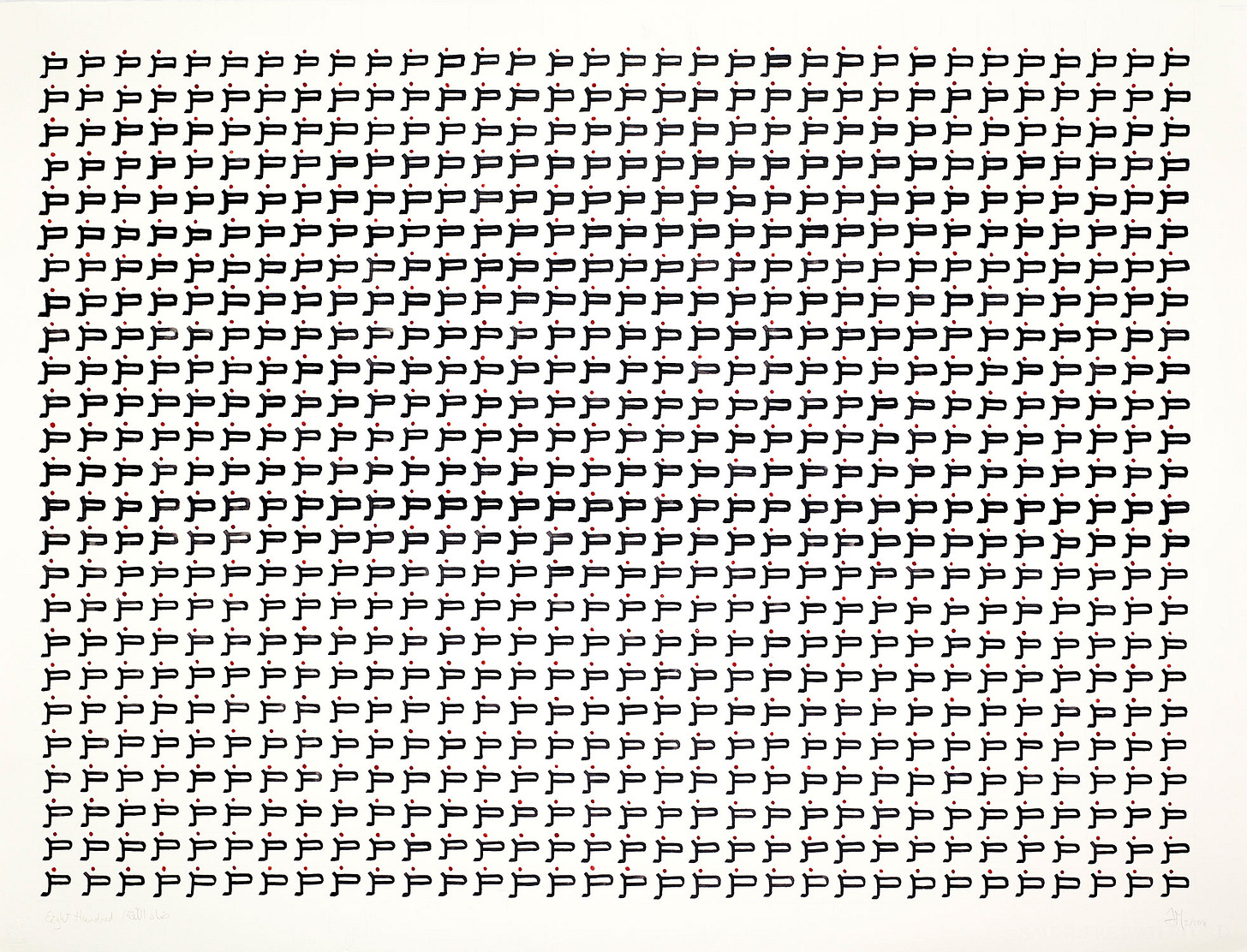
In this piece I was using ink I made and a pen I also made. It’s called 800 (more info here) because it’s about the letter ض ḍād, which supposedly only exists in Arabic—not actually true—and that is its numerological value. So I wrote it 800 times. But see what happens, which you can discern even on this small scale: as the writing goes, the strokes get thicker as the pen gets worn down, until the point I have to cut it again – it suddenly gets sharper and thinner before gradually wearing down again. While I was working, I didn’t have this overview; I only felt the pen become less and less workable. It’s only when I finished that I could see the visual imprint of that work process.
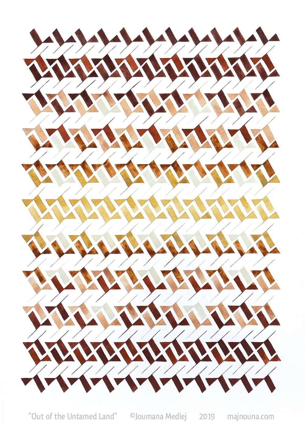
This next piece was inspired by the ochres I showed you earlier, which were all gathered on only two different sites.
I love the idea that each place, each area of land has its own palette, and it can be just minerals or just plants or both together. Here, my way of letting go was to limit myself to the colours that were available in just one place—a single-origin artwork. And the word that the site inspired is barr, which means the land, the wilderness, but you can also read it birr which means devotion and reverence (more info here).
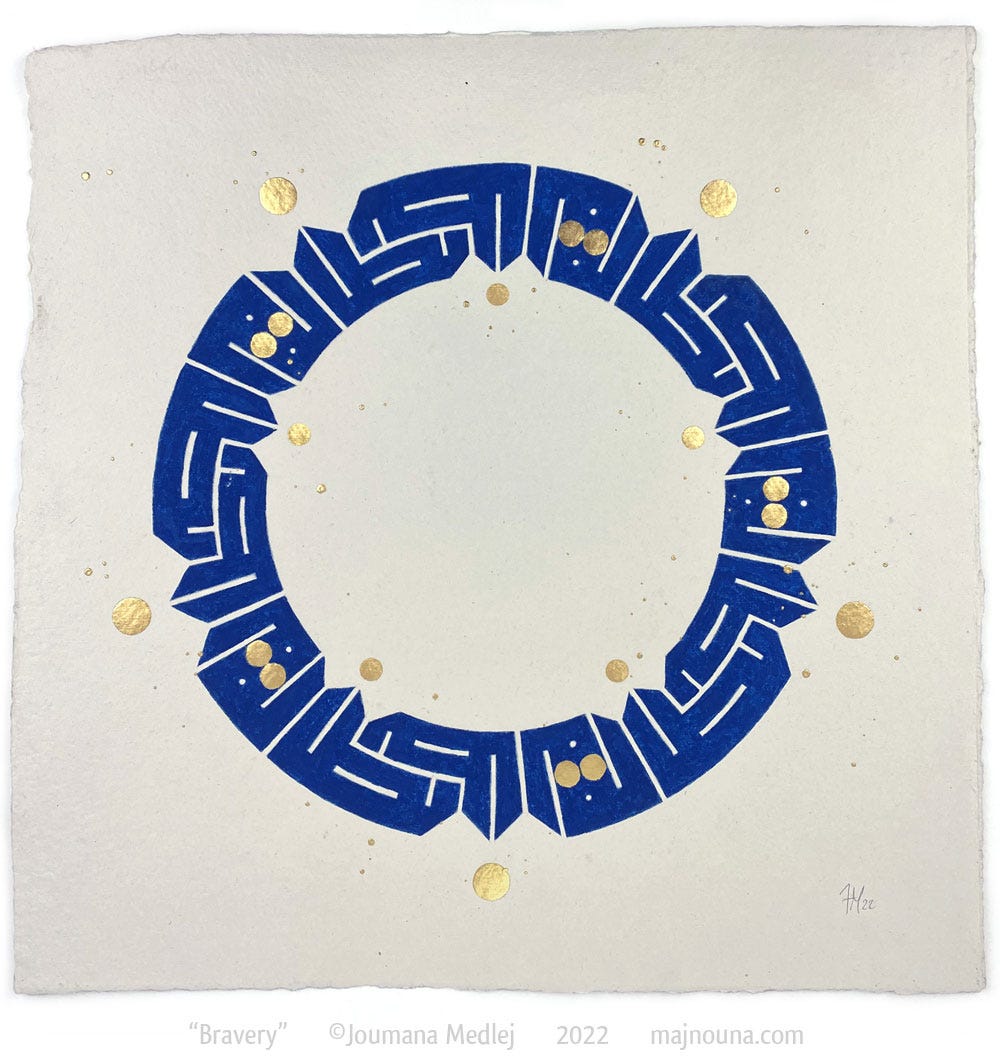
I also showed you some azurite, which has to be very coarse so that the blue is really strong. This piece called Bravery was inspired by the incredible courage of Ukrainian people:
The colours are obviously referential, but I also wanted to use the purest precious materials. The gold is 24ct leaf, applied over gum ammoniac, a historical plant-based size. Then I used azurite’s peculiarities by mixing two grades (of my own extraction) together: one fine grade to give good coverage, and one coarse grade for the deep blue.
But it’s not only deep: because it’s coarse, it sparkles like diamond dust, which you can just glimpse in the still photo. The paint surface is so intensely mineral it doesn’t even look like paint anymore.
To finish, a couple of pieces that are part of a new body of work that is entirely informed by the entropy of some materials. This series started after a year of creative silence, where I was too overwhelmed by world events and in particular by what was happening back home in Lebanon to be able to make art. But eventually I found a way of processing loss and destruction through creation.
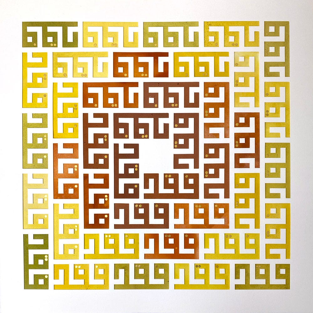
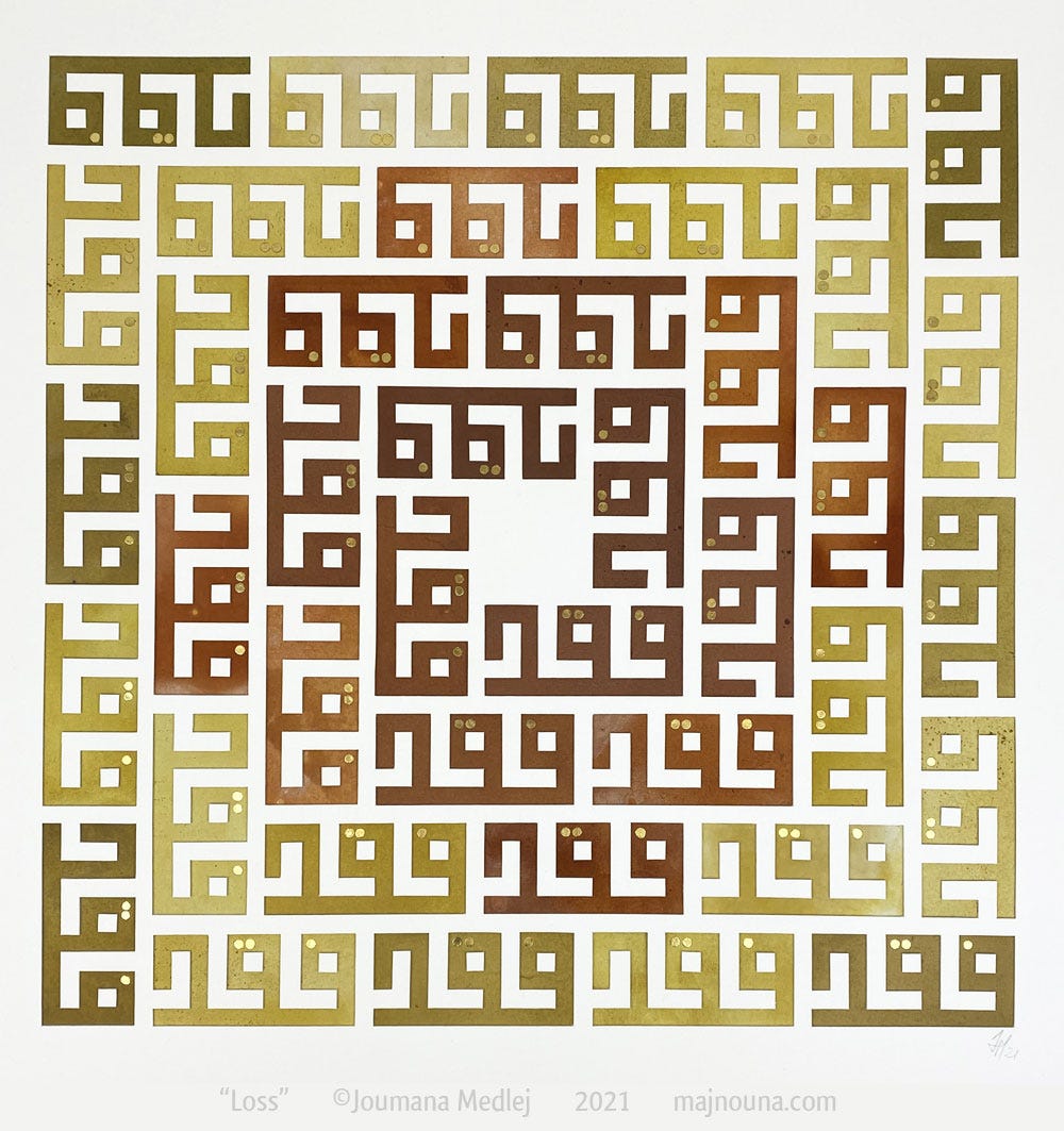
Faqd is “loss”, illustrated here by a composition that will fade over time thanks to the impermanence of plant colours. I gathered all the dye plants in August 2021, around the anniversary of the Beirut blast, and dyed pieces of paper with them. You see above the freshly completed piece, its colours still fresh. Then I left the finished piece exposed to natural light. A year later, the change is noticeable:
I have no idea how long it may take for these hues to fade completely, if they even do. But I planned for that eventuality by cutting out the design, so even if all colour fades the piece will have a sculptural feel, like Greek monuments that have been bleached by time. Meanwhile though, the gold of the seed-like dots will neither fade nor tarnish. And that’s an important part of the series: it’s about loss, but also about the hope that what is true will survive, or that something new can appear out of the ashes.
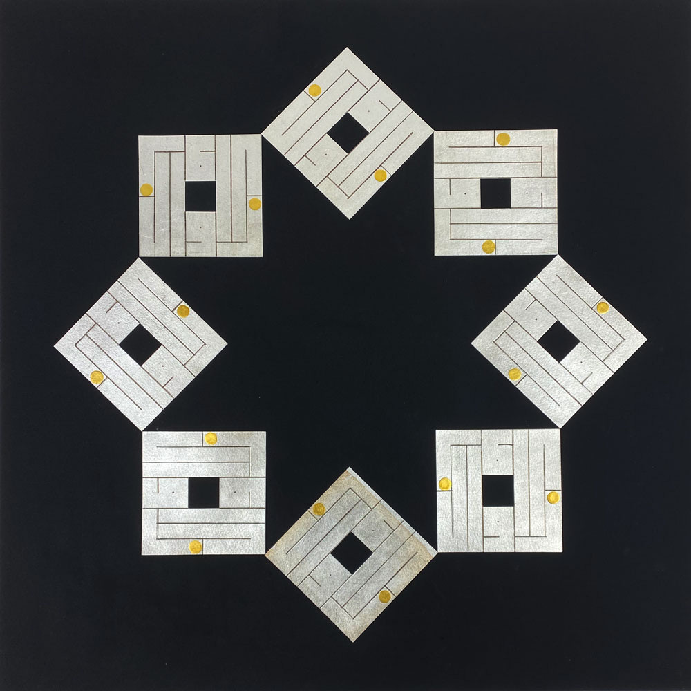
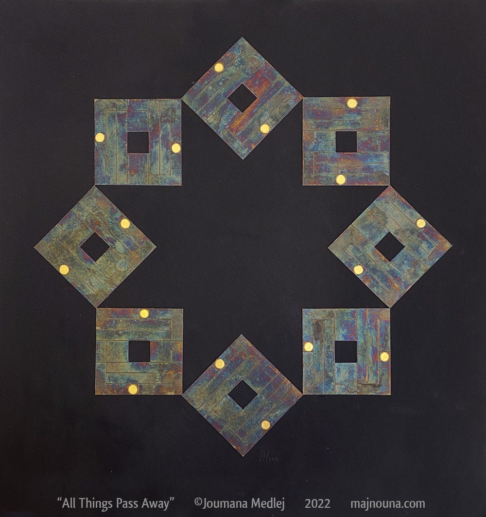
Along the same lines, Zawal is the passing away of all things, and this time I used the supposed defect of silver. Here’s the freshly assembled piece, with gold dots. I didn’t seal the silver as I would normally make sure to do. And here it is a year on:
I want to point out that it’s very difficult to take a photo of this surface, and in reality the rainbow effect is a lot more subtle. It’s dark grey over black and gradually turning into black. The more the silver tarnishes, the better you can actually see the gold and the pattern it makes.
This is just the beginning of my exploring this way of working. In some senses it’s still timid, because I want to make sure that the work preserves its integrity as it changes. It’s very easy to make a self-destructing piece of work, but the art consists in containing this process so that whatever it ends up looking like, it doesn’t fall apart, visually or literally. So there’s a tension between letting go and holding it together. But there’s definitely a different way of working, where the uncertainty of what’s going to happen is embraced as an opening up of possibilities.
Verdigris, lead white and cinnabar are all toxic. While simple and common sense precautions make it possible for artists to work with them safely, I would caution novices to stay away from them.
It was only after my talk that I learned from the collections’ curator, Benjamin Albritton, that this book had been in a fire – not directly burned, but exposed to high heat. Here's my interpretation of what happened: gesso is not a glue as such. To hold on to the gold, it relies on moisture that is locked in the gesso by the use of a hygroscopic component (a technical way to say it contains honey). The unnatural heat would have dehydrated the gesso completely so that in most of the book the gold just flaked away.
I’m not the only one to find them boring: such is the demand for earthiness that paint manufacturers are now re-introducing granulation artificially to some ranges.




Enjoyed the talk, some of those transformations are amazing!