As I redraw inscriptions, I usually encounter a number of errors or inconsistencies which I copy faithfully, as they can provide insight into the process of creating the work as well as the general health of the craft in a certain place and time (a little like the difference between a typo and poor spelling).
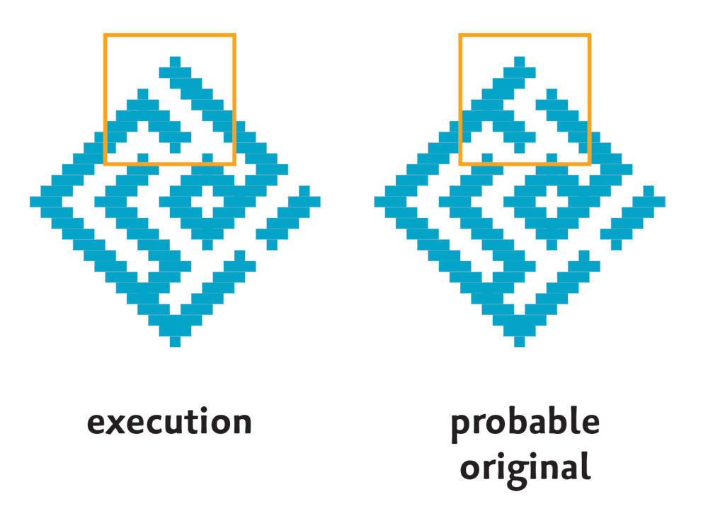
Perfect designs often end up with flawed execution. Errors are understandable: Take it from me, it's hard to copy this kind of design perfectly even if you have the model right under your eyes. If you're a brick-layer or tile-setter in the Persian-speaking world, executing a highly stylised design in Arabic, you're probably reproducing it purely visually, square-by-square, from a graphed drawing and it's incredibly easy to get mixed up. For instance, here’s the الكريم al-Karīm square from the vault in Yazd I shared previously. On the left, the design as it was executed on the vault. There’s a serious problem with the rā ر here: it’s missing its tail, which is absolutely not permissible. But this can be set right by shifting a few tiles as I have done on the right, which tells me that the original design was fine and simply got muddled during execution. (Readers familiar with the script will notice the mīm م is also missing its tail, but that’s permissible.)
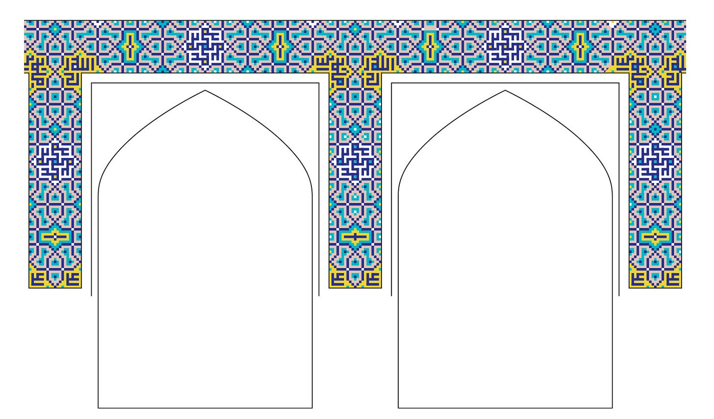
Muddles are particularly prone to happen when a module is being rotated. I know how much my students struggle to visualise the rotation of a design; this is remedied by turning the paper around as you draw, but you can’t exactly rotate a wall! Here's a prime example from a courtyard wall in Isfahan’s Masjid-i Shah.
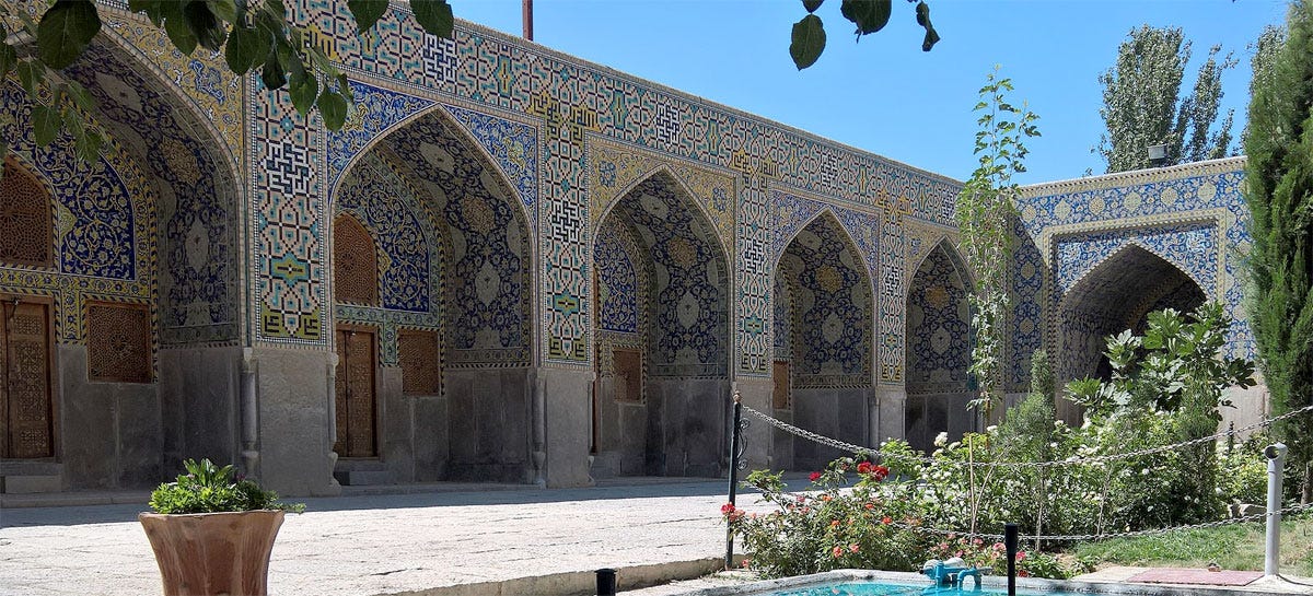
The wall on the left shows a mosaic pattern that runs along an entire side of the courtyard. It’s basically unchanging, with only the highlight colours varying in a way that’s irregular but not really noticeable.
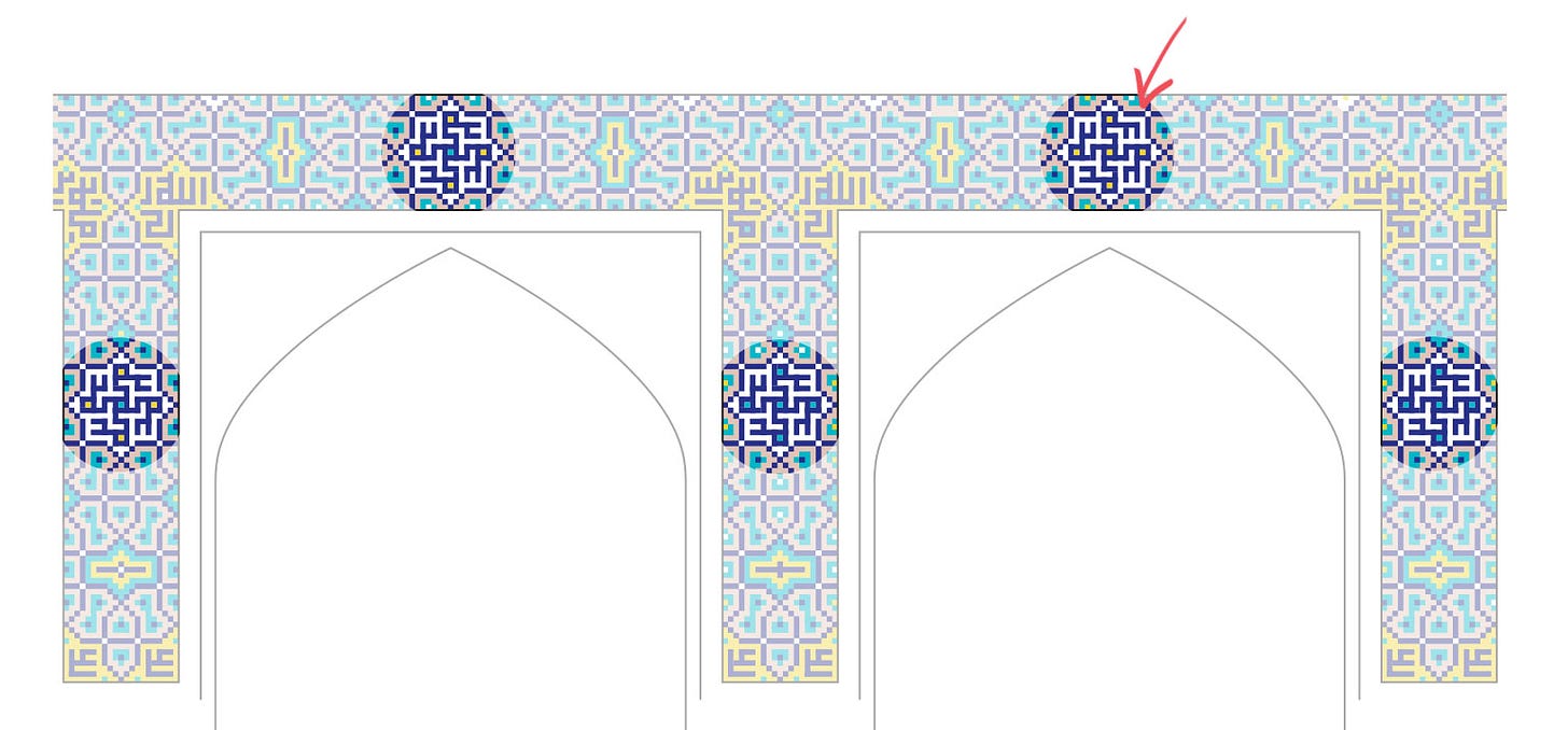
It’s a long wall though I’m only showing two arches, and a simple Muhammad mandala is repeated inside a white eight-pointed star along the whole length – but a close examination reveals an anomaly in just one of them:
That one instance of it has a wrong dāl د ending, breaking the regularity of the rotation. This could very well be an example of rotation confusion!
But there's another possibility, one we can't verify but neither can we discount, and for this I need to digress a little. Growing up, whenever I visited my grandma I was bemused by the tiling in her bathroom. It had a pattern of plain tiles interrupted every fifth tile by a realistic painted iris. What confused me was that one of these iris tiles was placed upside-down. Even aged five, I couldn't understand how this could have happened. How could someone set a tile upside-down without them or anyone else noticing? It's only many years later I found out that it was common practice for Muslim makers to not allow themselves to make something flawless.
Beauty-making is close to the heart of many spiritual traditions and it’s particularly explicit in Islam, where it’s stated that “God is beautiful and He loves beauty”. The two faces of the Divine, equivalent to yin/yang or masculine/feminine, are Majesty and Beauty, while near the top of the list of the ninety-nine divine attributes are the Creator الخالق, the Initiator البارئ and the Fashioner المصوّر — three stages of craft, from idea to finish. To live in beauty is to bring sacredness into everyday life. To be a creator, able to bring beauty to society as well as offer it back to the Source, is both an honour and a responsibility: There is a constant tension between embodying these divine attributes with all the skill you can muster, and steering clear of the hubris of actually identifying with the Creator. Makers did this in a very simple way: by allowing or introducing imperfections into their work. I suspect it’s very situational: a carpet, for instance, is such a complex work that it’s almost inevitable for small errors to creep in, and all you have to do is accept the deficiencies of your attention (as a knitter I can relate). Whereas a master craftsman, or someone tackling an exceedingly simple project, would have to take a deliberate step to break the perfection.
This is not dogma and I don’t know of written sources that discuss it — these matters only concerned makers, not the society at large, and the main mode of transmission in maker circles is practice, not writing — but I’ve observed too many wilfully placed tiles and unnecessary breaks in symmetry to accept the postmodern (and grossly colonialist) notion that it’s something carpet sellers made up to explain flawed goods.
(There may also have been echoes of the ancient belief that perfection doesn’t belong in this world and tends to attract its own destruction. It would certainly attract the evil eye, a pre-Islamic belief that is still robust back home regardless of sect. As a specific example, the Greek myth of Arachne comes to mind: when Arachne wove a perfect tapestry that outshone the work of Athena herself, the goddess ripped the piece to shreds and beat the young woman. In fear and shame Arachne hanged herself, and Athena turned her into a spider so she could live on, eternally weaving but eternally hanging.)
There is no certain way of determining that a complex design in a centuries-old mosque is flawed by design or by human error — not in the way the tile in my grandmother’s bathroom was clearly deliberate. But if a late twentieth-century tilesetter in secular Beirut could still feel moved to do this, how might the craftsmen of centuries past have felt, as they were adorning the most magnificent structures in Khorasan? Sometimes a displacement is so glaringly obvious, you feel sure they must have done it on purpose. But if it were human error, I believe it would have been fully accepted, being a natural expression of human limitations. So in a sense, the distinction is irrelevant. The skill for perfect execution was obviously available, if that had been the purpose to strive for. Here I must emphasise that the flawed execution of a perfectly designed idea is a very different thing from an incompetent and mediocre design executed flawlessly (the latter usually by mechanical means), which is the trend that later starts to dominate and has now taken over — something I’m on a solo crusade against!
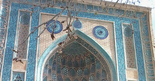
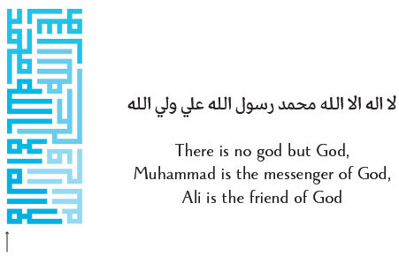
Back to our beautiful walls, though: The portal of the khanqah of Abdul Samad Isfahani in Natanz, Iran, is a very rare example of absolutely perfect design. There may be flaws in other aspects of the facade, but the turquoise inscription, which is what I’m interested in, is impeccable.
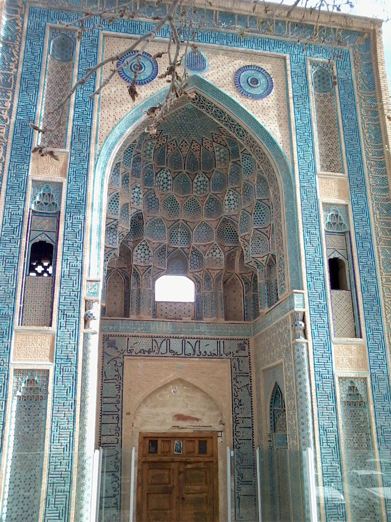
Looking a bit closer, we notice it’s actually made up of a short text, well-designed and used as a repeated module:
Impressive as it is, it gets better. The complete design is not actually made up of a single module, but three!
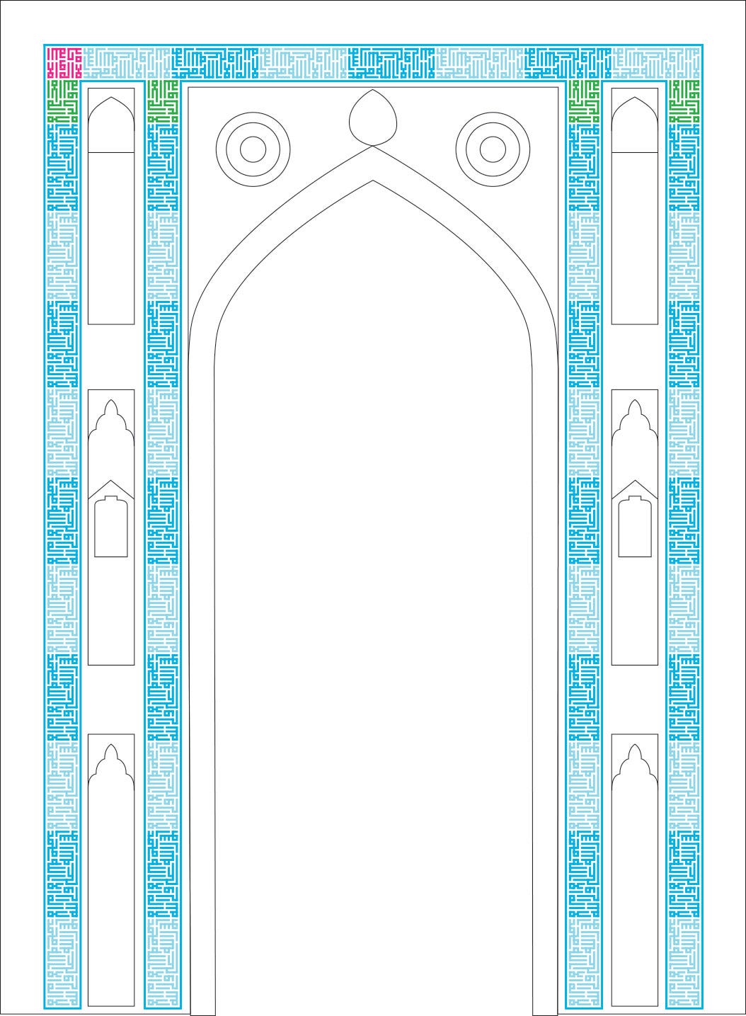
Unless there's an accessible rooftop very near by, it would be almost impossible to see the modified modules with the naked eye, being at the top of this unusally high portal. I only spotted it while redrawing the complete border from a number of photos – I'm very finicky and pay particularly close attention to how designs are resolved in corners.
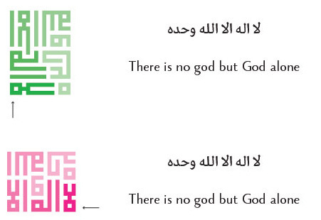
Here is the actual composition: In blue, the main module (alternating with light blue just to make it more visible), in green an alternative text that makes a unit exactly half the height of the first, and finally in pink, a modified version of the green, to fit the space available in that last corner. Which tells us, incidentally, the design was made from bottom to top and right to left!
Here are the two variants of the shorter text:
It's such a clever, perfectly seamless solution for fitting the pattern to the space, and a great display of how adaptable Square Kufi can be to fill a predetermined area.


